
- Tips & Tricks
- PowerPoint Templates
- Training Programs
- Free E-Courses

Visualization in Presentations
Home > PowerPoint Slides > Visualization in Presentations
In this article, you’ll read about an important parameter for slide evaluation which is about visualization in presentations. Presenting your ideas and concepts visually increases clarity of your message for your audience.
Before we learn about the slide-o-meter parameter…
A quick word about the relationship between Assertion and Evidence:
In a PowerPoint slide, there is a clear place for assertion, evidence and explanation of the slide. Here is the pictorial representation of how assertion-evidence model works on slides:
Evidence is a combination of visual representation and verbal explanation.
For a presentation to be effective, the evidence needs to be easily understood. The best way to achieve this is by using visualization and build. We will talk about build in another article.
| Visualization, as the word suggests is the art of representing information in visual form like diagrams, charts or images. The visuals are usually supported by narration from the presenter. |
Why use visualization in presentations?
To answer that, I want you to look at the following two slides. Both of them present the same information. Which of these two slides is easier for you to understand?
Slide 2: Visual Slide with charts and Diagrams on Sales Performance
I am sure you chose the second slide.
Here are the two questions I want you to think about –
- What is the difference between the two slides in presenting the same information?
- What is the specific reason why the second slide is easier to understand?
Here is the difference:
The first slide provides data about sales performance. The second slide provides information about sales performance by capturing the relationship between the data .
- Visualization is the art of capturing relationship between objects
Why capture relationship between objects?
Human brain stores information by forming connection between objects. This web of connection is called ‘schema’. For example, the following may be the web of information in our mind about Mammals.
These connections help the brain to retrieve the stored information quickly, and learn new information by establishing the context easily.
When you use visualization in presentations, you help your audience connect your ideas and objects. This helps them ‘get’ your message and retain your information for a long time.
At this point, we wish to recommend our Visual Presentations eBook , which teaches you a simple yet remarkable process to convey your ideas as visual diagrams. It is a must have book, if you are serious about improving your business presentation skills.
Resouce: FREE DOWNLOAD: As a thank you for going through today’s article, you can download the first 3 chapters from the ‘Visual Presentations – eBook’ for free.
A primer on capturing relationship between objects:
While this short article doesn’t give us enough space to explain the detailed process of creating remarkable visual presentations (That’s why we came up with the eBook), we will give you a quick primer on how to capture relationship between objects.
Start with the information on your bulleted slides. Remove the unnecessary words in each of the bulleted sentences. This will help you find the keywords of your message.
For example:
If your bullet point is:
- Most people have a strange habit when it comes to reading on the net. They don’t follow any specific order in reading the pages. They read in a random order.
Keywords are:
- Most people have a strange habit when it comes to reading web pages on the net. They don’t follow any specific order in reading the pages. They read in a random order.
Gist: People read web pages in random order.
Once you are clear with the keywords, the next step is to capture the relationship between the keywords. This will help you create the right diagram to represent the relationship.
Here is an example of how to capture the relationship between the keywords:
There is an effective method to capture the relations to help you come up with insightful visuals. We teach you the 3 critical steps for visualization in presentations in the eBook.
You can also read about a rough and ready way to quickly identify the right relationship between objects using the 4 common types of relationships for a shortcut to diagrams .
To summarize the article on visualization in presentations:
- Since our mind stores information as connections, visual diagrams help your audience to ‘get’ your message fast and retain it longer
- To visualize information, start with bulleted sentences and remove the junk words to identify the keywords
- Once you identify the keywords, capture the relationship between keywords in the form of a diagram
Return to Top of Visualization in presentations Page
Read related article on Visual Chunking for effective PowerPoint Design
Return to Main PowerPoint Slides
Share these tips & tutorials
Get 25 creative powerpoint ideas mini course & members-only tips & offers. sign up for free below:.
Newly Launched - AI Presentation Maker

AI PPT Maker
Design Services
Business PPTs
Business Plan
Introduction PPT
Self Introduction
Startup Business Plan
Cyber Security
Digital Marketing
Project Management
Product Management
Artificial Intelligence
Target Market
Communication
Supply Chain
Google Slides
Research Services
All Categories
10 Ultimate Data Visualization Techniques to Make your PowerPoint Presentation Stand Out!

Getting audience attention towards your PowerPoint presentation is a feat in and of itself.
To achieve this feat possibly you have spent hours crafting a winning PPT to get that attention.
Perhaps many of you likely have spent hundreds of bucks too.
But despite all efforts, you still struggle to get that desired applause from viewers. You have done all that was required to make a PPT standalone. So, the million dollar question is what went wrong?
Rest easy! We have figured out the culprit.
Well, we all know that figures or data are imperative to make an impact. The problem is that with each passing day data or figures are becoming bigger and bigger. Managing and presenting huge data or figures in an engaging manner especially the big ones is a challenge in itself.
That’s exactly the weak link where every second presenter fails to hit the captivating chord.
Even skipping data or figures calculatedly is not going to serve the purpose. In fact, such a strategy may backfire and perhaps will do more harm than benefit.
All you need to do is to understand the science of Data Visualization. Data visualization means the depiction of information in the form of visuals, chart and diagrams.
Well, we know many of you must be already applying charts, bar graphs and pie charts etc. to represent data. Frankly speaking, nowadays every second presenter is using such old data visualization tricks. These are good enough. But to create a jaw-dropping effect now you need to master new data visualization tricks.
To help you out, here are 10 data visualization techniques or tricks to make your PowerPoint stand out.
Data Visualization Techniques for PowerPoint Presentations
1. Speedometer Dashboard
An automobile dashboard provides information about various parameters of vehicles. In the business world, it can be applied as a metaphor of Key Performance Indicator (KPI). To put in other words, a dashboard helps to visualize figures related to sales, production, efficiency, planning, client satisfaction level or key market trends.

Download Speedometer PowerPoint Template
2. Batteries
A metaphor of battery may seem simple, but it has the potential to boost audience engagement. Presenters can apply battery visuals to symbolically represent figures related to employee satisfaction surveys, energy, motivation level of employees, strength, resources, time and financial state. Best is, instead of using traditional pie charts metaphors of batteries look trendy and are easy to comprehend.

Download Batteries PowerPoint Template
3. Cylinders
Like batteries, the metaphor of cylinders perfectly fits to symbolize figures related to targets and goals. In short, different levels of cylinders can be applied in a presentation slide to depict various business figures.

Download Cylinders PowerPoint Template
4. Thermometer
Thermometer is a perfect symbol to portray figures related to sales growth, target, production and customer base in which level of mercury represents current value, while the top of the thermometer signifies figure or goal to be achieved. Good thing is that temperature color or level can be used to exhibit or compare different business variables.
Besides this, presenters can also incorporate thermometer metaphors to depict total funds, available funds and used funds.

Download Thermometer PowerPoint Template
5. Circular Infographics
Circular infographics are the most popular and widely used designs in presentation templates. Circular shapes fit well to depict processes that are cyclic in nature thereby making them easy to understand and retain. Best is by applying circular shapes it is easy to portray even complex figures or concepts and hence have a definitive edge over other visuals.

Download Circular Infographic PPT Template
6. Innovative pie-charts
Pie-charts or area diagrams are simple but time tested visual techniques to symbolize different categories of data. In pie-charts arc length is directly proportionate to data and hence resonates perfectly with audience attention. Now, by reducing and increasing the size of each arc proportionately to data a little arty twist can be given to make it more impactful.

Download Pie-Chart PPT Template
7. Progress Bars
Giving a much richer experience progress bars are a powerful visual tool to illustrate weekly or monthly sales report. Showing completion percentages, progress bars inform spectators how close they are to complete a specific task. In short, as an indicator progress bar lay emphasis that a work is in process. In one line, easily comprehensible colorful visual representation greatly augments audience engagement.
Here’s the sample slide having progress bars to give a picture of various tasks advancement or progression.

Download Progress Bars Diagram
8. Measuring Scale
Every business house undertakes studies to analyze market trends and demand graphs. Here visuals of measuring scales can prove handy to lay emphasis on different findings or values of a survey. Data presented using measuring scale supports audience to make a quick and precise assessment.
For example, in the sample slide below measuring scale graphics are used to highlight business performance.

Download Measuring Scale PPT Template
Easier to read and understand an icon is a graphical pictogram to indicate a specific subject, thing or expression. Now, icons can also be used to show data in an eye-catching image format. The best thing is that with icons without relying on words presenters can explain data or figures with abstract shapes only.
For instance, in the slide below icons of humans are used to depict percentages.
Download Icons Chart PowerPoint Template
10. Creative Column Charts
Every second presenter applies vertical bars called column charts to represent data. Each vertical bar in a column chart is proportional to the data value. Application of the column chart is a great choice to show comparisons or data changes. Now, by bringing little arty effects a presenter can make them more likeable.

Download Column Chart PPT Template
Concluding thoughts
Driving audience attention seems harder than ever before. Therefore, a presenter just cannot afford to ignore even the smallest aspect of a PPT like figures or data.
We all know that it takes a lot of efforts to generate authentic figures or data. But getting such figures and presenting them in a PPT presentation is not enough. Presenting figures as such doesn’t mean the job is done.
In fact, that’s when the real work starts – presenting them in a striking manner is also important.
To conquer this roadblock, a presenter needs to understand the power of data visualization techniques. Key is start using data visualization tricks to make figures or data easily comprehensible even for an ordinary audience.
To help you out here we have casted a spotlight on ultimate data visualization tricks. Apply them to make your PowerPoint presentation a winning one.
Tell us what your favourite data visualization trick is to make the figures look interesting.
Liked this blog? Please recommend us

This form is protected by reCAPTCHA - the Google Privacy Policy and Terms of Service apply.
Presentations that move audiences
Refine, enhance, and tailor your content quicker than ever before.
Prezi is good for business
Keep teams engaged and customers asking for more

Prezi is smart for education
Make lessons more exciting and easier to remember

Millions of people — from students to CEOs — use Prezi to grab attention, stand out, and capture imaginations

The most engaging presentations happen on Prezi

Create with confidence
Professionally designed templates.
Choose from hundreds of modern, beautifully made templates.
Millions of reusable presentations
Focus on your own creativity and build off, remix, and reuse presentations from our extensive content library.
Real creative freedom
Open canvas.
Create, organize, and move freely on an open canvas. Create seamless presentations without the restrictions of linear slides.
Ready-made asset libraries
Choose from millions of images, stickers, GIFs, and icons from Unsplash and Giphy.

A presentation that works for you
Present in-person.
Have the confidence to deliver a memorable presentation with presenter notes and downloadable presentations.
Present over video conference
Keep your audience engaged by putting yourself in the center of your presentation.
Your own ideas, ready to present faster
Prezi AI is your new creative partner. Save time, amplify your ideas, and elevate your presentations.
The specialists on visual storytelling since 2009
From TED talks to classrooms. In every country across the world. Prezi has been a trusted presentation partner for over 15 years.
*independent Harvard study of Prezi vs. PowerPoint
See why our customers love us
Prezi is consistently awarded and ranks as the G2 leader across industries based on hundreds of glowing customer reviews.
Prezi powers the best presenters to do their best presentations
Presentation Guru
5 ways to make your presentation more visual and effective.

Visualizing slides (just a fancy word for transforming slides full of text into more visual slides) is a big part of my job, but you don’t need to be a PowerPoint expert to apply some basic visualization techniques to your presentations. Even minimal changes can make your presentations much more effective and can help people understand your messages better.
Listening to someone present, who is just reading a slide full of text, doesn’t add to understanding. It actually distracts, because the audience will end up reading the text on the slides themselves instead of listening to what the presenter is saying.
On the other hand, slides with less text and more visuals, whether it be graphs, pictures or diagrams can help the audience retain more information, because visuals and speech work hand-in-hand rather than compete for attention in the brain.
It’s a proven concept we follow at BrightCarbon, and one that we often preach about on our own blog . So, to get you started, here are 5 simple things that you can do to make your presentations more visual and more effective.
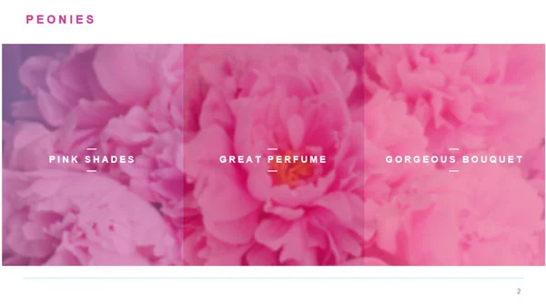
1) Cut down text on slides
Bullet-point filled slides have been plaguing audiences since PowerPoint began. But they aren’t just painfully dull: bullet points are really ineffective for communicating information to an audience.
So, the easiest way you can quickly make your presentation 1000 times better is by simply cutting out some of the text.
The easiest way to cut down text is to first break it down into chunks, then break it into key points – so, one short bullet-point per chunk – and then to get rid of filler words. This will help you take large paragraphs of text and break them into short and snappy phrases that can fit into text boxes or other shapes.
For example, let’s look at the following block of text:
Peonies are my favorite type of flower. They’re pretty to look at because they come in a range of beautiful shades of pink. They also smell amazing and make great perfume. Lastly, they are larger than a lot of other flowers and make a gorgeous, lush bouquet.
Instead of filling an entire paragraph, we could break this text into three key points:
- Peonies come in range of pink shades
- They make great perfume
- They make a gorgeous bouquet
Then, if we get rid of any filler, we are left with:
- Pink shades
- Great perfume
- Gorgeous bouquet
And voila! You have yourself some bullets that are ready to be fit into shapes. By allowing your text to fit into shapes you gain the ability to organize it in a linear way and then you can animate it on clicks, to stagger the flow of information and tell a more compelling story.
So, BEFORE :

and AFTER :
If you want to learn more about how to ditch the bullet points for good, find out more here .
2) Show locations on maps
I’ve worked on quite a few presentations at this point and I think it’s safe to say most of them include a list of locations at some point. This is because it is really common for companies to have a narrative that includes showing their impact on a national, or global, scale by showing their locations. Often, this is just presented as a list of places. But it’s a lot more interesting – and memorable – to show locations on a map.
For example, if a company has opened a couple stores per year, in different locations, they could animate icons representing these stores on a map and have information such as the year, location or size of store in a box next to the icon.
This is a good way to make the slides illustrate a story about the company’s growth, in a way that is easy for the audience to understand.
3) Add color cues
Adding color to slides in an organized way can enable you to manipulate the audience’s attention and increase their understanding of your content.
For example, if every element on your slide is blue and then you color one object yellow, people will understand that the differently colored object is important or different in some way.
The same idea of ‘color coding’ works when you want the audience to get certain ideas from colors e.g. yellow and black mean warning; green is positive; red is negative.
Keep in mind that these associations are partly based on cultural teachings, so they might not apply if the people you are presenting to have a different cultural understanding of color.
You can also use color to set a ‘mood’ for your presentation. For example, if your company is heading a green initiative then using green tones in your presentation will make it feel more environmentally friendly. Most brands already apply this theory in their logos and brand guidelines, so continuing this thought process in your slides can create even more cohesion and understanding.
Find out more about using color effectively here .
4) Use Timelines

A great way to organize text-heavy slides that involve dates and events is to divide them into a timeline.
This is similar to the map idea above, in that it requires a certain type of information to be successful, but if you have dates and information, it’s much more effective to see them organized linearly than in a list of bullet points.
A timeline is a pretty simple element to create on PowerPoint and just involves a line and some evenly aligned and distributed boxes. Create your boxes using the Insert -> Shape functionality, then use the built-in alignment tools to space everything out neatly .
5) Replace text with labelled images
The last, and arguably most important, point is to get rid of text all together, and replace it with images.
For example, if you want to talk about a new product and its features, the best way of doing this is to insert an image of the product and just label it with key words.
You can insert shapes to pin-point areas you’d like to highlight and then animate them in on clicks so you can stagger the rate at which you mention each feature, which can help the audience follow along.
It’s also useful to have images of the product being used by customers so that you can show the audience exactly how it will look and work.
Being complacent and adding tons of text or bullet points to your presentations won’t do you any favors, because people will become instantly bored and disengaged while you’re presenting, and will start reading what’s on the screen instead of listening to the important things you’re saying.
By applying a couple of easy-to-learn tips to your next presentation, you can significantly increase its effectiveness and make it much more visually appealing. Your audience will stay engaged throughout your presentation and will remember more of the content you are sharing.
It’s amazing how much visuals can do to improve communication between a presenter and an audience, so just remember that the next time you’re pasting reams of text into a 25-slide deck: there are better ways.
- Latest Posts
Latest posts by Amy Post ( see all )
- A Quick Guide to More Effective Animations - 28th February 2019
- Master the Slide Master - 20th March 2018
- 5 Ways to Make Your Presentation More Visual and Effective - 6th April 2017
Craig Hadden (@RemotePoss)
11th April 2017 at 4:05 am
These are great ideas, so thanks for sharing. Recently I’ve tried to use colour in a more systematic way, so I was especially interested to read your thoughts on that.
You might also like this makeover I did on a (real) slide. It was stuffed full of bulleted text, but ended up being far less wordy and much more visual. See what your think. (And any comments or questions are always welcome!)
15th April 2017 at 12:47 pm
Thanks for this. and if you’d like to write that piece for us, to help the thousands of designers and presenters out there, we’d love to publish that piece too. The guru is our community after all!
Abigail Lee
25th June 2019 at 12:11 pm
Great article. Prior to stumbling upon your article on Google, I have found similar another engaging article on this website https://www.slideteam.net/blog . It has a collection of enthusiastic articles on PowerPoint as well as professional slides. Feel free to explore all of them.
Your email address will not be published. Required fields are marked *
Follow The Guru

Join our Mailing List
Join our mailing list to get monthly updates and your FREE copy of A Guide for Everyday Business Presentations

The Only PowerPoint Templates You’ll Ever Need
Anyone who has a story to tell follows the same three-act story structure to...
The step-by-step approach to data visualization in presentations
We live in an age of digital information flow. Credibility and verifiability are important currencies when it comes to conveying information. While facts and figures have gained new significance, they often struggle to get noticed alongside the much better performing visual content.
Data visualization is the art of converting contexts, circumstances, and developments derived from verifiable data into visual objects in such a way that they are, ideally, graspable and comprehensible right from the first glance. Infographics, pie charts, bar graphs, or radar charts are all popular formats.

But how can larger volumes of data also be used to paint an informative picture? In five steps, we’ll explain what you need to remember when creating charts, diagrams, and graphs.
The data assessment
Companies generally have access to a wide range of data. Be selective when choosing the data you want to communicate. Assess the informative value and knowledge gain offered by the data sets. When it comes to graphs, charts and diagrams, the same approach applies as for all other PowerPoint-presentation content: Keep your presentation as short and concise as possible, and avoid overloading it with superfluous information.
Data is relevant if, for example:
- It shows developments that enable forecasts to be made for the future.
- It describes pattern deviations that indicate changes in trends.
- It highlights contexts/correlations previously unheard of.
- It confirms previously unverifiable assumptions.
Our tip: If you’re not sure whether certain data is important for your presentation, put it on a backup slide or in the appendix. If a relevant discussion or question comes up during your presentation, you can instantly access it then. This will show you’re well prepared and have thought your presentation through very carefully. And can focus on what’s most important for your audience.

The message
Data is often multidimensional, which makes it complex and difficult to understand. When it comes to data visualization, it is important to concentrate on the main findings and make clear, simple statements. But this also means you need to leave out anything that’s unnecessary. Excessive detail does not make a chart better. A core statement is not made more concise by having extra aspects added on to it. When handling data, people often fall into the trap of following an almost scientific approach. But most business presentations are not of a scientific nature; they’re about key findings. And the more scaled back these are, the clearer they become.
Our tip: Do you feel like you lose too much information by reducing data to a single message? Then check whether you can address the individual aspects separately. Make the most of visual storytelling, and combine various data representations into a well-structured narrative.

The target audience
Carefully consider the target audience of your presentation, and think about how familiar they are with handling data. While data is seen as proof of certain statements, it often also raises new questions. Always state the data source, and be prepared for questions about the collection method, time frame, and contexts/correlations.
Try not to overwhelm your target audience. Remember, even though you’ve been working with the tables and charts for a long time, this is the first time your audience will be seeing them.
Our tip: Remember the 15-second rule for presenting data. Anything that doesn’t trigger a “lightbulb moment” among your target audience within this time frame is definitely too complex. Test it on your coworkers and scale back your information if necessary.

When visualizing your data, only apply principles that will help your audience navigate and grasp the message. Making a table colorful because it looks nicer is not constructive; it might even end up being confusing. The human brain takes in lots of information subconsciously and sorts it. And there are certain perception principles you can utilize. Give your audience whatever they need to understand and easily grasp what you are showing, such as:
- A clear verbal introduction
- A clear heading conveying the slide’s core statement
- Colors of emotional significance (red=danger, yellow=neutral, green=desirable, corporate colors and competitor colors)
- Logical reading order (left to right and clockwise, e.g. based on importance and percentage in a pie chart)
- Labelling and accompanying texts reduced to the absolutely necessary, avoid repetition
- Learned symbols, e.g. symbols for female and male or flags
- Important information highlighted—using size, color, or distinguishing elements
Implementation
Only once you are familiar with your data and have identified the main statement can you determine the type of data suitable. It’s not just the visual attractiveness of a display format that is crucial; its function is too. Situations can be shown differently to processes. Contexts/correlations require a different format to percentages. A list of the most common display formats and their areas of use is available here .
When visualizing your data, be sure to take into account your company’s corporate design. PowerPoint masters are unfortunately often patchy when it comes to data visualization. This is a shame, because uniformly designed tables and charts convey a sense of professionalism, and underline the credibility of the information. Data visualizations are a key part of branding.
Contact us if you want to know how to professionally create data in your corporate design in PowerPoint.
Also remember our 5 criteria for successful PowerPoint presentations, and follow the OSCAR principle , which can also be applied to data visualization.
Share your new knowledge with others
- More QuickTools
- Master & Templates
- Creating presentations
- Presentation Trainings
- Agency Support
- Value Discovery
- Corporate Design
- Content Management
- Modular Sales Kit
- Training materials
- Data Visualization
- Terms and Conditions
- Privacy Policy
- Masters and templates
- Agency support
- Modular sales kits
Unternehmen
- Weitere QuickTools
- Master und Templates
- Präsentationserstellung
- Präsentations-Trainings
- Agentur-Support
- Vertriebsbaukästen
- Schulungsunterlagen
- Datenvisualisierung
- Datenschutzerklärung
- Präsentationstraining
- Design & deliver
Data visualization: A detailed guide to visualizing data in your presentation
- Last Updated : October 20, 2023
- 15 Min Read

"The greatest value of a picture is when it forces us to notice what we never expected to see." - John W. Tukey, mathematician and statistician
Visualization helps decipher or break down information that is challenging to understand in text or numeric form. It's mostly used for data storytelling, as it is a great way to simplify information and present it in a format that is understandable, insightful, and actionable.
Whether you're a data analyst, a graphic designer, a content strategist or a social media manager, expertise in data visualization can help you solve a wide range of business challenges and tell impactful stories. In this blog post, we will look at a step-by-step approach to using data visualizations in your presentation.
What is data visualization?
Data visualization is the process of presenting data in a visual format, such as a chart, graph, or map. It helps users identify patterns and trends in a data set, making it easier to understand complex information. Visualizations can be used to analyze data, make predictions, and even communicate ideas more effectively.
Some examples of data visualizations include dashboards to track analytics, infographics for storytelling, or even word clouds to highlight the crux of your article or script.
Why do we have to visualize data?
In today's information-rich world, audiences are often bombarded with vast amounts of data and complex information. This is where data visualization comes into play—it transforms raw data into visually appealing and comprehensible formats, allowing audiences to grasp key insights and trends at a glance.
Consider the picture below:
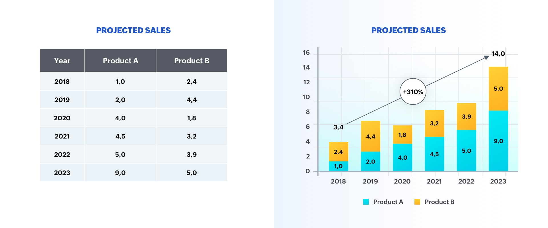
The option on the left is a table displaying two categories of data, whereas the option on the right is a graph representing sales growth. As you can see, the chart is more insightful, and makes it easier to identify trends in the numbers.
A good visualization typically represents some form of collected data as a picture, and can help with:
- Faster decision-making
- Identification of patterns and trends
- Presentation of an argument or story
Why is data visualization important in presentations?
Whether it's a business pitch, a campaign report, or a research presentation, data visualizations help you engage viewers on both rational and emotional levels.
They can be used to evoke empathy, urgency, or excitement, making the content more relatable and compelling. This is particularly crucial in decision-making contexts, where data-driven insights can sway opinions, drive actions, and guide strategic choices.
Ultimately, by incorporating data visualizations into presentations, you can benefit in the following ways:
- Elevate communication and convey impactful, data-centric narratives.
- Tell your story using visuals in a clear and meaningful way.
- Foster a deeper understanding of your data to make a stronger impact on the audience.
- Support idea generation and help derive business insights.
- Simplify data and business processes.
Step-by-step approach to data visualizations in presentations:
There are several factors to consider before adding a data visualization to your presentation. Here's a detailed guide:
Step 1: Define your purpose
The first step to visualizing data in your presentation is to determine your key message and decide on the type of story you are going to tell. Whether you plan to reveal trends, compare data, or explain a concept, a well-defined purpose will guide your data selection and visualization design, ensuring your visuals play a meaningful role in conveying your message.
Step 2: Understand your audience
Identify who your visualization is meant for and then make sure it fits their needs. Tailor your approach to suit your audience's familiarity with the topic and preferred level of detail. Knowing their expectations will help you fine-tune the complexity and depth of your visualizations, ensuring your presentation truly resonates with your audience.
Step 3: Choose your visualization type
Different data types and relationships call for different visualization formats. Selecting the appropriate chart, graph, or diagram is essential for accurately conveying your information. Here are some visualization types commonly used in presentations:
Tables: These consist of rows and columns and are used to compare variables in a structured way. Tables display data as categorical objects and make comparative data analysis easier. Example use: Pricing vs. feature comparison table.
Bar charts: Also known as column charts, these chart types use vertical or horizontal bars to compare categorical data. They are mainly used for analyzing value trends. Example use: Measure employee growth within a year.
Pie charts: These graphs are divided into sections that represent parts of a whole. They are used to compare the size of each component and are usually used to determine a percentage of the whole. Example use: Display website visitors by country.
Area charts: These are similar to bar and line graphs and show the progress of values over a period. These are mostly used to showcase data with a time-series relationship, and can be used to gauge the degree of a change in values. Example use: Show sales of different products in a financial year.
Histograms: Similar to bar charts (but with no space in between), histograms distribute numerical data. They are mainly used to plot the distribution of numbers and analyze the largest frequencies within a particular range. Example use: Measure app users by age.
Scatter charts: Also know as scatter plots, these graphs present the relationship between two variables. They are used to visualize large data sets, and show trends, clusters, patterns, and outliers. Example use: Track performance of different products in a suite.
Heat maps: These are a graphical way to visualize data in the form of hot and cold spots to identify user behavior. Example use: Present visitor behavior on your webpage.
Venn diagrams: These are best for showcasing similarities and differences between two or more categories. They are incredibly versatile and great for making comparisons, unions and intersections of different categories.
Timelines: These are best used for presenting chronological data. This is the most effective and efficient way to showcase events or time passage.
Flowcharts: These types of charts are ideal for showcasing a process or a workflow.
Infographics: These are a visual representation of content or data in a graphic format to make it more understandable at a glance.
Bonus: In addition to the above mentioned visualization types, you can use Gantt charts, word clouds, and tree maps. Gantt charts are used in project management presentations to demonstrate the work completed in a given period. Word clouds are a graphical representation of word frequency that gives greater prominence to the words that appear most within content. Tree maps display hierarchical data as a set of nested shapes, typically in the shape of rectangles.
Step 4: Use an appropriate chart
Once you're familiar with the different chart types available, the next step is to select the one that best conveys your key message. Knowing when and how to use each chart type empowers you to represent your data accurately and enhances the persuasiveness of your presentation. The best chart type for your needs depends more on the kind of analysis you are targeting than the type of data you've collected. Let's take a look at some of the most-used data visualization approaches in presentations.
Display changes over time: One of the most common applications of data visualizations is to show changes that have occurred over time. Bar or line charts are helpful in these instances.
Illustrate a part-to-whole composition: There might be times when you need to analyze the different components of a whole composition. Use pie, doughnut, and stacked bar charts for these part-to-whole compositions.
Visualize data distribution: Another important use of data visualization is to show how data has been distributed. Scatter plots, bar charts, and histograms help identify the outliers and demonstrate the range of information in the values.
Explore variable relationships: When you want to understand the relationship between two variables, use scatter plots or bubble charts. These can help you depict relationships between two variables, and observe trends and patterns between them.
Compare values between groups: Another common application of data visualization is in comparing values between two distinct groups. Using a grouped bar or line chart makes it easy to understand and compare trends.
There are several types of charts available in Zoho Show, each offering their own advantages. Learn how you can add and edit these charts in Show .
Step 5: Pick the right visualization tool
Utilize visualization software or tools that align with your proficiency and presentation needs. Factors such as ease of use, customization options, and compatibility with your data source should influence your choice of tool, enabling you to create impactful visualizations efficiently.
Zoho Show's charts are customizable, easy to use and come with wide range of options to make your data visualization easier. Some of the other prominent data visualization tools include Zoho Analytics , Tableau , Power Bi , and Infogram . These tools support a variety of visual styles and are capable of handling a large volume of data.
Step 6: Follow design best practices
Applying design principles will help you make sure your visualization is both aesthetically pleasing and easy to understand. You may apply these principles by choosing appropriate font colors and styles, or by effectively labeling and annotating your charts. By adhering to design best practices, you can create polished visuals and amplify the impact of your data-driven narrative.
Keep it simple: Data overload can quickly lead to confusion, so it’s important to include only the important information and simplify complex data. As a rule of thumb, don't crowd your slides with too much data, and avoid distracting elements.
Choose colors wisely: Use colors to differentiate and highlight information. The best practice is to use contrasting colors. You can also use patterns or texture to convey different types of information—but remember not to distort the data by applying 3D or gradient effects.
Add titles, labels, and annotations: Be sure to add a title, label, and description to your chart so your audience knows what they are looking at. Remember to keep it clear and concise.
Use proper fonts and text sizes: Use proper font styles and sizes to label and describe your charts. Your font choices may be playful, sophisticated, attention-grabbing, or elegant. Just be sure to choose a font that is easy to read and appropriate for your key message.
Closing thoughts
Human brains are naturally attuned to processing visual patterns and imageryUsing visuals not only helps you simplify complex information, but also makes your information more memorable. By leveraging charts and graphs, presenters can convey information to their audiences in a highly comprehensible manner. This helps them offer key insights and contribute to the decision-making process.
Ultimately, by incorporating data visualizations into presentations, presenters can elevate their communication from mere data sharing to impactful storytelling, fostering a deeper understanding of information among their audiences.
Related Topics
Leave a Reply
Your email address will not be published. Required fields are marked
You may also like

Key design trends for presentation templates in 2024

Deconstructing a presentation template: Layouts, colors, fonts, and more

Tips for creating an impactful social media strategy presentation
Presentations
- Most Recent
- Infographics
- Data Visualizations
- Forms and Surveys
- Video & Animation
- Case Studies
- Design for Business
- Digital Marketing
- Design Inspiration
- Visual Thinking
- Product Updates
- Visme Webinars
- Artificial Intelligence
15 Best Presentation Software for 2024 (Full Comparison Guide)

Written by: Orana Velarde
In this comparison guide, we’ll analyze each of these tools and many more to understand what the difference is between them so you can choose the best presentation maker for your business.
So, if you want to stand out from run-of-the-mill PowerPoint presentations and have a reliable presentation software that will help you collaborate with team members and design stunning slide decks in a fraction of the time, you’ll need this guide.
Let’s get started.
Table of Contents
- Google Slides
- Microsoft PowerPoint
- Beautiful.ai
- Microsoft Sway
What are Presentation Tools
Presentation tools are software applications that enable users to visually present ideas or share knowledge. These presentations are delivered in a slide-show format using a combination of text, images and other graphic elements.
Presentation software is frequently used to pitch an idea to investors , present proposals to clients , introduce new products or services to customers, train staff on new policies or ideas , or teach your students new or complex concepts.
Best Presentation Software: A Visual Comparison
When choosing the right presentation programs for your projects, there are some things to consider:
- Does the price point fit your budget?
- Is it easy to use?
- Who is the program geared at: businesses, educators, bloggers or social media managers?
- Does it have lots of templates to choose from? Are they good quality and helpful?
- Is the built-in graphic asset library extensive and varied?
- Can you embed content, add videos or GIFs?
- Can you add audio to your presentations?
- Can elements be animated?
- Is it desktop or cloud-based ?
- Can you use it to create presentations on any of your devices?
- Can finished presentations be viewed offline?
- Can you have team accounts or business accounts for easy collaboration inside your company?
- Does it include a Brand Kit? Is it easy to use?
- Can the finished presentation be shared online straight from the presentation software?
- Can your presentations be uploaded to the cloud privately with password protection?
- Does the presentation software include analytics to see how your projects perform on social media?
- Can you use the finished presentation as a lead generator straight from the software?
We'll take a look at all these aspects in the following list of best presentation software so you can make your own well-informed decision.
Last updated on May 30, 2024.

Visme is a powerful presentation software and all-in-one content authoring tool. It has a user-friendly interface and an extensive set of tools that make it easy for both beginners and experienced professionals to design and deliver impactful presentations.
Presentations made with Visme go beyond the standard slide deck to incorporate interactive elements and easy, full-featured offline sharing.
Making professional presentation slides with Visme is easy and straightforward. Create slides from scratch using content blocks and the extensive slide libraries categorized by style. Browse the presentation template library to find pre-designed slide decks which you can easily customize to fit your needs.

That's not all that Visme can do, though.
You can also use Visme to create other visual content, such as digital documents, animated infographics, interactive reports and whiteboards. There are tons of customizable templates that come built-in with the app.

You can also use Visme to create other visual content, such as infographics, reports and interactive charts. There are tons of customizable templates that come built-in with the software.
Visme can be used for free to test it out for as long as you want. With a free account, you can create up to three projects.
To access all of Visme's capabilities, you can upgrade to one of the paid plans .
- Starter: $12.25/month paid annually
- Pro: $24.75/month paid annually
- Visme for Teams: Custom – learn more here
If you're a nonprofit organization, you may qualify for a discount. Visme also offers separate Education plans for students and teachers.
Ease of Use
Visme is incredibly easy to use. Switching from slide to slide is a breeze, and you can even save a slide to your content block or slide library to reuse later.
The editor comes with a handy sidebar that lets you browse media, graphics and data tools and drag and drop relevant elements onto your slides. You can also use the /shortcut feature to open a search bar and quickly find what you need.
The dynamic fields feature ensures you don’t miss out on any critical information. With single click, you can easily update content throughout your presentation.
Who Is It For
Visme is perfect for small and large businesses, enterprises, marketing teams, project managers, educators, content creators and so much more. The resources and tools available in Visme reach far beyond the ability to create presentations.
- Social media teams can create content for their company’s social channels.
- Sales agents can create branded and personalized proposals in minutes.
- Professionals can build visual CVs to find the next ideal job.
- Project managers can conduct team meetings with a collaborative whiteboard.
Template Options

The template options in Visme are extensive and varied in style. From minimalistic to photographic, there are many presentation styles to pick from.
Presentation Templates

Ecommerce Webinar Presentation

Buyer Presentation
PixelGo Marketing Plan Presentation

Technology Presentation

Product Training Interactive Presentation

Work+Biz Pitch Deck - Presentation
Create your presentation View more templates
You can choose from dozens of fully designed presentations tailor-made for specific industries and topics or mix and match hundreds of slide layouts by choosing a presentation theme.
You can also start with a blank canvas, add new blank slides to existing presentation templates, and save custom slides to use later as your own templates.
Graphic Assets Library
When selecting the best tools for presentations, the visual capabilities and creative design elements should be a top consideration. Visme’s graphic library includes thousands of free icons, illustrations, stock photos, videos , 3D graphics , audio clips, charts and graphs to include in your presentations.

The best part is that every graphic asset that comes built-in with the Visme editor is fully customizable. Resize, rotate or change colors to fit your brand, content and theme.
AI-Powered Tools
Visme comes with a wide variety of useful AI-powered tools, making it one of the best presentation software.
Let's start with the AI presentation maker . This advanced tool is engineered to make your presentation creation process as quick and efficient as possible.
To create a presentation using this tool, you only need to provide a text prompt outlining your requirements. The tool will then generate the slides, complete with text, images, illustrations and any other content you specify.
After that, you can use Visme's presentation tools to personalize the AI-generated slides and add the final touches.
Next up is the AI writer . This user-friendly tool is your key to overcoming writer's block and crafting engaging copy for your presentation. It can help you create layouts, edit and proofread text, summarize the content and much more. Explain to the AI writer what you want to generate, and it will take care of the rest.
Visme offers several AI image editing tools , including erase and replace, background remover, unblur, and upscaler. These tools can be used to edit the image content or enhance its quality. For example, you can use the Image Upscaler to resize your image without sacrificing quality, ensuring your visuals always look high-quality.
And as always, you just need to provide the right text prompts. Feel free to tweak the prompts as many times as you want until you achieve the perfect outcome.
Videos and GIFs
It's easy to insert or embed videos and GIFs inside a Visme presentation. This is another that makes Visme a powerful video presentation software .
To insert a video, upload a video from your computer or cloud storage and place it on a slide of your choosing. Once you’ve uploaded it, it’ll be in your Media library for future use.
If you don’t have videos of your own, Visme has hundreds of stock videos to choose from in lots of categories. Browse them by clicking the / shortcut on your keyboard and opening the videos tab.
Edit your videos with the integrated timeline feature. Trim video clips and customize playback settings. Resize the video on your slide easily by dragging the corner. Or you can resize any video into another shape for more flexibility.
GIFs are available through the Giphy integration, which you’ll find in the Media tab. These are a great choice when you want to make a meme-based presentation.
Take note that all presentations that have videos or GIFs in the slides must be shared as a live link or downloaded as HTML5 or MP4. If you download it as a PDF or PPTX, all the interactive elements won’t play back.
Adding audio to a presentation is easy on Visme. Either along with a video or as the audio on its own. You can also record a voice over.
Another great option is accessing our Presenter Studio to record a video of yourself presenting your content. You can turn on your camera or record audio only before sending a link to your audience. This is a great way to present asynchronously or save your presentation for people to view again and again.
Embed Third-Party Content
There is more content that can be embedded into Visme presentations, like polls, quizzes , forms , online videos and any content that can be turned into code to insert in an iframe.
You can also take advantage of several integrations to embed even more engaging and interactive content into your slides.
Some of our integrations include SurveyMonkey, Hubspot, Giphy, and many more.
Animations and Transitions
With Visme, you can animate your content and create interactive experiences such as:
- Hover effects or clickable pop-ups, link your slides or content blocks to objects
- Pre-animated assets like characters, illustrations and gestures
- Custom animation and motion effects
Features inside Visme presentations can be animated, and we also have a number of seamless slide transitions that make your content pop, like "Enter from Side" or "Staggered Fade."

If you want to make your content even more dynamic, you can access our Custom Animation feature. This is perfect for creating video presentations or making your elements look like they're floating on your slide.
Visme also comes with a 3D Character Creator that helps you elevate your storytelling and connect with your audience. You can create and customize 3D animated characters to embody your brand or message.
Tweak everything, from gender and hairstyles to outfits and skin tone, until you achieve the perfect look. You also have the ability to choose their entry, waiting and exit poses.
Desktop or Cloud
Visme is an online cloud-based app that can be easily used on your computer. We also provide a desktop app that you can download and use outside of your regular browser for seamless content creation.
And if you need to create content on the go, you can easily edit existing projects right from your mobile device or tablet using the Visme iOS app .
Data Widgets
Visme offers a wide selection of data widgets that allow you to creatively visualize statistics and figures in the form of gauges, clocks, pictographs and icon arrays.
Data visualization in Visme goes beyond widgets. Add tables, graphs, and charts to your presentation slides and connect them to a live data source . Create a data stream from Google Sheets or Google Analytics into customized data visualizations.
Offline Viewing
Finished presentations can be viewed offline in four different formats.
The best option is to download it as an HTML5 file. That way it will maintain all the animations when opened on Google Chrome, even without internet. Downloading as an HTML 5 file is a premium feature. Presentations can also be downloaded as a collection of JPG or PNG images, as a PDF or as an editable PowerPoint file.
Create a stunning presentation in less time
- Hundreds of premade slides available
- Add animation and interactivity to your slides
- Choose from various presentation options
Sign up. It’s free.

Collaboration Possibilities
Visme has a premium teams plan that lets all team members customize and complete projects together. Leave comments with edits and feedback, edit projects simultaneously and easily share with other people on your team to move the project along.
Plus, Visme's workflow management features give the project admin complete control over your team's collaboration process. You can assign tasks, manage roles, set deadlines and more, all from a centralized platform. These features are useful for streamlining communication and reducing the time between briefing and final presentation design.
Branding Capabilities
Visme's brand design tool makes it easy to keep all of your content on-brand regardless of who's creating it. It works in three easy steps:
1. Upload all of your branding assets (colors, fonts, logo) to Visme with the Brand Wizard . Input your website URL and watch as our Brand Wizard automatically pulls in all of your branding.
2. Access a bundle of 30+ automatically branded templates that have your logo, fonts and colors already ready to go.
3. Easily access thousands of other templates and input your brand fonts and colors with just a click in Visme's editor.
Then boom! All of your content will always have the same branding, helping increase brand strength and recognition.
Share to Social Media
Once a presentation is finished, it can be shared to social media seamlessly right from the editor. It can also be downloaded.

Privacy and Password Protection
Presentations on Visme can be published privately with password protection so that only the people you want can access it. It is advisable to only use strong passwords for this purpose. There are a few free password managers that could help you do that and keep your account secure .
Visme’s analytics is what makes it stand out as the best tool for presentation. When a presentation is shared via a live link, it can be analyzed for views and sharing.

Access in-depth analytics that show you how much of your presentation is typically viewed, for how long and which slides seem to be the most popular.
Lead Generation
You can add a signup form to your presentations to collect leads that could potentially become clients. Simply head over to our Advanced Settings tab before sharing your project and turn on Requires Registration to collect emails from each person who views your content.
The best part of using Visme is that you get access to an interactive online form builder that's proven to generate 2X more conversions than traditional forms. You can choose your preferred form type and customize every aspect, including character appearance, color, background and animations to match your design and branding requirements.

Prezi offers a great alternative to the traditional presentation format that goes slide by slide. The creative idea behind Prezi is you can create an animated, non-sequential flow with topics and subtopics that are hidden until you zoom in.
While Prezi's interface can be slightly complicated to use, it's a good option for people who need to add a creative touch to their presentations.
Prezi is free for basic capabilities and limited templates.
For the paid plans, there are three tiers.
- Standard: $5/month
- Plus: $12/month
- Premium: $16/month
- Teams: Upon Request
There are separate plans available for students and teachers.
Prezi has a slight learning curve, but once you create a couple of presentations, you get the hang of it. However, it doesn't offer too much customizability inside the templates.

Businesses and educators who are in need of a different style of presentation. Prezi offers a “conversational style” of zooming and moving around between information. So, who Prezi is for really depends on who needs this sort of presentation style.
There are plenty of templates to choose from, and you can also start from scratch. The templates are different in color and style, but the idea of zooming into topics and subtopics is the same.

AI Presentation Assistant
Prezi has an AI assistant that automatically generates presentations for users.

The assets library has some icons and shapes available, the usual ones like arrows and buttons. Premium plans get access to over 80,000 icons and 500,000 images.
Videos can be uploaded or embedded from YouTube. Embedded videos are not viewable in offline mode. GIFs aren’t supported.
Voice over can be added in premium plans.
No other content can be embedded into Prezi presentations.
Prezi is all about animations between topics and subtopics. The presentations themselves are viewed as animations.
Prezi is a cloud app but can be accessed to view offline with premium plans.
Available to Create on Multiple Devices
Prezi presentations can only be created on a computer but can be viewed on all devices.
Prezi for teams is available upon demand and has a Slack integration.
Brand Kits are only available with Prezi's team plans, but each presentation can be customized to fit your brand with color customizations and some available fonts.
Prezi presentations can be shared to social media via a special share button at the top-right of the Prezi page. They can be shared to LinkedIn, Facebook and Twitter.

Prezi presentations can only be downloaded from the Prezi app. There are two options, as an EXE file for PC and a ZIP file for Mac. Presentations can then be viewed without internet connection or the need to connect to the Prezi app.
Presentations are public unless you have a paid account.
Analytics are available with premium accounts but it only applies to Prezi presentations you share via a link to someone.
There are no lead generation capabilities with Prezi.
3 Google Slides

Google Slides is the presentation software available via your Google account. Just like you can create documents and spreadsheets with Google Docs and Sheets, you can create presentations with Google Slides.

The setup is very similar to PowerPoint and is free to use for anyone with a google account. There is a business version called G Suite, which includes the same things with more storage and management capabilities.
Google Slides is free to use for anyone with a Google account. All features are available to everyone.
There are plans for business accounts so that teams can be created and information can be managed in a more organized way. Plans start at $6/user/month and go up to $18/user/month.
Compared to other examples of presentation software, Google Slides is very easy to use. The controls are very similar to Google Docs and Sheets.

Business professionals, educators and students who need fast and easy access to a presentation software that can get things done.
There is a general collection of templates, but there are not very many. Presentations can also be started from scratch.

The graphic assets are average and simple. The shapes are classic and generic. Photographs can be uploaded from your desktop, your Google Drive, a URL or searched online.

Videos can uploaded with a YouTube link or from Google Drive. GIFs can be added just like images.
Audio and Embed Third-Party Content
Anything from your Google Drive can be added in. Also there are some available “add-ons” that can be integrated for icons, stock photography and audio.

Elements inside each slide can be animated and so can the transition between the slides.

Google Slides is a cloud-based program.
Google Slides can be used fully on any device with their respective apps for Android and iPhone. Presentations can be edited and viewed on all devices.
Collaborating with other people is easy with Google Slides
There is no brand kit feature.
Presentations can be shared via email or link.

Google Slides can be viewed offline with a Chrome Extension and the use of Backup and Sync.
Presentations can be shared privately, but there are no password capabilities, only invitations.
Analytics and Lead Generation
These features are not available.
Read either PowerPoint vs Google , or you can check out Google Slides vs Visme to get a detailed overview of each tool and find the perfect presentation software for your needs.

Keynote is the native Apple presentation software — one of the original PowerPoint Alternatives. Anyone with an Apple ID can use the Keynote editor. It is the most similar to PowerPoint and also Google Slides.
Keynote is free for downloading and also accessing via the cloud with an apple ID.
If you know how to use PowerPoint or Google Slides, Keynote is a breeze. This feature makes it stand out as one of the best tools for presentation.

Keynote is good for businesses, educators and anyone who needs a practical presentation software.
The templates are limited but come in standard or wide sizes. Templates can also be found outside of Keynote and uploaded into the program.

There are plenty of classic symbols and icons available which are also customizable in terms of color and gradient. Images can only be added from your computer.

Videos are not embeddable in Keynote slides but that is sorted with a plug-in like LiveSlides. GIFs can be added as .gif images.
You can upload existing audio files in Keynote to play on specific slides. There's also an option to record your own voiceover to create a narrated presentation.
Including these is not available
Slides and objects can be animated in a number of ways, including path creation, scaling, bounce or jiggle effects, and more.

Keynote is available on both desktop and cloud.
You can create keynote presentations on any apple device and PC.
Keynote presentations can be downloaded as .pdf or as .pptx to view offline.
Keynote presentations can be collaborated on via a link or email with permission settings set to “can make changes”.

Brand Kit, Share to Social Media, Analytics and Lead Generation
None of these are available on Keynote.
Presentations are private until shared and there is no password protection capabilities.
5 Microsoft PowerPoint

This list wouldn't have been complete without the most popular presentation software in the world. Even though there are tons of more advanced presentation tools out there now, PowerPoint is still a favorite of many because of its familiarity, ease of use and availability.
The desktop-based PowerPoint program is part of Microsoft 365, which has different plans for businesses that start from $6/month and go up to $22/month. You can also buy an unbundled digital PowerPoint account for $159.99
PowerPoint Online is free on any device, including mobile.
Most, if not every, computer user knows how to work a PowerPoint. The traditional sidebar interface is easy to use simply because it's familiar. But for people who are using PowerPoint for the first time, there might be a slight learning curve.

Businesses, individuals, students, teachers and anyone who uses a Windows PC or device. PowerPoint is also a good fit for people who want to create simple, conventional presentations, and aren't looking for fancy new features or capabilities.
There are dozens of themes that come built-in with PowerPoint, and there are all customizable so you can play around with the styles.
You can browse stock images, icons, stickers and more by searching for relevant keywords in PowerPoint's graphic library.

Videos and GIFs can be uploaded from your computer. You can also embed videos from YouTube and other online sources. However, this feature is only available to Windows users.
You can upload audio files from your computer. You can also record audio directly inside PowerPoint and edit the settings for playback.
You can embed files created in other Microsoft Office applications, such as charts created in Excel, or any other programs that support Object Linking and Embedding (OLE.)
There are tons of animation and transition options available in PowerPoint, which can actually get confusing at times. However, if you know your way around these options, it gets easier to create a professional-looking slideshow.
There are both desktop and cloud versions of PowerPoint available.
You can download the PowerPoint mobile apps on both Android and iOS devices.
It's possible to share your presentation with specific people.

Brand kits are not available, but you can save custom themes.
Presentations cannot be shared to social media.
You can download your PowerPoint presentations in various formats, including PPTX and PDF. This makes it easy to access them on any device offline.
You can mark your presentations as read-only to prevent users from editing the file.
This feature is not available in PowerPoint.

Ludus is one of the best-looking presentation tools available online. The main attractions with Ludus are the clean black screen to edit on and the number of integrations that give importing capabilities for all sorts of content. From photography to .svg to code builds.
Ludus starts at $14.99/month for teams of 1-15 people. Teams that need more licenses are encouraged to contact for more pricing information. Ludus does offer a 30-day free trial.
Ludus is quite easy to use and includes lots of keyboard shortcuts. It is easy to learn how to use and pretty straightforward. It seems to be easier for designers than for non-designers to use.

This presentation software is geared more towards designers or business owners who have some design knowledge to totally be able to use the broad capabilities.
There are no templates to choose from. You have to start from scratch or use smart blocks that you can create to use over and over easily. Smart blocks are kept in their own library.
Ludus has minimal in-house graphic assets like simple shapes, but the integrations are epic. You can import .svg icons and edit them inside Ludus quite easily. Photos can also be imported via Unsplash, Instagram, Facebook or uploaded.

Videos and GIFs are easily imported via the integrations like YouTube, Vimeo, Giphy and more.

Audio can be embedded as an audio file from SoundCloud, Dropbox and other integrations.
You can pretty much embed anything into Ludus. The integrations are impressive and there are also iframe and HTML options.

Internal elements can’t be animated but there are so many integrations that animations can be done in different ways.
Ludus is a cloud-based app. No need to download anything.
Presentations can only be edited on computers. Finished presentations can be viewed on all handheld devices that have access to the internet via a URL link.
Collaborations are possible with the team plans. This includes live collaboration, workspaces and more.
With collaborations, smart blocks and the Brandfetch integration, a brand kit can be organized quite easily. But it’s not an internal feature.

Finished presentations can be easily shared to social media straight from Ludus.

Ludus presentations can be downloaded as .pdf or .html to be viewed offline.
Pro Plans have password protection.
There are no analytics or lead generation capabilities available in Ludus.

Slides is the only presentation software that promotes itself as being “pixel perfect” as the editor includes a built-in grid to help with composition. Slides has a lower cost at the highest price tag which is good for smaller businesses.
Slides is free to use, but finished presentations will be public and available.
The paid plans start at $5/month, and the Pro plan sits at $10/month and go up to $20/month for features like unlimited collaborators, privacy, shared media library and Google Analytics.
Slides is very easy to use, the editing board is minimal but all tools are at easy reach. No need to get confused with Slides. There are no templates so presentations are built from scratch.

Small business owners or startups. Individuals that know what they want and don’t need templates to help them along. Also for developers because it has HTML and CSS building capabilities.
Slides has a very limited template library with just a handful of different options to choose from.
The available shapes and icons are common and minimal. Photos have to be uploaded or imported from a URL.
Videos and GIFs are easy to add. Videos can be uploaded or linked and GIFs can be uploaded as .gif or .mp4 as video.
Including audio is not possible with Slides.
Anything with code can be added in an iframe.

All elements and features can be animated to fade in, fade out etc. Length of duration can be customized.

Slides is a cloud-based presentation software that can only be used online.
Slides can be used on the computer and handheld devices. To edit and to view.
Paid plans have very capable collaboration possibilities. Users can leave comments with feedback for the creator to review and make edits.

There is no set section for a brand kit but branded decks can be created and then cloned to use as a template.
Yes, quite easily.

You can also share presentations via URL, email or embeddable code.

A Slides presentations can be downloaded as a ZIP file with an .html file inside that can be viewed offline on any browser.
Privacy and Analytics
Possible with paid plans.
This is not possible on Slides.
8 Slidebean

Slidebean is an easy-to-use presentation software with interesting templates and customizable content blocks.
The highlight of this presentation software is that it uses artificial intelligence (AI) to help you put together the best possible slide layouts and configurations. They also have a team of experts that can both write and design your pitch deck for you if you don't want to take the DIY route.
The free plan has limited capabilities but it's enough to see how Slidebean works. To export your presentation, you'll need to upgrade.
There are three price levels from $8/month to $19/month to $149/month. The last one is the Founder's Edition plan, which includes help from the experts on your presentations.
If you choose to get their help on your presentation design, it starts at $29 per slide or $1,999 for the full project.
Slidebean is quite easy to use. You can choose between templates or start from scratch. Adding content is simple and to the point from a popup.
Editing can be done in outline or design mode. The editing is limited to how the content blocks are set up, but there are lots of choices. There's no free size changing or moving around.

Startups, small businesses and entrepreneurs.
There are plenty of template options. They are organized in sections and niche. The template collection has presentations by known brands like Snapchat and Buzzfeed.

There are plenty of icons and images to choose from. However, there are no shapes, but icons can be used as shapes.

GIFs can be added via the Giphy integration in a content block. Video can be added in the paid plans.

There are no audio capabilities.
The code snippet content block has lots of options so a lot of different kinds of third-party content can be added in.

Content blocks and their elements can be animated with a couple features.
Slidebean is an online program on the cloud.
It can be used to edit or view on any device.
Collaboration is possible in the paid plans.

This feature is available in the paid plans.
Sharing to Social Media

Slidebean presentations can be exported to download as both .pdf and .html files to view offline.
This feature is not available.
Analytics are available in the paid plans.
9 Zoho Show

Zoho Show is a presentation software that mimics Microsoft PowerPoint in the way it is set up, with a menu up top for all the actions. However, Zoho's version is much nicer and polished.
Zoho is a complete CRM for businesses and the company offers different types of apps for teams and office use — Zoho Show is only one of their programs.
Zoho show is completely free and without ads.
Zoho Show is pretty easy to use. The content blocks can be chosen as themes but they can also be moved around freely and resized. The presentation can be viewed in three ways, with a handy grid view to see all slides next to each other.

Businesses, entrepreneurs, educators and students. Anyone who needs to make a presentation.
There aren’t exactly templates, but there are themes. These do not come with images or lorem ipsum but are more like visual canvases that can be customized in terms of color, layout and more.

The shapes are pretty good, there are quite a bit to choose from. An added bonus is the possibility to draw shapes or scribble anything yourself with the trackpad.

Videos can be added via the YouTube integration and GIFs can be added as an image.
Audio can be added via Soundcloud with an embed code.
There are a number of sites that are supported via Embed codes but not that many. Zoho Show says that you can ask your needs to be added in the permitted list.
All elements and transitions can be animated.

Zoho Show is a cloud bases program and can be broadcast from anywhere and on any device. The live broadcast includes a chat window and the audience can download the presentation if they want to.
You can only create presentations on a computer.
Teams can easily use Zoho Show, even in the free version.
Custom branding is only available in the highest paid plan.
Sharing to social media is not possible unless downloaded as a PDF file and then uploaded to something like SlideShare.

Presentations can be downloaded as .pptx or .pdf files for offline viewing.
Yes, this is possible on all plans.
Analytics are possible on the paid plans.

10 Beautiful.ai

Beautiful.ai is a presentation software that helps you create great-looking slides with the help of Artificial Intelligence. This means that your presentation will look professional every single time, regardless of who designs it.
Beautiful.ai currently offers a Pro plan at $12/month and a Team plan at $40/month, both billed annually. They offer a 14-day free trial to test out their tool.
This is probably the best thing about Beautiful.ai — it's incredibly simple to use. All you need to do is add smart slides, plug in your content, and choose from different preset layouts.
Of course, that also means that you have limited customization options. But if you're looking for a simple solution and you don't trust your design skills, this may be a good option for you.

Beautiful.ai is a great tool for absolute beginners and non-designers who are looking for a no-nonsense presentation software.
For example, startups and entrepreneurs can use this software to create a nice-looking pitch deck or proposal quickly without any design help.
There are a handful of slide themes available, but they're mostly basic in terms of design. You can play around with the layouts inside each theme to put together a unique presentation.

The graphic assets library comes with a bunch of free stock photos and icons to choose from, but the options are pretty limited.
Videos and GIFs can be uploaded from your computer. You can also import videos from YouTube and Vimeo to embed in your slides.
Audio can be uploaded from your computer.
It's not possible to embed third-party content into Beautiful.ai presentations. However, you can add interactive links to your slides.
Each slide comes with a preset animation style that you're unable to customize. However, you can change the speed, timing and triggers for the animations.
Beautiful.ai is a cloud-based application.
The software only works on your desktop computer.
You can invite people to collaborate on your presentation by either giving them "view" or "edit" access. Collaborators must have a Beautiful.ai account to view or edit the presentation.
While there's no brand kit feature available, you can customize a theme (colors and fonts) and save it to your library to use in future presentations.
There are several options to share your presentations. Send an email invite, share a public or private link, generate an embed code or share directly to social media.

You can export your presentations to PDF or PowerPoint to view offline.
There is no password protection, but you can use the Secure Viewing option to only share your presentation with other Beautiful.ai users via an email invite.
This feature is only available in the paid plans. You can access a number of viewing and usage statistics for your presentations.
This feature is not available in Beautiful.ai.
11 Genially

The main idea behind the Genially presentation software is interactivity.
This program is good not only for presentations and video presentations but also for other visual graphics. It’s great for adding a modern, interactive feel to your presentations.
There is a free plan in Genially, which gives you unlimited creations but limited resources. The paid plans are as follow, paid yearly:
- Pro: $7.49 / month
- Master: $20.82 / month
- Team: $79.15 / month
Genially is easy to use if you are accustomed to programs with lots of choices. There is a lot that can be done with the features in Genially.
Any change can be applied to all slides with a single click of the button in the menu. When editing, there is a "design view" and a "layers view."

Professionals and educators of any field who can benefit from interactive presentations.
There are plenty of template options. Some are free and some are only available via the premium plans. Presentation templates are also available as "video presentations."

The graphic assets in Genially are quite varied; there is plenty to choose from. Images can be uploaded or found on the Pixabay integration.

Videos can be added via a YouTube link and GIFs can be imported with the Giphy integration.
Audio can be uploaded from your computer, added via SoundCloud and a couple of other integrations, or recorded directly in Genially.
Third-party content can be added to your presentations with Genially integrations. For example, you can add an interactive map via Google Maps.

All elements can be animated, as can the transitions between slides. Animation effects are quite extensive. There is a similar tab called “interactivity,” which are pop-ups and hyperlinks supplied with lots of button choices.

Genially is a cloud-based presentation program.
This program is only available to edit on computers but can be viewed on any device.
It seems that a professional plan allows 5 team members, but the pricing plan shows that all plans have collaborative capabilities. Collaborators can be added in the dashboard where all creations are stored.
Brand kits are available in the premium plans. It is an internal feature with easy access.
Finished presentations can be shared to social media.

Finished presentations can be downloaded as a set of .jpg images, as a .pdf or as an .html5 file which will keep all animations.
Premium plans have these features.
This is not available in Genially.

Canva is not only a presentation software but also a full editing program for all visual needs. Presentation creation is only one of the possibilities with Canva. It has become a favorite with bloggers and home-based businesses.
The free version of Canva is pretty extensive. The only restrictions are the use of premium resources that can be either bought separately or through the Canva Pro plan. Canva Pro is charged at $12.99/month or $119.99/year.
Canva Teams is $14.99/month + $14.99/month for every team member after the 5th.
Canva is easy to use as all elements are easy to find and are mostly customizable. Presentations are viewed scrolling; there is no master view and you can’t change something on all slides at once.

Bloggers, small home-based businesses and startups
There are lots of customizable template options, and each slide inside the templates can be used individually.

There are plenty of options in the graphic assets library, including shapes, icons, photos, frames and stickers. Some are free, while others are paid.

Videos and GIFs can be uploaded to Canva.
You can add music to your presentations using the available options inside Canva.
Canva offers dozens of integrations and media embed options, including YouTube, Google Maps, Vimeo, Pinterest, Tumblr, Twitter and more.
There are several animation options that apply to entire slides inside Canva. You can also add animated stickers to your slides.
Canva is a cloud-based app. Presentations can be seen on any device.
Canva is available as an iPhone app and an android app for editing capabilities.
Presentations can be shared for editing with team members.

Canva Pro has a brand kit feature.

Presentations can be shared on Twitter and Facebook.

Presentations can be downloaded as a group of .png or .jpg images or as a .pdf. You can also download it as an MP4 video for offline viewing.
All designs on Canva are private unless they are made public or shared via a link. There is no password-protected sharing though.
These features are not available in Canva.
While Canva offers a wide range of features for various visual design needs, you can explore better alternatives to find solutions that may better fit your requirements. If you want to explore other options, read our article about 12 excellent Canva alternatives .
13 FlowVella

FlowVella is a downloadable presentation software that can be used offline. The main attraction of FlowVella is the Kiosk Mode, in which you can create interactive presentations like the ones used in museums or information counters at malls or hotels.
FlowVella is free to try out. You can use it free forever but the options are limited and the finished presentations has a watermark. P aid plans are as follows:
- Premium : $10/month or $60/year
- Pro : $20/month or $200/year
- Enterprise : Upon request
FlowVella is pretty easy to use, and the controls are straightforward and uncomplicated.

This presentation software is for professionals and educators that need to be able to create presentations offline. Also for those who can take advantage of the Kiosk Mode.
The template options are quite varied and well designed.

The graphic assets library is very limited. Photographs and images need to be uploaded from your computer.
Videos can be uploaded or found via YouTube, iCloud and Dropbox integrations when online. GIFs can be added as images.

Audio can be uploaded from your computer, or added via iCloud or Dropbox.
You can add PDF files.
Only the transitions are animated minimally.
This is a desktop-based application. It must be downloaded.
There are iPad and device apps available for editing on those devices as well.
Paid premium plans can work with teams.
Brand kits are not available.
Presentations can be shared on Facebook and Twitter.
Since this is a desktop application, offline viewing is not a complication.
These features are available in the paid plans. Analytics can be viewed once the presentation has been published online.

This feature is not available on FlowVella.
14 Haiku Deck

Haiku Deck is a presentation software that is straightforward with a simple interface that makes quick and practical presentations. Presentations can be created on the computer and on mobile devices.
Haiku Deck can be tried for free with one available presentation. The Public plan is USD 7.99 a month, Pro plans are USD 9.99 a month billed annually and USD 19.99 billed monthly, and Premium plans are USD 29.99 a month.
Haiku Deck is quite easy to use and menus are easy to follow. There are word size limiters and specific text placement choices for each slide. Charts are simple to create and can be customized. The editor can be connected via cloud to all devices. The new addition, Zuru, is an Artificial Intelligence system that creates creative presentations from simple PowerPoint files or outlines.

The Haiku Deck presentation software is geared mostly toward educators and classrooms. Businesses and bloggers can also use it for practical purposes.
Templates on Haiku Deck are more like an inspiring collection of photographs for a specific niche with some suggestions on where to place the text and what charts to include.

The available graphic assets library in Haiku Deck are millions of photographs, numerous font choices and charts and graphs.

YouTube videos can be embedded easily in a Haiku Deck. GIFs cannot be added to Haiku Decks but a finished presentation can be turned into a video or into a GIF.
Narrations and voice overs are easily recorded on a presentation in Haiku Deck.
Only videos can be embedded.
Features can't be animated in Haiku Deck
Desktop or Cloud / Available to Create on Multiple Devices
Haiku Deck is a cloud-based app that is available for editing and viewing on your laptop and also as an app on phones and tablets.

Haiku decks can be downloaded as .pptx files for offline viewing.
Presentations can be easily shared to social media from the editor.

Haiku Deck offers team possibilities upon request.
There is no brand kit, but you can add your logo to the finished product.
Pro and Premium plans have private and password-protected capabilities.

Premium plans have analytics for who has viewed your presentations.
Emails cannot be captured with Haiku Deck but slides and presentations can be sent with invitations to your existing email contacts.
15 Microsoft Sway

Microsoft has its own alternative to PowerPoint — Sway.
This online presentation software is completely different from PowerPoint and introduces a new concept of building "Sways" instead of "presentations."
Sway is free to use for anyone who has a Microsoft account.
It's super easy to use Sway and kind of fun too. It has a non-traditional storyline editor, which lets you add "blocks" of content that the software configures into layouts.

Sway is mostly for people who don't want to spend too much time designing a complex presentation. For example, students and nonprofit organizations.
There are several templates for different purposes, such as photo slideshows, sales trainings and even personal portfolios.
You can upload your own media or search from various sources inside Sway, including Flickr and Bing Images. There are no shapes and icons included.

You can upload videos from your device or embed from YouTube.
You can add audio to Sway by uploading or dragging and dropping the audio file onto your storyline from your computer.
You can embed images, videos, maps and other content from tons of websites, including Google Maps, Soundcloud, Twitter, Facebook and more.
Sway automatically adds animations to your slides. You cannot change or customize them; you can only increase or decrease the level of animation added to your Sway.
Sway is an online, cloud-based software.
Sway works on any device with an internet browser.
You can invite people to view or edit your Sway presentation.
Sway presentations can be shared directly to Facebook, LinkedIn and Twitter.
You can download your Sway as a Word or PDF file to view offline.
There is no password protection available, but you can choose to share your Sway with specific people, anyone with a link or only people in your organization who have a link.
You can view reader statistics for your Sway if you have a Microsoft Office 365 subscription.
This feature is not available in Microsoft Sway.
Presentation Software FAQs
Still have questions? We've compiled answers to some of the most frequently asked questions about the best presentation tools available.
Q. Which Is the Best Software for Making Presentations?
There are many presentation tools out there but Visme stands out as a top pick and a creative presentation app with a full suite of advanced features tailored to the needs of individual users and businesses. Visme offers real-time collaboration, interactive and animated elements, hyper-customization options, robust data visualization tools and a brand wizard to maintain brand consistency across your presentations.
Q. What Is Better Than PowerPoint?
Visme is often considered a top presentation software and offers several advantages as a PowerPoint alternative software. Its intuitive interface and extensive template library make creating visually stunning presentations seamless, even for beginners. Visme's collaboration features are superior, allowing teams to work seamlessly. On top of that, Visme is packed with advanced interactive and animated elements to keep your audience hooked.
Q. Is PowerPoint or Prezi Better?
PowerPoint and Prezi each have strengths and are suited for different presentation styles. PowerPoint is easy to use, has a clear structure, and is widely available, making it suitable for traditional slide decks and formal presentations. On the other hand, Prezi excels at non-linear, visually engaging presentations with its zooming and panning features, making it ideal for creative or storytelling presentations. The best choice depends on your content, audience and desired presentation style.
Q. What Is the Best App to Do a Presentation On?
Visme offers a powerful presentation app that allows you to create, edit and present your slides from anywhere. Its mobile app is designed for on-the-go editing and presenting, ensuring you always have your presentation at your fingertips.
Q. Is Canva Better Than PowerPoint?
Canva and PowerPoint are tailored to suit the diverse preferences and requirements of different users.
Generally, Canva is known for its drag-and-drop interface, extensive library of design-focused templates and emphasis on visual appeal. It is an excellent choice for those who value aesthetics and want to create content quickly. On the other hand, PowerPoint offers more traditional features and is super flexible. It is often preferred due to its integration and compatibility with other Microsoft Office tools.
Q. What Is Replacing PowerPoint?
Visme is quickly gaining popularity as a PowerPoint replacement and a free presentation software with a user-friendly interface, tons of customization options, and powerful tools that make creating presentations a breeze. With a plethora of templates, interactive elements, and powerful data visualization tools, Visme empowers you to create presentations that truly captivate your audience and leave a lasting impression
Don't just take our word for it. Hear what Kendra Bradley, Graphic Content Developer at WOW!, has to say about Visme:
“Previously we were using PowerPoint, which is fine, but the interactivity you can get with Visme is so much more robust that we’ve all steered away from PowerPoint.”
“PowerPoint templates are plain and boring, and we want to create more fun and engaging content. Visme has multiple slide templates to choose from, which makes this so much easier.”
“I just made a deck recently and it took me about 15-20 minutes. I found a template I really liked and tweaked it and put it in our brand colors. In PowerPoint, it would take anywhere from an hour to an hour and a half.”
Read the full case study to learn how they streamlined their presentation creation process and found a better alternative than PowerPoint.
Looking for a Presentation Software?
Choosing the best presentation program for your business is a great first step towards better and more effective slide deck development. In this guide, you learned about 15 different types of presentation software and we gave you a checklist to help you decide.
If you're looking for an easy-to-use presentation maker that also comes with unique features that you won't find in most other tools, Visme might be a great option.
You can look for the right pricing plan for your needs and even apply for a discount if you're a nonprofit organization. And if you just want to try out Visme to see if it's a good fit, sign up for a free account and use it for as long as you like — no strings attached.
Which of these best presentation software options fits your needs? If you have any questions or comments, we'd love to hear from you below.
Create stunning presentations in minutes with Visme

Trusted by leading brands
Recommended content for you:

Create Stunning Content!
Design visual brand experiences for your business whether you are a seasoned designer or a total novice.
About the Author
Orana is a multi-faceted creative. She is a content writer, artist, and designer. She travels the world with her family and is currently in Istanbul. Find out more about her work at oranavelarde.com
Recommended content for you

How to Make a Presentation Interactive: Best Tips, Templates & Tools
Raja Mandal Aug 30, 2024
Top 12 PowerPoint Alternatives Compared
Victoria Taylor Aug 06, 2024

15 Successful Startup Pitch Deck Examples, Tips & Templates
Olujinmi Oluwatoni Aug 02, 2024

30+ Pitch Deck Templates for Startups, Real Estate & More
Idorenyin Uko Jul 26, 2024
Unlimited Access to PowerPoint Templates & more! Starting at only $49 Unlock Full Access

From Data to Insights: Data Visualization in PowerPoint

In the age of information, data is abundant. Whether you’re a business professional, a researcher, or a student, you often need to convey complex data in a clear and understandable manner. This is where the art of data visualization comes into play. Data visualization in PowerPoint can transform raw numbers into meaningful insights that resonate with your audience. In this blog post, we’ll explore the importance of data visualization and how to effectively use it in your PowerPoint presentations.
Why Data Visualization Matters
Data visualization is the practice of representing data through charts, graphs, and other visual elements. It’s an essential tool for turning data into insights for several reasons:
- Clarity : Visualizing data makes it easier to understand and interpret. A well-designed chart or graph can convey complex information more effectively than a table of numbers.
- Engagement : Visuals capture and hold your audience’s attention. They make your presentation more engaging and memorable.
- Storytelling : Data visualization helps you tell a story with your data. You can highlight trends, correlations, and outliers, providing a compelling narrative.
Choosing the Right Visualization
The first step in data visualization is selecting the right type of chart or graph for your data. PowerPoint provides various options, including:
- Bar charts : Great for comparing data across categories.
- Line charts : Ideal for showing trends over time.
- Pie charts : Useful for illustrating parts of a whole.
- Scatter plots : Good for showing relationships between two variables.
- Heat maps : Effective for displaying patterns and variations.
Choose the visualization method that best conveys your data’s message. Remember, not every data point needs a visualization; only use visuals for the most crucial information.
Design Principles for Effective Data Visualization
Creating impactful data visualizations in PowerPoint requires adherence to some design principles:
- Simplicity : Keep your visuals clean and uncluttered. Remove unnecessary elements that don’t contribute to the message.
- Consistency : Maintain a consistent color scheme and style throughout your presentation. This creates a cohesive look and reinforces your brand.
- Labeling : Always label your axes, data points, and any significant features. Clarity is essential to understanding the data.
- Color : Use color purposefully. Avoid using too many colors, as it can confuse the audience. Ensure your color choices are accessible for all viewers, including those with color vision deficiencies.
- Legibility : Ensure your text is readable, even when projected. Use a legible font size and style, and contrast your text with the background.
Telling a Data-Driven Story
Data visualization should be an integral part of your presentation’s narrative. Here’s how you can incorporate it effectively:
- Start with a Hook : Begin your presentation with an engaging data visualization that teases your main findings or insights.
- Contextualize : Provide context for your data. Explain what the numbers represent and why they matter.
- Use Data as Evidence : Use data to support your arguments and claims. Visuals make your case more compelling.
- Highlight Key Points : Emphasize the most critical data points using visual cues like color, size, or annotations.
- Summarize and Conclude : End your presentation with a summary visualization that highlights your main insights and conclusions.
Data visualization in PowerPoint is a powerful tool for turning raw data into actionable insights. By choosing the right visualization methods and following design principles, you can create engaging, informative, and persuasive presentations. Remember that the goal is not just to present data but to provide your audience with the tools they need to understand, interpret, and act on that data. So, from your next PowerPoint presentation onward, make data your ally in delivering impactful insights to your audience.

Get Unlimited Access to EVERYTHING


- Business Essentials
- Leadership & Management
- Credential of Leadership, Impact, and Management in Business (CLIMB)
- Entrepreneurship & Innovation
- Digital Transformation
- Finance & Accounting
- Business in Society
- For Organizations
- Support Portal
- Media Coverage
- Founding Donors
- Leadership Team

- Harvard Business School →
- HBS Online →
- Business Insights →
Business Insights
Harvard Business School Online's Business Insights Blog provides the career insights you need to achieve your goals and gain confidence in your business skills.
- Career Development
- Communication
- Decision-Making
- Earning Your MBA
- Negotiation
- News & Events
- Productivity
- Staff Spotlight
- Student Profiles
- Work-Life Balance
- AI Essentials for Business
- Alternative Investments
- Business Analytics
- Business Strategy
- Business and Climate Change
- Creating Brand Value
- Design Thinking and Innovation
- Digital Marketing Strategy
- Disruptive Strategy
- Economics for Managers
- Entrepreneurship Essentials
- Financial Accounting
- Global Business
- Launching Tech Ventures
- Leadership Principles
- Leadership, Ethics, and Corporate Accountability
- Leading Change and Organizational Renewal
- Leading with Finance
- Management Essentials
- Negotiation Mastery
- Organizational Leadership
- Power and Influence for Positive Impact
- Strategy Execution
- Sustainable Business Strategy
- Sustainable Investing
- Winning with Digital Platforms
17 Data Visualization Techniques All Professionals Should Know

- 17 Sep 2019
There’s a growing demand for business analytics and data expertise in the workforce. But you don’t need to be a professional analyst to benefit from data-related skills.
Becoming skilled at common data visualization techniques can help you reap the rewards of data-driven decision-making , including increased confidence and potential cost savings. Learning how to effectively visualize data could be the first step toward using data analytics and data science to your advantage to add value to your organization.
Several data visualization techniques can help you become more effective in your role. Here are 17 essential data visualization techniques all professionals should know, as well as tips to help you effectively present your data.
Access your free e-book today.
What Is Data Visualization?
Data visualization is the process of creating graphical representations of information. This process helps the presenter communicate data in a way that’s easy for the viewer to interpret and draw conclusions.
There are many different techniques and tools you can leverage to visualize data, so you want to know which ones to use and when. Here are some of the most important data visualization techniques all professionals should know.
Data Visualization Techniques
The type of data visualization technique you leverage will vary based on the type of data you’re working with, in addition to the story you’re telling with your data .
Here are some important data visualization techniques to know:
- Gantt Chart
- Box and Whisker Plot
- Waterfall Chart
- Scatter Plot
- Pictogram Chart
- Highlight Table
- Bullet Graph
- Choropleth Map
- Network Diagram
- Correlation Matrices
1. Pie Chart

Pie charts are one of the most common and basic data visualization techniques, used across a wide range of applications. Pie charts are ideal for illustrating proportions, or part-to-whole comparisons.
Because pie charts are relatively simple and easy to read, they’re best suited for audiences who might be unfamiliar with the information or are only interested in the key takeaways. For viewers who require a more thorough explanation of the data, pie charts fall short in their ability to display complex information.
2. Bar Chart

The classic bar chart , or bar graph, is another common and easy-to-use method of data visualization. In this type of visualization, one axis of the chart shows the categories being compared, and the other, a measured value. The length of the bar indicates how each group measures according to the value.
One drawback is that labeling and clarity can become problematic when there are too many categories included. Like pie charts, they can also be too simple for more complex data sets.
3. Histogram

Unlike bar charts, histograms illustrate the distribution of data over a continuous interval or defined period. These visualizations are helpful in identifying where values are concentrated, as well as where there are gaps or unusual values.
Histograms are especially useful for showing the frequency of a particular occurrence. For instance, if you’d like to show how many clicks your website received each day over the last week, you can use a histogram. From this visualization, you can quickly determine which days your website saw the greatest and fewest number of clicks.
4. Gantt Chart

Gantt charts are particularly common in project management, as they’re useful in illustrating a project timeline or progression of tasks. In this type of chart, tasks to be performed are listed on the vertical axis and time intervals on the horizontal axis. Horizontal bars in the body of the chart represent the duration of each activity.
Utilizing Gantt charts to display timelines can be incredibly helpful, and enable team members to keep track of every aspect of a project. Even if you’re not a project management professional, familiarizing yourself with Gantt charts can help you stay organized.
5. Heat Map

A heat map is a type of visualization used to show differences in data through variations in color. These charts use color to communicate values in a way that makes it easy for the viewer to quickly identify trends. Having a clear legend is necessary in order for a user to successfully read and interpret a heatmap.
There are many possible applications of heat maps. For example, if you want to analyze which time of day a retail store makes the most sales, you can use a heat map that shows the day of the week on the vertical axis and time of day on the horizontal axis. Then, by shading in the matrix with colors that correspond to the number of sales at each time of day, you can identify trends in the data that allow you to determine the exact times your store experiences the most sales.
6. A Box and Whisker Plot

A box and whisker plot , or box plot, provides a visual summary of data through its quartiles. First, a box is drawn from the first quartile to the third of the data set. A line within the box represents the median. “Whiskers,” or lines, are then drawn extending from the box to the minimum (lower extreme) and maximum (upper extreme). Outliers are represented by individual points that are in-line with the whiskers.
This type of chart is helpful in quickly identifying whether or not the data is symmetrical or skewed, as well as providing a visual summary of the data set that can be easily interpreted.
7. Waterfall Chart

A waterfall chart is a visual representation that illustrates how a value changes as it’s influenced by different factors, such as time. The main goal of this chart is to show the viewer how a value has grown or declined over a defined period. For example, waterfall charts are popular for showing spending or earnings over time.
8. Area Chart

An area chart , or area graph, is a variation on a basic line graph in which the area underneath the line is shaded to represent the total value of each data point. When several data series must be compared on the same graph, stacked area charts are used.
This method of data visualization is useful for showing changes in one or more quantities over time, as well as showing how each quantity combines to make up the whole. Stacked area charts are effective in showing part-to-whole comparisons.
9. Scatter Plot

Another technique commonly used to display data is a scatter plot . A scatter plot displays data for two variables as represented by points plotted against the horizontal and vertical axis. This type of data visualization is useful in illustrating the relationships that exist between variables and can be used to identify trends or correlations in data.
Scatter plots are most effective for fairly large data sets, since it’s often easier to identify trends when there are more data points present. Additionally, the closer the data points are grouped together, the stronger the correlation or trend tends to be.
10. Pictogram Chart

Pictogram charts , or pictograph charts, are particularly useful for presenting simple data in a more visual and engaging way. These charts use icons to visualize data, with each icon representing a different value or category. For example, data about time might be represented by icons of clocks or watches. Each icon can correspond to either a single unit or a set number of units (for example, each icon represents 100 units).
In addition to making the data more engaging, pictogram charts are helpful in situations where language or cultural differences might be a barrier to the audience’s understanding of the data.
11. Timeline

Timelines are the most effective way to visualize a sequence of events in chronological order. They’re typically linear, with key events outlined along the axis. Timelines are used to communicate time-related information and display historical data.
Timelines allow you to highlight the most important events that occurred, or need to occur in the future, and make it easy for the viewer to identify any patterns appearing within the selected time period. While timelines are often relatively simple linear visualizations, they can be made more visually appealing by adding images, colors, fonts, and decorative shapes.
12. Highlight Table

A highlight table is a more engaging alternative to traditional tables. By highlighting cells in the table with color, you can make it easier for viewers to quickly spot trends and patterns in the data. These visualizations are useful for comparing categorical data.
Depending on the data visualization tool you’re using, you may be able to add conditional formatting rules to the table that automatically color cells that meet specified conditions. For instance, when using a highlight table to visualize a company’s sales data, you may color cells red if the sales data is below the goal, or green if sales were above the goal. Unlike a heat map, the colors in a highlight table are discrete and represent a single meaning or value.
13. Bullet Graph

A bullet graph is a variation of a bar graph that can act as an alternative to dashboard gauges to represent performance data. The main use for a bullet graph is to inform the viewer of how a business is performing in comparison to benchmarks that are in place for key business metrics.
In a bullet graph, the darker horizontal bar in the middle of the chart represents the actual value, while the vertical line represents a comparative value, or target. If the horizontal bar passes the vertical line, the target for that metric has been surpassed. Additionally, the segmented colored sections behind the horizontal bar represent range scores, such as “poor,” “fair,” or “good.”
14. Choropleth Maps

A choropleth map uses color, shading, and other patterns to visualize numerical values across geographic regions. These visualizations use a progression of color (or shading) on a spectrum to distinguish high values from low.
Choropleth maps allow viewers to see how a variable changes from one region to the next. A potential downside to this type of visualization is that the exact numerical values aren’t easily accessible because the colors represent a range of values. Some data visualization tools, however, allow you to add interactivity to your map so the exact values are accessible.
15. Word Cloud

A word cloud , or tag cloud, is a visual representation of text data in which the size of the word is proportional to its frequency. The more often a specific word appears in a dataset, the larger it appears in the visualization. In addition to size, words often appear bolder or follow a specific color scheme depending on their frequency.
Word clouds are often used on websites and blogs to identify significant keywords and compare differences in textual data between two sources. They are also useful when analyzing qualitative datasets, such as the specific words consumers used to describe a product.
16. Network Diagram

Network diagrams are a type of data visualization that represent relationships between qualitative data points. These visualizations are composed of nodes and links, also called edges. Nodes are singular data points that are connected to other nodes through edges, which show the relationship between multiple nodes.
There are many use cases for network diagrams, including depicting social networks, highlighting the relationships between employees at an organization, or visualizing product sales across geographic regions.
17. Correlation Matrix

A correlation matrix is a table that shows correlation coefficients between variables. Each cell represents the relationship between two variables, and a color scale is used to communicate whether the variables are correlated and to what extent.
Correlation matrices are useful to summarize and find patterns in large data sets. In business, a correlation matrix might be used to analyze how different data points about a specific product might be related, such as price, advertising spend, launch date, etc.
Other Data Visualization Options
While the examples listed above are some of the most commonly used techniques, there are many other ways you can visualize data to become a more effective communicator. Some other data visualization options include:
- Bubble clouds
- Circle views
- Dendrograms
- Dot distribution maps
- Open-high-low-close charts
- Polar areas
- Radial trees
- Ring Charts
- Sankey diagram
- Span charts
- Streamgraphs
- Wedge stack graphs
- Violin plots

Tips For Creating Effective Visualizations
Creating effective data visualizations requires more than just knowing how to choose the best technique for your needs. There are several considerations you should take into account to maximize your effectiveness when it comes to presenting data.
Related : What to Keep in Mind When Creating Data Visualizations in Excel
One of the most important steps is to evaluate your audience. For example, if you’re presenting financial data to a team that works in an unrelated department, you’ll want to choose a fairly simple illustration. On the other hand, if you’re presenting financial data to a team of finance experts, it’s likely you can safely include more complex information.
Another helpful tip is to avoid unnecessary distractions. Although visual elements like animation can be a great way to add interest, they can also distract from the key points the illustration is trying to convey and hinder the viewer’s ability to quickly understand the information.
Finally, be mindful of the colors you utilize, as well as your overall design. While it’s important that your graphs or charts are visually appealing, there are more practical reasons you might choose one color palette over another. For instance, using low contrast colors can make it difficult for your audience to discern differences between data points. Using colors that are too bold, however, can make the illustration overwhelming or distracting for the viewer.
Related : Bad Data Visualization: 5 Examples of Misleading Data
Visuals to Interpret and Share Information
No matter your role or title within an organization, data visualization is a skill that’s important for all professionals. Being able to effectively present complex data through easy-to-understand visual representations is invaluable when it comes to communicating information with members both inside and outside your business.
There’s no shortage in how data visualization can be applied in the real world. Data is playing an increasingly important role in the marketplace today, and data literacy is the first step in understanding how analytics can be used in business.
Are you interested in improving your analytical skills? Learn more about Business Analytics , our eight-week online course that can help you use data to generate insights and tackle business decisions.
This post was updated on January 20, 2022. It was originally published on September 17, 2019.

About the Author
- SUGGESTED TOPICS
- The Magazine
- Newsletters
- Managing Yourself
- Managing Teams
- Work-life Balance
- The Big Idea
- Data & Visuals
- Reading Lists
- Case Selections
- HBR Learning
- Topic Feeds
- Account Settings
- Email Preferences
Visualizations That Really Work
- Scott Berinato

Not long ago, the ability to create smart data visualizations (or dataviz) was a nice-to-have skill for design- and data-minded managers. But now it’s a must-have skill for all managers, because it’s often the only way to make sense of the work they do. Decision making increasingly relies on data, which arrives with such overwhelming velocity, and in such volume, that some level of abstraction is crucial. Thanks to the internet and a growing number of affordable tools, visualization is accessible for everyone—but that convenience can lead to charts that are merely adequate or even ineffective.
By answering just two questions, Berinato writes, you can set yourself up to succeed: Is the information conceptual or data-driven? and Am I declaring something or exploring something? He leads readers through a simple process of identifying which of the four types of visualization they might use to achieve their goals most effectively: idea illustration, idea generation, visual discovery, or everyday dataviz.
This article is adapted from the author’s just-published book, Good Charts: The HBR Guide to Making Smarter, More Persuasive Data Visualizations.
Know what message you’re trying to communicate before you get down in the weeds.
Idea in Brief
Knowledge workers need greater visual literacy than they used to, because so much data—and so many ideas—are now presented graphically. But few of us have been taught data-visualization skills.
Tools Are Fine…
Inexpensive tools allow anyone to perform simple tasks such as importing spreadsheet data into a bar chart. But that means it’s easy to create terrible charts. Visualization can be so much more: It’s an agile, powerful way to explore ideas and communicate information.
…But Strategy Is Key
Don’t jump straight to execution. Instead, first think about what you’re representing—ideas or data? Then consider your purpose: Do you want to inform, persuade, or explore? The answers will suggest what tools and resources you need.
Not long ago, the ability to create smart data visualizations, or dataviz, was a nice-to-have skill. For the most part, it benefited design- and data-minded managers who made a deliberate decision to invest in acquiring it. That’s changed. Now visual communication is a must-have skill for all managers, because more and more often, it’s the only way to make sense of the work they do.
- Scott Berinato is a senior editor at Harvard Business Review and the author of Good Charts Workbook: Tips Tools, and Exercises for Making Better Data Visualizations and Good Charts: The HBR Guide to Making Smarter, More Persuasive Data Visualizations .
Partner Center
The Role of Data Visualization in Presentations
Data visualization in presentations: types and advantages.
Sep 19, 2022
Your presentation should inspire, persuade, and inform your audience without boring them to tears. However, even with a creative mind and polished design skills, infusing life into sticky and data-populated presentation topics can be a tall order. But not if you leverage data visualization.

Data visualization is the representation of data through visual displays such as charts, histograms, maps, tables, dashboards, graphs, and infographics. Integrating data visualization into your presentation makes it easy for your audience to digest, absorb, and remember complex information and data. The American Management Association says visuals and actions make written information 70% more memorable .
Thus, if you want to design a stellar presentation that delights your audience from start to finish, utilize graphical displays to your advantage. Fortunately, as we discuss below, you can employ several types of data visualization in your presentation.
The Different Types of Interactive Data Visualizations
Interactive information visualization helps your audience quickly gather your presentation’s primary insights and takeaways by analyzing the visuals.
Interactive visualizations create a synergetic interaction between your audience and the data, empowering them to summarize and correlate findings more efficiently. They’re especially effective in the corporate world, for instance, when delivering a business process improvement presentation.
While interactive visualizations can take many forms, these are the most prevalent in presentations:
Pie Charts To Show Important Percentages

Pie charts are by far the most effective way of representing data in percentages. A pie chart denotes individual percentages of a whole figure, making it easier to interpret data since percentages tally up to 100%.
The full circle represents the whole figure, while each slice of the pie portrays the individual percentages. Ideally, you should use the pie chart to visualize five to six parts utmost, so it’s legible and not too populated. If you have seven or more sections to compare, go for the donut chart .
Lastly, make good use of color coding to differentiate each wedge of your pie chart as color schemes make your data more memorable. Research has shown that colors improve human memory by boosting concentration and focus.
Bar Chart or Scatter Plots for Easy Data Comparison
Bar charts contrast data along a vertical axis (y-axis) and a horizontal axis (x-axis). The graphical representation created by bar charts makes it easy to compare correlative data. For instance, when comparing the yearly profit revenues of a company, you can display the revenue numbers on the x-axis and the years on the y-axis.
Complete Dashboard Design With Multiple Graphs and Maps

When you need to display geographical data and protracted metrics, a dashboard design that integrates maps and graphs will suffice. You may need multiple graphs to present overlapping information like sales, revenue, and marketing data. Maps are handy when displaying geographical data like election results or meteorological data.
You need ample graphic design knowledge to create aesthetic data visualization designs — like business process flowcharts — to integrate them smoothly into your presentation. Good thing you can hire graphic design experts who understand the assignment inside out and are flexible and prompt.
Why Data Visualization Tools Are Necessary for a Presentation
You need data visualization tools to create all types of visual displays. These tools are software applications designed to render and present raw data in graphical formats, such as pie charts, graphs, and bar charts. Besides handling data rendering, data visualizations tools offer the following benefits:
Tells Your Data Story in an Elegant and Meaningful Way
Data in its raw form is complex and challenging to interpret and understand. It’s hard to tell a perceptive data story using blocks of text only. Given that the attention span for a typical audience is seven minutes , you’ll lose your audience sooner if your presentation is crammed with lots of raw data and statistics.
Conversely, visuals help you tell a compelling data story that your audience can follow without being at sea. Good thing you’ll find a suitable data visualization tool no matter your field of expertise. For instance, you’ll find a tool for creating complex scientific visualizations if you’re a scientist and one for creating simple pie charts if you’re a motivational speaker.
Supports Idea Generation Beyond Just Those in the Field of Statistics
It’s easier for your audience to derive business insights and spot data inaccuracies from a presentation with a lot of data visualizations. By assessing and probing these insights, your audience may get a light-bulb moment that births a conceptual idea with a real-world transformational impact.

With a graphical representation of data, it’s easier for a discerning eye to spot marginal differences in cycles and patterns. These are the subtle insights that decision-makers and top professionals need to implement innovative ideas. Without data visualization tools, it would take a great deal of time to structure raw data in an easy-to-read format that can foster idea generation.
Simplifies Data and Business Processes
If you had to draw all the data visualization examples you need in a presentation by yourself, it would be a huge undertaking that would tie up most of your productive time. But with data visualization tools, it’s simple and less time and resource-intensive. This has multifold benefits for you and your audience.
On the one hand, you’ll prepare your presentation visuals more swiftly. Faster preparation gives you more time to complete other tasks on your tab. On the other hand, your audience will access real-time data in a digested form, making it more valuable to their business processes.
Visualize Data With Ease By Outsourcing Your Presentations
Admittedly, adding data visualizations in your presentations isn’t a no-sweat job. Particularly, when dealing with large-scale data that needs multiple visual and graphic representations, the workflow can easily overwhelm you as there's much design thinking needed. But, creating data visualizations shouldn’t be overwhelming since you can hire presentation design experts like GhostRanch Communications to do all the heavy lifting.
At GhostRanch Communications, we design any graphical and visual representations you need for your presentation. Whether you want 3-D maps, bar graphs, or simple pie charts, we have the tools and talent to deliver exquisite designs that’ll turn heads, close deals, and save you time.
Contact us today , and let us help you visualize your next presentation.
You May Also Like…
The “whole brain” approach to presentation excellence.
What we can learn from a surgeon, a voice coach and a comedian.
Aug 30, 2024
Move Content from an Ugly Table into a Pretty Table
Feb 27, 2024
How do you write a powerful personal story? (Even when you don’t have a story to tell)
You don’t have to launch Xbox 360 in Europe or tour with rock bands to have a tale worth telling.
Feb 13, 2024
Transferring Themes - Colors and Fonts - from PowerPoint to Word and Excel and Vice Versa
Feb 12, 2024
What Is Data Visualization: Brief Theory, Useful Tips and Awesome Examples
- Share on Facebook
- Share on Twitter
By Al Boicheva
in Insights , Inspiration
4 years ago
Viewed 11,900 times
Spread the word about this article:

Updated: June 23, 2022
To create data visualization in order to present your data is no longer just a nice to have skill. Now, the skill to effectively sort and communicate your data through charts is a must-have for any business in any field that deals with data. Data visualization helps businesses quickly make sense of complex data and start making decisions based on that data. This is why today we’ll talk about what is data visualization. We’ll discuss how and why does it work, what type of charts to choose in what cases, how to create effective charts, and, of course, end with beautiful examples.
So let’s jump right in. As usual, don’t hesitate to fast-travel to a particular section of your interest.
Article overview: 1. What Does Data Visualization Mean? 2. How Does it Work? 3. When to Use it? 4. Why Use it? 5. Types of Data Visualization 6. Data Visualization VS Infographics: 5 Main Differences 7. How to Create Effective Data Visualization?: 5 Useful Tips 8. Examples of Data Visualization
1. What is Data Visualization?
Data Visualization is a graphic representation of data that aims to communicate numerous heavy data in an efficient way that is easier to grasp and understand . In a way, data visualization is the mapping between the original data and graphic elements that determine how the attributes of these elements vary. The visualization is usually made by the use of charts, lines, or points, bars, and maps.
- Data Viz is a branch of Descriptive statistics but it requires both design, computer, and statistical skills.
- Aesthetics and functionality go hand in hand to communicate complex statistics in an intuitive way.
- Data Viz tools and technologies are essential for making data-driven decisions.
- It’s a fine balance between form and functionality.
- Every STEM field benefits from understanding data.
2. How Does it Work?
If we can see it, our brains can internalize and reflect on it. This is why it’s much easier and more effective to make sense of a chart and see trends than to read a massive document that would take a lot of time and focus to rationalize. We wouldn’t want to repeat the cliche that humans are visual creatures, but it’s a fact that visualization is much more effective and comprehensive.
In a way, we can say that data Viz is a form of storytelling with the purpose to help us make decisions based on data. Such data might include:
- Tracking sales
- Identifying trends
- Identifying changes
- Monitoring goals
- Monitoring results
- Combining data
3. When to Use it?
Data visualization is useful for companies that deal with lots of data on a daily basis. It’s essential to have your data and trends instantly visible. Better than scrolling through colossal spreadsheets. When the trends stand out instantly this also helps your clients or viewers to understand them instead of getting lost in the clutter of numbers.
With that being said, Data Viz is suitable for:
- Annual reports
- Presentations
- Social media micronarratives
- Informational brochures
- Trend-trafficking
- Candlestick chart for financial analysis
- Determining routes
Common cases when data visualization sees use are in sales, marketing, healthcare, science, finances, politics, and logistics.
4. Why Use it?
Short answer: decision making. Data Visualization comes with the undeniable benefits of quickly recognizing patterns and interpret data. More specifically, it is an invaluable tool to determine the following cases.
- Identifying correlations between the relationship of variables.
- Getting market insights about audience behavior.
- Determining value vs risk metrics.
- Monitoring trends over time.
- Examining rates and potential through frequency.
- Ability to react to changes.
5. Types of Data Visualization
As you probably already guessed, Data Viz is much more than simple pie charts and graphs styled in a visually appealing way. The methods that this branch uses to visualize statistics include a series of effective types.
Map visualization is a great method to analyze and display geographically related information and present it accurately via maps. This intuitive way aims to distribute data by region. Since maps can be 2D or 3D, static or dynamic, there are numerous combinations one can use in order to create a Data Viz map.
COVID-19 Spending Data Visualization POGO by George Railean
The most common ones, however, are:
- Regional Maps: Classic maps that display countries, cities, or districts. They often represent data in different colors for different characteristics in each region.
- Line Maps: They usually contain space and time and are ideal for routing, especially for driving or taxi routes in the area due to their analysis of specific scenes.
- Point Maps: These maps distribute data of geographic information. They are ideal for businesses to pinpoint the exact locations of their buildings in a region.
- Heat Maps: They indicate the weight of a geographical area based on a specific property. For example, a heat map may distribute the saturation of infected people by area.
Charts present data in the form of graphs, diagrams, and tables. They are often confused with graphs since graphs are indeed a subcategory of charts. However, there is a small difference: graphs show the mathematical relationship between groups of data and is only one of the chart methods to represent data.

Infographic Data Visualization by Madeline VanRemmen
With that out of the way, let’s talk about the most basic types of charts in data visualization.

They use a series of bars that illustrate data development. They are ideal for lighter data and follow trends of no more than three variables or else, the bars become cluttered and hard to comprehend. Ideal for year-on-year comparisons and monthly breakdowns.

These familiar circular graphs divide data into portions. The bigger the slice, the bigger the portion. They are ideal for depicting sections of a whole and their sum must always be 100%. Avoid pie charts when you need to show data development over time or lack a value for any of the portions. Doughnut charts have the same use as pie charts.

They use a line or more than one lines that show development over time. It allows tracking multiple variables at the same time. A great example is tracking product sales by a brand over the years. Area charts have the same use as line charts.
Scatter Plot

These charts allow you to see patterns through data visualization. They have an x-axis and a y-axis for two different values. For example, if your x-axis contains information about car prices while the y-axis is about salaries, the positive or negative relationship will tell you about what a person’s car tells about their salary.
Unlike the charts we just discussed, tables show data in almost a raw format. They are ideal when your data is hard to present visually and aim to show specific numerical data that one is supposed to read rather than visualize.

Data Visualisation | To bee or not to bee by Aishwarya Anand Singh
For example, charts are perfect to display data about a particular illness over a time period in a particular area, but a table comes to better use when you also need to understand specifics such as causes, outcomes, relapses, a period of treatment, and so on.
6. Data Visualization VS Infographics
5 main differences.
They are not that different as both visually represent data. It is often you search for infographics and find images titled Data Visualization and the other way around. In many cases, however, these titles aren’t misleading. Why is that?
- Data visualization is made of just one element. It could be a map, a chart, or a table. Infographics , on the other hand, often include multiple Data Viz elements.
- Unlike data visualizations that can be simple or extremely complex and heavy, infographics are simple and target wider audiences. The latter is usually comprehensible even to people outside of the field of research the infographic represents.
- Interestingly enough, data Viz doesn’t offer narratives and conclusions, it’s a tool and basis for reaching those. While infographics, in most cases offer a story and a narrative. For example, a data visualization map may have the title “Air pollution saturation by region”, while an infographic with the same data would go “Areas A and B are the most polluted in Country C”.
- Data visualizations can be made in Excel or use other tools that automatically generate the design unless they are set for presentation or publishing. The aesthetics of infographics , however, are of great importance and the designs must be appealing to wider audiences.
- In terms of interaction, data visualizations often offer interactive charts, especially in an online form. Infographics, on the other hand, rarely have interaction and are usually static images.
While on topic, you could also be interested to check out these 50 engaging infographic examples that make complex data look great.
7. Tips to Create Effective Data Visualization
The process is naturally similar to creating Infographics and it revolves around understanding your data and audience. To be more precise, these are the main steps and best practices when it comes to preparing an effective visualization of data for your viewers to instantly understand.
1. Do Your Homework
Preparation is half the work already done. Before you even start visualizing data, you have to be sure you understand that data to the last detail.
Knowing your audience is undeniable another important part of the homework, as different audiences process information differently. Who are the people you’re visualizing data for? How do they process visual data? Is it enough to hand them a single pie chart or you’ll need a more in-depth visual report?
The third part of preparing is to determine exactly what you want to communicate to the audience. What kind of information you’re visualizing and does it reflect your goal?
And last, think about how much data you’ll be working with and take it into account.
2. Choose the Right Type of Chart
In a previous section, we listed the basic chart types that find use in data visualization. To determine best which one suits your work, there are a few things to consider.
- How many variables will you have in a chart?
- How many items will you place for each of your variables?
- What will be the relation between the values (time period, comparison, distributions, etc.)
With that being said, a pie chart would be ideal if you need to present what portions of a whole takes each item. For example, you can use it to showcase what percent of the market share takes a particular product. Pie charts, however, are unsuitable for distributions, comparisons, and following trends through time periods. Bar graphs, scatter plots,s and line graphs are much more effective in those cases.
Another example is how to use time in your charts. It’s way more accurate to use a horizontal axis because time should run left to right. It’s way more visually intuitive.
3. Sort your Data
Start with removing every piece of data that does not add value and is basically excess for the chart. Sometimes, you have to work with a huge amount of data which will inevitably make your chart pretty complex and hard to read. Don’t hesitate to split your information into two or more charts. If that won’t work for you, you could use highlights or change the entire type of chart with something that would fit better.
Tip: When you use bar charts and columns for comparison, sort the information in an ascending or a descending way by value instead of alphabetical order.
4. Use Colors to Your Advantage
In every form of visualization, colors are your best friend and the most powerful tool. They create contrasts, accents, and emphasis and lead the eye intuitively. Even here, color theory is important.
When you design your chart, make sure you don’t use more than 5 or 6 colors. Anything more than that will make your graph overwhelming and hard to read for your viewers. However, color intensity is a different thing that you can use to your advantage. For example, when you compare the same concept in different periods of time, you could sort your data from the lightest shade of your chosen color to its darker one. It creates a strong visual progression, proper to your timeline.
Things to consider when you choose colors:
- Different colors for different categories.
- A consistent color palette for all charts in a series that you will later compare.
- It’s appropriate to use color blind-friendly palettes.
5. Get Inspired
Always put your inspiration to work when you want to be at the top of your game. Look through examples, infographics, and other people’s work and see what works best for each type of data you need to implement.
This Twitter account Data Visualization Society is a great way to start. In the meantime, we’ll also handpick some amazing examples that will get you in the mood to start creating the visuals for your data.
8. Examples for Data Visualization
As another art form, Data Viz is a fertile ground for some amazing well-designed graphs that prove that data is beautiful. Now let’s check out some.
Dark Souls III Experience Data
We start with Meng Hsiao Wei’s personal project presenting his experience with playing Dark Souls 3. It’s a perfect example that infographics and data visualization are tools for personal designs as well. The research is pretty massive yet very professionally sorted into different types of charts for the different concepts. All data visualizations are made with the same color palette and look great in infographics.

My dark souls 3 playing data by Meng Hsiao Wei
Greatest Movies of all Time
Katie Silver has compiled a list of the 100 greatest movies of all time based on critics and crowd reviews. The visualization shows key data points for every movie such as year of release, oscar nominations and wins, budget, gross, IMDB score, genre, filming location, setting of the film, and production studio. All movies are ordered by the release date.

100 Greatest Movies Data Visualization by Katie Silver
The Most Violent Cities
Federica Fragapane shows data for the 50 most violent cities in the world in 2017. The items are arranged on a vertical axis based on population and ordered along the horizontal axis according to the homicide rate.

The Most Violent Cities by Federica Fragapane
Family Businesses as Data
These data visualizations and illustrations were made by Valerio Pellegrini for Perspectives Magazine. They show a pie chart with sector breakdown as well as a scatter plot for contribution for employment.

PERSPECTIVES MAGAZINE – Family Businesses by Valerio Pellegrini
Orbit Map of the Solar System
The map shows data on the orbits of more than 18000 asteroids in the solar system. Each asteroid is shown at its position on New Years’ Eve 1999, colored by type of asteroid.

An Orbit Map of the Solar System by Eleanor Lutz
The Semantics Of Headlines
Katja Flükiger has a take on how headlines tell the story. The data visualization aims to communicate how much is the selling influencing the telling. The project was completed at Maryland Institute College of Art to visualize references to immigration and color-coding the value judgments implied by word choice and context.

The Semantics of Headlines by Katja Flükiger
Moon and Earthquakes
This data visualization works on answering whether the moon is responsible for earthquakes. The chart features the time and intensity of earthquakes in response to the phase and orbit location of the moon.

Moon and Earthquakes by Aishwarya Anand Singh
Dawn of the Nanosats
The visualization shows the satellites launched from 2003 to 2015. The graph represents the type of institutions focused on projects as well as the nations that financed them. On the left, it is shown the number of launches per year and satellite applications.

WIRED UK – Dawn of the by Nanosats by Valerio Pellegrini
Final Words
Data visualization is not only a form of science but also a form of art. Its purpose is to help businesses in any field quickly make sense of complex data and start making decisions based on that data. To make your graphs efficient and easy to read, it’s all about knowing your data and audience. This way you’ll be able to choose the right type of chart and use visual techniques to your advantage.
You may also be interested in some of these related articles:
- Infographics for Marketing: How to Grab and Hold the Attention
- 12 Animated Infographics That Will Engage Your Mind from Start to Finish
- 50 Engaging Infographic Examples That Make Complex Ideas Look Great
- Good Color Combinations That Go Beyond Trends: Inspirational Examples and Ideas

Add some character to your visuals
Cartoon Characters, Design Bundles, Illustrations, Backgrounds and more...
Like us on Facebook
Subscribe to our newsletter
Be the first to know what’s new in the world of graphic design and illustrations.
- [email protected]
Browse High Quality Vector Graphics
E.g.: businessman, lion, girl…
Related Articles
What are stock photos and why you should use them [master’s guide], cupid’s finest selection: st. valentine’s day art inspiration and freebies, how to make an engaging infographic: the full guide, visuals for kids : enhancing communication and learning, top 7 infographic creator tools to try now (no design skills required), check out our infographics bundle with 500+ infographic templates:, enjoyed this article.
Don’t forget to share!
- Comments (2)

Al Boicheva
Al is an illustrator at GraphicMama with out-of-the-box thinking and a passion for anything creative. In her free time, you will see her drooling over tattoo art, Manga, and horror movies.

Thousands of vector graphics for your projects.
Hey! You made it all the way to the bottom!
Here are some other articles we think you may like:

5 Great Ways to Teach Creativity & Make Learning Effective
by Iveta Pavlova

Inspiration
70 inspiring presentation slides with cartoon designs.

The Ultimate Guide to Online Teaching in 2022
by Boril Obreshkov
Looking for Design Bundles or Cartoon Characters?
A source of high-quality vector graphics offering a huge variety of premade character designs, graphic design bundles, Adobe Character Animator puppets, and more.
- Reviews / Why join our community?
- For companies
- Frequently asked questions
Information Visualization
What is information visualization.
Information visualization is the process of representing data in a visual and meaningful way so that a user can better understand it. Dashboards and scatter plots are common examples of information visualization. Via its depicting an overview and showing relevant connections, information visualization allows users to draw insights from abstract data in an efficient and effective manner.
Information visualization plays an important role in making data digestible and turning raw information into actionable insights. It draws from the fields of human-computer interaction, visual design, computer science, and cognitive science, among others. Examples include world map-style representations, line graphs, and 3-D virtual building or town plan designs.
The process of creating information visualization typically starts with understanding the information needs of the target user group. Qualitative research (e.g., user interviews) can reveal how, when, and where the visualization will be used. Taking these insights, a designer can determine which form of data organization is needed for achieving the users’ goals. Once information is organized in a way that helps users understand it better—and helps them apply it so as to reach their goals—visualization techniques are the next tools a designer brings out to use. Visual elements (e.g., maps and graphs) are created, along with appropriate labels, and visual parameters such as color, contrast, distance, and size are used to create an appropriate visual hierarchy and a visual path through the information.
Information visualization is becoming increasingly interactive, especially when used in a website or application. Being interactive allows for manipulation of the visualization by users, making it highly effective in catering to their needs. With interactive information visualization, users are able to view topics from different perspectives, and manipulate their visualizations of these until they reach the desired insights. This is especially useful if users require an explorative experience.
Questions related to Information Visualization
There are many types of information visualization . And different types cater to diverse needs. The most common forms include charts, graphs, diagrams, and maps. Charts, like bar graphs, succinctly display data trends. Diagrams, such as flowcharts, convey processes. Maps visually represent spatial information, enhancing geographical insights.
Each type serves a unique purpose, offering a comprehensive toolkit for effective information representation.
Information visualization and data visualization share a connection but diverge in scope. Data visualization centers on graphically representing raw data using charts or graphs. Information visualization extends beyond raw data, embracing a comprehensive array of contextual details and intricate datasets. It strives for a complete presentation, often employing interactivity to convey insights.
Data visualization concentrates on visually representing data points. Conversely, information visualization adopts a holistic approach. It considers the context for deeper comprehension and decision-making.
This video illustrates this concept using a routine example. It highlights the creative process and the importance of capturing and structuring ideas for effective communication.
- Transcript loading…
Information visualization and infographics play unique roles. Human memory is visual, often remembering images and patterns more than raw data. Information visualization capitalizes on this aspect. It simplifies complex data through graphics for better understanding.
This article gives valuable insights into the properties of human memory and their significance for information visualization .
Infographics portray information in engaging formats, often for storytelling or marketing. Both use visuals, but information visualization prioritizes clarity for users and turning data into usable insights. However, the latter focuses on effective communication and engagement.
No, Information Design and data visualization are distinctive in their objectives and applications. Information Design is a broader concept. It helps organize and present information to improve communication in the bigger picture. It considers the text, images, and layout to convey information effectively.
On the other hand, data visualization translates raw data into graphical representations. It extracts meaningful insights and patterns. The approach focuses on visual elements to simplify the analysis of complex datasets.
Information visualization is a process that transforms complex data into easy-to-understand visuals. The seven stages include:
Data collection: Gathering relevant data from diverse sources to form the basis for visualization.
Data analysis: Examining and processing the collected data to identify patterns, trends, and insights.
Data pre-processing: Cleaning and organizing the data to make it suitable for visualization.
Visual representation: Choosing appropriate visualization techniques to represent data accurately and effectively.
Interaction design: Developing user-friendly interfaces that allow meaningful interaction with the visualized data.
Interpretation: Enabling users to interpret and derive insights from the visualized information.
Evaluation: Assessing the effectiveness of the visualization in conveying information and meeting objectives.
This article provides a comprehensive overview of the data analysis process and explores key techniques for analysis.
Information visualization helps people understand data and make decisions. It turns complicated data into easy-to-understand visuals. This makes it easier to see patterns and get a good overall picture. It also helps people communicate by showing information in a visually exciting way. Visualizations empower individuals to interact with data, enhancing engagement and enabling deeper exploration. Additionally, visual representations facilitate easier retention and recall of information.
Data visualization has advantages and disadvantages. One big challenge is misinterpretation. The visualization of data can be misleading if presented inappropriately. It can also lead to false conclusions, especially for those who do not understand the information.
Another major problem is too much information, as this article explains: Information Overload, Why it Matters, and How to Combat It . A crowded or complex visualization can overwhelm users and make communicating difficult.
Also, making good visualizations takes time and skill. This can sometimes be challenging for newbies.
Data visualization is a powerful tool. Creating valuable and impactful visualizations requires a combination of skills. You must understand the data, choose suitable visualization methods, and tell a compelling story . All this requires a good understanding of data and design, as explained in this video.
Interpreting complex data and choosing compelling visualizations can be challenging for beginners. However, leveraging available resources and enhancing skills can simplify data visualization despite the occasional difficulty.
Check out this course to learn more about Information Visualization . The course also explains the connection between the eye and the brain in creating images. It looks at the history of information visualization, how it has evolved, and common mistakes that you must avoid in visual perception.
It will teach you how to design compelling information visualizations and use various techniques for your projects.
Literature on Information Visualization
Here’s the entire UX literature on Information Visualization by the Interaction Design Foundation, collated in one place:
Learn more about Information Visualization
Take a deep dive into Information Visualization with our course Information Visualization .
Information visualization skills are in high demand, partly thanks to the rise in big data. Tech research giant Gartner Inc. observed that digital transformation has put data at the center of every organization. With the ever-increasing amount of information being gathered and analyzed, there’s an increasing need to present data in meaningful and understandable ways.
In fact, even if you are not involved in big data, information visualization will be able to help in your work processes as a designer. This is because many design processes—including conducting user interviews and analyzing user flows and sales funnels—involve the collation and presentation of information. Information visualization turns raw data into meaningful patterns, which will help you find actionable insights. From designing meaningful interfaces, to processing your own UX research, information visualization is an indispensable tool in your UX design kit.
This course is presented by Alan Dix, a former professor at Lancaster University in the UK. A world-renowned authority in the field of human-computer interaction, Alan is the author of the university-level textbook Human-Computer Interaction . “Information Visualization” is full of simple but practical lessons to guide your development in information visualization. We start with the basics of what information visualization is, including its history and necessity, and then walk you through the initial steps in creating your own information visualizations. While there’s plenty of theory here, we’ve got plenty of practice for you, too.
All open-source articles on Information Visualization
Information overload, why it matters and how to combat it.

- 1.1k shares
- 4 years ago
Visual Representation

How to Design an Information Visualization

How to Visualize Your Qualitative User Research Results for Maximum Impact

- 3 years ago
Preattentive Visual Properties and How to Use Them in Information Visualization

- 5 years ago
How to Conduct Focus Groups

The Properties of Human Memory and Their Importance for Information Visualization

- 7 years ago
Information Visualization – A Brief Introduction

Visual Mapping – The Elements of Information Visualization

Guidelines for Good Visual Information Representations

How to Show Hierarchical Data with Information Visualization

Information Visualization – An Introduction to Multivariate Analysis

- 8 years ago
How to Display Complex Network Data with Information Visualization

Information Visualization – Who Needs It?

Vision and Visual Perception Challenges

Information Visualization an Introduction to Transformable Information Representations

The Principles of Information Visualization for Basic Network Data

The Continuum of Understanding and Information Visualization

- 6 years ago
Information Visualization – A Brief Pre-20th Century History

Information Visualization an Introduction to Manipulable Information Representations

Open Access—Link to us!
We believe in Open Access and the democratization of knowledge . Unfortunately, world-class educational materials such as this page are normally hidden behind paywalls or in expensive textbooks.
If you want this to change , cite this page , link to us, or join us to help us democratize design knowledge !
Privacy Settings
Our digital services use necessary tracking technologies, including third-party cookies, for security, functionality, and to uphold user rights. Optional cookies offer enhanced features, and analytics.
Experience the full potential of our site that remembers your preferences and supports secure sign-in.
Governs the storage of data necessary for maintaining website security, user authentication, and fraud prevention mechanisms.
Enhanced Functionality
Saves your settings and preferences, like your location, for a more personalized experience.
Referral Program
We use cookies to enable our referral program, giving you and your friends discounts.
Error Reporting
We share user ID with Bugsnag and NewRelic to help us track errors and fix issues.
Optimize your experience by allowing us to monitor site usage. You’ll enjoy a smoother, more personalized journey without compromising your privacy.
Analytics Storage
Collects anonymous data on how you navigate and interact, helping us make informed improvements.
Differentiates real visitors from automated bots, ensuring accurate usage data and improving your website experience.
Lets us tailor your digital ads to match your interests, making them more relevant and useful to you.
Advertising Storage
Stores information for better-targeted advertising, enhancing your online ad experience.
Personalization Storage
Permits storing data to personalize content and ads across Google services based on user behavior, enhancing overall user experience.
Advertising Personalization
Allows for content and ad personalization across Google services based on user behavior. This consent enhances user experiences.
Enables personalizing ads based on user data and interactions, allowing for more relevant advertising experiences across Google services.
Receive more relevant advertisements by sharing your interests and behavior with our trusted advertising partners.
Enables better ad targeting and measurement on Meta platforms, making ads you see more relevant.
Allows for improved ad effectiveness and measurement through Meta’s Conversions API, ensuring privacy-compliant data sharing.
LinkedIn Insights
Tracks conversions, retargeting, and web analytics for LinkedIn ad campaigns, enhancing ad relevance and performance.
LinkedIn CAPI
Enhances LinkedIn advertising through server-side event tracking, offering more accurate measurement and personalization.
Google Ads Tag
Tracks ad performance and user engagement, helping deliver ads that are most useful to you.
Share Knowledge, Get Respect!
or copy link
Cite according to academic standards
Simply copy and paste the text below into your bibliographic reference list, onto your blog, or anywhere else. You can also just hyperlink to this page.
New to UX Design? We’re Giving You a Free ebook!

Download our free ebook The Basics of User Experience Design to learn about core concepts of UX design.
In 9 chapters, we’ll cover: conducting user interviews, design thinking, interaction design, mobile UX design, usability, UX research, and many more!
We use essential cookies to make Venngage work. By clicking “Accept All Cookies”, you agree to the storing of cookies on your device to enhance site navigation, analyze site usage, and assist in our marketing efforts.
Manage Cookies
Cookies and similar technologies collect certain information about how you’re using our website. Some of them are essential, and without them you wouldn’t be able to use Venngage. But others are optional, and you get to choose whether we use them or not.
Strictly Necessary Cookies
These cookies are always on, as they’re essential for making Venngage work, and making it safe. Without these cookies, services you’ve asked for can’t be provided.
Show cookie providers
- Google Login
Functionality Cookies
These cookies help us provide enhanced functionality and personalisation, and remember your settings. They may be set by us or by third party providers.
Performance Cookies
These cookies help us analyze how many people are using Venngage, where they come from and how they're using it. If you opt out of these cookies, we can’t get feedback to make Venngage better for you and all our users.
- Google Analytics
Targeting Cookies
These cookies are set by our advertising partners to track your activity and show you relevant Venngage ads on other sites as you browse the internet.
- Google Tag Manager
- Infographics
- Daily Infographics
- Popular Templates
- Accessibility
- Graphic Design
- Graphs and Charts
- Data Visualization
- Human Resources
- Beginner Guides
Blog Graphic Design 12 Best Presentation Software for 2024
12 Best Presentation Software for 2024
Written by: Krystle Wong Jan 12, 2024

Whether you’re a student, professional or entrepreneur, having access to the right presentation tools can make all the difference.
When you craft a well-executed presentation , your message becomes more memorable. You’re not just sharing information; you’re weaving a story, painting a picture and leaving a lasting impact on your audience’s minds.
We’re living in the age of information overload, where attention spans are shorter than ever. A good presentation slide takes this into account, breaking down complex information into bite-sized chunks. It guides your audience through a logical flow, allowing them to digest information effortlessly and retain key points without feeling overwhelmed.
To help you stay ahead of the game, I’ve compiled a list of the 12 best software for presentations. These PowerPoint alternatives offer a combination of user-friendly interfaces, stunning visuals, collaboration features and innovative functionalities that will take your presentations to the next level.
Let’s dive in and explore these top presentation software picks!
1. Venngage

Allow me to be a little bit biased here but my top pick is none other than, you guessed it — Venngage! Venngage goes beyond just presentations to focus on data visualization and transforming complex information into visually appealing and engaging visuals.
One of the standout features of Venngage as a presentation software is the extensive library of infographic elements. Gain access to a wide range of pre-designed elements such as icons, charts, maps as well as illustrations to simplify the process of creating data-driven and visually appealing presentations.
You don’t have to be a pro when designing with Venngage. Venngage’s drag-and-drop interface allows you to customize your presentations by simply dragging and dropping elements onto the canvas. You can tweak sizes, colors and layouts with ease, making your presentations visually cohesive and personalized, even if you’re not a design wizard.
Just so you know, some of our features and templates are free to use and some require a small monthly fee. Sign-up is completely free, as is access to Venngage’s online drag-and-drop editor. Here’s how Venngage’s presentation maker can become your secret weapon in the quest for presentation success.
Vast selection of templates
Venngage boasts an extensive library of professionally designed templates, catering to a wide range of industries and presentation purposes. Whether you’re creating a marketing report, educational presentation or business pitch, Venngage’s presentation tool offers templates that provide a solid foundation for your designs.
Save 20+ hours of designing with Venngage’s fully customizable, pre-designed infographic templates. Thes e presentation templates provide a good foundation with well-structured layouts and visually appealing aesthetics.

Data visualization made easy
Venngage simplifies the process of data visualization, making it accessible to users of all backgrounds. With a few clicks, you can transform dull statistics into visually engaging charts and graphs that tell a compelling story.

Seamless real-time in-editor collaboration tools
Venngage brings teamwork to the next level with our seamless collaboration tools designed to foster collaboration across teams, departments and the entire organization. Whether you’re in the same room or across the globe, Venngage enables real-time collaboration that makes working together becomes a breeze.
Consistently brand your designs with smart Autobrand features
Effortlessly infuse your presentation slides with your brand’s colors, fonts and logos with Venngage’s My Brand Kit . Upload your brand assets and create engaging presentations by applying your branding to any template you create on Venngage.
Who is it for
Marketers, designers, educators and businesses that require data-driven and visually appealing presentations.
Key features
Infographic elements, data visualization tools, collaboration options, customizable templates.
Create your first 5 designs with Venngage for free and upgrade to a premium or business plan for $10 USD/month per user and $24 USD/month per user to enjoy premium features. For larger teams who need extra support, controls and security, the enterprise plan starts from $499 USD/month for 10+ seats.
Additionally, there are also plans available for classrooms priced at $99 USD/year for up to 35 students per instructor. Non profit organizations can also apply for a nonprofit discount to any Venngage plan.
2. Microsoft PowerPoint

Source: Screenshot from Microsoft PowerPoint
Even with dozens of presentation software and tools out there, PowerPoint presentations have stood the test of time as one of the best presentation software. In fact, 89% of people still use PowerPoint presentations over competitor services .
Whether you’re a student, teacher, business professional or just a creative soul, PowerPoint’s user-friendly interface allows both beginners and experienced users to create presentations with ease.
PowerPoint delivers captivating and engaging presentations through its advanced animation and transition effects. You can create interactive PowerPoint presentations by captivating your audience and guiding them through your content with seamless transitions and eye-catching animations.
Seamless integration with other Microsoft Office tools is another significant advantage of PowerPoint as a presentation software. As part of the Microsoft Office suite, PowerPoint effortlessly integrates with other familiar applications such as Word and Excel. This integration allows you to incorporate charts, graphs and written content from these tools directly into your presentation.
However, collaboration features in PowerPoint can be somewhat limited compared to dedicated collaboration platforms. While you can share and co-edit presentations with others, the collaboration options may not be as robust as those offered by specialized presentation tools.
Suitable for individuals, students, educators and businesses of all sizes.
Customizable templates, multimedia support, extensive slide editing options, robust animations and transitions.
You can subscribe to PowerPoint as part of your Microsoft 365 subscription with various plans tailored for businesses, ranging from $6 to $22 USD/month. Additionally, there is also the option to purchase an unbundled PowerPoint account separately, priced at $159.99 USD.
3. Google Slides

Source: Screenshot from Google Slides
Unlike PowerPoint which requires file sharing and manual syncing for teamwork, Google Slides enables real-time collaboration and easy access from any device with an internet connection.
Google Slides shines in its seamless collaboration capabilities. Multiple users can work on the same presentation simultaneously, enabling real-time editing and fostering efficient teamwork. The integrated commenting feature on Google Slides allows for shared feedback and discussions, enhancing collaboration even further.
Google Slides’ cloud-based storage and auto-saving feature ensures that your work is constantly saved, minimizing the risk of losing progress or important changes. No more panicking over unsaved slides and changes.
But that also means that Google Slides heavily relies on an internet connection for full functionality and access is more limited compared to desktop-based software. Although an offline mode is available, Google Slides has certain limitations and may not provide the same level of functionality as when connected to the internet.
Templates and customization features-wise, Google Slides also have fewer design options compared to other presentation tools. This may limit the level of visual creativity and flexibility for those seeking intricate designs or specialized effects.
Ideal for remote teams, educators, students and anyone looking for easy collaboration and access from any device.
Real-time collaboration, shared commenting, offline mode and built-in sharing options.
Google Slides is accessible to all individuals with a Google account at no cost, providing all users with access to its full range of features. However, for businesses and teams looking for additional organizational capabilities, there are subscription plans available ranging from $6 to $18 USD/month.
4. Keynote (for Mac users)

Source: Screenshot from Keynote
For Apple users, Keynote is a presentation tool designed exclusively for your Apple devices and is available on macOS, iOS and iPadOS. Keynote is known for its sleek and intuitive interface, reflecting Apple’s design aesthetics.
It offers visually appealing templates, animations, and transitions, allowing users to create polished and modern-looking presentations. Keynote users can seamlessly incorporate images, videos, audio files and interactive elements into their presentations. The presentation software also includes a wide range of animations and transitions, enabling smooth and cinematic effects that bring slides to life.
Keynote presentations is known for its seamless integration within the Apple ecosystem. It works effortlessly with other Apple applications, allowing users to combine different elements and data from various sources. Presentations created in Keynote can be easily shared and accessed across Apple devices, ensuring a consistent experience for both the presenter and the audience.
Additionally, Keynote as a presentation software offers collaborative editing capabilities, enabling multiple users to work on the same presentation simultaneously. Users can share their presentations with others, who can then provide feedback, make edits and contribute to the project in real-time.
That said, since Keynote is exclusively designed for Apple devices, it may not be accessible or fully compatible with non-Apple platforms. Hence, sharing presentations created in Keynote with users on different platforms may require exporting or converting the files to a compatible format, which can lead to potential formatting issues or loss of certain features.
Mac users, creatives, professionals, educators and anyone who wants visually stunning presentations.
Elegant templates, advanced multimedia options, cinematic transitions and collaborative editing.
Keynote is available for free on Apple devices, including macOS, iOS, and iPadOS. As it comes pre-installed with these devices, users can access and use Keynote without any additional cost.

Source: Screenshot from Prezi
Known for its distinctive zooming presentation style, Prezi revolutionizes the way you create presentations by offering a visually engaging and non-linear approach.
One of Prezi’s renowned features is its unique zooming and transition effects, allowing presenters to navigate through a virtual canvas seamlessly. This dynamic presentation style enhances engagement by creating a sense of movement and spatial relationship between ideas.
Moreover, Prezi offers cloud-based collaboration, making it easy for multiple users to collaborate on a presentation in real-time. This feature facilitates seamless teamwork, enabling users to collectively develop and refine their presentations regardless of their physical locations.
Prezi presentations also include interactive elements, such as embedded videos, images and hyperlinks. Utilizing these elements would allow presenters to create interactive presentations and engage their audience on a deeper level.
However, Prezi has a steeper learning curve compared to more traditional presentation tools. Users may require some time and practice to become proficient in navigating the canvas, creating smooth transitions and effectively utilizing all of Prezi’s features.
Creative professionals, educators and individuals who want to create visually captivating and non-linear presentations.
Zooming presentation style, interactive elements, cloud-based collaboration and reusable templates.
For individuals & business professionals
Basics: Create and share up to 5 visual projects for free
Standard: Starting at $5 USD/month
Plus: Starting at $12 USD/month
Premium: Starting at $16 USD/month
Teams: Starting at $19 USD/month per user (billed annually)
For Students & Educators
EDU Plus: Starting at $3/month
EDU Pro: Starting at $4/month
EDU Teams: Enquiry required with Prezi sales team

Source: Screenshot from Canva
One of the great things about Canva as a presentation tool is its user-friendly interface, which makes it super easy to use even if you’re not a design pro. You can simply drag and drop elements to create your presentation slides without breaking a sweat.
Canva’s vast collection of pre-designed templates caters to various purposes and occasions. The availability of these templates allows users to jumpstart their design projects with professional-looking layouts, saving valuable time and effort.
For businesses or educational institutions working on group projects or marketing campaigns, Canva also offers collaboration features that enhance teamwork and co-creation. Users can invite team members or clients to collaborate on a design project, enabling real-time feedback and efficient design processes.
While Canva does offer some basic slide transition effects, the range and customization options for transitions may be limited compared to dedicated presentation software like Microsoft PowerPoint or Apple Keynote.
Individuals, students, small businesses and startups seeking professional-looking marketing materials and presentations.
Extensive template options, intuitive drag-and-drop interface, ability to share presentations as downloadable files or online links and built-in multimedia support for adding videos , images, and audio to slides.
The free version of Canva provides a wide range of features and resources, with the only limitations being the use of premium resources that can be acquired either through separate purchases or by subscribing to the Canva Pro plan. The Canva Pro plan is available for $12.99 USD per month or $119.99 USD per year.
For collaborative purposes, Canva Teams is available at a price of $14.99 USD per month, with an additional charge of $14.99 USD per month for every team member beyond the initial five.
7. Adobe Express

Source: Screenshot from Adobe Express
As part of the Adobe Creative Cloud suite, Adobe Express is a presentation software that offers a simplified and user-friendly interface. With its intuitive interface, Adobe Express allows users to create visually stunning presentations with ease. Users can access both design professionals and individuals without extensive design experience.
One of the notable advantages of Adobe Express is its seamless integration with other Adobe products, such as Photoshop and Illustrator. This integration enables users to leverage the power of these industry-standard design tools within their presentations, providing access to advanced design features and a vast library of high-quality assets.
Adobe Express is also great for creating interactive presentations. Its extensive multimedia support, allowing users to incorporate videos, audio files and interactive elements to keep your audience engaged.
That being said, some of its advanced features may require familiarity with other Adobe tools, which can be challenging for beginners who are not already familiar with the Adobe Creative Cloud ecosystem.
Designers, creative professionals, individuals and businesses seeking professional-grade presentation design.
Professional design options, multimedia support, easy integration with other Adobe products and cloud-based collaboration.
While the free version for Adobe Express includes all the core features, users can gain access to premium templates and features when they upgrade to the Premium subscription for $9.99 USD/month.
For businesses and teams, Adobe provides tailored plans that include additional features like collaboration tools, centralized license management and enterprise-level support. The pricing for these plans depends on the number of licenses and the specific needs of the organization. It’s best to consult with Adobe or their authorized resellers to get accurate pricing information for business plans.
8. Haiku Deck

Source: Haiku Deck
Haiku Deck is all about visual storytelling, offering a simple and minimalist approach to designing presentations. With its clean and minimalist templates, Haiku Deck makes it a breeze to create presentations that focus on eye-catching images.
Haiku Deck is a user-friendly presentation software that offers a straightforward and intuitive interface. It’s designed to be easily accessible on both computers and mobile devices, giving you the flexibility to create quick and practical presentations on the go.
Plus, the presentation tool seamlessly integrates with image search engines, making it a piece of cake to find and add high-quality visuals that enhance the overall look and feel of your presentation.
However,if you’re looking for advanced features like complex animations or interactive elements, you might not find them here. While the clean and minimalist templates are gorgeous, they don’t offer as much flexibility for customization.
Educators, individuals and professionals who appreciate the power of visual storytelling and minimalist design.
Image-focused templates, easy-to-use interface, cloud-based collaboration and seamless image search integration.
Haiku Deck offers a free trial that allows you to experience the software with one presentation. If you decide to upgrade, they have different pricing plans available. Additionally, Haiku Deck also offers special pricing to qualifying nonprofit organizations, students and educators.
The Pro plans are available at $9.99 per month with annual billing or $19.99 per month with monthly billing. For those seeking advanced features, the Premium plans are priced at $29.99 per month.
Source: Screenshot from Ludus
Ludus brings together the best of both worlds by offering the traditional slide deck format along with interactive and multimedia elements that take presentations to a whole new level.
The presentation software is rich in multimedia capabilities, allowing users to seamlessly integrate videos, audio and elements to create interactive presentations that captivate the audience.
Ludus offers unique presentation tools that enable users to incorporate interactive elements like clickable buttons, hover effects and embedded web content, enabling a more dynamic and engaging presentation experience.
This makes Ludus a great choice for designers, creatives, marketing professionals, and anyone who wants to create interactive and visually appealing presentations that leave a lasting impression. Collaboration is another area where Ludus excels. The software offers collaborative editing, allowing multiple users to edit presentations simultaneously.
However, it’s worth mentioning that Ludus has relatively limited templates compared to some other presentation software options. While the customization options are vast, users might find themselves starting from scratch or investing more time in creating the initial design. Additionally, for individuals new to the platform, there might be a learning curve involved in fully harnessing all of Ludus’ features and capabilities.
Designers, creatives, marketing professionals and anyone looking for interactive and visually appealing presentations.
Interactive and multimedia elements, collaborative editing, extensive design customization, real-time comments and feedback.
Ludus offers a starting price of $14.99 USD/month per user for teams consisting of 1-15 members with all features included. For larger teams requiring additional licenses, Ludus encourages reaching out for more information on pricing. It’s worth noting that Ludus provides a 30-day free trial, allowing users to explore the platform and its features before committing to a subscription.
10. Slidebean

Source: Screenshot from Slidebean
Slidebean offers a unique approach to slide design by automating the process and simplifying the creation of well-designed presentations. With its automation features, Slidebean streamlines the design process, saving users valuable time and effort.
The highlight of Slidebean is its automated slide design functionality. Using artificial intelligence (AI), the software generates visually appealing slide layouts based on the content provided. Slidebean also offers collaboration options, allowing multiple team members to work on a presentation simultaneously.
Another advantage of Slidebean is its AI-powered content suggestions. The software intelligently analyzes the presentation content and provides helpful suggestions for improving the messaging and overall flow. This feature ensures that users can effectively communicate their ideas and engage their audience.
Unlike Ludus, Slidebean may not cater to users who prefer extensive customization and control over their slide layouts. Certain advanced features are only available in premium plans, which may require an upgrade for those seeking more advanced functionality.
Startups, entrepreneurs, small businesses, and individuals who want to create polished presentations quickly.
Automated design, content suggestions, collaboration tools and pitch deck-specific templates.
The free version offers limited functionalities, but it provides a sufficient opportunity to experience Slidebean’s capabilities and understand its workflow. However, to export your presentation and access advanced features, upgrading to a higher plan is necessary.
The all-access plan is available at $228 USD/year, while additional services such as startup expert consultations and pitch deck and financial model services are available for separate purchase.
11. Beautiful.ai

Source: Screenshot from Beautiful.ai
Beautiful.ai aims to simplify the process of creating visually stunning and professional-looking slides with minimal effort. One of the notable strengths of the presentation software is its collection of smart templates and design suggestions.
Their templates are intelligently designed to provide visually appealing layouts, saving users valuable time and effort in creating presentations. Unlike other types of presentation software, the platform leverages AI-powered technology to offer layout optimization, ensuring that slide elements are positioned optimally for maximum impact.
Beautiful.ai also offers time-saving features that streamline the presentation creation process. The software automatically adjusts the layout and formatting as users add or modify content, eliminating the need for manual adjustments.
As the software provides smart templates and design suggestions, customization options may be somewhat limited. Users may find that certain design elements or layout adjustments are not as flexible as they would like.
Individuals, startups and professionals who want visually impressive presentations without extensive design skills.
Smart templates, automated design suggestions, AI-powered layout optimization and easy slide customization.
Beautiful.ai provides two subscription options for users. The Pro plan is available at a monthly cost of $12 USD /month, while the Team plan is priced at $40 USD/month. Both plans are billed annually. You can also subscribe to the monthly subscription for ad hoc projects and gain access to all pro features for $45 USD/month (billed monthly).
There is a 14-day free trial period that allows users to thoroughly test and explore the features and capabilities of the tool before committing to a subscription.

Source: Screenshot from Pitch
Pitch is a modern video presentation maker that stands out with its collaborative and iterative approach to presentation creation.
One of the key strengths of Pitch lies in its collaborative features. The presentation software provides robust collaboration tools that allow team members to work together in real-time. This makes it easy for users to collaborate on presentation content, provide feedback and make revisions collectively.
Pitch boasts an extensive slide library, offering a wide range of professionally designed templates to choose from. These templates serve as a foundation for creating visually stunning presentations while providing a starting point that saves time and ensures a polished look.
The availability of diverse templates caters to different industries, topics and presentation styles, allowing users to create presentations for their needs.
Seamless integration with project management tools is another advantage of Pitch. The software integrates well with popular project management platforms, enabling users to streamline their workflow by syncing tasks, deadlines and other project-related information with their presentations.
For teams, startups and businesses that value collaboration, feedback and the ability to iterate on their presentations
Collaboration tools, version control, project management integration and template library.
Users can create unlimited presentations and enjoy the starter plan for free or upgrade to Pro for $8 USD/month, billed annually.
There you have it — the top 12 best presentation tools for the year! Whether you value simplicity, collaboration, automation, design versatility or data visualization, these presentation software examples have a solution out there for your future presentations.
Got your mind set on your to-go presentation software? Great! Now it’s time to start creating your slides and ace that presentation.
Discover popular designs

Infographic maker

Brochure maker

White paper online

Newsletter creator

Flyer maker

Timeline maker

Letterhead maker

Mind map maker

Ebook maker
We Trust in Human Precision
20,000+ Professional Language Experts Ready to Help. Expertise in a variety of Niches.
API Solutions
- API Pricing
- Cost estimate
- Customer loyalty program
- Educational Discount
- Non-Profit Discount
- Green Initiative Discount1
Value-Driven Pricing
Unmatched expertise at affordable rates tailored for your needs. Our services empower you to boost your productivity.
- Special Discounts
- Enterprise transcription solutions
- Enterprise translation solutions
- Transcription/Caption API
- AI Transcription Proofreading API
Trusted by Global Leaders
GoTranscript is the chosen service for top media organizations, universities, and Fortune 50 companies.
GoTranscript
One of the Largest Online Transcription and Translation Agencies in the World. Founded in 2005.
Speaker 1: The problem I would pitch with data visualization as it applies to how presentations work is the tools that sort of pump out our charts and our graphics, they're not optimized or really even designed to be making those for presentations. They're really just designed to be the most efficient method of pumping out that information. I'm kind of envisioning that Excel chart that's got 50 points of data on it and then people just most commonly grab the screenshot or export it as a PNG and throw it into their deck, and they're like, all right, sweet, ready to present. Really, that's not a great solution. We're going to talk about some redesign. I'll show you some before and after examples. The funny thing about this one here, it seems like I would have to kind of make up these horrible fake world scenarios, but this coincidentally, so Prezi is an actual kind of like platform. I call it kind of the new school PowerPoint in a lot of ways. A consulting firm did this, I imagine, very expensive study on behalf of Prezi to learn about the value of presentations as it applies to agencies and marketing agencies specifically. They delivered this to Prezi on a PowerPoint. I'll show you some more examples. Just mind blowing, I'm sure they spent tens of thousands of dollars on this research study and then it all gets thrown into this just kind of terrifying slide here. There are many more like this. This is not made up. This is not just hastily prepared internal staffing meeting. These are real world presentations for expensive projects that are getting presented like this. The actual main takeaway here is right here, but they just kind of threw all the information on it and it's not clear even what's being asked, let alone what the responses are. So here's an idea of how we can redesign this with the Prezi platform. It allows us to really break it down into bite-sized pieces for an audience. So number one, this is just PowerPoint, slide, whatever, start with what you're asking. That other one really buried the initial question. So that's just a bad principle in the first place. But the point of this was really have you ever had to work with or consider an agency and the ultimate takeaway was that 112 people had and 31 people hadn't. So we've covered that perfect. Now that was really buried in that first version, but here's what's neat about Prezi. So the rest of those bars that you were seeing in that previous example, those were actually respondent demographic information, but it made it very confusing because they tried to fit it all on that one axis there. So instead, we can actually now zoom in on this kind of supplementary information here and talk about, okay, respondents by company size, respondents by title, respondents by gender, I believe. And then now that we've looked at all these kind of individually, we come back to this big picture concept. And now hopefully the fact that you had a chance to look at it piece by piece, it's much more comprehensible than that previous edition. What do you think? Interesting? Yeah? Cool. So this is version one. I'll show you a few more examples on the data visualization perspective. I'm not sure why that photo didn't load, so my apologies on that one there. But my point here, these are actually screenshots from four additional slides from this aforementioned, somewhat scary PowerPoint presentation. And my challenge with slides often is that you can even have some great, well-designed slides, but they feel very fragmented. They feel like individual pieces rather than something that's all very complimentary and making an overall point. So these were all really getting at one point, which was what is the value of presentations? But because they're presented as individual slides, it's very hard for the audience to track that takeaway. So instead, kind of similar to what we just did, we're going to present the overall takeaway, and then we're going to talk about what are the three elements that are supporting this. So first one was makes me doubt the creative ability. You can read it yourself. 91% agreed, 7% disagreed. And then the second piece there was would you consider rejecting a good pitch? Actually, I like this one. So three-quarters of the people said yes, that if it wasn't a creative presentation, they would consider rejecting it. And then to break that out a little bit further, what I find very interesting is these represent small, medium, and large companies, and you can see the large companies, I think that was about 250-plus employees, they were much more tolerant of poorly designed presentations than the smaller companies. So I thought that was a really interesting takeaway there. In any case, it definitely does have an impact according to this research study. And lastly, the creativity, and 90% claimed that they would lean towards a more creative solution. These are all just the details, but the point is we can present those individually, give you a chance to evaluate each of them one at a time. Again, then we can come back to our sort of landing page, so to speak, and show how those all were really supporting one point, right, the value of presentations. So it helps you address that fragmented element of it there. Example three, this is not meant to get super political, but this is just an example of a chart that's very complicated. And as, you know, this is a data-based group, so as you all know, text is not very meaningful when it comes to numbers. And so just looking at this one from a different approach would be advantageous, no matter the presentation platform. But, you know, you have that ability to break it down piece by piece. So this is an actual real-life slide, and this is the way we redesigned it here. So we start with the big picture again. You can see kind of how it breaks up. You can start to get the top-level information. But if you really want to learn more about the different types of delegates and how it breaks down, we can actually, of course, as you're starting to notice the trend here, we can actually zoom in on it piece by piece, so proportional. This one had a little bit of subtext. And, of course, we couldn't use some previous chart. We tried to fit it all in one, and it ended up being just a lot of information. So here we can look at this piece, this piece, show how they all look percentage-wise and kind of from the count. And then once we've got all that evaluated, it's very important that we come back to where we started so we can see kind of really tie that thought together, right? This is an example of how we can take a pretty commonly used chart and actually break it down piece by piece and hopefully make it much more comprehensible. If we've got some supplementary information, we can, in some ways, kind of hide it and allow them to evaluate it individually, not trying to read this chart with all those different pieces of information. Last one here, this is a pretty common example. We're showing this year's numbers. Someone calls you on the phone and says they're from RealCorp, do not buy their products. It's probably not a real company. So this is our made-up example here. Hopefully, no one works for RealCorp here. So pretty empty numbers, yep, great. 2016 numbers, cool. Apparently, we're doing really well. And then instead of just moving away, we can actually then just zoom out and show both of those in the same context. And because we recognize those, it's really common for people to actually try to do this with slides, but now the chart looks a little different, and now it's even harder to remember that, oh, yeah, that was the information we were talking about before. But in this case, we didn't actually build a new chart. We just showed a different perspective, the overall showing both of those together. And we can use something like this, put a little header. Now this is the key information. And then if we want to even add a little takeaway, we shift downward, and we can add this supplementary information there. These are all pretty subtle shifts. Kind of think of this as our first slide. This is our second, and then our third was right here, and this was our fourth. So really all four showed that very first one, but we're building on our pieces. We're building on our story rather than simply showing individual slides that are harder to connect to and back to the audience. So the solution, as I think I've made pretty clear in these examples, hopefully, I'll address that in questions in just a moment, is basically you can show the overall graphic. These are relatively simple charts, but you can imagine even a very complex chart where because we're able to look at it in a piece-by-piece element, we're able to improve comprehension of the audience and really guide the logic of what we're talking about. So we can go into that piece-by-piece level, and then we can come back to the big picture to get our takeaway. And I added these little expert tips here at the end. You can judge whether or not they're an expert tip. I think this one should be just common sense, but it often isn't. The point here is design, as hopefully Randy would agree with this as well, design your charts and your slides for a presentation like an infographic. It shouldn't take more than a few seconds to get that takeaway. You should be able to quickly assess what it's trying to say. If you really, if this is the meeting of we need to get into really deep in the data, that's where that's more appropriate for an email or a follow-up. Give them the PDF. Let them dig into the numbers all weekend if they really want to. But we want to kind of design it really more of an infographic. A presentation isn't usually an appropriate time to throw up just dozens and dozens of data points that are very difficult to comprehend. So you want to make sure and gauge what is the appropriate outlet for these. Cool. I will pause and take a look at how we're, does anyone have the same questions?

IMAGES
VIDEO
COMMENTS
15 Effective Visual Presentation Tips To Wow Your Audience
When you use visualization in presentations, you help your audience connect your ideas and objects. This helps them 'get' your message and retain your information for a long time. At this point, we wish to recommend our Visual Presentations eBook, which teaches you a simple yet remarkable process to convey your ideas as visual diagrams.
10 Ultimate Data Visualization Techniques to ...
6. Prepare. Many people underestimate how much time they need to set aside to prepare for a presentation. They'll spend days creating content and visuals but only a few hours practicing. Allow extra preparation time to hone your message and feel fully confident in your presentation.
Presentations and videos with engaging visuals for hybrid teams | Prezi ... ... Prezi
8 Types of Presentations You Should Know [+Examples & ...
Amy Post is a self-proclaimed PowerPoint wizard and Visualization Consultant at BrightCarbon, an international presentation design agency whose focus is on creating effective sales and training presentations, but also custom eLearning, motion graphics, and infographics.
5 ways to boost your visual power. For you to start getting these benefits, some simple tricks can boost your visuals and, with them, your message. Here are the 5 main ways you can make presentations more engaging and memorable. 1. Speak your words — don't write them on your slides.
The step-by-step approach to data visualization in presentations. We live in an age of digital information flow. Credibility and verifiability are important currencies when it comes to conveying information. While facts and figures have gained new significance, they often struggle to get noticed alongside the much better performing visual content.
Data visualization is the process of presenting data in a visual format, such as a chart, graph, or map. It helps users identify patterns and trends in a data set, making it easier to understand complex information. Visualizations can be used to analyze data, make predictions, and even communicate ideas more effectively.
15 Best Presentation Software for 2024 (Full Comparison ...
Storytelling: Data visualization helps you tell a story with your data. You can highlight trends, correlations, and outliers, providing a compelling narrative. Use editable vivid infographics in PowerPoint. Choosing the Right Visualization. The first step in data visualization is selecting the right type of chart or graph for your data.
Visualization is a simple technique that you can use to create a strong mental image of a future event. With good use of visualization, you can practice in advance for the event, so that you can prepare properly for it. And by visualizing success, you can build the self-confidence you need to perform well.
17 Important Data Visualization Techniques - HBS Online
What is Data Visualization? (Definition, Examples, Best ...
Visualizations That Really Work
Data visualization is the representation of data through visual displays such as charts, histograms, maps, tables, dashboards, graphs, and infographics. Integrating data visualization into your presentation makes it easy for your audience to digest, absorb, and remember complex information and data. The American Management Association says ...
What Is Data Visualization: Definition, Types, Tips, and ...
What Is Data Visualization? Definition & Examples
Data Visualization: Definition, Benefits, and Examples
Information visualization is the process of representing data in a visual and meaningful way so that a user can better understand it. Dashboards and scatter plots are common examples of information visualization. Via its depicting an overview and showing relevant connections, information visualization allows users to draw insights from abstract ...
Venngage goes beyond just presentations to focus on data visualization and transforming complex information into visually appealing and engaging visuals. One of the standout features of Venngage as a presentation software is the extensive library of infographic elements. Gain access to a wide range of pre-designed elements such as icons, charts ...
Presentation/Visualization | PPT
Speaker 1: The problem I would pitch with data visualization as it applies to how presentations work is the tools that sort of pump out our charts and our graphics, they're not optimized or really even designed to be making those for presentations. They're really just designed to be the most efficient method of pumping out that information. I'm kind of envisioning that Excel chart that's got ...