Home Blog Presentation Ideas How to Create and Deliver a Research Presentation

How to Create and Deliver a Research Presentation

Every research endeavor ends up with the communication of its findings. Graduate-level research culminates in a thesis defense , while many academic and scientific disciplines are published in peer-reviewed journals. In a business context, PowerPoint research presentation is the default format for reporting the findings to stakeholders.
Condensing months of work into a few slides can prove to be challenging. It requires particular skills to create and deliver a research presentation that promotes informed decisions and drives long-term projects forward.
Table of Contents
What is a Research Presentation
Key slides for creating a research presentation, tips when delivering a research presentation, how to present sources in a research presentation, recommended templates to create a research presentation.
A research presentation is the communication of research findings, typically delivered to an audience of peers, colleagues, students, or professionals. In the academe, it is meant to showcase the importance of the research paper , state the findings and the analysis of those findings, and seek feedback that could further the research.
The presentation of research becomes even more critical in the business world as the insights derived from it are the basis of strategic decisions of organizations. Information from this type of report can aid companies in maximizing the sales and profit of their business. Major projects such as research and development (R&D) in a new field, the launch of a new product or service, or even corporate social responsibility (CSR) initiatives will require the presentation of research findings to prove their feasibility.
Market research and technical research are examples of business-type research presentations you will commonly encounter.
In this article, we’ve compiled all the essential tips, including some examples and templates, to get you started with creating and delivering a stellar research presentation tailored specifically for the business context.
Various research suggests that the average attention span of adults during presentations is around 20 minutes, with a notable drop in an engagement at the 10-minute mark . Beyond that, you might see your audience doing other things.
How can you avoid such a mistake? The answer lies in the adage “keep it simple, stupid” or KISS. We don’t mean dumbing down your content but rather presenting it in a way that is easily digestible and accessible to your audience. One way you can do this is by organizing your research presentation using a clear structure.
Here are the slides you should prioritize when creating your research presentation PowerPoint.
1. Title Page
The title page is the first thing your audience will see during your presentation, so put extra effort into it to make an impression. Of course, writing presentation titles and title pages will vary depending on the type of presentation you are to deliver. In the case of a research presentation, you want a formal and academic-sounding one. It should include:
- The full title of the report
- The date of the report
- The name of the researchers or department in charge of the report
- The name of the organization for which the presentation is intended
When writing the title of your research presentation, it should reflect the topic and objective of the report. Focus only on the subject and avoid adding redundant phrases like “A research on” or “A study on.” However, you may use phrases like “Market Analysis” or “Feasibility Study” because they help identify the purpose of the presentation. Doing so also serves a long-term purpose for the filing and later retrieving of the document.
Here’s a sample title page for a hypothetical market research presentation from Gillette .

2. Executive Summary Slide
The executive summary marks the beginning of the body of the presentation, briefly summarizing the key discussion points of the research. Specifically, the summary may state the following:
- The purpose of the investigation and its significance within the organization’s goals
- The methods used for the investigation
- The major findings of the investigation
- The conclusions and recommendations after the investigation
Although the executive summary encompasses the entry of the research presentation, it should not dive into all the details of the work on which the findings, conclusions, and recommendations were based. Creating the executive summary requires a focus on clarity and brevity, especially when translating it to a PowerPoint document where space is limited.
Each point should be presented in a clear and visually engaging manner to capture the audience’s attention and set the stage for the rest of the presentation. Use visuals, bullet points, and minimal text to convey information efficiently.

3. Introduction/ Project Description Slides
In this section, your goal is to provide your audience with the information that will help them understand the details of the presentation. Provide a detailed description of the project, including its goals, objectives, scope, and methods for gathering and analyzing data.
You want to answer these fundamental questions:
- What specific questions are you trying to answer, problems you aim to solve, or opportunities you seek to explore?
- Why is this project important, and what prompted it?
- What are the boundaries of your research or initiative?
- How were the data gathered?
Important: The introduction should exclude specific findings, conclusions, and recommendations.

4. Data Presentation and Analyses Slides
This is the longest section of a research presentation, as you’ll present the data you’ve gathered and provide a thorough analysis of that data to draw meaningful conclusions. The format and components of this section can vary widely, tailored to the specific nature of your research.
For example, if you are doing market research, you may include the market potential estimate, competitor analysis, and pricing analysis. These elements will help your organization determine the actual viability of a market opportunity.
Visual aids like charts, graphs, tables, and diagrams are potent tools to convey your key findings effectively. These materials may be numbered and sequenced (Figure 1, Figure 2, and so forth), accompanied by text to make sense of the insights.

5. Conclusions
The conclusion of a research presentation is where you pull together the ideas derived from your data presentation and analyses in light of the purpose of the research. For example, if the objective is to assess the market of a new product, the conclusion should determine the requirements of the market in question and tell whether there is a product-market fit.
Designing your conclusion slide should be straightforward and focused on conveying the key takeaways from your research. Keep the text concise and to the point. Present it in bullet points or numbered lists to make the content easily scannable.

6. Recommendations
The findings of your research might reveal elements that may not align with your initial vision or expectations. These deviations are addressed in the recommendations section of your presentation, which outlines the best course of action based on the result of the research.
What emerging markets should we target next? Do we need to rethink our pricing strategies? Which professionals should we hire for this special project? — these are some of the questions that may arise when coming up with this part of the research.
Recommendations may be combined with the conclusion, but presenting them separately to reinforce their urgency. In the end, the decision-makers in the organization or your clients will make the final call on whether to accept or decline the recommendations.

7. Questions Slide
Members of your audience are not involved in carrying out your research activity, which means there’s a lot they don’t know about its details. By offering an opportunity for questions, you can invite them to bridge that gap, seek clarification, and engage in a dialogue that enhances their understanding.
If your research is more business-oriented, facilitating a question and answer after your presentation becomes imperative as it’s your final appeal to encourage buy-in for your recommendations.
A simple “Ask us anything” slide can indicate that you are ready to accept questions.
1. Focus on the Most Important Findings
The truth about presenting research findings is that your audience doesn’t need to know everything. Instead, they should receive a distilled, clear, and meaningful overview that focuses on the most critical aspects.
You will likely have to squeeze in the oral presentation of your research into a 10 to 20-minute presentation, so you have to make the most out of the time given to you. In the presentation, don’t soak in the less important elements like historical backgrounds. Decision-makers might even ask you to skip these portions and focus on sharing the findings.
2. Do Not Read Word-per-word
Reading word-for-word from your presentation slides intensifies the danger of losing your audience’s interest. Its effect can be detrimental, especially if the purpose of your research presentation is to gain approval from the audience. So, how can you avoid this mistake?
- Make a conscious design decision to keep the text on your slides minimal. Your slides should serve as visual cues to guide your presentation.
- Structure your presentation as a narrative or story. Stories are more engaging and memorable than dry, factual information.
- Prepare speaker notes with the key points of your research. Glance at it when needed.
- Engage with the audience by maintaining eye contact and asking rhetorical questions.
3. Don’t Go Without Handouts
Handouts are paper copies of your presentation slides that you distribute to your audience. They typically contain the summary of your key points, but they may also provide supplementary information supporting data presented through tables and graphs.
The purpose of distributing presentation handouts is to easily retain the key points you presented as they become good references in the future. Distributing handouts in advance allows your audience to review the material and come prepared with questions or points for discussion during the presentation.
4. Actively Listen
An equally important skill that a presenter must possess aside from speaking is the ability to listen. We are not just talking about listening to what the audience is saying but also considering their reactions and nonverbal cues. If you sense disinterest or confusion, you can adapt your approach on the fly to re-engage them.
For example, if some members of your audience are exchanging glances, they may be skeptical of the research findings you are presenting. This is the best time to reassure them of the validity of your data and provide a concise overview of how it came to be. You may also encourage them to seek clarification.
5. Be Confident
Anxiety can strike before a presentation – it’s a common reaction whenever someone has to speak in front of others. If you can’t eliminate your stress, try to manage it.
People hate public speaking not because they simply hate it. Most of the time, it arises from one’s belief in themselves. You don’t have to take our word for it. Take Maslow’s theory that says a threat to one’s self-esteem is a source of distress among an individual.
Now, how can you master this feeling? You’ve spent a lot of time on your research, so there is no question about your topic knowledge. Perhaps you just need to rehearse your research presentation. If you know what you will say and how to say it, you will gain confidence in presenting your work.
All sources you use in creating your research presentation should be given proper credit. The APA Style is the most widely used citation style in formal research.
In-text citation
Add references within the text of your presentation slide by giving the author’s last name, year of publication, and page number (if applicable) in parentheses after direct quotations or paraphrased materials. As in:
The alarming rate at which global temperatures rise directly impacts biodiversity (Smith, 2020, p. 27).
If the author’s name and year of publication are mentioned in the text, add only the page number in parentheses after the quotations or paraphrased materials. As in:
According to Smith (2020), the alarming rate at which global temperatures rise directly impacts biodiversity (p. 27).
Image citation
All images from the web, including photos, graphs, and tables, used in your slides should be credited using the format below.
Creator’s Last Name, First Name. “Title of Image.” Website Name, Day Mo. Year, URL. Accessed Day Mo. Year.
Work cited page
A work cited page or reference list should follow after the last slide of your presentation. The list should be alphabetized by the author’s last name and initials followed by the year of publication, the title of the book or article, the place of publication, and the publisher. As in:
Smith, J. A. (2020). Climate Change and Biodiversity: A Comprehensive Study. New York, NY: ABC Publications.
When citing a document from a website, add the source URL after the title of the book or article instead of the place of publication and the publisher. As in:
Smith, J. A. (2020). Climate Change and Biodiversity: A Comprehensive Study. Retrieved from https://www.smith.com/climate-change-and-biodiversity.
1. Research Project Presentation PowerPoint Template
A slide deck containing 18 different slides intended to take off the weight of how to make a research presentation. With tons of visual aids, presenters can reference existing research on similar projects to this one – or link another research presentation example – provide an accurate data analysis, disclose the methodology used, and much more.
Use This Template
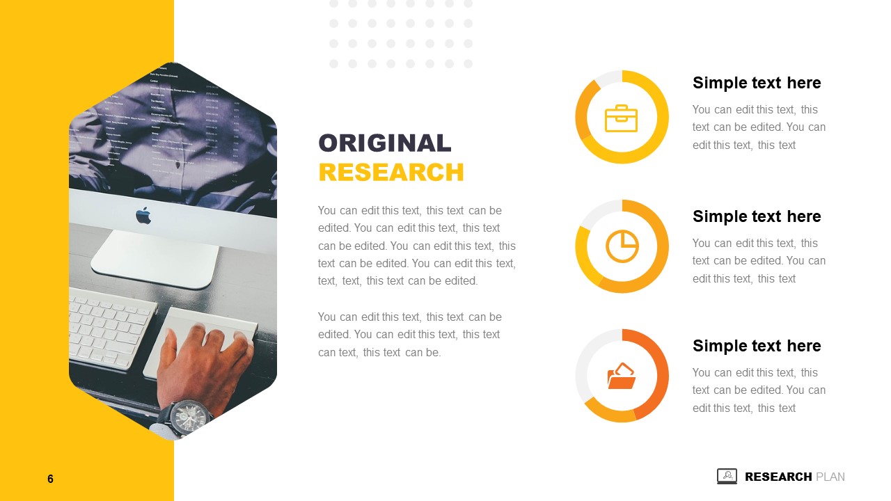
2. Research Presentation Scientific Method Diagram PowerPoint Template
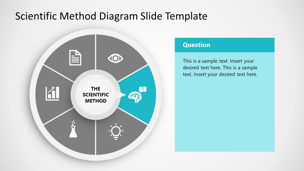
Whenever you intend to raise questions, expose the methodology you used for your research, or even suggest a scientific method approach for future analysis, this circular wheel diagram is a perfect fit for any presentation study.
Customize all of its elements to suit the demands of your presentation in just minutes.
3. Thesis Research Presentation PowerPoint Template

If your research presentation project belongs to academia, then this is the slide deck to pair that presentation. With a formal aesthetic and minimalistic style, this research presentation template focuses only on exposing your information as clearly as possible.
Use its included bar charts and graphs to introduce data, change the background of each slide to suit the topic of your presentation, and customize each of its elements to meet the requirements of your project with ease.
4. Animated Research Cards PowerPoint Template
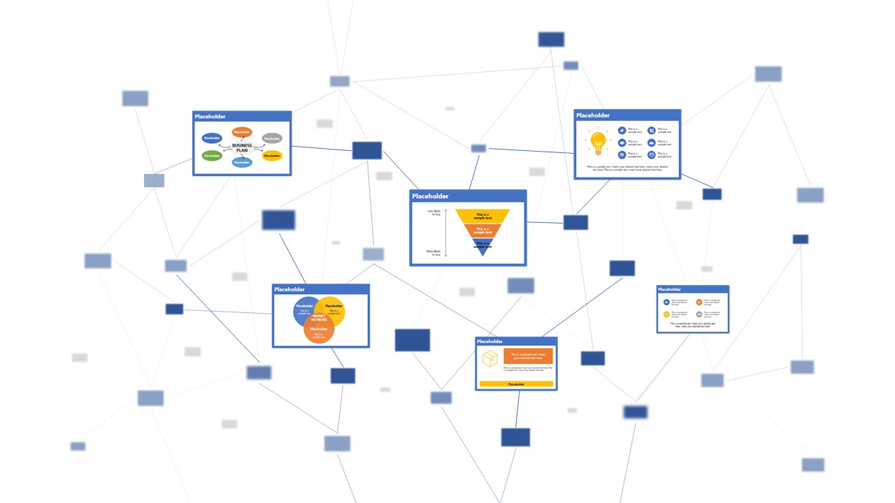
Visualize ideas and their connection points with the help of this research card template for PowerPoint. This slide deck, for example, can help speakers talk about alternative concepts to what they are currently managing and its possible outcomes, among different other usages this versatile PPT template has. Zoom Animation effects make a smooth transition between cards (or ideas).
5. Research Presentation Slide Deck for PowerPoint
With a distinctive professional style, this research presentation PPT template helps business professionals and academics alike to introduce the findings of their work to team members or investors.
By accessing this template, you get the following slides:
- Introduction
- Problem Statement
- Research Questions
- Conceptual Research Framework (Concepts, Theories, Actors, & Constructs)
- Study design and methods
- Population & Sampling
- Data Collection
- Data Analysis
Check it out today and craft a powerful research presentation out of it!
A successful research presentation in business is not just about presenting data; it’s about persuasion to take meaningful action. It’s the bridge that connects your research efforts to the strategic initiatives of your organization. To embark on this journey successfully, planning your presentation thoroughly is paramount, from designing your PowerPoint to the delivery.
Take a look and get inspiration from the sample research presentation slides above, put our tips to heart, and transform your research findings into a compelling call to action.
Like this article? Please share
Academics, Presentation Approaches, Research & Development Filed under Presentation Ideas
Related Articles

Filed under Design • August 14th, 2024
Creating Custom Themes for PowerPoint and Google Slides
Do you want your slides to go beyond the average result from a template? If so, learn how to create custom themes for presentations with this guide.

Filed under Business • July 24th, 2024
How to Create a Demo Presentation
Discover the secrets behind successful demo presentations and what they should contain with this article. Recommended PPT templates included.

Filed under Presentation Ideas • July 17th, 2024
How to Convert a Text Document into a Presentation with AI
One of the biggest challenges for presenters is to summarize content from lengthy reports, academic papers, or any other kind of written media in an informative and concise way. Rather than losing countless hours going over and over the same text, we can speed up the process thanks to the virtues of artificial intelligence. In […]
Leave a Reply
- Chapter Seven: Presenting Your Results
This chapter serves as the culmination of the previous chapters, in that it focuses on how to present the results of one's study, regardless of the choice made among the three methods. Writing in academics has a form and style that you will want to apply not only to report your own research, but also to enhance your skills at reading original research published in academic journals. Beyond the basic academic style of report writing, there are specific, often unwritten assumptions about how quantitative, qualitative, and critical/rhetorical studies should be organized and the information they should contain. This chapter discusses how to present your results in writing, how to write accessibly, how to visualize data, and how to present your results in person.
- Chapter One: Introduction
- Chapter Two: Understanding the distinctions among research methods
- Chapter Three: Ethical research, writing, and creative work
- Chapter Four: Quantitative Methods (Part 1)
- Chapter Four: Quantitative Methods (Part 2 - Doing Your Study)
- Chapter Four: Quantitative Methods (Part 3 - Making Sense of Your Study)
- Chapter Five: Qualitative Methods (Part 1)
- Chapter Five: Qualitative Data (Part 2)
- Chapter Six: Critical / Rhetorical Methods (Part 1)
- Chapter Six: Critical / Rhetorical Methods (Part 2)
Written Presentation of Results
Once you've gone through the process of doing communication research – using a quantitative, qualitative, or critical/rhetorical methodological approach – the final step is to communicate it.
The major style manuals (the APA Manual, the MLA Handbook, and Turabian) are very helpful in documenting the structure of writing a study, and are highly recommended for consultation. But, no matter what style manual you may use, there are some common elements to the structure of an academic communication research paper.
Title Page :
This is simple: Your Paper's Title, Your Name, Your Institutional Affiliation (e.g., University), and the Date, each on separate lines, centered on the page. Try to make your title both descriptive (i.e., it gives the reader an idea what the study is about) and interesting (i.e., it is catchy enough to get one's attention).
For example, the title, "The uncritical idealization of a compensated psychopath character in a popular book series," would not be an inaccurate title for a published study, but it is rather vague and exceedingly boring. That study's author fortunately chose the title, "A boyfriend to die for: Edward Cullen as compensated psychopath in Stephanie Meyer's Twilight ," which is more precisely descriptive, and much more interesting (Merskin, 2011). The use of the colon in academic titles can help authors accomplish both objectives: a catchy but relevant phrase, followed by a more clear explanation of the article's topic.
In some instances, you might be asked to write an abstract, which is a summary of your paper that can range in length from 75 to 250 words. If it is a published paper, it is useful to include key search terms in this brief description of the paper (the title may already have a few of these terms as well). Although this may be the last thing your write, make it one of the best things you write, because this may be the first thing your audience reads about the paper (and may be the only thing read if it is written badly). Summarize the problem/research question, your methodological approach, your results and conclusions, and the significance of the paper in the abstract.
Quantitative and qualitative studies will most typically use the rest of the section titles noted below. Critical/rhetorical studies will include many of the same steps, but will often have different headings. For example, a critical/rhetorical paper will have an introduction, definition of terms, and literature review, followed by an analysis (often divided into sections by areas of investigation) and ending with a conclusion/implications section. Because critical/rhetorical research is much more descriptive, the subheadings in such a paper are often times not generic subheads like "literature review," but instead descriptive subheadings that apply to the topic at hand, as seen in the schematic below. Because many journals expect the article to follow typical research paper headings of introduction, literature review, methods, results, and discussion, we discuss these sections briefly next.
Introduction:
As you read social scientific journals (see chapter 1 for examples), you will find that they tend to get into the research question quickly and succinctly. Journal articles from the humanities tradition tend to be more descriptive in the introduction. But, in either case, it is good to begin with some kind of brief anecdote that gets the reader engaged in your work and lets the reader understand why this is an interesting topic. From that point, state your research question, define the problem (see Chapter One) with an overview of what we do and don't know, and finally state what you will do, or what you want to find out. The introduction thus builds the case for your topic, and is the beginning of building your argument, as we noted in chapter 1.
By the end of the Introduction, the reader should know what your topic is, why it is a significant communication topic, and why it is necessary that you investigate it (e.g., it could be there is gap in literature, you will conduct valuable exploratory research, or you will provide a new model for solving some professional or social problem).
Literature Review:
The literature review summarizes and organizes the relevant books, articles, and other research in this area. It sets up both quantitative and qualitative studies, showing the need for the study. For critical/rhetorical research, the literature review often incorporates the description of the historical context and heuristic vocabulary, with key terms defined in this section of the paper. For more detail on writing a literature review, see Appendix 1.
The methods of your paper are the processes that govern your research, where the researcher explains what s/he did to solve the problem. As you have seen throughout this book, in communication studies, there are a number of different types of research methods. For example, in quantitative research, one might conduct surveys, experiments, or content analysis. In qualitative research, one might instead use interviews and observations. Critical/rhetorical studies methods are more about the interpretation of texts or the study of popular culture as communication. In creative communication research, the method may be an interpretive performance studies or filmmaking. Other methods used sometimes alone, or in combination with other methods, include legal research, historical research, and political economy research.
In quantitative and qualitative research papers, the methods will be most likely described according to the APA manual standards. At the very least, the methods will include a description of participants, data collection, and data analysis, with specific details on each of these elements. For example, in an experiment, the researcher will describe the number of participants, the materials used, the design of the experiment, the procedure of the experiment, and what statistics will be used to address the hypotheses/research questions.
Critical/rhetorical researchers rarely have a specific section called "methods," as opposed to quantitative and qualitative researchers, but rather demonstrate the method they use for analysis throughout the writing of their piece.
Helping your reader understand the methods you used for your study is important not only for your own study's credibility, but also for possible replication of your study by other researchers. A good guideline to keep in mind is transparency . You want to be as clear as possible in describing the decisions you made in designing your study, gathering and analyzing your data so that the reader can retrace your steps and understand how you came to the conclusions you formed. A research study can be very good, but if it is not clearly described so that others can see how the results were determined or obtained, then the quality of the study and its potential contributions are lost.
After you completed your study, your findings will be listed in the results section. Particularly in a quantitative study, the results section is for revisiting your hypotheses and reporting whether or not your results supported them, and the statistical significance of the results. Whether your study supported or contradicted your hypotheses, it's always helpful to fully report what your results were. The researcher usually organizes the results of his/her results section by research question or hypothesis, stating the results for each one, using statistics to show how the research question or hypothesis was answered in the study.
The qualitative results section also may be organized by research question, but usually is organized by themes which emerged from the data collected. The researcher provides rich details from her/his observations and interviews, with detailed quotations provided to illustrate the themes identified. Sometimes the results section is combined with the discussion section.
Critical/rhetorical researchers would include their analysis often with different subheadings in what would be considered a "results" section, yet not labeled specifically this way.
Discussion:
In the discussion section, the researcher gives an appraisal of the results. Here is where the researcher considers the results, particularly in light of the literature review, and explains what the findings mean. If the results confirmed or corresponded with the findings of other literature, then that should be stated. If the results didn't support the findings of previous studies, then the researcher should develop an explanation of why the study turned out this way. Sometimes, this section is called a "conclusion" by researchers.
References:
In this section, all of the literature cited in the text should have full references in alphabetical order. Appendices: Appendix material includes items like questionnaires used in the study, photographs, documents, etc. An alphabetical letter is assigned for each piece (e.g. Appendix A, Appendix B), with a second line of title describing what the appendix contains (e.g. Participant Informed Consent, or New York Times Speech Coverage). They should be organized consistently with the order in which they are referenced in the text of the paper. The page numbers for appendices are consecutive with the paper and reference list.
Tables/Figures:
Tables and figures are referenced in the text, but included at the end of the study and numbered consecutively. (Check with your professor; some like to have tables and figures inserted within the paper's main text.) Tables generally are data in a table format, whereas figures are diagrams (such as a pie chart) and drawings (such as a flow chart).
Accessible Writing
As you may have noticed, academic writing does have a language (e.g., words like heuristic vocabulary and hypotheses) and style (e.g., literature reviews) all its own. It is important to engage in that language and style, and understand how to use it to communicate effectively in an academic context . Yet, it is also important to remember that your analyses and findings should also be written to be accessible. Writers should avoid excessive jargon, or—even worse—deploying jargon to mask an incomplete understanding of a topic.
The scourge of excessive jargon in academic writing was the target of a famous hoax in 1996. A New York University physics professor submitted an article, " Transgressing the Boundaries: Toward a Transformative Hermeneutics of Quantum Gravity ," to a special issue of the academic journal Social Text devoted to science and postmodernism. The article was designed to point out how dense academic jargon can sometimes mask sloppy thinking. As the professor, Alan Sokal, had expected, the article was published. One sample sentence from the article reads:
It has thus become increasingly apparent that physical "reality", no less than social "reality", is at bottom a social and linguistic construct; that scientific "knowledge", far from being objective, reflects and encodes the dominant ideologies and power relations of the culture that produced it; that the truth claims of science are inherently theory-laden and self-referential; and consequently, that the discourse of the scientific community, for all its undeniable value, cannot assert a privileged epistemological status with respect to counter-hegemonic narratives emanating from dissident or marginalized communities. (Sokal, 1996. pp. 217-218)
According to the journal's editor, about six reviewers had read the article but didn't suspect that it was phony. A public debate ensued after Sokal revealed his hoax. Sokal said he worried that jargon and intellectual fads cause academics to lose contact with the real world and "undermine the prospect for progressive social critique" ( Scott, 1996 ). The APA Manual recommends to avoid using technical vocabulary where it is not needed or relevant or if the technical language is overused, thus becoming jargon. In short, the APA argues that "scientific jargon...grates on the reader, encumbers the communication of information, and wastes space" (American Psychological Association, 2010, p. 68).
Data Visualization
Images and words have long existed on the printed page of manuscripts, yet, until recently, relatively few researchers possessed the resources to effectively combine images combined with words (Tufte, 1990, 1983). Communication scholars are only now becoming aware of this dimension in research as computer technologies have made it possible for many people to produce and publish multimedia presentations.
Although visuals may seem to be anathema to the primacy of the written word in research, they are a legitimate way, and at times the best way, to present ideas. Visual scholar Lester Faigley et al. (2004) explains how data visualizations have become part of our daily lives:
Visualizations can shed light on research as well. London-based David McCandless specializes in visualizing interesting research questions, or in his words "the questions I wanted answering" (2009, p. 7). His images include a graph of the peak times of the year for breakups (based on Facebook status updates), a radiation dosage chart , and some experiments with the Google Ngram Viewer , which charts the appearance of keywords in millions of books over hundreds of years.
The public domain image below creatively maps U.S. Census data of the outflow of people from California to other states between 1995 and 2000.
Visualizing one's research is possible in multiple ways. A simple technology, for example, is to enter data into a spreadsheet such as Excel, and select Charts or SmartArt to generate graphics. A number of free web tools can also transform raw data into useful charts and graphs. Many Eyes , an open source data visualization tool (sponsored by IBM Research), says its goal "is to 'democratize' visualization and to enable a new social kind of data analysis" (IBM, 2011). Another tool, Soundslides , enables users to import images and audio to create a photographic slideshow, while the program handles all of the background code. Other tools, often open source and free, can help visual academic research into interactive maps; interactive, image-based timelines; interactive charts; and simple 2-D and 3-D animations. Adobe Creative Suite (which includes popular software like Photoshop) is available on most computers at universities, but open source alternatives exist as well. Gimp is comparable to Photoshop, and it is free and relatively easy to use.
One online performance studies journal, Liminalities , is an excellent example of how "research" can be more than just printed words. In each issue, traditional academic essays and book reviews are often supported photographs, while other parts of an issue can include video, audio, and multimedia contributions. The journal, founded in 2005, treats performance itself as a methodology, and accepts contribution in html, mp3, Quicktime, and Flash formats.
For communication researchers, there is also a vast array of visual digital archives available online. Many of these archives are located at colleges and universities around the world, where digital librarians are spearheading a massive effort to make information—print, audio, visual, and graphic—available to the public as part of a global information commons. For example, the University of Iowa has a considerable digital archive including historical photos documenting American railroads and a database of images related to geoscience. The University of Northern Iowa has a growing Special Collections Unit that includes digital images of every UNI Yearbook between 1905 and 1923 and audio files of UNI jazz band performances. Researchers at he University of Michigan developed OAIster , a rich database that has joined thousands of digital archives in one searchable interface. Indeed, virtually every academic library is now digitizing all types of media, not just texts, and making them available for public viewing and, when possible, for use in presenting research. In addition to academic collections, the Library of Congress and the National Archives offer an ever-expanding range of downloadable media; commercial, user-generated databases such as Flickr, Buzznet, YouTube and Google Video offer a rich resource of images that are often free of copyright constraints (see Chapter 3 about Creative Commons licenses) and nonprofit endeavors, such as the Internet Archive , contain a formidable collection of moving images, still photographs, audio files (including concert recordings), and open source software.
Presenting your Work in Person
As Communication students, it's expected that you are not only able to communicate your research project in written form but also in person.
Before you do any oral presentation, it's good to have a brief "pitch" ready for anyone who asks you about your research. The pitch is routine in Hollywood: a screenwriter has just a few minutes to present an idea to a producer. Although your pitch will be more sophisticated than, say, " Snakes on a Plane " (which unfortunately was made into a movie), you should in just a few lines be able to explain the gist of your research to anyone who asks. Developing this concise description, you will have some practice in distilling what might be a complicated topic into one others can quickly grasp.
Oral presentation
In most oral presentations of research, whether at the end of a semester, or at a research symposium or conference, you will likely have just 10 to 20 minutes. This is probably not enough time to read the entire paper aloud, which is not what you should do anyway if you want people to really listen (although, unfortunately some make this mistake). Instead, the point of the presentation should be to present your research in an interesting manner so the listeners will want to read the whole thing. In the presentation, spend the least amount of time on the literature review (a very brief summary will suffice) and the most on your own original contribution. In fact, you may tell your audience that you are only presenting on one portion of the paper, and that you would be happy to talk more about your research and findings in the question and answer session that typically follows. Consider your presentation the beginning of a dialogue between you and the audience. Your tone shouldn't be "I have found everything important there is to find, and I will cram as much as I can into this presentation," but instead "I found some things you will find interesting, but I realize there is more to find."
Turabian (2007) has a helpful chapter on presenting research. Most important, she emphasizes, is to remember that your audience members are listeners, not readers. Thus, recall the lessons on speech making in your college oral communication class. Give an introduction, tell them what the problem is, and map out what you will present to them. Organize your findings into a few points, and don't get bogged down in minutiae. (The minutiae are for readers to find if they wish, not for listeners to struggle through.) PowerPoint slides are acceptable, but don't read them. Instead, create an outline of a few main points, and practice your presentation.
Turabian suggests an introduction of not more than three minutes, which should include these elements:
- The research topic you will address (not more than a minute).
- Your research question (30 seconds or less)
- An answer to "so what?" – explaining the relevance of your research (30 seconds)
- Your claim, or argument (30 seconds or less)
- The map of your presentation structure (30 seconds or less)
As Turabian (2007) suggests, "Rehearse your introduction, not only to get it right, but to be able to look your audience in the eye as you give it. You can look down at notes later" (p. 125).
Poster presentation
In some symposiums and conferences, you may be asked to present at a "poster" session. Instead of presenting on a panel of 4-5 people to an audience, a poster presenter is with others in a large hall or room, and talks one-on-one with visitors who look at the visual poster display of the research. As in an oral presentation, a poster highlights just the main point of the paper. Then, if visitors have questions, the author can informally discuss her/his findings.
To attract attention, poster presentations need to be nicely designed, or in the words of an advertising professor who schedules poster sessions at conferences, "be big, bold, and brief" ( Broyles , 2011). Large type (at least 18 pt.), graphics, tables, and photos are recommended.
A poster presentation session at a conference, by David Eppstein (Own work) [CC-BY-SA-3.0 ( www.creativecommons.org/licenses/by-sa/3.0 )], via Wikimedia Commons]
The Association for Education in Journalism and Mass Communication (AEJMC) has a template for making an effective poster presentation . Many universities, copy shops, and Internet services also have large-scale printers, to print full-color research poster designs that can be rolled up and transported in a tube.
Judging Others' Research
After taking this course, you should have a basic knowledge of research methods. There will still be some things that may mystify you as a reader of other's research. For example, you may not be able to interpret the coefficients for statistical significance, or make sense of a complex structural equation. Some specialized vocabulary may still be difficult.
But, you should understand how to critically review research. For example, imagine you have been asked to do a blind (i.e., the author's identity is concealed) "peer review" of communication research for acceptance to a conference, or publication in an academic journal. For most conferences and journals , submissions are made online, where editors can manage the flow and assign reviews to papers. The evaluations reviewers make are based on the same things that we have covered in this book. For example, the conference for the AEJMC ask reviewers to consider (on a five-point scale, from Excellent to Poor) a number of familiar research dimensions, including the paper's clarity of purpose, literature review, clarity of research method, appropriateness of research method, evidence presented clearly, evidence supportive of conclusions, general writing and organization, and the significance of the contribution to the field.
Beyond academia, it is likely you will more frequently apply the lessons of research methods as a critical consumer of news, politics, and everyday life. Just because some expert cites a number or presents a conclusion doesn't mean it's automatically true. John Allen Paulos, in his book A Mathematician reads the newspaper , suggests some basic questions we can ask. "If statistics were presented, how were they obtained? How confident can we be of them? Were they derived from a random sample or from a collection of anecdotes? Does the correlation suggest a causal relationship, or is it merely a coincidence?" (1997, p. 201).
Through the study of research methods, we have begun to build a critical vocabulary and understanding to ask good questions when others present "knowledge." For example, if Candidate X won a straw poll in Iowa, does that mean she'll get her party's nomination? If Candidate Y wins an open primary in New Hampshire, does that mean he'll be the next president? If Candidate Z sheds a tear, does it matter what the context is, or whether that candidate is a man or a woman? What we learn in research methods about validity, reliability, sampling, variables, research participants, epistemology, grounded theory, and rhetoric, we can consider whether the "knowledge" that is presented in the news is a verifiable fact, a sound argument, or just conjecture.
American Psychological Association (2010). Publication manual of the American Psychological Association (6th ed.). Washington, DC: Author.
Broyles, S. (2011). "About poster sessions." AEJMC. http://www.aejmc.org/home/2013/01/about-poster-sessions/ .
Faigley, L., George, D., Palchik, A., Selfe, C. (2004). Picturing texts . New York: W.W. Norton & Company.
IBM (2011). Overview of Many Eyes. http://www.research.ibm.com/social/projects_manyeyes.shtml .
McCandless, D. (2009). The visual miscellaneum . New York: Collins Design.
Merskin, D. (2011). A boyfriend to die for: Edward Cullen as compensated psychopath in Stephanie Meyer's Twilight. Journal of Communication Inquiry 35: 157-178. doi:10.1177/0196859911402992
Paulos, J. A. (1997). A mathematician reads the newspaper . New York: Anchor.
Scott, J. (1996, May 18). Postmodern gravity deconstructed, slyly. New York Times , http://www.nytimes.com/books/98/11/15/specials/sokal-text.html .
Sokal, A. (1996). Transgressing the boundaries: towards a transformative hermeneutics of quantum gravity. Social Text 46/47, 217-252.
Tufte, E. R. (1990). Envisioning information . Cheshire, CT: Graphics Press.
Tufte, E. R. (1983). The visual display of quantitative information . Cheshire, CT: Graphics Press.
Turabian, Kate L. (2007). A manual for writers of research papers, theses, and dissertations: Chicago style guide for students and researchers (7th ed.). Chicago: University of Chicago Press.
Princeton Correspondents on Undergraduate Research
How to Make a Successful Research Presentation
Turning a research paper into a visual presentation is difficult; there are pitfalls, and navigating the path to a brief, informative presentation takes time and practice. As a TA for GEO/WRI 201: Methods in Data Analysis & Scientific Writing this past fall, I saw how this process works from an instructor’s standpoint. I’ve presented my own research before, but helping others present theirs taught me a bit more about the process. Here are some tips I learned that may help you with your next research presentation:
More is more
In general, your presentation will always benefit from more practice, more feedback, and more revision. By practicing in front of friends, you can get comfortable with presenting your work while receiving feedback. It is hard to know how to revise your presentation if you never practice. If you are presenting to a general audience, getting feedback from someone outside of your discipline is crucial. Terms and ideas that seem intuitive to you may be completely foreign to someone else, and your well-crafted presentation could fall flat.
Less is more
Limit the scope of your presentation, the number of slides, and the text on each slide. In my experience, text works well for organizing slides, orienting the audience to key terms, and annotating important figures–not for explaining complex ideas. Having fewer slides is usually better as well. In general, about one slide per minute of presentation is an appropriate budget. Too many slides is usually a sign that your topic is too broad.

Limit the scope of your presentation
Don’t present your paper. Presentations are usually around 10 min long. You will not have time to explain all of the research you did in a semester (or a year!) in such a short span of time. Instead, focus on the highlight(s). Identify a single compelling research question which your work addressed, and craft a succinct but complete narrative around it.
You will not have time to explain all of the research you did. Instead, focus on the highlights. Identify a single compelling research question which your work addressed, and craft a succinct but complete narrative around it.
Craft a compelling research narrative
After identifying the focused research question, walk your audience through your research as if it were a story. Presentations with strong narrative arcs are clear, captivating, and compelling.
- Introduction (exposition — rising action)
Orient the audience and draw them in by demonstrating the relevance and importance of your research story with strong global motive. Provide them with the necessary vocabulary and background knowledge to understand the plot of your story. Introduce the key studies (characters) relevant in your story and build tension and conflict with scholarly and data motive. By the end of your introduction, your audience should clearly understand your research question and be dying to know how you resolve the tension built through motive.

- Methods (rising action)
The methods section should transition smoothly and logically from the introduction. Beware of presenting your methods in a boring, arc-killing, ‘this is what I did.’ Focus on the details that set your story apart from the stories other people have already told. Keep the audience interested by clearly motivating your decisions based on your original research question or the tension built in your introduction.
- Results (climax)
Less is usually more here. Only present results which are clearly related to the focused research question you are presenting. Make sure you explain the results clearly so that your audience understands what your research found. This is the peak of tension in your narrative arc, so don’t undercut it by quickly clicking through to your discussion.
- Discussion (falling action)
By now your audience should be dying for a satisfying resolution. Here is where you contextualize your results and begin resolving the tension between past research. Be thorough. If you have too many conflicts left unresolved, or you don’t have enough time to present all of the resolutions, you probably need to further narrow the scope of your presentation.
- Conclusion (denouement)
Return back to your initial research question and motive, resolving any final conflicts and tying up loose ends. Leave the audience with a clear resolution of your focus research question, and use unresolved tension to set up potential sequels (i.e. further research).
Use your medium to enhance the narrative
Visual presentations should be dominated by clear, intentional graphics. Subtle animation in key moments (usually during the results or discussion) can add drama to the narrative arc and make conflict resolutions more satisfying. You are narrating a story written in images, videos, cartoons, and graphs. While your paper is mostly text, with graphics to highlight crucial points, your slides should be the opposite. Adapting to the new medium may require you to create or acquire far more graphics than you included in your paper, but it is necessary to create an engaging presentation.
The most important thing you can do for your presentation is to practice and revise. Bother your friends, your roommates, TAs–anybody who will sit down and listen to your work. Beyond that, think about presentations you have found compelling and try to incorporate some of those elements into your own. Remember you want your work to be comprehensible; you aren’t creating experts in 10 minutes. Above all, try to stay passionate about what you did and why. You put the time in, so show your audience that it’s worth it.
For more insight into research presentations, check out these past PCUR posts written by Emma and Ellie .
— Alec Getraer, Natural Sciences Correspondent
Share this:
- Share on Tumblr

Research Guide
Chapter 7 presenting your findings.
Now that you have worked so hard in your project, how to ensure that you can communicate your findings in an effective and efficient way? In this section, I will introduce a few tips that could help you prepare your slides and preparing for your final presentation.
7.1 Sections of the Presentation
When preparing your slides, you need to ensure that you have a clear roadmap. You have a limited time to explain the context of your study, your results, and the main takeaways. Thus, you need to be organized and efficient when deciding what material will be included in the slides.
You need to ensure that your presentation contains the following sections:
- Motivation : Why did you choose your topic? What is the bigger question?
- Research question : Needs to be clear and concise. Include secondary questions, if available, but be clear about what is your research question.
- Literature Review : How does your paper fit in the overall literature? What are your contributions?
- Context : Give an overview of the issue and the population/countries that you analyzed
- Study Characteristics : This section is key, as it needs to include your model, identification strategy, and introduce your data (sources, summary statistics, etc.).
- Results : In this section, you need to answer your research question(s). Include tables that are readable.
- Additional analysis : Here, include any additional information that your public needs to know. For instance, did you try different specifications? did you find an obstacle (i.e. your data is very noisy, the sample is very small, something else) that may bias your results or create some issues in your analysis? Tell your audience! No research project is perfect, but you need to be clear about the imperfections of your project.
- Conclusion : Be repetitive! What was your research question? How did you answer it? What did you find? What is next in this topic?
7.2 How to prepare your slides
When preparing your slides, remember that humans have a limited capacity to pay attention. If you want to convey your convey your message in an effective way, you need to ensure that the message is simple and that you keep your audience attention. Here are some strategies that you may want to follow:
- Have a clear roadmap at the beginning of the presentation. Tell your audience what to expect.
- Number your slides. This will help you and your audience to know where you are in your analysis.
- Ensure that each slide has a purpose
- Ensure that each slide is connected to your key point.
- Make just one argument per slide
- State the objective of each slide in the headline
- Use bullet points. Do not include more than one sentence per bullet point.
- Choose a simple background.
- If you want to direct your audience attention to a specific point, make it more attractive (using a different font color)
- Each slide needs to have a similar structure (going from the general to the particular detauls).
- Use images/graphs when possible. Ensure that the axes for the graphs are clear.
- Use a large font for your tables. Keep them as simple as possible.
- If you can say it with an image, choose it over a table.
- Have an Appendix with slides that address potential questions.
7.3 How to prepare your presentation
One of the main constraints of having simple presentations is that you cannot rely on them and read them. Instead, you need to have extra notes and memorize them to explain things beyond what is on your slides. The following are some suggestions on how to ensure you communicate effectively during your presentation.
- Practice, practice, practice!
- Keep the right volume (practice will help you with that)
- Be journalistic about your presentation. Indicate what you want to say, then say it.
- Ensure that your audience knows where you are going
- Avoid passive voice.
- Be consistent with the terms you are using. You do not want to confuse your audience, even if using synonyms.
- Face your audience and keep an eye contact.
- Do not try reading your slides
- Ensure that your audience is focused on what you are presenting and there are no other distractions that you can control.
- Do not rush your presentation. Speak calmly and controlled.
- Be comprehensive when answering questions. Avoid yes/no answers. Instead, rephrase question (to ensure you are answering the right question), then give a short answer, then develop.
- If you lose track, do not panick. Go back a little bit or ask your audience for assistance.
- Again, practice is the secret.
You have worked so hard in your final project, and the presentation is your opportunity to share that work with the rest of the world. Use this opportunity to shine and enjoy it.
Since this is the first iteration of the Guide, I expect that there are going to be multiple typos and structure issues. Please feel free to let me know, and I will correct accordingly. ↩︎
Note that you would still need to refine some of the good questions even more. ↩︎

- Joyner Library
- Laupus Health Sciences Library
- Music Library
- Digital Collections
- Special Collections
- North Carolina Collection
- Teaching Resources
- The ScholarShip Institutional Repository
- Country Doctor Museum
Presentations: Oral Presentations
- Poster Design
- Poster Content
- Poster Presentation
- Oral Presentations
- Printing & Archiving
Oral Presentations Purpose
An Oral Research Presentation is meant to showcase your research findings. A successful oral research presentation should: communicate the importance of your research; clearly state your findings and the analysis of those findings; prompt discussion between researcher and audience. Below you will find information on how to create and give a successful oral presentation.
Creating an Effective Presentation
Who has a harder job the speaker? Or, the audience?
Most people think speaker has the hardest job during an oral presentation, because they are having to stand up in a room full of people and give a presentation. However, if the speaker is not engaging and if the material is way outside of the audiences knowledge level, the audience can have a difficult job as well. Below you will find some tips on how to be an effective presenter and how to engage with your audience.
Organization of a Presentation
Introduction/Beginning
How are you going to begin? How are you going to get the attention of your audience? You need to take the time and think about how you are going to get started!
Here are some ways you could start:
- Ask the audience a question
- make a statement
- show them something
No matter how you start your presentation it needs to relate to your research and capture the audiences attention.
Preview what you are going to discuss . Audiences do not like to be manipulated or tricked. Tell the audience exactly what you are going to discuss, this will help them follow along. *Do not say you are going to cover three points and then try to cover 8 points.
At the end of your introduction, the audience should feel like they know exactly what you are going to discuss and exactly how you are going to get there.
Body/Middle
Conclusion/End
Delivery and Communication
Eye Contact
Making eye contact is a great way to engage with your audience. Eye contact should be no longer than 2-3 seconds per person. Eye contact for much longer than that can begin to make the audience member feel uncomfortable.
Smiling lets attendees know you are happy to be there and that you are excited to talk with them about your project.
We all know that body language says a lot, so here are some things you should remember when giving your presentation.
- Stand with both feet on the floor, not with one foot crossed over the other.
- Do not stand with your hands in your pockets, or with your arms crossed.
- Stand tall with confidence and own your space (remember you are the expert).
Abbreviated Notes
Having a written set of notes or key points that you want to address can help prevent you from reading the poster.
Speak Clearly
Sometimes when we get nervous we begin to talk fast and blur our words. It is important that you make sure every word is distinct and clear. A great way to practice your speech is to say tongue twisters.
Ten tiny tots tottered toward the shore
Literally literary. Literally literary. Literally literary.
Sally soon saw that she should sew some sheets.
Avoid Fillers
Occasionally we pick up fillers that we are not aware of, such as um, like, well, etc. One way to get rid of fillers is to have a friend listen to your speech and every time you say a "filler" have that friend tap you on the arm or say your name. This will bring the filler to light, then you can practice avoiding that filler.
Manage Anxiety
Many people get nervous when they are about to speak to a crowd of people. Below are ways that you can manage your anxiety levels.
- Practice, Practice, Practice - the more prepared you are the less nervous you will be.
- Recognize that anxiety is just a big shot of adrenalin.
- Take deep breaths before your presentation to calm you down.
Components of an Oral Research Presentation
Introduction
The introduction section of your oral presentation should consist of 3 main parts.
Part 1: Existing facts
In order to give audience members the "full picture", you first need to provide them with information about past research. What facts already exist? What is already known about your research area?
Part 2: Shortcomings
Once you have highlighted past research and existing facts. You now need to address what is left to be known, or what shortcomings exist within the current information. This should set the groundwork for your experiment. Keep in mind, how does your research fill these gaps or help address these questions?
Part 3: Purpose or Hypothesis
After you have addressed past/current research and have identified shortcomings/gaps, it is now time to address your research. During this portion of the introduction you need to tell viewers why you are conducting your research experiement/study, and what you hope to accomplish by doing so.
In this section you should share with your audience how you went about collecting and analyzing your data
Should include:
- Participants: Who or what was in the study?
- Materials/ measurements: what did you measure?
- Procedures: How did you do the study?
- Data-analysis: What analysis were conducted?
This section contains FACTS – with no opinion, commentary or interpretation. Graphs, charts and images can be used to display data in a clear and organized way.
Keep in mind when making figures:
- Make sure axis, treatments, and data sets are clearly labeled
- Strive for simplicity, especially in figure titles.
- Know when to use what kind of graph
- Be careful with colors.
Interpretation and commentary takes place here. This section should give a clear summary of your findings.
You should:
- Address the positive and negative aspects of you research
- Discuss how and if your research question was answered.
- Highlight the novel and important findings
- Speculate on what could be occurring in your system
Future Research
- State your goals
- Include information about why you believe research should go in the direction you are proposing
- Discuss briefly how you plan to implement the research goals, if you chose to do so.
Why include References?
- It allows viewers to locate the material that you used, and can help viewers expand their knowledge of your research topic.
- Indicates that you have conducted a thorough review of the literature and conducted your research from an informed perspective.
- Guards you against intellectual theft. Ideas are considered intellectual property failure to cite someone's ideas can have serious consequences.
Acknowledgements
This section is used to thank the people, programs and funding agencies that allowed you to perform your research.
Questions
Allow for about 2-3 minutes at the end of your presentation for questions.
It is important to be prepared.
- Know why you conducted the study
- Be prepared to answer questions about why you chose a specific methodology
If you DO NOT know the answer to a question
Visual Aids
PowerPoints and other visual aids can be used to support what you are presenting about.
Power Point Slides and other visual aids can help support your presentation, however there are some things you should consider:
- Do not overdo it . One big mistake that presenters make is they have a slide for every single item they want to say. One way you can avoid this is by writing your presentation in Word first, instead of making a Power Point Presentation. By doing this you can type exactly what you want to say, and once your presentation is complete, you can create Power Point slides that help support your presentation.
Formula for number of visual aids : Length of presentation divided by 2 plus 1
example: 12 minute presentation should have no more than 7 slides.
- Does it add interest?
- Does it prove?
- Does it clarify?
- Do not read the text . Most people can read, and if they have the option of reading material themselves versus listen to you read it, they are going to read it themselves and then your voice becomes an annoyance. Also, when you are reading the text you are probably not engaging with the audience.
- No more than 4-6 lines on a slide and no more than 4-6 words in a line.
- People should be able to read your slide in 6 seconds.
- << Previous: Poster Presentation
- Next: Printing & Archiving >>
- Last Updated: Apr 11, 2024 9:02 AM
- URL: https://libguides.ecu.edu/c.php?g=637469
Research presentation: A comprehensive guide
Learn how to choose a topic, conduct research, create visuals, and deliver your presentation with confidence.
Raja Bothra
Building presentations

Hey there, fellow knowledge seekers!
Today, we're diving deep into the world of research presentations.
Whether you're a student gearing up for your undergraduate research showcase or a professional preparing for a crucial job interview, mastering the art of delivering an effective research presentation is a valuable skill.
What is a research presentation?
A research presentation is a means to communicate your findings, insights, and discoveries to an audience, be it in a classroom, at a conference, or in a boardroom. It's your opportunity to showcase your expertise and share the results of your hard work.
Purpose of a research presentation
Before we dive into the intricacies of creating a stellar research presentation, let's explore the underlying reasons that make these presentations indispensable. The purpose of a research presentation is not merely to present data but to serve as a powerful tool for communication and engagement.
Sharing knowledge
At its core, a research presentation is a conduit for sharing knowledge, disseminating your research findings, and illuminating the uncharted realms of your work. It's about taking the complex and making it comprehensible, even captivating.
Academic evaluation
In the realm of academia, research presentations play a pivotal role in the evaluation process. They are your platform to defend a dissertation or thesis with vigor and confidence. Moreover, they are your plea for research funding, where your passion and precision could tip the scales in your favor.
Professional communication
Beyond the academic sphere, research presentations find a home in the corporate world, such as job interview s. In these scenarios, your presentation serves as a bridge, connecting your ideas with potential employers. It's an opportunity to demonstrate not just your research skills but also your ability to communicate them effectively.
The bigger picture
Your research presentation is more than just slides and data; it's an embodiment of your dedication and expertise. It's a tool for persuading, inspiring, and inciting action. It's a gateway to engage, educate, and advocate, whether in academic circles, professional settings, or public platforms.
A universal canvas
Regardless of the context, the core objectives of a research presentation remain constant:
- Dissemination of information : Sharing insights and discoveries for the collective advancement of knowledge.
- Engagement : Creating a presentation that captivates and effectively conveys complex ideas.
- Feedback and discussion : Welcoming questions, feedback, and discussions that refine and expand your research.
- Peer review : Serving as part of the peer-review process in academia, where experts evaluate the quality and validity of your work.
- Educational : Actively contributing to education by disseminating valuable information about a particular topic or research area.
- Persuasion : In cases like grant applications, presentations aim to persuade the audience to support or fund the research project.
- Networking : An opportunity to connect with peers, professionals, and stakeholders interested in your field.
- Professional development : A chance to enhance your communication skills and professional development.
- Public awareness : Raising public awareness about significant issues or findings that have a direct impact on society.
Your research presentation is not merely a sequence of slides but a powerful tool for communication and connection. Whether you're in the academic realm, the corporate world, or the public sphere, your ability to convey your research clearly and engagingly is pivotal to your success. Remember, you're not just presenting data; you're sharing knowledge, engaging your audience, and advocating for a cause.
Different types of research presentation
Research presentations are as diverse as the research itself, and the choice of presentation format is crucial. It depends on factors like the audience, the research's nature, and the specific goals of the presentation. Let's explore the myriad forms research presentations can take:
1. Oral presentations
- Conference presentations : These formal presentations are typically held at academic conferences, where researchers present their findings to a specialized audience. It's a platform for in-depth discussions and peer feedback.
- Seminar presentations : Often conducted at universities or research institutions, these presentations delve deep into research topics, encouraging detailed discussions and expert insights.
- Lecture series : A series of lectures focused on a particular research topic, usually organized by universities. These sessions offer a comprehensive exploration of a subject.
2. Poster presentations
- Conference posters : Visual presentations of research findings displayed on large posters, commonly used at academic conferences. They provide a snapshot of research, making complex data more accessible.
- Academic fairs : Frequently used to showcase research projects at the undergraduate or high school level. These exhibitions make research engaging for students.
3. Online/webinar presentations
- Webinars : Online presentations where researchers share their work with a remote audience. These presentations often include interactive elements, like Q&A sessions.
- Online workshops : Hands-on, interactive presentations that teach research methodologies or specific skills. Ideal for engaging the audience in a virtual setting.
4. Thesis or dissertation defense: Researchers defend their doctoral or master's theses or dissertations before a committee. It involves explaining their research in-depth and responding to questions.
5. Ignite or pecha kucha presentations : These are fast-paced presentations where presenters use a fixed number of slides and limited time per slide to convey their research succinctly. It's a dynamic format that encourages clarity and conciseness.
6. Panel discussions: Researchers participate in a discussion alongside other experts, sharing their perspectives on a specific topic
or research area. These discussions provide a well-rounded view of the subject.
7. TED talks or public lectures: Researchers present their work to a general audience in an engaging and accessible manner. The focus is on making complex ideas understandable and captivating.
8. Corporate research presentations: Researchers may present their findings to colleagues, executives, or stakeholders in a business or industry setting. These presentations often have practical applications and implications for the company.
9. Pitch presentations: Researchers may need to pitch their research project to potential funders , collaborators, or sponsors. This format requires the ability to convey the research's value and potential impact effectively.
10. Media interviews: Researchers can present their work through interviews with journalists, on television, radio, podcasts, or in written articles. The challenge here is to convey complex ideas to a broad audience.
11. Educational workshops: These presentations occur in an educational context, where researchers teach others about a particular subject or research method. It's a way to transfer knowledge and skills effectively.
12. Research reports: These formal written reports communicate research findings and are presented in a document format. They are often used for thorough documentation and publication.
13. Interactive exhibits: Researchers create interactive exhibits at science centers or museums to engage the public with their research. It's about making research accessible and engaging to a wide audience.
14. Government or policy briefings: Researchers may present their work to policymakers, helping to inform decision-making. These presentations have a direct impact on policy and require clarity and relevance.
15. Peer review: In the academic realm, researchers present their work to a group of peers for constructive feedback before formal publication. It's an essential step in ensuring the quality and validity of research.
In the world of research presentations, adaptability is key. Researchers often need to tailor their content and style to suit the context and meet the expectations of their audience. Remember, the choice of presentation type should align with your goals and the nature of your research. Each format has its unique strengths and is a valuable tool for sharing knowledge, engaging your audience, and achieving your research objectives.
What should a research presentation include?
A research presentation is not just a random assortment of slides; it's a meticulously crafted narrative that informs, engages, and inspires. Regardless of the type of presentation you opt for, there are some indispensable components to consider:
Introduction: Your presentation journey begins with the introduction—a compelling opening act. This is where you introduce your topic, explain its significance, and clearly state your research question or hypothesis. Think of it as setting the stage for the story you're about to tell.
Background: The background section is your opportunity to equip your audience with the necessary context to grasp the intricacies of your research. This may encompass discussions on relevant theories, prior research, and fundamental concepts that lay the foundation for your work. It's about ensuring your audience starts on the same page.
Methodology: This section provides an insight into the "how" of your research. Share the methods you employed in conducting your research, such as data collection techniques, sampling procedures, and your chosen methods of analysis. It's a backstage pass to the mechanics of your study.
Results: With the methodology unveiled, it's time to present the star of the show—your findings. This section is where you shine a spotlight on your results, delivering them in a clear and concise manner. Visual aids, such as tables, graphs, and other visuals, can be invaluable allies in communicating your results effectively.
Discussion: As you transition from presenting results, you enter the realm of interpretation and discussion. Here, you dissect your findings, analyzing their implications and discussing their real-world significance. Don't forget to address the limitations of your study and suggest future research directions.
Conclusion: In the grand finale of your presentation, it's time to bring the pieces together. Summarize your main points, reiterate the importance of your research, and leave your audience with a lasting impression. A compelling conclusion can be the key to a memorable presentation.
Q&A session: Your presentation isn't just a monologue; it's a dialogue with your audience. Provide an opportunity for engagement and clarification through a Q&A session. Allow your audience to ask questions, offer feedback, and explore the nuances of your research.
Contact information: Consider including a slide with your contact information. This way, curious audience members can reach out to you with questions, feedback, or collaboration opportunities. It's a subtle but essential way to maintain the conversation beyond the presentation.
It's important to note that the specific content and length of your research presentation may vary based on your audience and time constraints. For instance, if your audience is general and diverse, dedicating more time to background and discussion can enhance comprehension. On the other hand, when presenting to experts in your field, you can streamline these sections and focus on the intricate details of your methodology and results.
How to structure an effective research presentation
Crafting an effective research presentation is akin to weaving a compelling narrative. It's about captivating your audience while imparting knowledge. Here's a step-by-step guide on how to structure a presentation that leaves a lasting impression:
Title slide : Your presentation begins with the title slide, your first impression. Include the title of your presentation, your name, affiliation, and the date. This slide sets the stage for your audience, providing essential information about what they are about to learn.
Introduction : The introduction is your opportunity to grab your audience's attention and set the stage for your presentation. Start with a hook, like a thought-provoking question, a surprising fact, or even a touch of humor if it fits naturally. Additionally, in the introduction, provide background and context for your research, clearly state your research question or objectives, and explain why your research is important or relevant.
Literature review : In this section, briefly summarize key research in your field related to your topic. Highlight gaps or areas where your research contributes. If relevant, mention theories or models that underpin your work, demonstrating your understanding of the existing body of knowledge.
Methodology : Explain the nuts and bolts of your research methods. Share the methods you used, whether they were surveys, experiments, case studies, or any other approach. Include details of data collection procedures, sample size, and data analysis techniques. If ethical considerations played a role, mention them here.
Data presentation : This is where you unveil your research findings using visuals like charts, graphs, and tables. Make sure to explain the significance of each visual and its relation to your research question, using clear and concise labels for data points. Highlight key results or trends that are critical to your narrative, making it easier for your audience to grasp the key takeaways.
Discussion : Interpret the data and discuss its implications. This section should explain how your findings relate to your research question or objectives. Address any limitations or potential sources of bias and offer insights into the broader implications and practical applications of your research. It's a critical part where you demonstrate your analytical skills and the value of your work.
Conclusion : In the grand finale of your presentation, summarize the main points and reiterate the significance of your research and its contribution to the field. Suggest potential areas for future research, inviting your audience to continue the journey and emphasizing the continuity of the research.
Q&A session : Now, it's time to engage your audience. Invite questions and be prepared to provide detailed answers and clarify any doubts. This interaction adds depth to your presentation and ensures your audience's comprehension.
References : Include a list of all the sources you cited during your presentation. This shows your commitment to sound research practices and allows your audience to delve deeper into the literature if they wish.
Acknowledgments (if necessary) : If your research received support from funding sources, collaborators, or institutions, acknowledge them at this point. Gratitude goes a long way in the academic community, and it's essential to recognize those who contributed to your work.
Additional Tips:
- Keep your presentation concise and focused to avoid overwhelming your audience with an excess of information.
- Use visual aids effectively, but remember, less is often more. Avoid overcrowding slides with excessive text or data.
- Practice your presentation multiple times to ensure a smooth delivery and stay within the allotted time.
- Engage with your audience throughout. Ask questions, encourage discussion, and make eye contact to maintain their interest.
- Speak clearly and confidently, avoiding jargon or overly technical language whenever possible.
- Adapt your style and level of detail to your audience's background and interests. The key to an effective research presentation lies in clear, organized, and engaging communication, ensuring your message not only informs but also captivates your audience.
Do’s and Don'ts of a Research Presentation
Delivering a successful research presentation is crucial for conveying your findings and insights effectively. Here are some do's and don'ts to keep in mind:
- Know your audience: Tailor your presentation to your audience's background and interests. Consider whether they are experts in the field or have limited prior knowledge.
- Structure your presentation: Organize your presentation with a clear structure. Start with an introduction, outline your methodology, present your results, and conclude with key takeaways and implications.
- Practice: Rehearse your presentation multiple times to ensure a smooth and confident delivery. Practice also helps you manage your time effectively.
- Use visuals: Incorporate visuals like graphs, charts, and images to make complex data more accessible. Visual aids should be clear, concise, and relevant.
- Engage your audience: Use stories, anecdotes, or questions to capture your audience's attention and keep them engaged. Encourage questions and discussions.
- Speak clearly and slowly: Enunciate your words clearly and avoid speaking too fast. This makes it easier for your audience to follow your presentation.
- Keep slides simple: Limit the amount of information on each slide. Use bullet points, not paragraphs. Avoid excessive animations and transitions.
- Cite sources: Acknowledge and cite the work of others when presenting their ideas or research. This shows academic integrity.
- Anticipate questions: Be prepared to answer questions about your research. It demonstrates your expertise and thorough understanding of the topic.
- Time management: Stick to your allotted time. Respect your audience's time by not going over the time limit.
Don'ts:
- Don't overload slides: Avoid cluttered or text-heavy slides. They can overwhelm your audience and distract from your key points.
- Don't read directly from slides: Your slides should support your presentation, not replace it. Avoid reading verbatim from your slides.
- Don't rush: Speaking too quickly can make it hard for the audience to follow your presentation. Speak at a measured pace.
- Don't assume prior knowledge: Don't assume that your audience is familiar with your topic. Provide sufficient background information to ensure understanding.
- Don't wing it: Winging a research presentation can lead to disorganization and confusion. Preparation is key to a successful presentation.
- Don't get defensive: If someone challenges your research, remain composed and open to constructive criticism. Avoid becoming defensive or confrontational.
- Don't neglect visual design: Poorly designed visuals can detract from your presentation. Pay attention to design principles for your slides.
- Don't oversimplify or overcomplicate: Strike a balance between simplifying complex ideas and providing enough detail for your audience to grasp the topic.
- Don't use jargon unnecessarily: Avoid overusing technical jargon or acronyms. If you must use them, explain them for the benefit of non-experts.
- Don't monopolize the Q&A: Give all audience members an opportunity to ask questions. Don't allow one or two people to dominate the Q&A session.
Summarizing key takeaways
- Purpose of research presentation : Research presentations are essential for sharing knowledge, academic evaluation, professional communication, and more.
- Types of research presentations : They come in various formats, like oral, poster, webinars, and more, and should match your goals.
- Content of a research presentation : Typically includes an introduction, background, methodology, results, discussion, conclusion, Q&A, references, and acknowledgments (if needed).
- Structuring an effective presentation : Organize your presentation logically, use visuals, practice, engage your audience, and speak clearly.
- Do's : Do tailor to your audience, structure well, and use visuals.
- Don'ts : Don't overload slides, rush, assume prior knowledge, or neglect design.
FAQ's about research Presentation
1. how can i create a research presentation that stands out.
When creating your research presentation, consider using prezent, powerpoint presentation or other presentation software to help you prepare a visually appealing presentation. Utilizing presentation templates can provide you with a professional and organized look. Try to include appropriate graphics that enhance your content and help you avoid using too much text. Remember that the purpose of your presentation is to present your research in a way that your audience can follow, so use different fonts, but make sure to keep font size and style consistent for headings and content.
2. How many slides should I have in my research presentation?
A rule of thumb for creating a research presentation is to aim for approximately one to five minutes per slide. For a 15-minute presentation, you might have around 15 to 75 slides. However, the number of slides can vary depending on your content. Avoid using too much detail, and keep it simple to maintain your audience's engagement.
3. Should I use a handout as part of my research presentation?
You don't need to provide a handout as part of your research presentation, but it can be a helpful addition. Including a handout can help your audience take notes and refer back to important things you've discussed. Be sure to include your name and contact details on the handout so that your audience knows how to reach you.
4. What should I do when giving an in-person research presentation?
When giving an in-person presentation, it's essential to use a projector and present your research paper slowly and clearly. Make sure the audience can see the content from a few feet away, and use sans-serif fonts, such as Arial, for better contrast and readability. Remember not to read word for word from your presentation slides; instead, use them as a guide. Also, be prepared to answer questions as you go and engage with your audience.
5. How can I make my research presentation suitable for a symposium in the social sciences, for example?
To make your research presentation suitable for a symposium in the social sciences or any specific field, first, decide whether your audience needs a more technical or general overview of your work. Adapt the content and the appropriate graphics accordingly. Use a table of contents to help guide your presentation, and present your research in a manner that aligns with the expectations of the audience in your field. Make sure your presentation design and content are tailored to your audience and the nature of the symposium.
Create your research presentation with prezent
Creating a compelling research presentation is an essential skill for academics and professionals alike. Prezent, a powerful communication success platform, offers an innovative solution for crafting engaging and brand-compliant research presentations. With Prezent, you can save valuable time and streamline your presentation creation process. The platform's AI presentation tool combines audience preferences, personalized fingerprints, and a presentation builder to help you deliver impactful research findings.
One of the standout features of Prezent is its emphasis on brand-approved design. The platform allows you to maintain consistency with your corporate brand and marketing team's guidelines. You can access over 35,000 slides in your company's approved design, ensuring that your research presentation is always on-brand.
To further enhance your research presentation experience, Prezent offers professional services such as overnight services and dedicated presentation specialists. These services can help you refine your content, convert meeting notes into polished presentations, and brainstorm design ideas. With a strong commitment to enterprise-grade security, Prezent ensures the safety of your data through independent third-party assurance.
Ready to supercharge your research presentations? Try our free trial or book a demo today with Prezent!
More zenpedia articles

Crafting an effective crisis communication plan in 10 steps

How to present a value proposition: A guide with templates

How Managers Can Foster Effective Communication in Hybrid Work Environments
Get the latest from Prezent community
Join thousands of subscribers who receive our best practices on communication, storytelling, presentation design, and more. New tips weekly. (No spam, we promise!)
- Presentations
- Most Recent
- Infographics
- Data Visualizations
- Forms and Surveys
- Video & Animation
- Case Studies
- Design for Business
- Digital Marketing
- Design Inspiration
- Visual Thinking
- Product Updates
- Visme Webinars
- Artificial Intelligence
How to Create a Powerful Research Presentation

Written by: Raja Mandal
Have you ever had to create a research presentation?
If yes, you know how difficult it is to prepare an effective presentation that perfectly explains your research.
Since it's a visual representation of your papers, a large chunk of its preparation goes into designing.
No one knows your research paper better than you. So, only you can create the presentation to communicate the core message perfectly.
We've developed a practical, step-by-step guide to help you prepare a stellar research presentation.
Let's get started!
Table of Contents
What is a research presentation, purpose of a research presentation, how to prepare an effective research presentation, research presentation design best practices, research presentation faqs.
- A research presentation visually showcases systematic investigation findings and allows presenters to get feedback. It's commonly used in academic settings, such as Higher Degree Research students presenting their papers.
- The purpose of a research presentation is to explain the significance of your research, clearly state your findings and methodology, get valuable feedback and make the audience learn more about your work or read your research paper.
- To prepare an effective research presentation, decide on your presentation’s goal, know your audience, create an outline, limit the amount of text on your slides, and spend more time explaining your research than summarizing old work.
- Some research presentation design tips include using an attractive background, utilizing a variety of layouts, using colors wisely, using font hierarchy and including high-quality images.
- Visme can help you create all kinds of research, corporate and creative presentations. Browse thousands of presentation templates , import a PowerPoint , whip up a custom presentation design using our AI presentation maker or create a slide deck from scratch using our drag-and-drop presentation software .
A research presentation is a visual representation of an individual's or organization's systematic investigation of a subject. It helps the presenter obtain feedback on their proposed research. For example, educational establishments require Higher Degree Research (HDR) students to present their research papers in a research presentation.
The purpose of a research presentation is to share the findings with the world. When done well, it helps achieve significant levels of impact in front of groups of people. Delivering the research paper as a presentation also communicates the subject matter in powerful ways.
A beautifully designed research presentation should:
- Explain the significance of your research.
- Clearly state your findings and the method of analysis.
- Get valuable feedback from others in your community to strengthen your research.
- Make the audience learn more about your work or read your research paper.
Create a stunning presentation in less time
- Hundreds of premade slides available
- Add animation and interactivity to your slides
- Choose from various presentation options
Sign up. It’s free.

Most research presentations can be boring, especially if your data is not presented in an engaging way. You should prepare your presentation in a way that attracts and persuades your audience while drawing attention to the main points.
Follow the steps below to do that.

Decide on Your Presentation’s Purpose
Beginning the design process without deciding on the purpose of your presentation is like crawling in the dark without knowing the destination. You should first know the purpose of your presentation before creating it.
The purpose of a research presentation can be defending a dissertation, an academic job interview, a conference, asking for funding, and various others. The rest of the process will depend on the purpose of your presentation.
Look at these 25 different presentation examples to get inspiration and find the one that best fits your needs.
Know Your Audience
You probably wouldn't speak to your lecturer like you talk to your friends. Creating a presentation is the same—you need to tailor your presentation's design, tone and content to make it appropriate for your audience.
To do that, you need to establish who your audience is. Your audience could be:
- Scientists/scholars in your field
- Graduate and undergraduate students
- Community members
Your target audience might be a mix of all of the above. In that case, it's better to have something for everyone. Once you know who your target audience is, ask yourself the following questions:
- Why are they here?
- What do they expect from your presentations?
- Are they willing to participate?
- What will keep them engaged?
- What do you want them to do and what's their part in your presentation?
- How do they prefer to receive information?
The answers to these questions will help you know your audience better and prepare your research presentation accordingly. Once you define your target audience, use these five traits of a highly engaging presentation to capture your audience's attention.
Create a Research Presentation Outline
Before crafting your presentation, it's crucial to create a presentation outline . Your outline will act as your guide to put your information in order and ensure you touch on all your major points.
Like other forms of academic writing, research presentations can be divided into several parts to make them more effective.
A research outline will:
- Guide you as you prepare your presentation
- Enable you to organize your ideas
- Present your research in a logical format
- Show the relationships among slides in your presentation
- Construct an order overview of your presentation
- Group ideas into main points
Though there is no universal formula for a research presentation outline, here's an example of what the outline should look like:
- Introduction and purpose
- Background and context
- Data and methodology
- Descriptive data
- Quantitative and qualitative analysis
- Future Research
Pro Tip: If your presentation needs to go through several rounds of edits or approvals, such as in the outline stage, streamline the process using Visme’s workflows . Instead of sending files back and forth, you can simply assign tasks and set up reviews or approvals.
Learn more about presentation structure to keep your audience engaged. Watch the video below for a better understanding.
Limit the Amount of Text on Your Slides
One of the most important things people often overlook is the amount of text on their presentation slides . Since the audience will be listening and watching, putting up a slide with lots of words will make them focus on reading instead of listening. As a result, they'll miss out on any critical points you are making.
The simpler you make your slides, the more your audience will grasp the meaning and retain the critical information. Here are a few ways to limit the amount of text on your slides.
1. Use Only Crucial Text on the Slides
Without making your point clear immediately, you will struggle to keep your audience's attention. Too much text can make your slides look cluttered and overwhelm the audience. Cut out waffle words, limiting content to the essentials.
If you’re struggling with summarizing your content or articulating your idea succinctly, use Visme’s AI Writer to create or shorten text into concise bullet points.
To avoid cognitive overload, combine text and images . Add animated graphics , icons , characters and gestures to bring your research presentation to life and capture your audience's attention.
2. Split up the Content Onto Multiple Slides
We recommend using one piece of information on a single slide. If you're talking about two or more topics, divide the topics into different slides to make your slides easily digestible and less daunting. The less information on each slide, the more your audience is likely to read.
3. Put Key Message Into the Heading
Use the slide headings of your presentation as a summary message. Think about the one key point you want the audience to take from each slide. And make the header short and impactful. This will ensure that your audience gets the main points immediately.
For example, you may have a statistic you want to really get across to your audience. Include that number in your heading so that it's the first point your audience reads.
But what if that statistic changes? Having to manually go back and update the number throughout your research presentation can be time-consuming.
With Visme's Dynamic Fields feature , updating important information throughout your presentation is a breeze. Take advantage of Dynamic Fields to ensure your data and research information is always up to date and accurate.
4. Visualize Data Instead of Writing Them
When adding facts and figures to your research presentation, harness the power of data visualization . Add charts and graphs to take out most of the text. You can also animate your charts and transform your slide deck into an interactive presentation .
Text with visuals causes a faster and stronger reaction than words alone, making your presentation more memorable. However, your data visualization should be straightforward to help create a narrative that further builds connections between information.
Have a look at these data visualization examples for inspiration. And here's an infographic explaining data visualization best practices.

Visme comes with a wide variety of charts and graphs templates you can use in your presentation.
5. Use Presenter Notes
Visme's Presenter Studio comes with a presenter notes feature that can help you keep your slides succinct. Use it to pull out any additional text that the audience needs to understand the content.
View your notes for each slide in the left sidebar of the presentation software to help you stay focused and on message throughout your presentation.
Explain Your Research
Some people spend nearly all of the presentation going over the existing research and giving background information on the particular case. Since you're preparing a research presentation, use more slides to explain the research papers you directly contributed to. This is also helpful to do when creating a grant proposal .
Your audience is there to learn about your new and exciting research, not to hear a summary of old work. So, if you create 20 slides for the presentation, spend at least 15 slides explaining your research, findings, and the key takeaways or recommendations.
Use Visme’s collaboration tools to work on your research presentation together with your team. This will help you create a well-rounded presentation that includes all the necessary points, even those that you did not work on directly.
Learn more about how to give a good presentation . This will help you explain your research more effectively.
A study shows that 91% of presenters feel more confident when presenting a well-designed slide deck. So, let's move on to the design part of your research presentation to boost your confidence.
1. Use an Attractive Background
The background of each presentation slide is a crucial design element for your presentation. So choose the background carefully. Try not to use backgrounds that are distracting or make the text difficult to read.
Use simple and relevant backgrounds to make the slide aesthetically appealing. Always use the same background for the slides throughout the presentation. Look at these presentation background templates and examples to get inspired.

2. Use a Variety of Layouts
Slide after slide of the same layout makes your presentation repetitive and boring. Mixing up the layout of your slides can help you avoid this issue and keep your audience engaged.
The presentation template below has a wide variety of images, texts, icons and other elements to create an interesting layout for your presentation slides.
Have a look at these 29 best presentation templates for inspiration.
3. Use Colors Wisely
Colors play an essential role in designing your presentation slides, regardless of the type of presentation you're working with. However, if you're a non-designer, you might be unsure about about how to use colors in a presentation . So, here are some tips for you:
- Use complementary colors to stay on the safe side.
- Use a text color that contrasts with the background to make the text pop.
- Use colors to emphasize a text or design element.
- Keep colors simple — less is more.
Don't be discouraged if you still find it difficult to choose colors for your presentation. All the presentation templates in Visme come with perfect color combinations to get the job done for you.
Below is an example of a research project presentation.

4. Use Fonts Hierarchy
Fonts are another design element that can make or break the design of your research presentation. If you struggle a lot while choosing fonts for a presentation , you aren't alone. Here are some tips that you can follow:
- Try not to use smaller fonts that make your text difficult to read.
- Use different font sizes for headings and body text. For example, you can use 20 points for the body text, 24 for the subheadings and 40 for the title.
- Learn about font pairing and use it in your design. For example, use sans-serif with serif fonts as they always go well together.
- Use two or three fonts max—ideally two. One should be for the headlines and the other for the body text. Anything more than that can make your slides cluttered.
- Handwritten fonts and script fonts may look tempting, but they are a big no. They could negatively affect the readability and legibility of your research presentation.
Here's a research presentation template from Visme designed with the points mentioned above in mind.

5. Include High-Resolution Images
Are there any images you can use in your research presentation slides to introduce or explain a topic? As the saying goes, "A picture tells a thousand words." Use pictures to help your audience listen to you more efficiently while viewing the slides.
Pictures can also help you reduce the text clutter in the presentation, as long as they prompt you to make the points you need to make. Upload your own photos or browse through Visme's high-resolution stock photo library . It features over 1,000,000 free stock photos.
If you can’t find the perfect image, don’t worry. Use Visme’s AI Image Generator to whip one up for you based on prompts. You can also use our AI Image Editing tools to unblur, upscale and remove unwanted backgrounds from your photos.
Have a look at the presentation template below. It includes only high-resolution images, like all the presentation templates in Visme.

Below is a video of 13 presentation design tips to help you design a research presentation that your audience will love.
How to do a 5 minute research presentation?
Here are some tips to wrap up a research presentation in 5 minutes:
- Focus on key points: Get to the meat of it quickly. Briefly introduce the topic, explain your methodology, present main findings and then conclude your presentation.
- Less is more: Keep your presentation to 3-5 slides max, and use bullet points and visuals over walls of text.
- Rehearse and refine: Practice delivering your presentation within the time limit before the big day. Trim content if you consistently run over, and aim to finish at 4:30 to allow for any unexpected pauses.
How long should a research presentation be?
According to Guy Kawaski’s 10/20/30 rule , your research presentation should be no more than 10 slides and take no longer than 20 minutes to present.
How do you introduce yourself in a research presentation?
Introduce yourself by clearly stating your name, institute and research focus. For example: "I'm Jane Doe from XYZ University. My research examines the impact of climate change on coral reefs."
How many slides should a research presentation have?
As a general rule, you should spend 1-2 minutes on each slide. This means you should aim for around 5-10 slides for a 10-minute research presentation.
Prepare Your Research Presentation Using Visme
Designing presentation slides from scratch isn't easy, especially if you have no experience. Fortunately, Visme comes with hundreds of professional presentation templates crafted by expert designers that make the job easy for you.
You don't need any design experience to create effective research presentations, corporate presentations and even creative presentations .
Choose from hundreds of beautifully designed presentation templates and customize them according to your needs using Visme's all-in-one presentation software . Anyone can use our powerful software to create stunning presentations in minutes.
Create a free account in Visme today and start creating your research presentation like an expert.
Put together powerful research presentations in minutes with Visme.

Trusted by leading brands
Recommended content for you:

Create Stunning Content!
Design visual brand experiences for your business whether you are a seasoned designer or a total novice.
About the Author
Raja Antony Mandal is a Content Writer at Visme. He can quickly adapt to different writing styles, possess strong research skills, and know SEO fundamentals. Raja wants to share valuable information with his audience by telling captivating stories in his articles. He wants to travel and party a lot on the weekends, but his guitar, drum set, and volleyball court don’t let him.
Want to create or adapt books like this? Learn more about how Pressbooks supports open publishing practices.
Qualitative Data Analysis
23 Presenting the Results of Qualitative Analysis
Mikaila Mariel Lemonik Arthur
Qualitative research is not finished just because you have determined the main findings or conclusions of your study. Indeed, disseminating the results is an essential part of the research process. By sharing your results with others, whether in written form as scholarly paper or an applied report or in some alternative format like an oral presentation, an infographic, or a video, you ensure that your findings become part of the ongoing conversation of scholarship in your field, forming part of the foundation for future researchers. This chapter provides an introduction to writing about qualitative research findings. It will outline how writing continues to contribute to the analysis process, what concerns researchers should keep in mind as they draft their presentations of findings, and how best to organize qualitative research writing
As you move through the research process, it is essential to keep yourself organized. Organizing your data, memos, and notes aids both the analytical and the writing processes. Whether you use electronic or physical, real-world filing and organizational systems, these systems help make sense of the mountains of data you have and assure you focus your attention on the themes and ideas you have determined are important (Warren and Karner 2015). Be sure that you have kept detailed notes on all of the decisions you have made and procedures you have followed in carrying out research design, data collection, and analysis, as these will guide your ultimate write-up.
First and foremost, researchers should keep in mind that writing is in fact a form of thinking. Writing is an excellent way to discover ideas and arguments and to further develop an analysis. As you write, more ideas will occur to you, things that were previously confusing will start to make sense, and arguments will take a clear shape rather than being amorphous and poorly-organized. However, writing-as-thinking cannot be the final version that you share with others. Good-quality writing does not display the workings of your thought process. It is reorganized and revised (more on that later) to present the data and arguments important in a particular piece. And revision is totally normal! No one expects the first draft of a piece of writing to be ready for prime time. So write rough drafts and memos and notes to yourself and use them to think, and then revise them until the piece is the way you want it to be for sharing.
Bergin (2018) lays out a set of key concerns for appropriate writing about research. First, present your results accurately, without exaggerating or misrepresenting. It is very easy to overstate your findings by accident if you are enthusiastic about what you have found, so it is important to take care and use appropriate cautions about the limitations of the research. You also need to work to ensure that you communicate your findings in a way people can understand, using clear and appropriate language that is adjusted to the level of those you are communicating with. And you must be clear and transparent about the methodological strategies employed in the research. Remember, the goal is, as much as possible, to describe your research in a way that would permit others to replicate the study. There are a variety of other concerns and decision points that qualitative researchers must keep in mind, including the extent to which to include quantification in their presentation of results, ethics, considerations of audience and voice, and how to bring the richness of qualitative data to life.
Quantification, as you have learned, refers to the process of turning data into numbers. It can indeed be very useful to count and tabulate quantitative data drawn from qualitative research. For instance, if you were doing a study of dual-earner households and wanted to know how many had an equal division of household labor and how many did not, you might want to count those numbers up and include them as part of the final write-up. However, researchers need to take care when they are writing about quantified qualitative data. Qualitative data is not as generalizable as quantitative data, so quantification can be very misleading. Thus, qualitative researchers should strive to use raw numbers instead of the percentages that are more appropriate for quantitative research. Writing, for instance, “15 of the 20 people I interviewed prefer pancakes to waffles” is a simple description of the data; writing “75% of people prefer pancakes” suggests a generalizable claim that is not likely supported by the data. Note that mixing numbers with qualitative data is really a type of mixed-methods approach. Mixed-methods approaches are good, but sometimes they seduce researchers into focusing on the persuasive power of numbers and tables rather than capitalizing on the inherent richness of their qualitative data.
A variety of issues of scholarly ethics and research integrity are raised by the writing process. Some of these are unique to qualitative research, while others are more universal concerns for all academic and professional writing. For example, it is essential to avoid plagiarism and misuse of sources. All quotations that appear in a text must be properly cited, whether with in-text and bibliographic citations to the source or with an attribution to the research participant (or the participant’s pseudonym or description in order to protect confidentiality) who said those words. Where writers will paraphrase a text or a participant’s words, they need to make sure that the paraphrase they develop accurately reflects the meaning of the original words. Thus, some scholars suggest that participants should have the opportunity to read (or to have read to them, if they cannot read the text themselves) all sections of the text in which they, their words, or their ideas are presented to ensure accuracy and enable participants to maintain control over their lives.
Audience and Voice
When writing, researchers must consider their audience(s) and the effects they want their writing to have on these audiences. The designated audience will dictate the voice used in the writing, or the individual style and personality of a piece of text. Keep in mind that the potential audience for qualitative research is often much more diverse than that for quantitative research because of the accessibility of the data and the extent to which the writing can be accessible and interesting. Yet individual pieces of writing are typically pitched to a more specific subset of the audience.
Let us consider one potential research study, an ethnography involving participant-observation of the same children both when they are at daycare facility and when they are at home with their families to try to understand how daycare might impact behavior and social development. The findings of this study might be of interest to a wide variety of potential audiences: academic peers, whether at your own academic institution, in your broader discipline, or multidisciplinary; people responsible for creating laws and policies; practitioners who run or teach at day care centers; and the general public, including both people who are interested in child development more generally and those who are themselves parents making decisions about child care for their own children. And the way you write for each of these audiences will be somewhat different. Take a moment and think through what some of these differences might look like.
If you are writing to academic audiences, using specialized academic language and working within the typical constraints of scholarly genres, as will be discussed below, can be an important part of convincing others that your work is legitimate and should be taken seriously. Your writing will be formal. Even if you are writing for students and faculty you already know—your classmates, for instance—you are often asked to imitate the style of academic writing that is used in publications, as this is part of learning to become part of the scholarly conversation. When speaking to academic audiences outside your discipline, you may need to be more careful about jargon and specialized language, as disciplines do not always share the same key terms. For instance, in sociology, scholars use the term diffusion to refer to the way new ideas or practices spread from organization to organization. In the field of international relations, scholars often used the term cascade to refer to the way ideas or practices spread from nation to nation. These terms are describing what is fundamentally the same concept, but they are different terms—and a scholar from one field might have no idea what a scholar from a different field is talking about! Therefore, while the formality and academic structure of the text would stay the same, a writer with a multidisciplinary audience might need to pay more attention to defining their terms in the body of the text.
It is not only other academic scholars who expect to see formal writing. Policymakers tend to expect formality when ideas are presented to them, as well. However, the content and style of the writing will be different. Much less academic jargon should be used, and the most important findings and policy implications should be emphasized right from the start rather than initially focusing on prior literature and theoretical models as you might for an academic audience. Long discussions of research methods should also be minimized. Similarly, when you write for practitioners, the findings and implications for practice should be highlighted. The reading level of the text will vary depending on the typical background of the practitioners to whom you are writing—you can make very different assumptions about the general knowledge and reading abilities of a group of hospital medical directors with MDs than you can about a group of case workers who have a post-high-school certificate. Consider the primary language of your audience as well. The fact that someone can get by in spoken English does not mean they have the vocabulary or English reading skills to digest a complex report. But the fact that someone’s vocabulary is limited says little about their intellectual abilities, so try your best to convey the important complexity of the ideas and findings from your research without dumbing them down—even if you must limit your vocabulary usage.
When writing for the general public, you will want to move even further towards emphasizing key findings and policy implications, but you also want to draw on the most interesting aspects of your data. General readers will read sociological texts that are rich with ethnographic or other kinds of detail—it is almost like reality television on a page! And this is a contrast to busy policymakers and practitioners, who probably want to learn the main findings as quickly as possible so they can go about their busy lives. But also keep in mind that there is a wide variation in reading levels. Journalists at publications pegged to the general public are often advised to write at about a tenth-grade reading level, which would leave most of the specialized terminology we develop in our research fields out of reach. If you want to be accessible to even more people, your vocabulary must be even more limited. The excellent exercise of trying to write using the 1,000 most common English words, available at the Up-Goer Five website ( https://www.splasho.com/upgoer5/ ) does a good job of illustrating this challenge (Sanderson n.d.).
Another element of voice is whether to write in the first person. While many students are instructed to avoid the use of the first person in academic writing, this advice needs to be taken with a grain of salt. There are indeed many contexts in which the first person is best avoided, at least as long as writers can find ways to build strong, comprehensible sentences without its use, including most quantitative research writing. However, if the alternative to using the first person is crafting a sentence like “it is proposed that the researcher will conduct interviews,” it is preferable to write “I propose to conduct interviews.” In qualitative research, in fact, the use of the first person is far more common. This is because the researcher is central to the research project. Qualitative researchers can themselves be understood as research instruments, and thus eliminating the use of the first person in writing is in a sense eliminating information about the conduct of the researchers themselves.
But the question really extends beyond the issue of first-person or third-person. Qualitative researchers have choices about how and whether to foreground themselves in their writing, not just in terms of using the first person, but also in terms of whether to emphasize their own subjectivity and reflexivity, their impressions and ideas, and their role in the setting. In contrast, conventional quantitative research in the positivist tradition really tries to eliminate the author from the study—which indeed is exactly why typical quantitative research avoids the use of the first person. Keep in mind that emphasizing researchers’ roles and reflexivity and using the first person does not mean crafting articles that provide overwhelming detail about the author’s thoughts and practices. Readers do not need to hear, and should not be told, which database you used to search for journal articles, how many hours you spent transcribing, or whether the research process was stressful—save these things for the memos you write to yourself. Rather, readers need to hear how you interacted with research participants, how your standpoint may have shaped the findings, and what analytical procedures you carried out.
Making Data Come Alive
One of the most important parts of writing about qualitative research is presenting the data in a way that makes its richness and value accessible to readers. As the discussion of analysis in the prior chapter suggests, there are a variety of ways to do this. Researchers may select key quotes or images to illustrate points, write up specific case studies that exemplify their argument, or develop vignettes (little stories) that illustrate ideas and themes, all drawing directly on the research data. Researchers can also write more lengthy summaries, narratives, and thick descriptions.
Nearly all qualitative work includes quotes from research participants or documents to some extent, though ethnographic work may focus more on thick description than on relaying participants’ own words. When quotes are presented, they must be explained and interpreted—they cannot stand on their own. This is one of the ways in which qualitative research can be distinguished from journalism. Journalism presents what happened, but social science needs to present the “why,” and the why is best explained by the researcher.
So how do authors go about integrating quotes into their written work? Julie Posselt (2017), a sociologist who studies graduate education, provides a set of instructions. First of all, authors need to remain focused on the core questions of their research, and avoid getting distracted by quotes that are interesting or attention-grabbing but not so relevant to the research question. Selecting the right quotes, those that illustrate the ideas and arguments of the paper, is an important part of the writing process. Second, not all quotes should be the same length (just like not all sentences or paragraphs in a paper should be the same length). Include some quotes that are just phrases, others that are a sentence or so, and others that are longer. We call longer quotes, generally those more than about three lines long, block quotes , and they are typically indented on both sides to set them off from the surrounding text. For all quotes, be sure to summarize what the quote should be telling or showing the reader, connect this quote to other quotes that are similar or different, and provide transitions in the discussion to move from quote to quote and from topic to topic. Especially for longer quotes, it is helpful to do some of this writing before the quote to preview what is coming and other writing after the quote to make clear what readers should have come to understand. Remember, it is always the author’s job to interpret the data. Presenting excerpts of the data, like quotes, in a form the reader can access does not minimize the importance of this job. Be sure that you are explaining the meaning of the data you present.
A few more notes about writing with quotes: avoid patchwriting, whether in your literature review or the section of your paper in which quotes from respondents are presented. Patchwriting is a writing practice wherein the author lightly paraphrases original texts but stays so close to those texts that there is little the author has added. Sometimes, this even takes the form of presenting a series of quotes, properly documented, with nothing much in the way of text generated by the author. A patchwriting approach does not build the scholarly conversation forward, as it does not represent any kind of new contribution on the part of the author. It is of course fine to paraphrase quotes, as long as the meaning is not changed. But if you use direct quotes, do not edit the text of the quotes unless how you edit them does not change the meaning and you have made clear through the use of ellipses (…) and brackets ([])what kinds of edits have been made. For example, consider this exchange from Matthew Desmond’s (2012:1317) research on evictions:
The thing was, I wasn’t never gonna let Crystal come and stay with me from the get go. I just told her that to throw her off. And she wasn’t fittin’ to come stay with me with no money…No. Nope. You might as well stay in that shelter.
A paraphrase of this exchange might read “She said that she was going to let Crystal stay with her if Crystal did not have any money.” Paraphrases like that are fine. What is not fine is rewording the statement but treating it like a quote, for instance writing:
The thing was, I was not going to let Crystal come and stay with me from beginning. I just told her that to throw her off. And it was not proper for her to come stay with me without any money…No. Nope. You might as well stay in that shelter.
But as you can see, the change in language and style removes some of the distinct meaning of the original quote. Instead, writers should leave as much of the original language as possible. If some text in the middle of the quote needs to be removed, as in this example, ellipses are used to show that this has occurred. And if a word needs to be added to clarify, it is placed in square brackets to show that it was not part of the original quote.
Data can also be presented through the use of data displays like tables, charts, graphs, diagrams, and infographics created for publication or presentation, as well as through the use of visual material collected during the research process. Note that if visuals are used, the author must have the legal right to use them. Photographs or diagrams created by the author themselves—or by research participants who have signed consent forms for their work to be used, are fine. But photographs, and sometimes even excerpts from archival documents, may be owned by others from whom researchers must get permission in order to use them.
A large percentage of qualitative research does not include any data displays or visualizations. Therefore, researchers should carefully consider whether the use of data displays will help the reader understand the data. One of the most common types of data displays used by qualitative researchers are simple tables. These might include tables summarizing key data about cases included in the study; tables laying out the characteristics of different taxonomic elements or types developed as part of the analysis; tables counting the incidence of various elements; and 2×2 tables (two columns and two rows) illuminating a theory. Basic network or process diagrams are also commonly included. If data displays are used, it is essential that researchers include context and analysis alongside data displays rather than letting them stand by themselves, and it is preferable to continue to present excerpts and examples from the data rather than just relying on summaries in the tables.
If you will be using graphs, infographics, or other data visualizations, it is important that you attend to making them useful and accurate (Bergin 2018). Think about the viewer or user as your audience and ensure the data visualizations will be comprehensible. You may need to include more detail or labels than you might think. Ensure that data visualizations are laid out and labeled clearly and that you make visual choices that enhance viewers’ ability to understand the points you intend to communicate using the visual in question. Finally, given the ease with which it is possible to design visuals that are deceptive or misleading, it is essential to make ethical and responsible choices in the construction of visualization so that viewers will interpret them in accurate ways.
The Genre of Research Writing
As discussed above, the style and format in which results are presented depends on the audience they are intended for. These differences in styles and format are part of the genre of writing. Genre is a term referring to the rules of a specific form of creative or productive work. Thus, the academic journal article—and student papers based on this form—is one genre. A report or policy paper is another. The discussion below will focus on the academic journal article, but note that reports and policy papers follow somewhat different formats. They might begin with an executive summary of one or a few pages, include minimal background, focus on key findings, and conclude with policy implications, shifting methods and details about the data to an appendix. But both academic journal articles and policy papers share some things in common, for instance the necessity for clear writing, a well-organized structure, and the use of headings.
So what factors make up the genre of the academic journal article in sociology? While there is some flexibility, particularly for ethnographic work, academic journal articles tend to follow a fairly standard format. They begin with a “title page” that includes the article title (often witty and involving scholarly inside jokes, but more importantly clearly describing the content of the article); the authors’ names and institutional affiliations, an abstract , and sometimes keywords designed to help others find the article in databases. An abstract is a short summary of the article that appears both at the very beginning of the article and in search databases. Abstracts are designed to aid readers by giving them the opportunity to learn enough about an article that they can determine whether it is worth their time to read the complete text. They are written about the article, and thus not in the first person, and clearly summarize the research question, methodological approach, main findings, and often the implications of the research.
After the abstract comes an “introduction” of a page or two that details the research question, why it matters, and what approach the paper will take. This is followed by a literature review of about a quarter to a third the length of the entire paper. The literature review is often divided, with headings, into topical subsections, and is designed to provide a clear, thorough overview of the prior research literature on which a paper has built—including prior literature the new paper contradicts. At the end of the literature review it should be made clear what researchers know about the research topic and question, what they do not know, and what this new paper aims to do to address what is not known.
The next major section of the paper is the section that describes research design, data collection, and data analysis, often referred to as “research methods” or “methodology.” This section is an essential part of any written or oral presentation of your research. Here, you tell your readers or listeners “how you collected and interpreted your data” (Taylor, Bogdan, and DeVault 2016:215). Taylor, Bogdan, and DeVault suggest that the discussion of your research methods include the following:
- The particular approach to data collection used in the study;
- Any theoretical perspective(s) that shaped your data collection and analytical approach;
- When the study occurred, over how long, and where (concealing identifiable details as needed);
- A description of the setting and participants, including sampling and selection criteria (if an interview-based study, the number of participants should be clearly stated);
- The researcher’s perspective in carrying out the study, including relevant elements of their identity and standpoint, as well as their role (if any) in research settings; and
- The approach to analyzing the data.
After the methods section comes a section, variously titled but often called “data,” that takes readers through the analysis. This section is where the thick description narrative; the quotes, broken up by theme or topic, with their interpretation; the discussions of case studies; most data displays (other than perhaps those outlining a theoretical model or summarizing descriptive data about cases); and other similar material appears. The idea of the data section is to give readers the ability to see the data for themselves and to understand how this data supports the ultimate conclusions. Note that all tables and figures included in formal publications should be titled and numbered.
At the end of the paper come one or two summary sections, often called “discussion” and/or “conclusion.” If there is a separate discussion section, it will focus on exploring the overall themes and findings of the paper. The conclusion clearly and succinctly summarizes the findings and conclusions of the paper, the limitations of the research and analysis, any suggestions for future research building on the paper or addressing these limitations, and implications, be they for scholarship and theory or policy and practice.
After the end of the textual material in the paper comes the bibliography, typically called “works cited” or “references.” The references should appear in a consistent citation style—in sociology, we often use the American Sociological Association format (American Sociological Association 2019), but other formats may be used depending on where the piece will eventually be published. Care should be taken to ensure that in-text citations also reflect the chosen citation style. In some papers, there may be an appendix containing supplemental information such as a list of interview questions or an additional data visualization.
Note that when researchers give presentations to scholarly audiences, the presentations typically follow a format similar to that of scholarly papers, though given time limitations they are compressed. Abstracts and works cited are often not part of the presentation, though in-text citations are still used. The literature review presented will be shortened to only focus on the most important aspects of the prior literature, and only key examples from the discussion of data will be included. For long or complex papers, sometimes only one of several findings is the focus of the presentation. Of course, presentations for other audiences may be constructed differently, with greater attention to interesting elements of the data and findings as well as implications and less to the literature review and methods.
Concluding Your Work
After you have written a complete draft of the paper, be sure you take the time to revise and edit your work. There are several important strategies for revision. First, put your work away for a little while. Even waiting a day to revise is better than nothing, but it is best, if possible, to take much more time away from the text. This helps you forget what your writing looks like and makes it easier to find errors, mistakes, and omissions. Second, show your work to others. Ask them to read your work and critique it, pointing out places where the argument is weak, where you may have overlooked alternative explanations, where the writing could be improved, and what else you need to work on. Finally, read your work out loud to yourself (or, if you really need an audience, try reading to some stuffed animals). Reading out loud helps you catch wrong words, tricky sentences, and many other issues. But as important as revision is, try to avoid perfectionism in writing (Warren and Karner 2015). Writing can always be improved, no matter how much time you spend on it. Those improvements, however, have diminishing returns, and at some point the writing process needs to conclude so the writing can be shared with the world.
Of course, the main goal of writing up the results of a research project is to share with others. Thus, researchers should be considering how they intend to disseminate their results. What conferences might be appropriate? Where can the paper be submitted? Note that if you are an undergraduate student, there are a wide variety of journals that accept and publish research conducted by undergraduates. Some publish across disciplines, while others are specific to disciplines. Other work, such as reports, may be best disseminated by publication online on relevant organizational websites.
After a project is completed, be sure to take some time to organize your research materials and archive them for longer-term storage. Some Institutional Review Board (IRB) protocols require that original data, such as interview recordings, transcripts, and field notes, be preserved for a specific number of years in a protected (locked for paper or password-protected for digital) form and then destroyed, so be sure that your plans adhere to the IRB requirements. Be sure you keep any materials that might be relevant for future related research or for answering questions people may ask later about your project.
And then what? Well, then it is time to move on to your next research project. Research is a long-term endeavor, not a one-time-only activity. We build our skills and our expertise as we continue to pursue research. So keep at it.
- Find a short article that uses qualitative methods. The sociological magazine Contexts is a good place to find such pieces. Write an abstract of the article.
- Choose a sociological journal article on a topic you are interested in that uses some form of qualitative methods and is at least 20 pages long. Rewrite the article as a five-page research summary accessible to non-scholarly audiences.
- Choose a concept or idea you have learned in this course and write an explanation of it using the Up-Goer Five Text Editor ( https://www.splasho.com/upgoer5/ ), a website that restricts your writing to the 1,000 most common English words. What was this experience like? What did it teach you about communicating with people who have a more limited English-language vocabulary—and what did it teach you about the utility of having access to complex academic language?
- Select five or more sociological journal articles that all use the same basic type of qualitative methods (interviewing, ethnography, documents, or visual sociology). Using what you have learned about coding, code the methods sections of each article, and use your coding to figure out what is common in how such articles discuss their research design, data collection, and analysis methods.
- Return to an exercise you completed earlier in this course and revise your work. What did you change? How did revising impact the final product?
- Find a quote from the transcript of an interview, a social media post, or elsewhere that has not yet been interpreted or explained. Write a paragraph that includes the quote along with an explanation of its sociological meaning or significance.
The style or personality of a piece of writing, including such elements as tone, word choice, syntax, and rhythm.
A quotation, usually one of some length, which is set off from the main text by being indented on both sides rather than being placed in quotation marks.
A classification of written or artistic work based on form, content, and style.
A short summary of a text written from the perspective of a reader rather than from the perspective of an author.
Social Data Analysis Copyright © 2021 by Mikaila Mariel Lemonik Arthur is licensed under a Creative Commons Attribution-NonCommercial-ShareAlike 4.0 International License , except where otherwise noted.

An official website of the United States government
The .gov means it’s official. Federal government websites often end in .gov or .mil. Before sharing sensitive information, make sure you’re on a federal government site.
The site is secure. The https:// ensures that you are connecting to the official website and that any information you provide is encrypted and transmitted securely.
- Publications
- Account settings
Preview improvements coming to the PMC website in October 2024. Learn More or Try it out now .
- Advanced Search
- Journal List
- Am J Pharm Educ
- v.74(8); 2010 Oct 11
Presenting and Evaluating Qualitative Research
The purpose of this paper is to help authors to think about ways to present qualitative research papers in the American Journal of Pharmaceutical Education . It also discusses methods for reviewers to assess the rigour, quality, and usefulness of qualitative research. Examples of different ways to present data from interviews, observations, and focus groups are included. The paper concludes with guidance for publishing qualitative research and a checklist for authors and reviewers.
INTRODUCTION
Policy and practice decisions, including those in education, increasingly are informed by findings from qualitative as well as quantitative research. Qualitative research is useful to policymakers because it often describes the settings in which policies will be implemented. Qualitative research is also useful to both pharmacy practitioners and pharmacy academics who are involved in researching educational issues in both universities and practice and in developing teaching and learning.
Qualitative research involves the collection, analysis, and interpretation of data that are not easily reduced to numbers. These data relate to the social world and the concepts and behaviors of people within it. Qualitative research can be found in all social sciences and in the applied fields that derive from them, for example, research in health services, nursing, and pharmacy. 1 It looks at X in terms of how X varies in different circumstances rather than how big is X or how many Xs are there? 2 Textbooks often subdivide research into qualitative and quantitative approaches, furthering the common assumption that there are fundamental differences between the 2 approaches. With pharmacy educators who have been trained in the natural and clinical sciences, there is often a tendency to embrace quantitative research, perhaps due to familiarity. A growing consensus is emerging that sees both qualitative and quantitative approaches as useful to answering research questions and understanding the world. Increasingly mixed methods research is being carried out where the researcher explicitly combines the quantitative and qualitative aspects of the study. 3 , 4
Like healthcare, education involves complex human interactions that can rarely be studied or explained in simple terms. Complex educational situations demand complex understanding; thus, the scope of educational research can be extended by the use of qualitative methods. Qualitative research can sometimes provide a better understanding of the nature of educational problems and thus add to insights into teaching and learning in a number of contexts. For example, at the University of Nottingham, we conducted in-depth interviews with pharmacists to determine their perceptions of continuing professional development and who had influenced their learning. We also have used a case study approach using observation of practice and in-depth interviews to explore physiotherapists' views of influences on their leaning in practice. We have conducted in-depth interviews with a variety of stakeholders in Malawi, Africa, to explore the issues surrounding pharmacy academic capacity building. A colleague has interviewed and conducted focus groups with students to explore cultural issues as part of a joint Nottingham-Malaysia pharmacy degree program. Another colleague has interviewed pharmacists and patients regarding their expectations before and after clinic appointments and then observed pharmacist-patient communication in clinics and assessed it using the Calgary Cambridge model in order to develop recommendations for communication skills training. 5 We have also performed documentary analysis on curriculum data to compare pharmacist and nurse supplementary prescribing courses in the United Kingdom.
It is important to choose the most appropriate methods for what is being investigated. Qualitative research is not appropriate to answer every research question and researchers need to think carefully about their objectives. Do they wish to study a particular phenomenon in depth (eg, students' perceptions of studying in a different culture)? Or are they more interested in making standardized comparisons and accounting for variance (eg, examining differences in examination grades after changing the way the content of a module is taught). Clearly a quantitative approach would be more appropriate in the last example. As with any research project, a clear research objective has to be identified to know which methods should be applied.
Types of qualitative data include:
- Audio recordings and transcripts from in-depth or semi-structured interviews
- Structured interview questionnaires containing substantial open comments including a substantial number of responses to open comment items.
- Audio recordings and transcripts from focus group sessions.
- Field notes (notes taken by the researcher while in the field [setting] being studied)
- Video recordings (eg, lecture delivery, class assignments, laboratory performance)
- Case study notes
- Documents (reports, meeting minutes, e-mails)
- Diaries, video diaries
- Observation notes
- Press clippings
- Photographs
RIGOUR IN QUALITATIVE RESEARCH
Qualitative research is often criticized as biased, small scale, anecdotal, and/or lacking rigor; however, when it is carried out properly it is unbiased, in depth, valid, reliable, credible and rigorous. In qualitative research, there needs to be a way of assessing the “extent to which claims are supported by convincing evidence.” 1 Although the terms reliability and validity traditionally have been associated with quantitative research, increasingly they are being seen as important concepts in qualitative research as well. Examining the data for reliability and validity assesses both the objectivity and credibility of the research. Validity relates to the honesty and genuineness of the research data, while reliability relates to the reproducibility and stability of the data.
The validity of research findings refers to the extent to which the findings are an accurate representation of the phenomena they are intended to represent. The reliability of a study refers to the reproducibility of the findings. Validity can be substantiated by a number of techniques including triangulation use of contradictory evidence, respondent validation, and constant comparison. Triangulation is using 2 or more methods to study the same phenomenon. Contradictory evidence, often known as deviant cases, must be sought out, examined, and accounted for in the analysis to ensure that researcher bias does not interfere with or alter their perception of the data and any insights offered. Respondent validation, which is allowing participants to read through the data and analyses and provide feedback on the researchers' interpretations of their responses, provides researchers with a method of checking for inconsistencies, challenges the researchers' assumptions, and provides them with an opportunity to re-analyze their data. The use of constant comparison means that one piece of data (for example, an interview) is compared with previous data and not considered on its own, enabling researchers to treat the data as a whole rather than fragmenting it. Constant comparison also enables the researcher to identify emerging/unanticipated themes within the research project.
STRENGTHS AND LIMITATIONS OF QUALITATIVE RESEARCH
Qualitative researchers have been criticized for overusing interviews and focus groups at the expense of other methods such as ethnography, observation, documentary analysis, case studies, and conversational analysis. Qualitative research has numerous strengths when properly conducted.
Strengths of Qualitative Research
- Issues can be examined in detail and in depth.
- Interviews are not restricted to specific questions and can be guided/redirected by the researcher in real time.
- The research framework and direction can be quickly revised as new information emerges.
- The data based on human experience that is obtained is powerful and sometimes more compelling than quantitative data.
- Subtleties and complexities about the research subjects and/or topic are discovered that are often missed by more positivistic enquiries.
- Data usually are collected from a few cases or individuals so findings cannot be generalized to a larger population. Findings can however be transferable to another setting.
Limitations of Qualitative Research
- Research quality is heavily dependent on the individual skills of the researcher and more easily influenced by the researcher's personal biases and idiosyncrasies.
- Rigor is more difficult to maintain, assess, and demonstrate.
- The volume of data makes analysis and interpretation time consuming.
- It is sometimes not as well understood and accepted as quantitative research within the scientific community
- The researcher's presence during data gathering, which is often unavoidable in qualitative research, can affect the subjects' responses.
- Issues of anonymity and confidentiality can present problems when presenting findings
- Findings can be more difficult and time consuming to characterize in a visual way.
PRESENTATION OF QUALITATIVE RESEARCH FINDINGS
The following extracts are examples of how qualitative data might be presented:
Data From an Interview.
The following is an example of how to present and discuss a quote from an interview.
The researcher should select quotes that are poignant and/or most representative of the research findings. Including large portions of an interview in a research paper is not necessary and often tedious for the reader. The setting and speakers should be established in the text at the end of the quote.
The student describes how he had used deep learning in a dispensing module. He was able to draw on learning from a previous module, “I found that while using the e learning programme I was able to apply the knowledge and skills that I had gained in last year's diseases and goals of treatment module.” (interviewee 22, male)
This is an excerpt from an article on curriculum reform that used interviews 5 :
The first question was, “Without the accreditation mandate, how much of this curriculum reform would have been attempted?” According to respondents, accreditation played a significant role in prompting the broad-based curricular change, and their comments revealed a nuanced view. Most indicated that the change would likely have occurred even without the mandate from the accreditation process: “It reflects where the profession wants to be … training a professional who wants to take on more responsibility.” However, they also commented that “if it were not mandated, it could have been a very difficult road.” Or it “would have happened, but much later.” The change would more likely have been incremental, “evolutionary,” or far more limited in its scope. “Accreditation tipped the balance” was the way one person phrased it. “Nobody got serious until the accrediting body said it would no longer accredit programs that did not change.”
Data From Observations
The following example is some data taken from observation of pharmacist patient consultations using the Calgary Cambridge guide. 6 , 7 The data are first presented and a discussion follows:
Pharmacist: We will soon be starting a stop smoking clinic. Patient: Is the interview over now? Pharmacist: No this is part of it. (Laughs) You can't tell me to bog off (sic) yet. (pause) We will be starting a stop smoking service here, Patient: Yes. Pharmacist: with one-to-one and we will be able to help you or try to help you. If you want it. In this example, the pharmacist has picked up from the patient's reaction to the stop smoking clinic that she is not receptive to advice about giving up smoking at this time; in fact she would rather end the consultation. The pharmacist draws on his prior relationship with the patient and makes use of a joke to lighten the tone. He feels his message is important enough to persevere but he presents the information in a succinct and non-pressurised way. His final comment of “If you want it” is important as this makes it clear that he is not putting any pressure on the patient to take up this offer. This extract shows that some patient cues were picked up, and appropriately dealt with, but this was not the case in all examples.
Data From Focus Groups
This excerpt from a study involving 11 focus groups illustrates how findings are presented using representative quotes from focus group participants. 8
Those pharmacists who were initially familiar with CPD endorsed the model for their peers, and suggested it had made a meaningful difference in the way they viewed their own practice. In virtually all focus groups sessions, pharmacists familiar with and supportive of the CPD paradigm had worked in collaborative practice environments such as hospital pharmacy practice. For these pharmacists, the major advantage of CPD was the linking of workplace learning with continuous education. One pharmacist stated, “It's amazing how much I have to learn every day, when I work as a pharmacist. With [the learning portfolio] it helps to show how much learning we all do, every day. It's kind of satisfying to look it over and see how much you accomplish.” Within many of the learning portfolio-sharing sessions, debates emerged regarding the true value of traditional continuing education and its outcome in changing an individual's practice. While participants appreciated the opportunity for social and professional networking inherent in some forms of traditional CE, most eventually conceded that the academic value of most CE programming was limited by the lack of a systematic process for following-up and implementing new learning in the workplace. “Well it's nice to go to these [continuing education] events, but really, I don't know how useful they are. You go, you sit, you listen, but then, well I at least forget.”
The following is an extract from a focus group (conducted by the author) with first-year pharmacy students about community placements. It illustrates how focus groups provide a chance for participants to discuss issues on which they might disagree.
Interviewer: So you are saying that you would prefer health related placements? Student 1: Not exactly so long as I could be developing my communication skill. Student 2: Yes but I still think the more health related the placement is the more I'll gain from it. Student 3: I disagree because other people related skills are useful and you may learn those from taking part in a community project like building a garden. Interviewer: So would you prefer a mixture of health and non health related community placements?
GUIDANCE FOR PUBLISHING QUALITATIVE RESEARCH
Qualitative research is becoming increasingly accepted and published in pharmacy and medical journals. Some journals and publishers have guidelines for presenting qualitative research, for example, the British Medical Journal 9 and Biomedcentral . 10 Medical Education published a useful series of articles on qualitative research. 11 Some of the important issues that should be considered by authors, reviewers and editors when publishing qualitative research are discussed below.
Introduction.
A good introduction provides a brief overview of the manuscript, including the research question and a statement justifying the research question and the reasons for using qualitative research methods. This section also should provide background information, including relevant literature from pharmacy, medicine, and other health professions, as well as literature from the field of education that addresses similar issues. Any specific educational or research terminology used in the manuscript should be defined in the introduction.
The methods section should clearly state and justify why the particular method, for example, face to face semistructured interviews, was chosen. The method should be outlined and illustrated with examples such as the interview questions, focusing exercises, observation criteria, etc. The criteria for selecting the study participants should then be explained and justified. The way in which the participants were recruited and by whom also must be stated. A brief explanation/description should be included of those who were invited to participate but chose not to. It is important to consider “fair dealing,” ie, whether the research design explicitly incorporates a wide range of different perspectives so that the viewpoint of 1 group is never presented as if it represents the sole truth about any situation. The process by which ethical and or research/institutional governance approval was obtained should be described and cited.
The study sample and the research setting should be described. Sampling differs between qualitative and quantitative studies. In quantitative survey studies, it is important to select probability samples so that statistics can be used to provide generalizations to the population from which the sample was drawn. Qualitative research necessitates having a small sample because of the detailed and intensive work required for the study. So sample sizes are not calculated using mathematical rules and probability statistics are not applied. Instead qualitative researchers should describe their sample in terms of characteristics and relevance to the wider population. Purposive sampling is common in qualitative research. Particular individuals are chosen with characteristics relevant to the study who are thought will be most informative. Purposive sampling also may be used to produce maximum variation within a sample. Participants being chosen based for example, on year of study, gender, place of work, etc. Representative samples also may be used, for example, 20 students from each of 6 schools of pharmacy. Convenience samples involve the researcher choosing those who are either most accessible or most willing to take part. This may be fine for exploratory studies; however, this form of sampling may be biased and unrepresentative of the population in question. Theoretical sampling uses insights gained from previous research to inform sample selection for a new study. The method for gaining informed consent from the participants should be described, as well as how anonymity and confidentiality of subjects were guaranteed. The method of recording, eg, audio or video recording, should be noted, along with procedures used for transcribing the data.
Data Analysis.
A description of how the data were analyzed also should be included. Was computer-aided qualitative data analysis software such as NVivo (QSR International, Cambridge, MA) used? Arrival at “data saturation” or the end of data collection should then be described and justified. A good rule when considering how much information to include is that readers should have been given enough information to be able to carry out similar research themselves.
One of the strengths of qualitative research is the recognition that data must always be understood in relation to the context of their production. 1 The analytical approach taken should be described in detail and theoretically justified in light of the research question. If the analysis was repeated by more than 1 researcher to ensure reliability or trustworthiness, this should be stated and methods of resolving any disagreements clearly described. Some researchers ask participants to check the data. If this was done, it should be fully discussed in the paper.
An adequate account of how the findings were produced should be included A description of how the themes and concepts were derived from the data also should be included. Was an inductive or deductive process used? The analysis should not be limited to just those issues that the researcher thinks are important, anticipated themes, but also consider issues that participants raised, ie, emergent themes. Qualitative researchers must be open regarding the data analysis and provide evidence of their thinking, for example, were alternative explanations for the data considered and dismissed, and if so, why were they dismissed? It also is important to present outlying or negative/deviant cases that did not fit with the central interpretation.
The interpretation should usually be grounded in interviewees or respondents' contributions and may be semi-quantified, if this is possible or appropriate, for example, “Half of the respondents said …” “The majority said …” “Three said…” Readers should be presented with data that enable them to “see what the researcher is talking about.” 1 Sufficient data should be presented to allow the reader to clearly see the relationship between the data and the interpretation of the data. Qualitative data conventionally are presented by using illustrative quotes. Quotes are “raw data” and should be compiled and analyzed, not just listed. There should be an explanation of how the quotes were chosen and how they are labeled. For example, have pseudonyms been given to each respondent or are the respondents identified using codes, and if so, how? It is important for the reader to be able to see that a range of participants have contributed to the data and that not all the quotes are drawn from 1 or 2 individuals. There is a tendency for authors to overuse quotes and for papers to be dominated by a series of long quotes with little analysis or discussion. This should be avoided.
Participants do not always state the truth and may say what they think the interviewer wishes to hear. A good qualitative researcher should not only examine what people say but also consider how they structured their responses and how they talked about the subject being discussed, for example, the person's emotions, tone, nonverbal communication, etc. If the research was triangulated with other qualitative or quantitative data, this should be discussed.
Discussion.
The findings should be presented in the context of any similar previous research and or theories. A discussion of the existing literature and how this present research contributes to the area should be included. A consideration must also be made about how transferrable the research would be to other settings. Any particular strengths and limitations of the research also should be discussed. It is common practice to include some discussion within the results section of qualitative research and follow with a concluding discussion.
The author also should reflect on their own influence on the data, including a consideration of how the researcher(s) may have introduced bias to the results. The researcher should critically examine their own influence on the design and development of the research, as well as on data collection and interpretation of the data, eg, were they an experienced teacher who researched teaching methods? If so, they should discuss how this might have influenced their interpretation of the results.
Conclusion.
The conclusion should summarize the main findings from the study and emphasize what the study adds to knowledge in the area being studied. Mays and Pope suggest the researcher ask the following 3 questions to determine whether the conclusions of a qualitative study are valid 12 : How well does this analysis explain why people behave in the way they do? How comprehensible would this explanation be to a thoughtful participant in the setting? How well does the explanation cohere with what we already know?
CHECKLIST FOR QUALITATIVE PAPERS
This paper establishes criteria for judging the quality of qualitative research. It provides guidance for authors and reviewers to prepare and review qualitative research papers for the American Journal of Pharmaceutical Education . A checklist is provided in Appendix 1 to assist both authors and reviewers of qualitative data.
ACKNOWLEDGEMENTS
Thank you to the 3 reviewers whose ideas helped me to shape this paper.
Appendix 1. Checklist for authors and reviewers of qualitative research.
Introduction
- □ Research question is clearly stated.
- □ Research question is justified and related to the existing knowledge base (empirical research, theory, policy).
- □ Any specific research or educational terminology used later in manuscript is defined.
- □ The process by which ethical and or research/institutional governance approval was obtained is described and cited.
- □ Reason for choosing particular research method is stated.
- □ Criteria for selecting study participants are explained and justified.
- □ Recruitment methods are explicitly stated.
- □ Details of who chose not to participate and why are given.
- □ Study sample and research setting used are described.
- □ Method for gaining informed consent from the participants is described.
- □ Maintenance/Preservation of subject anonymity and confidentiality is described.
- □ Method of recording data (eg, audio or video recording) and procedures for transcribing data are described.
- □ Methods are outlined and examples given (eg, interview guide).
- □ Decision to stop data collection is described and justified.
- □ Data analysis and verification are described, including by whom they were performed.
- □ Methods for identifying/extrapolating themes and concepts from the data are discussed.
- □ Sufficient data are presented to allow a reader to assess whether or not the interpretation is supported by the data.
- □ Outlying or negative/deviant cases that do not fit with the central interpretation are presented.
- □ Transferability of research findings to other settings is discussed.
- □ Findings are presented in the context of any similar previous research and social theories.
- □ Discussion often is incorporated into the results in qualitative papers.
- □ A discussion of the existing literature and how this present research contributes to the area is included.
- □ Any particular strengths and limitations of the research are discussed.
- □ Reflection of the influence of the researcher(s) on the data, including a consideration of how the researcher(s) may have introduced bias to the results is included.
Conclusions
- □ The conclusion states the main finings of the study and emphasizes what the study adds to knowledge in the subject area.
Research Voyage
Research Tips and Infromation
12 Proven Tips to Make an Effective Research Presentation as an Invited Speaker

Guidance from an Experienced Mentor
The evolution of my presentation skills, what is there in this post for you, research presentation tip #1: start confidently, research presentation tip #2: eye to eye contact with the audience, research presentation tip #3: welcome your audience, research presentation tip #4: adjust your voice.
- Research Presentation Tip #5: Memorize your Opening Line
- Research Presentation Tip #6: Use the words “ 'Think for while', 'Imagine', 'Think of', 'Close Your Eyes' ”
Research Presentation Tip #7: Story Telling
Research presentation tip #8: facts and statistics.
- Research Presentation Tip #9: Power of "Pause"
Research Presentation Tip #10: Quote a Great Researcher
Research presentation tip #11: begin with a video, research presentation tip #12: avoid using filler words, side benefits of giving great research presentations, how should i dress for my invited talk at a research conference, can i share my conference presentation slides after my talk with the audience, shall i entertain questions in between my presentation as an invited speaker to a research conference, can you give some tips for a successful q&a session:.
- How to handle questions where I don't know the answers in my presentation?
Introduction
In this blog post, I’ll be sharing with you some invaluable tips for delivering an effective research presentation, drawn from my own journey through academia. These tips are not just theoretical; they’re the result of my own experiences and the guidance I received along the way.
When I first embarked on my PhD journey, the prospect of presenting my research to an audience filled me with a mixture of excitement and apprehension. Like many researchers, I was eager to share my findings and insights, but I lacked the confidence and experience to do so effectively.
It wasn’t until I had been immersed in my research for nearly a year, clarifying my domain, objectives, and problem statements, that I was presented with an opportunity to speak about my work. However, despite my preparation, I found myself struggling to convey my ideas with clarity and confidence.
Fortunately, I was not alone in this journey. At the event where I was scheduled to present my research, there was another presenter—an experienced professor—who took notice of my nerves and offered his guidance. He generously shared with me a set of tips that would not only improve my presentation that day but also become the foundation for my future presentations.
As I incorporated these tips into my presentations, I noticed a remarkable improvement in my ability to engage and inform my audience. Each tip—from starting confidently to utilizing storytelling and incorporating facts and statistics—contributed to a more polished and impactful presentation style.
As an invited speaker, delivering an effective research presentation is essential to engage and inform your audience. A well-crafted presentation can help you communicate your research findings, ideas, and insights in a clear, concise, and engaging manner.
However, many presenters face challenges when it comes to delivering a successful presentation. Some of these challenges include nervousness, lack of confidence, and difficulty connecting with the audience.
In this article, we will discuss tips to help you make an effective research presentation as an invited speaker. We will cover strategies to prepare for your presentation, ways to deliver your presentation with confidence and impact, and common mistakes to avoid.
By following these tips, you can improve your presentation skills and create a compelling and engaging talk that resonates with your audience.
Tips to Make an Effective Research Presentation
- Tip 1: Start confidently
- Tip 2: Eye To Eye Contact With the Audience
- Tip 3: Welcome Your Audience
- Tip 4: Adjust your Voice
- Tip 5: Memorize your Opening Line
- Tip 6: Use the words “ ‘Think for while’, ‘Imagine’, ‘Think of’, ‘Close Your Eyes’ ”
- Tip 7: Story Telling
- Tip 8: Facts and Statistics
- Tip 9: Power of “Pause”
- Tip 10: Quote a Great Researcher
- Tip 11: Begin with a Video
- Tip 12: Avoid using Filler Words
Starting your presentation confidently is essential as it sets the tone for the rest of your presentation. It will help you grab your audience’s attention and make them more receptive to your message. Here are a few ways you can start confidently.
- Begin with a self-introduction: Introduce yourself to the audience and establish your credibility. Briefly mention your educational background, your professional experience, and any relevant achievements that make you an authority on the topic. For example, “Good morning everyone, my name is John and I’m a researcher at XYZ University. I have a Ph.D. in molecular biology, and my research has been published in several reputable journals.”
- Introduce the topic: Clearly state the purpose of your presentation and provide a brief overview of what you’ll be discussing. This helps the audience understand the context of your research and what they can expect from your presentation. For example, “Today, I’ll be presenting my research on the role of DNA repair mechanisms in cancer development. I’ll be discussing the current state of knowledge in this field, the methods we used to conduct our research and the novel insights we’ve gained from our findings.”
- Start with a strong opening statement: Once you’ve introduced yourself and the topic, start your presentation confidently with a statement that captures the audience’s attention and makes them curious to hear more. As mentioned earlier, you could use a strong opening statement, a powerful visual aid, or show enthusiasm for your research. For example:
- “Have you ever wondered how artificial intelligence can be used to predict user behaviour? Today, I’ll be sharing my research on the latest AI algorithms and their potential applications in the field of e-commerce.”
- “Imagine a world where cybersecurity threats no longer exist. My research is focused on developing advanced security measures that can protect your data from even the most sophisticated attacks.”
- “Think for a moment about the amount of data we generate every day. My research focuses on how we can use machine learning algorithms to extract meaningful insights from this vast amount of data, and ultimately drive innovation in industries ranging from healthcare to finance.”
By following these steps, you’ll be able to start your research presentation confidently, establish your credibility and expertise, and create interest in your topic.
Speaking confidently as an invited speaker can be a daunting task, but there are ways to prepare and feel more confident. One such way is through practising yoga. Yoga is a great tool for reducing stress and anxiety, which can be major barriers to confident public speaking.
By practising yoga, you can learn to control your breathing, calm your mind, and increase your focus and concentration. All of these skills can help you feel more centred and confident when it’s time to give your presentation.
If you’re interested in learning more about the benefits of yoga, check out our blog post on the subject YOGA: The Ultimate Productivity Hack for Ph.D. Research Scholars and Researchers .
If you’re ready to dive deeper and start your own yoga practice, be sure to download my e-book on :
Unlock Your Research Potential Through Yoga: A Research Scholar’s Companion
A large number of audiences in the presentation hall make you feel jittery and lose your confidence in no time. This happens because you are seeing many of the audience for the first time and you don’t know their background and their knowledge of the subject in which you are presenting.
The best way to overcome this fear is to go and attack the fear itself. That is come at least 10-15 minutes early to the conference room and start interacting with the people over there. This short span of connectivity with a few of the audience will release your tension.
When you occupy the stage for presenting, the first thing you need to do is gaze around the room, establish one-to-one eye contact, and give a confident smile to your audience whom you had just met before the start of the presentation.
Just gazing around the presentation hall will make you feel connected to everyone in the hall. Internally within your mind choose one of the audience and turn towards him/her make eye contact and deliver a few sentences, then proceed to the next audience and repeat the same set of steps.
This will make everyone in the room feel that you are talking directly to them. Make the audience feel that you are engaging with them personally for this topic, which makes them invest fully in your topic.
The third tip for making an effective research presentation is to welcome your audience. This means taking a few minutes to greet your audience, introduce yourself, and set the tone for your presentation. Here are a few ways you can welcome your audience:
- Greet your audience: Start by greeting your audience with a smile and a warm welcome. This will help you establish a connection with your audience and put them at ease.
- Introduce yourself: Introduce yourself to the audience and give a brief background on your expertise and how it relates to your presentation. This will help your audience understand your qualifications and why you’re the right person to be delivering the presentation.
- Explain the purpose of your presentation: Explain to your audience why you’re presenting your research and what they can expect to learn from your presentation. This will help your audience understand the context of your research and what they can expect from your presentation.
- Set the tone: Set the tone for your presentation by giving a brief overview of your presentation structure and what your audience can expect throughout your presentation. This will help your audience understand what to expect and keep them engaged.
Here are a few examples of how you can welcome your audience:
- If you’re presenting to a group of industry professionals, welcome them by acknowledging their expertise and experience. This will show that you value their knowledge and experience.
- If you’re presenting to a group of students or academics, welcome them by acknowledging their interest in your research area. This will help you establish a connection with your audience and show that you’re excited to share your research with them.
- If you’re presenting to a mixed audience, welcome them by acknowledging their diversity and the different perspectives they bring to the presentation. This will help you set an inclusive tone and show that you’re open to different viewpoints.
Overall, welcoming your audience is an important aspect of delivering an effective research presentation. It helps you establish a connection with your audience, set the tone for your presentation, and keep your audience engaged throughout your presentation.
In my earlier days of presentations, I just used to go on stage and start my presentations without greeting anyone. Later I learned stage etiquette with the help of my fellow research scholars and underwent professional etiquette courses .
The fourth tip for making an effective research presentation is to adjust your voice. This means using your voice effectively to convey your message and engage your audience. Here are a few ways you can adjust your voice during your research presentation:
- Speak clearly: Speak clearly and enunciate your words so that your audience can understand what you’re saying. Avoid speaking too fast or mumbling, which can make it difficult for your audience to follow your presentation.
- Use a varied pace: Use a varied pace to keep your audience engaged. Speak slowly and clearly when you’re making important points, and speed up when you’re discussing less important points. This will help you maintain your audience’s attention throughout your presentation.
- Use a varied pitch: Use a varied pitch to convey emotion and emphasize important points. Lower your pitch when you’re discussing serious or important topics, and raise your pitch when you’re excited or enthusiastic.
- Use pauses: Use pauses to emphasize important points and give your audience time to reflect on what you’re saying. Pausing also helps to break up your presentation and make it easier for your audience to follow.
Here are a few examples of how you can adjust your voice during your research presentation:
- If you’re discussing a complex or technical topic, speak slowly and clearly so that your audience can understand what you’re saying. Use pauses to emphasize important points and give your audience time to reflect on what you’re saying.
- If you’re discussing an exciting or enthusiastic topic, raise your pitch and use a varied pace to convey your excitement to your audience. This will help you engage your audience and keep them interested in your presentation.
- If you’re discussing a serious or emotional topic, lower your pitch and use a slower pace to convey the gravity of the situation. Use pauses to emphasize important points and give your audience time to process what you’re saying.
Overall, adjusting your voice is an important aspect of delivering an effective research presentation. It helps you convey your message clearly, engage your audience, and keep their attention throughout your presentation.
Many researchers are less talkative and speak with a very low voice and this makes their concepts unheard by other researchers. To overcome this drawback, they go for vocal coaching to improve their voice modulation.
Research Presentation Tip #5: Memorize your Opening Line
The fifth tip for making an effective research presentation is to memorize your opening line. This means having a powerful and memorable opening line that will grab your audience’s attention and set the tone for your presentation. Here are a few ways you can create a memorable opening line:
- Use a quote or statistic: Start your presentation with a powerful quote or statistic that relates to your research. This will grab your audience’s attention and show them why your research is important.
- Use a story or anecdote: Use a personal story or anecdote to illustrate the importance of your research. This will help you connect with your audience on an emotional level and show them why your research is relevant to their lives.
- Ask a question: Ask your audience a thought-provoking question that relates to your research. This will help you engage your audience and get them thinking about your topic.
Once you’ve created a memorable opening line, it’s important to memorize it so that you can deliver it confidently and without hesitation. Here are a few examples of powerful opening lines:
- “In the United States, someone dies of a drug overdose every seven minutes. Today, I want to talk to you about the opioid epidemic and what we can do to prevent it.”
- “When I was a child, my grandmother was diagnosed with Alzheimer’s disease. Today, I want to share with you the latest research on Alzheimer’s and what we can do to slow its progression.”
- “Have you ever wondered why some people are more resilient than others? Today, I want to talk to you about the science of resilience and how we can use it to overcome adversity.”
Overall, memorizing your opening line is an important aspect of delivering an effective research presentation. It helps you grab your audience’s attention, set the tone for your presentation, and establish your credibility as a speaker.
Remembering the concepts at the right time and in the right sequence is critical for every researcher. Few of my research scholars face the problem of forgetting everything once they reach the stage for presentation. To overcome this difficulty I gift them with one of my favourite books on improving memory power: “Limitless by Jim Quick” . This book has changed many lives. You can also try.
Research Presentation Tip #6: Use the words “ ‘Think for while’, ‘Imagine’, ‘Think of’, ‘Close Your Eyes’ ”
The sixth tip for making an effective research presentation is to use specific phrases that encourage your audience to think, imagine, and engage with your presentation. Here are a few examples of phrases you can use to encourage your audience to engage with your presentation:
- “Think for a moment about…” This phrase encourages your audience to reflect on a particular point or idea that you’ve just discussed. For example, “Think for a moment about the impact that climate change is having on our planet.”
- “Imagine that…” This phrase encourages your audience to visualize a particular scenario or idea. For example, “Imagine that you’re living in a world without access to clean water. How would your daily life be affected?”
- “Think of a time when…” This phrase encourages your audience to reflect on their own experiences and relate them to your presentation. For example, “Think of a time when you felt overwhelmed at work. How did you manage that stress?”
- “Close your eyes and picture…” This phrase encourages your audience to use their imagination to visualize a particular scenario or idea. For example, “Close your eyes and picture a world without poverty. What would that look like?”
By using these phrases, you can encourage your audience to actively engage with your presentation and think more deeply about your research. Here are a few examples of how you might incorporate these phrases into your presentation:
- “Think for a moment about the impact that our use of plastics is having on our environment. Each year, millions of tons of plastic end up in our oceans, harming marine life and polluting our planet.”
- “Imagine that you’re a scientist working to develop a cure for a deadly disease. What kind of research would you conduct, and what challenges might you face?”
- “Think of a time when you had to overcome a significant challenge. How did you persevere, and what lessons did you learn from that experience?”
- “Close your eyes and picture a world where renewable energy is our primary source of power. What benefits would this have for our planet, and how can we work together to make this a reality?”
Overall, using phrases that encourage your audience to think and engage with your presentation is an effective way to make your research presentation more impactful and memorable.
The seventh tip for making an effective research presentation is to incorporate storytelling into your presentation. Storytelling is a powerful way to connect with your audience, illustrate your points, and make your research more engaging and memorable.
People love stories, but your story has to be relevant to your research. You can craft a story about an experience you had and tell how you could able to define your research problem based on the experience you had. This makes your presentation both interesting and incorporates information about the work you are carrying out.
Storytelling or sharing your own experience is the best way to connect with your audience. Many researchers use this technique and it remains one of the most critical pieces to becoming an effective presenter.
Here are a few examples of how you can incorporate storytelling into your presentation:
- Personal stories: Use a personal story to illustrate the importance of your research. For example, if you’re researching a new cancer treatment, you might share a story about a friend or family member who has been affected by cancer. This personal connection can help your audience relate to your research on a more emotional level.
- Case studies: Use a case study to illustrate how your research has been applied in the real world. For example, if you’re researching the impact of a new educational program, you might share a case study about a school that has implemented the program and seen positive results.
- Historical examples: Use a historical example to illustrate the significance of your research. For example, if you’re researching the impact of climate change, you might share a story about the Dust Bowl of the 1930s to illustrate the devastating effects of drought and soil erosion.
- Analogies: Use an analogy to explain complex concepts or ideas. For example, if you’re researching the workings of the brain, you might use the analogy of a computer to help your audience understand how neurons communicate with each other.
By incorporating storytelling into your presentation, you can help your audience connect with your research on a more personal level and make your presentation more memorable. Here are a few examples of how you might incorporate storytelling into your presentation:
- “When my mother was diagnosed with cancer, I felt helpless and afraid. But thanks to the groundbreaking research that is being done in this field, we now have more treatment options than ever before. Today, I want to share with you the latest research on cancer treatments and what we can do to support those who are fighting this disease.”
- “Imagine for a moment that you’re a small business owner trying to grow your online presence. You’ve heard that search engine optimization (SEO) is important for driving traffic to your website, but you’re not sure where to start. That’s where my research comes in. By analyzing millions of search queries, I’ve identified the key factors that search engines use to rank websites. Using this information, I’ve developed a new algorithm that can help businesses like yours optimize their websites for better search engine rankings. Imagine being able to reach more customers and grow your business, all thanks to this new algorithm. That’s the power of my research.”
In these examples, the speaker is using storytelling to help the audience understand the real-world impact of their research in a relatable way. By framing the research in terms of a relatable scenario, the speaker is able to engage the audience and make the research feel more relevant to their lives. Additionally, by highlighting the practical applications of the research, the speaker is able to demonstrate the value of the research in a tangible way.
Here I recommend without any second thought “ Storytelling with Data: A Data Visualization Guide for Business Professionals ” by Cole Nussbaumer Knaflic. This is one of the powerful techniques to showcase data in the form of graphs and charts.
The eighth tip for making an effective research presentation is to incorporate facts and statistics into your presentation. Facts and statistics can help you communicate the significance of your research and make it more compelling to your audience.
Make your audience curious about your topic with a fact they didn’t know. Explaining the importance of your topic to your audience is essential. Showcasing data and statistics to prove a point remains a critical strategy not just at the beginning but also throughout. Statistics can be mind-numbing but if there is some compelling information that can help further the conversation.
Here are a few examples of how you might use facts and statistics in your research presentation:
- Contextualize your research: Use statistics to provide context for your research. For example, if you’re presenting on the prevalence of a particular disease, you might start by sharing statistics on how many people are affected by the disease worldwide.
- Highlight key findings: Use facts and statistics to highlight the key findings of your research. For example, if you’re presenting on new drug therapy, you might share statistics on the success rate of the therapy and how it compares to existing treatments.
- Support your arguments: Use facts and statistics to support your arguments. For example, if you’re arguing that a particular policy change is needed, you might use statistics to show how the current policy is failing and why a change is necessary.
- Visualize your data: Use graphs, charts, and other visual aids to help illustrate your data. This can make it easier for your audience to understand the significance of your research. For example, if you’re presenting on the impact of climate change, you might use a graph to show the rise in global temperatures over time.
Here’s an example of how you might use facts and statistics in a research presentation:
“Did you know that over 80% of internet users own a smartphone? That’s a staggering number when you think about it. And with the rise of mobile devices, it’s more important than ever for businesses to have a mobile-friendly website. That’s where my research comes in.
By analyzing user behaviour and website performance data, I’ve identified the key factors that make a website mobile-friendly. And the results are clear: mobile-friendly websites perform better in search engine rankings, have lower bounce rates, and are more likely to convert visitors into customers. By implementing the recommendations from my research, businesses can improve their online presence and reach more customers than ever before.”
In this example, the speaker is using statistics to provide context for their research (the high prevalence of smartphone ownership) and to support their argument (that businesses need to have mobile-friendly websites).
By emphasizing the benefits of mobile-friendly websites (better search engine rankings, lower bounce rates, and higher conversion rates), the speaker is able to make the research more compelling to their audience. Finally, by using concrete examples (implementing the recommendations from the research), the speaker is able to make the research feel actionable and relevant to the audience.
In my blog posts on the benefits of using graphs and tables in research presentations, I have presented different ways that these tools can enhance the impact and effectiveness of your research presentation. By incorporating graphs and tables, you can help your audience to engage more deeply with your research and better grasp the significance of your findings. To learn more about the benefits of using graphs and tables in research presentations, check out my blog posts listed below, on the subject.
- Maximizing the Impact of Your Research Paper with Graphs and Charts
- Best Practices for Designing and Formatting Tables in Research Papers
You can also refer the book “Information Visualization: An Introduction” for getting more clarity on the representation of facts and statistics.
Research Presentation Tip #9: Power of “Pause”
The ninth tip for making an effective research presentation is to use the power of “pause.” Pausing at key moments in your presentation can help you emphasize important points, allow your audience to process information, and create a sense of anticipation.
We are all uncomfortable when there is a pause. Yet incorporating pause into your presentation can be a valuable tool causing the audience to be attentive to what you are going to say next.
A pause is an effective way to grab attention. There are two ways you might use this technique. After you are introduced, walk on stage and say nothing. Simply pause for three to five seconds and wait for the full attention of the audience. It’s a powerful opening. Depending on the audience, you might need to pause for longer than five seconds.
At another point in your presentation, you might be discussing the results or you are about to provide important information, that’s when you pause to grab attention. You’ll probably feel uncomfortable when you first try this technique, but it’s worth mastering.
Here are a few examples of how you might use the power of the pause in your research presentation:
- Emphasize key points: Pause briefly after making an important point to allow your audience to absorb the information. For example, if you’re presenting on the benefits of a new product, you might pause after stating the most compelling benefits to give your audience time to reflect on the information.
- Create anticipation: Pause before revealing a key piece of information or making a surprising statement. This can create a sense of anticipation in your audience and keep them engaged. For example, if you’re presenting on the results of a study, you might pause before revealing the most surprising or unexpected finding.
- Allow time for reflection: Pause after asking a thought-provoking question to give your audience time to reflect on their answer. This can help create a more interactive and engaging presentation. For example, if you’re presenting on the impact of social media on mental health, you might pause after asking the audience to reflect on their own social media use.
- Control the pace: Use pauses to control the pace of your presentation. Pausing briefly before transitioning to a new topic can help you signal to your audience that you’re about to move on. This can help prevent confusion and make your presentation more organized.
Here’s an example of how you might use the power of the pause in a research presentation:
“Imagine being able to reduce the risk of heart disease by 50%. That’s the potential impact of my research. By analyzing the diets and lifestyles of over 10,000 participants, I’ve identified the key factors that contribute to heart disease. And the results are clear: by making a few simple changes to your diet and exercise routine, you can significantly reduce your risk of heart disease. So, what are these changes? Pause for effect. It turns out that the most important factors are a diet rich in fruits and vegetables, regular exercise, and limited alcohol consumption.”
In this example, the speaker is using the pause to create anticipation before revealing the most important findings of their research. By pausing before revealing the key factors that contribute to heart disease, the speaker is able to create a sense of anticipation and emphasize the importance of the information. By using the power of the pause in this way, the speaker is able to make their research presentation more engaging and memorable for the audience.
The tenth tip for making an effective research presentation is to quote a great researcher. By including quotes from respected researchers or experts in your field, you can add credibility to your presentation and demonstrate that your research is supported by other respected professionals.
Quoting someone who is a well-known researcher in your field is a great way to start any presentation. Just be sure to make it relevant to the purpose of your speech and presentation. If you are using slides, adding a picture of the person you are quoting will add more value to your presentation.
Here are a few examples of how you might use quotes in your research presentation:
- Begin with a quote: Starting your presentation with a quote from a respected researcher can help set the tone and establish your credibility. For example, if you’re presenting on the benefits of exercise for mental health, you might begin with a quote from a well-known psychologist or psychiatrist who has researched the topic.
- Use quotes to support your argument: Including quotes from experts who support your argument can help reinforce your ideas and add credibility to your presentation. For example, if you’re presenting on the importance of early childhood education, you might include a quote from a respected educational psychologist who has studied the topic.
- Challenge conventional wisdom: Including quotes from experts who challenge conventional wisdom can help you make a more compelling argument and stand out from other presenters. For example, if you’re presenting on the effects of technology on social interaction, you might include a quote from a respected sociologist who argues that technology can actually improve social connections.
- Add a personal touch: Including quotes from researchers who have inspired you personally can help you connect with your audience and add a more personal touch to your presentation. For example, if you’re presenting on the importance of diversity in the workplace, you might include a quote from a researcher who has inspired you to pursue your own research on the topic.
Here’s an example of how you might use a quote in a research presentation:
“As the great psychologist Abraham Maslow once said, ‘What a man can be, he must be.’ This quote perfectly captures the essence of my research on human potential. By analyzing the lives of highly successful individuals, I’ve identified the key factors that contribute to success. And the results are clear: by cultivating a growth mindset, setting ambitious goals, and surrounding yourself with supportive people, you can unlock your full potential and achieve greatness.”
In this example, the speaker is using a quote from a respected psychologist to support their argument about human potential. By including the quote, the speaker is able to add credibility to their presentation and demonstrate that their research is supported by other respected professionals in the field. By using quotes in this way, the speaker is able to make their research presentation more engaging and persuasive for the audience.
The eleventh tip for making an effective research presentation is to begin with a video. Using a video at the beginning of your presentation can capture the audience’s attention and help establish the theme of your talk
Video remains a powerful mechanism to begin a presentation. Limit your videos to 2–3 minutes. People like video, and it can capture their attention, but they can also tire of it easily. It gives the presenter and the attendees a break from each other. Sometimes, you just look for visible reactions from the audience that might provide a transition from video back to speaking. Conversely, for the attendees, the video provides a break from the speaker.
Here are a few examples of how you might use a video in your research presentation:
- Introduce a new technology: Use a video to introduce a new technology or innovation that is related to your research. For example, if you’re presenting on the potential of artificial intelligence in healthcare, you might use a video that shows how AI is being used to detect cancer early.
- Demonstrate a problem: Use a video to demonstrate a problem or challenge that your research is trying to solve. For example, if you’re presenting on the importance of cybersecurity in the finance industry, you might use a video that shows how easily hackers can gain access to sensitive financial information.
- Showcase your research: Use a video to showcase your own research and the methods you used to conduct it. For example, if you’re presenting on a new algorithm for image recognition, you might use a video that shows how the algorithm works in action.
- Add a personal touch: Use a video to share a personal story or experience that relates to your research. For example, if you’re presenting on the impact of technology on society, you might use a video that shows how technology has changed your own life.
Here’s an example of how you might use a video at the beginning of a research presentation in computer science:
“Before I dive into my research on the potential of blockchain technology in supply chain management, I want to show you a video that demonstrates the challenges that the industry currently faces. As you’ll see, there are numerous pain points that blockchain could help to address, from tracking the provenance of goods to reducing fraud and counterfeiting. By leveraging the power of blockchain, we can create a more transparent, efficient, and secure supply chain for everyone involved.”
In this example, the speaker is using a video to demonstrate a problem or challenge that their research is trying to solve. By showing the audience the current pain points in supply chain management, the speaker is able to establish the need for blockchain technology and capture the audience’s attention. By using a video in this way, the speaker is able to make their research presentation more engaging and impactful for the audience.
One sincere piece of advice while preparing the video is not to install the full video and start searching for the clip to be displayed to the audience. If you show this side or that side of the video content not relevant to the context, the audience may lose patience and drift away from the presentation. This shows your unpreparedness for the presentation. I suggest you go ahead with professional video editing software to edit your video before showing it to your audience.
When giving a research presentation, it’s important to sound confident and knowledgeable. However, using too many filler words such as “ok”, “so”, and “umms” can make you sound unsure of yourself and can distract from the content of your presentation.
Here are a few tips to help you avoid using too many filler words:
- Practice your presentation: One of the best ways to reduce the use of filler words is to practice your presentation. By rehearsing what you want to say, you’ll become more comfortable with the content and won’t need to rely on filler words as much.
- Use a script: If you’re prone to using filler words, consider writing out a script for your presentation. This will help you stay on track and avoid unnecessary pauses or verbal crutches.
- Record yourself: Another helpful strategy is to record yourself giving your presentation. By listening back to the recording, you can identify any filler words or other verbal tics and work on eliminating them in future presentations.
- Take pauses: Instead of relying on filler words to fill pauses in your presentation, try taking intentional pauses. This will help you gather your thoughts and emphasize important points.
Here’s an example of how to avoid using too many filler words in a research presentation:
“Today, I want to talk to you about the impact of machine learning on cybersecurity. Ok, so, umm, as you all know, cybersecurity is a critical issue for businesses and organizations. But did you know that machine learning can help to identify and mitigate cyber threats before they become a major problem? By using algorithms to analyze data, we can create more effective security protocols and protect sensitive information from being compromised. So, in conclusion, machine learning has the potential to revolutionize the way we approach cybersecurity.”
In this example, the speaker is using several filler words throughout the presentation, which can detract from the content and make them sound less confident. By practising their presentation and focusing on eliminating filler words, the speaker can deliver a more polished and engaging presentation that highlights the important points.
Many presenters, though have good content fail to impress the audience by using too many “ok” “so” and “umms” which shows a lack of good communication skills. This can be due to stage fear/poor preparation/happen unconsciously.
Such filler words can ruin your credibility despite how innocent they look. One tip for avoiding this annoying habit is to practice your speech or presentation multiple times beforehand in front of your supervisor/research scholars / yourself in front of the mirror. If you are hesitant then the best option is to record your speech on your mobile and check for the mistakes unconsciously you make.
Giving a good research presentation as a keynote speaker is an excellent opportunity to showcase your expertise and knowledge in your research domain. As a keynote speaker, you can communicate your research findings, methodologies, and the impact of your research to a wider audience.
A well-delivered presentation can also demonstrate your ability to engage with diverse stakeholders and effectively communicate complex ideas. This can be an advantage when looking for research consultancy work, as potential clients or employers can assess your ability to deliver quality work, understand their needs, and provide innovative solutions to their problems.
If you are interested in exploring research consultancy jobs, check out the link Research Consultancy: An Alternate Career for Researchers to discover some exciting opportunities in your research domain.
Delivering a successful research presentation requires careful planning, practice, and attention to detail. By starting confidently, making eye contact with your audience, and using effective communication techniques like storytelling and statistics, you can engage your audience and communicate your research findings in a compelling way.
Remember to adjust your voice, avoid filler words, and take intentional pauses to keep your audience engaged and focused. By following these tips and incorporating your own unique style and perspective, you can deliver a powerful and memorable research presentation that showcases your expertise and leaves a lasting impression.
Frequently Asked Questions
As a speaker at a research conference, it’s important to dress professionally and appropriately to make a positive impression on the audience and fellow researchers. Here are some general guidelines for what to wear: Business Formal Attire : Most research conferences have a business formal dress code. This typically means wearing a suit or dress pants/skirt with a collared shirt/blouse. For men, a suit with a tie is appropriate, and for women, a pantsuit or a skirt/dress with a blazer is a good choice. Neutral and Classic Colors : Stick to neutral and classic colours like black, navy, grey, or beige for a polished and sophisticated look. Avoid loud or overly bright colors and patterns that may distract from your presentation. Comfortable and Well-Fitted Clothing : Ensure that your clothing fits well and is comfortable to wear for an extended period. This will help you feel more at ease during your presentation. Appropriate Footwear : Wear closed-toe shoes that are comfortable and complement your outfit. For men, dress shoes are ideal, and for women, low-heeled pumps or flats are a good choice. Minimal Accessories : Keep your accessories simple and minimal. A wristwatch, small earrings, and a modest necklace can add a touch of elegance without being distracting. Grooming and Hygiene : Pay attention to personal grooming and hygiene. Make sure your hair is well-groomed, and avoid heavy cologne or perfume, as some attendees may be sensitive to strong scents. Bring Layers : Conference venues can sometimes be chilly due to air conditioning, so consider bringing a light sweater or jacket that complements your outfit. Check the Conference Theme : Occasionally, research conferences may have specific themes or cultural considerations. In such cases, you can subtly incorporate elements related to the theme or culture into your outfit if appropriate. You can visit my blog post on ” How to dress for academic / research conferences ” for further details.
Absolutely! Sharing your conference presentation slides with the audience after your talk can be a great way to provide additional value to those who attended your presentation and those who couldn’t make it to the event.
As an invited speaker at a research conference, it is generally expected and encouraged to entertain questions from the audience during or after your presentation. Q&A sessions are a valuable part of academic conferences as they allow attendees to engage with the speaker, seek clarifications, and gain further insights into the research being presented. However, a few speakers as well as the audience may get distracted by the questions asked during the presentation. Check your preparedness and the mood of the audience and then decide.
Tips for a Successful Q&A Session: Be Prepared : Anticipate potential questions that may arise from your presentation and be prepared to answer them. This will boost your confidence during the Q&A. Encourage Questions : After your presentation, let the audience know that you welcome their questions. Creating a supportive and inclusive environment will encourage more participation. Active Listening : Listen carefully to each question and ensure you understand it before responding. If a question is unclear, ask for clarification to provide the best possible answer. Be Respectful and Professional : Even if you receive challenging or critical questions, respond in a respectful and professional manner. Avoid becoming defensive and maintain a positive tone. Manage Time : If there’s a specific time allocated for the Q&A session, manage it effectively so that you can address as many questions as possible without exceeding the allocated time.
How to handle questions where I don’t know the answers in my presentation?
Handling a question during your presentation when you don’t know the answer is a common scenario, and it’s essential to respond gracefully and professionally. Here’s how to handle such situations: Stay Calm and Composed : Take a deep breath and remain calm. It’s okay not to know the answer to every question, and the audience understands that. Acknowledge the Question : Show appreciation for the question and the person who asked it. You can say something like, “Thank you for the question; that’s an interesting point to consider.” Be Honest : It’s best to be honest if you don’t know the answer. Avoid making up information or guessing as it can harm your credibility. Admit You Don’t Know : You can respond with a polite acknowledgement that you don’t have the information at hand. For example, say, “I’m afraid I don’t have the answer to that question right now.” Offer to Follow Up : Express your willingness to find the answer later. You can say, “I’ll make sure to look into this further and get back to you with an answer.” Redirect the Question : If appropriate, you can redirect the question to the audience or to someone who might have more expertise on the topic. Stay Positive : Maintain a positive tone throughout your response. Avoid apologizing excessively or sounding defensive. Bridge to Related Topics : If you can’t answer the specific question, try to bridge it to related topics you are familiar with. This way, you can still contribute to the discussion. Use It as a Learning Opportunity : If the question raises a valid point you haven’t considered before, acknowledge it as a learning opportunity. You can say, “That’s an excellent question, and it gives me something to think about.” Learn for the Future : After the presentation, take note of the questions you couldn’t answer and use them as a basis for further research or study. This will help you better prepare for similar situations in the future.
Upcoming Events
- Visit the Upcoming International Conferences at Exotic Travel Destinations with Travel Plan
- Visit for Research Internships Worldwide

Recent Posts
- Best 5 Journals for Quick Review and High Impact in August 2024
- 05 Quick Review, High Impact, Best Research Journals for Submissions for July 2024
- Top Mistakes to Avoid When Writing a Research Paper
- Average Stipend for Research/Academic Internships
- These Institutes Offer Remote Research/Academic Internships
- All Blog Posts
- Research Career
- Research Conference
- Research Internship
- Research Journal
- Research Tools
- Uncategorized
- Research Conferences
- Research Journals
- Research Grants
- Internships
- Research Internships
- Email Templates
- Conferences
- Blog Partners
- Privacy Policy
Copyright © 2024 Research Voyage
Design by ThemesDNA.com

Chapter 20. Presentations
Introduction.
If a tree falls in a forest, and no one is around to hear it, does it make a sound? If a qualitative study is conducted, but it is not presented (in words or text), did it really happen? Perhaps not. Findings from qualitative research are inextricably tied up with the way those findings are presented. These presentations do not always need to be in writing, but they need to happen. Think of ethnographies, for example, and their thick descriptions of a particular culture. Witnessing a culture, taking fieldnotes, talking to people—none of those things in and of themselves convey the culture. Or think about an interview-based phenomenological study. Boxes of interview transcripts might be interesting to read through, but they are not a completed study without the intervention of hours of analysis and careful selection of exemplary quotes to illustrate key themes and final arguments and theories. And unlike much quantitative research in the social sciences, where the final write-up neatly reports the results of analyses, the way the “write-up” happens is an integral part of the analysis in qualitative research. Once again, we come back to the messiness and stubborn unlinearity of qualitative research. From the very beginning, when designing the study, imagining the form of its ultimate presentation is helpful.
Because qualitative researchers are motivated by understanding and conveying meaning, effective communication is not only an essential skill but a fundamental facet of the entire research project. Ethnographers must be able to convey a certain sense of verisimilitude, the appearance of true reality. Those employing interviews must faithfully depict the key meanings of the people they interviewed in a way that rings true to those people, even if the end result surprises them. And all researchers must strive for clarity in their publications so that various audiences can understand what was found and why it is important. This chapter will address how to organize various kinds of presentations for different audiences so that your results can be appreciated and understood.
In the world of academic science, social or otherwise, the primary audience for a study’s results is usually the academic community, and the primary venue for communicating to this audience is the academic journal. Journal articles are typically fifteen to thirty pages in length (8,000 to 12,000 words). Although qualitative researchers often write and publish journal articles—indeed, there are several journals dedicated entirely to qualitative research [1] —the best writing by qualitative researchers often shows up in books. This is because books, running from 80,000 to 150,000 words in length, allow the researcher to develop the material fully. You have probably read some of these in various courses you have taken, not realizing what they are. I have used examples of such books throughout this text, beginning with the three profiles in the introductory chapter. In some instances, the chapters in these books began as articles in academic journals (another indication that the journal article format somewhat limits what can be said about the study overall).
While the article and the book are “final” products of qualitative research, there are actually a few other presentation formats that are used along the way. At the very beginning of a research study, it is often important to have a written research proposal not just to clarify to yourself what you will be doing and when but also to justify your research to an outside agency, such as an institutional review board (IRB; see chapter 12), or to a potential funder, which might be your home institution, a government funder (such as the National Science Foundation, or NSF), or a private foundation (such as the Gates Foundation). As you get your research underway, opportunities will arise to present preliminary findings to audiences, usually through presentations at academic conferences. These presentations can provide important feedback as you complete your analyses. Finally, if you are completing a degree and looking to find an academic job, you will be asked to provide a “job talk,” usually about your research. These job talks are similar to conference presentations but can run significantly longer.
All the presentations mentioned so far are (mostly) for academic audiences. But qualitative research is also unique in that many of its practitioners don’t want to confine their presentation only to other academics. Qualitative researchers who study particular contexts or cultures might want to report back to the people and places they observed. Those working in the critical tradition might want to raise awareness of a particular issue to as large an audience as possible. Many others simply want everyday, nonacademic people to read their work, because they think it is interesting and important. To reach a wide audience, the final product can look like almost anything—it can be a poem, a blog, a podcast, even a science fiction short story. And if you are very lucky, it can even be a national or international bestseller.
In this chapter, we are going to stick with the more basic quotidian presentations—the academic paper / research proposal, the conference slideshow presentation / job talk, and the conference poster. We’ll also spend a bit of time on incorporating universal design into your presentations and how to create some especially attractive and impactful visual displays.
Researcher Note
What is the best piece of advice you’ve ever been given about conducting qualitative research?
The best advice I’ve received came from my adviser, Alford Young Jr. He told me to find the “Jessi Streib” answer to my research question, not the “Pierre Bourdieu” answer to my research question. In other words, don’t just say how a famous theorist would answer your question; say something original, something coming from you.
—Jessi Streib, author of The Power of the Past and Privilege Lost
Writing about Your Research
The journal article and the research proposal.
Although the research proposal is written before you have actually done your research and the article is written after all data collection and analysis is complete, there are actually many similarities between the two in terms of organization and purpose. The final article will (probably—depends on how much the research question and focus have shifted during the research itself) incorporate a great deal of what was included in a preliminary research proposal. The average lengths of both a proposal and an article are quite similar, with the “front sections” of the article abbreviated to make space for the findings, discussion of findings, and conclusion.
| — | Proposal | Article |
|---|---|---|
| Introduction | 20% | 10% |
| Formal abstract with keywords | — | 300 |
| Overview | 300 | 300 |
| Topic and purpose | 200 | 200 |
| Significance | 200 | 200 |
| Framework and general questions research questions | 100 | 200 |
| Limitations | 100 | — |
| Literature Review | 30% | 10% |
| Theory grounding/framing the research question or issue | 500 | 350 |
| Review of relevant literature and prior empirical research in areas | 1000 | 650 |
| Design and Methodology | 50% | 20% |
| Overall approach and fit to research question | 250 | 200 |
| Case, site, or population selection and sampling strategies | 500 | 400 |
| Access, role, reciprocity, trust, rapport issues | 200 | 150 |
| Reflective biography/situation of self | 200 | 200 |
| Ethical and political considerations | 200 | 200 |
| Data collection methods | 500 | 400 |
| Data management plan | 200 | — |
| Timeline | 100 | — |
| Data analysis procedures | 250 | 250 |
| Steps taken to ensure reliability, trustworthiness, and credibility | 100 | 200 |
| Findings/Discussion | 0% | 45% |
| Themes and patterns; examples | — | 3,000 |
| Discussion of findings (tying to theory and lit review) | — | 1,500 |
| Final sections | 0% | 15% |
| Limitations | — | 500 |
| Conclusion | — | 1000 |
| TOTAL WORDS | 5,000 | 10,000 |
Figure 20.1 shows one model for what to include in an article or research proposal, comparing the elements of each with a default word count for each section. Please note that you will want to follow whatever specific guidelines you have been provided by the venue you are submitting the article/proposal to: the IRB, the NSF, the Journal of Qualitative Research . In fact, I encourage you to adapt the default model as needed by swapping out expected word counts for each section and adding or varying the sections to match expectations for your particular publication venue. [2]
You will notice a few things about the default model guidelines. First, while half of the proposal is spent discussing the research design, this section is shortened (but still included) for the article. There are a few elements that only show up in the proposal (e.g., the limitations section is in the introductory section here—it will be more fully developed in the conclusory section in the article). Obviously, you don’t have findings in the proposal, so this is an entirely new section for the article. Note that the article does not include a data management plan or a timeline—two aspects that most proposals require.
It might be helpful to find and maintain examples of successfully written sections that you can use as models for your own writing. I have included a few of these throughout the textbook and have included a few more at the end of this chapter.
Make an Argument
Some qualitative researchers, particularly those engaged in deep ethnographic research, focus their attention primarily if not exclusively on describing the data. They might even eschew the notion that they should make an “argument” about the data, preferring instead to use thick descriptions to convey interpretations. Bracketing the contrast between interpretation and argument for the moment, most readers will expect you to provide an argument about your data, and this argument will be in answer to whatever research question you eventually articulate (remember, research questions are allowed to shift as you get further into data collection and analysis). It can be frustrating to read a well-developed study with clear and elegant descriptions and no argument. The argument is the point of the research, and if you do not have one, 99 percent of the time, you are not finished with your analysis. Calarco ( 2020 ) suggests you imagine a pyramid, with all of your data forming the basis and all of your findings forming the middle section; the top/point of the pyramid is your argument, “what the patterns in your data tell us about how the world works or ought to work” ( 181 ).
The academic community to which you belong will be looking for an argument that relates to or develops theory. This is the theoretical generalizability promise of qualitative research. An academic audience will want to know how your findings relate to previous findings, theories, and concepts (the literature review; see chapter 9). It is thus vitally important that you go back to your literature review (or develop a new one) and draw those connections in your discussion and/or conclusion. When writing to other audiences, you will still want an argument, although it may not be written as a theoretical one. What do I mean by that? Even if you are not referring to previous literature or developing new theories or adapting older ones, a simple description of your findings is like dumping a lot of leaves in the lap of your audience. They still deserve to know about the shape of the forest. Maybe provide them a road map through it. Do this by telling a clear and cogent story about the data. What is the primary theme, and why is it important? What is the point of your research? [3]
A beautifully written piece of research based on participant observation [and/or] interviews brings people to life, and helps the reader understand the challenges people face. You are trying to use vivid, detailed and compelling words to help the reader really understand the lives of the people you studied. And you are trying to connect the lived experiences of these people to a broader conceptual point—so that the reader can understand why it matters. ( Lareau 2021:259 )
Do not hide your argument. Make it the focal point of your introductory section, and repeat it as often as needed to ensure the reader remembers it. I am always impressed when I see researchers do this well (see, e.g., Zelizer 1996 ).
Here are a few other suggestions for writing your article: Be brief. Do not overwhelm the reader with too many words; make every word count. Academics are particularly prone to “overwriting” as a way of demonstrating proficiency. Don’t. When writing your methods section, think about it as a “recipe for your work” that allows other researchers to replicate if they so wish ( Calarco 2020:186 ). Convey all the necessary information clearly, succinctly, and accurately. No more, no less. [4] Do not try to write from “beginning to end” in that order. Certain sections, like the introductory section, may be the last ones you write. I find the methods section the easiest, so I often begin there. Calarco ( 2020 ) begins with an outline of the analysis and results section and then works backward from there to outline the contribution she is making, then the full introduction that serves as a road map for the writing of all sections. She leaves the abstract for the very end. Find what order best works for you.
Presenting at Conferences and Job Talks
Students and faculty are primarily called upon to publicly present their research in two distinct contexts—the academic conference and the “job talk.” By convention, conference presentations usually run about fifteen minutes and, at least in sociology and other social sciences, rely primarily on the use of a slideshow (PowerPoint Presentation or PPT) presentation. You are usually one of three or four presenters scheduled on the same “panel,” so it is an important point of etiquette to ensure that your presentation falls within the allotted time and does not crowd into that of the other presenters. Job talks, on the other hand, conventionally require a forty- to forty-five-minute presentation with a fifteen- to twenty-minute question and answer (Q&A) session following it. You are the only person presenting, so if you run over your allotted time, it means less time for the Q&A, which can disturb some audience members who have been waiting for a chance to ask you something. It is sometimes possible to incorporate questions during your presentation, which allows you to take the entire hour, but you might end up shorting your presentation this way if the questions are numerous. It’s best for beginners to stick to the “ask me at the end” format (unless there is a simple clarifying question that can easily be addressed and makes the presentation run more smoothly, as in the case where you simply forgot to include information on the number of interviews you conducted).
For slideshows, you should allot two or even three minutes for each slide, never less than one minute. And those slides should be clear, concise, and limited. Most of what you say should not be on those slides at all. The slides are simply the main points or a clear image of what you are speaking about. Include bulleted points (words, short phrases), not full sentences. The exception is illustrative quotations from transcripts or fieldnotes. In those cases, keep to one illustrative quote per slide, and if it is long, bold or otherwise, highlight the words or passages that are most important for the audience to notice. [5]
Figure 20.2 provides a possible model for sections to include in either a conference presentation or a job talk, with approximate times and approximate numbers of slides. Note the importance (in amount of time spent) of both the research design and the findings/results sections, both of which have been helpfully starred for you. Although you don’t want to short any of the sections, these two sections are the heart of your presentation.
| Introduction | 5 min | 1 | 1 min | 1 |
| Lit Review (background/justification) | 1-2 min | 1 | 3-5 min | 2 |
| Research goals/questions | 1 min | 1 | 1-2 min | 1 |
| Research design/data/methods** | 2 min** | 1 | 5 min** | 2 |
| Overview | 1 min | 1 | 3 min | 1 |
| Findings/results** | 4-8 min** | 4-8 | 20 min** | 4-6 |
| Discussion/implications | 1 min | 1 | 5 min | 1 |
| Thanks/References | 1 min | 1 | 1 min | 1 |
Fig 20.2. Suggested Slideshow Times and Number of Slides
Should you write out your script to read along with your presentation? I have seen this work well, as it prevents presenters from straying off topic and keeps them to the time allotted. On the other hand, these presentations can seem stiff and wooden. Personally, although I have a general script in advance, I like to speak a little more informally and engagingly with each slide, sometimes making connections with previous panelists if I am at a conference. This means I have to pay attention to the time, and I sometimes end up breezing through one section more quickly than I would like. Whatever approach you take, practice in advance. Many times. With an audience. Ask for feedback, and pay attention to any presentation issues that arise (e.g., Do you speak too fast? Are you hard to hear? Do you stumble over a particular word or name?).
Even though there are rules and guidelines for what to include, you will still want to make your presentation as engaging as possible in the little amount of time you have. Calarco ( 2020:274 ) recommends trying one of three story structures to frame your presentation: (1) the uncertain explanation , where you introduce a phenomenon that has not yet been fully explained and then describe how your research is tackling this; (2) the uncertain outcome , where you introduce a phenomenon where the consequences have been unclear and then you reveal those consequences with your research; and (3) the evocative example , where you start with some interesting example from your research (a quote from the interview transcripts, for example) or the real world and then explain how that example illustrates the larger patterns you found in your research. Notice that each of these is a framing story. Framing stories are essential regardless of format!
A Word on Universal Design
Please consider accessibility issues during your presentation, and incorporate elements of universal design into your slideshow. The basic idea behind universal design in presentations is that to the greatest extent possible, all people should be able to view, hear, or otherwise take in your presentation without needing special individual adaptations. If you can make your presentation accessible to people with visual impairment or hearing loss, why not do so? For example, one in twelve men is color-blind, unable to differentiate between certain colors, red/green being the most common problem. So if you design a graphic that relies on red and green bars, some of your audience members may not be able to properly identify which bar means what. Simple contrasts of black and white are much more likely to be visible to all members of your audience. There are many other elements of good universal design, but the basic foundation of all of them is that you consider how to make your presentation as accessible as possible at the outset. For example, include captions whenever possible, both as descriptions on slides and as images on slides and for any audio or video clips you are including; keep font sizes large enough to read from the back of the room; and face the audience when you are.
Poster Design
Undergraduate students who present at conferences are often encouraged to present at “poster sessions.” This usually means setting up a poster version of your research in a large hall or convention space at a set period of time—ninety minutes is common. Your poster will be one of dozens, and conference-goers will wander through the space, stopping intermittently at posters that attract them. Those who stop by might ask you questions about your research, and you are expected to be able to talk intelligently for two or three minutes. It’s a fairly easy way to practice presenting at conferences, which is why so many organizations hold these special poster sessions.

A good poster design will be immediately attractive to passersby and clearly and succinctly describe your research methods, findings, and conclusions. Some students have simply shrunk down their research papers to manageable sizes and then pasted them on a poster, all twelve to fifteen pages of them. Don’t do that! Here are some better suggestions: State the main conclusion of your research in large bold print at the top of your poster, on brightly colored (contrasting) paper, and paste in a QR code that links to your full paper online ( Calarco 2020:280 ). Use the rest of the poster board to provide a couple of highlights and details of the study. For an interview-based study, for example, you will want to put in some details about your sample (including number of interviews) and setting and then perhaps one or two key quotes, also distinguished by contrasting color background.
Incorporating Visual Design in Your Presentations
In addition to ensuring that your presentation is accessible to as large an audience as possible, you also want to think about how to display your data in general, particularly how to use charts and graphs and figures. [6] The first piece of advice is, use them! As the saying goes, a picture is worth a thousand words. If you can cut to the chase with a visually stunning display, do so. But there are visual displays that are stunning, and then there are the tired, hard-to-see visual displays that predominate at conferences. You can do better than most presenters by simply paying attention here and committing yourself to a good design. As with model section passages, keep a file of visual displays that work as models for your own presentations. Find a good guidebook to presenting data effectively (Evergreen 2018 , 2019 ; Schwabisch 2021) , and refer to it often.
Let me make a few suggestions here to get you started. First, test every visual display on a friend or colleague to find out how quickly they can understand the point you are trying to convey. As with reading passages aloud to ensure that your writing works, showing someone your display is the quickest way to find out if it works. Second, put the point in the title of the display! When writing for an academic journal, there will be specific conventions of what to include in the title (full description including methods of analysis, sample, dates), but in a public presentation, there are no limiting rules. So you are free to write as your title “Working-Class College Students Are Three Times as Likely as Their Peers to Drop Out of College,” if that is the point of the graphic display. It certainly helps the communicative aspect. Third, use the themes available to you in Excel for creating graphic displays, but alter them to better fit your needs . Consider adding dark borders to bars and columns, for example, so that they appear crisper for your audience. Include data callouts and labels, and enlarge them so they are clearly visible. When duplicative or otherwise unnecessary, drop distracting gridlines and labels on the y-axis (the vertical one). Don’t go crazy adding different fonts, however—keep things simple and clear. Sans serif fonts (those without the little hooks on the ends of letters) read better from a distance. Try to use the same color scheme throughout, even if this means manually changing the colors of bars and columns. For example, when reporting on working-class college students, I use blue bars, while I reserve green bars for wealthy students and yellow bars for students in the middle. I repeat these colors throughout my presentations and incorporate different colors when talking about other items or factors. You can also try using simple grayscale throughout, with pops of color to indicate a bar or column or line that is of the most interest. These are just some suggestions. The point is to take presentation seriously and to pay attention to visual displays you are using to ensure they effectively communicate what you want them to communicate. I’ve included a data visualization checklist from Evergreen ( 2018 ) here.
Ethics of Presentation and Reliability
Until now, all the data you have collected have been yours alone. Once you present the data, however, you are sharing sometimes very intimate information about people with a broader public. You will find yourself balancing between protecting the privacy of those you’ve interviewed and observed and needing to demonstrate the reliability of the study. The more information you provide to your audience, the more they can understand and appreciate what you have found, but this also may pose risks to your participants. There is no one correct way to go about finding the right balance. As always, you have a duty to consider what you are doing and must make some hard decisions.

The most obvious place we see this paradox emerge is when you mask your data to protect the privacy of your participants. It is standard practice to provide pseudonyms, for example. It is such standard practice that you should always assume you are being given a pseudonym when reading a book or article based on qualitative research. When I was a graduate student, I tried to find information on how best to construct pseudonyms but found little guidance. There are some ethical issues here, I think. [7] Do you create a name that has the same kind of resonance as the original name? If the person goes by a nickname, should you use a nickname as a pseudonym? What about names that are ethnically marked (as in, almost all of them)? Is there something unethical about reracializing a person? (Yes!) In her study of adolescent subcultures, Wilkins ( 2008 ) noted, “Because many of the goths used creative, alternative names rather than their given names, I did my best to reproduce the spirit of their chosen names” ( 24 ).
Your reader or audience will want to know all the details about your participants so that they can gauge both your credibility and the reliability of your findings. But how many details are too many? What if you change the name but otherwise retain all the personal pieces of information about where they grew up, and how old they were when they got married, and how many children they have, and whether they made a splash in the news cycle that time they were stalked by their ex-boyfriend? At some point, those details are going to tip over into the zone of potential unmasking. When you are doing research at one particular field site that may be easily ascertained (as when you interview college students, probably at the institution at which you are a student yourself), it is even more important to be wary of providing too many details. You also need to think that your participants might read what you have written, know things about the site or the population from which you drew your interviews, and figure out whom you are talking about. This can all get very messy if you don’t do more than simply pseudonymize the people you interviewed or observed.
There are some ways to do this. One, you can design a study with all of these risks in mind. That might mean choosing to conduct interviews or observations at multiple sites so that no one person can be easily identified. Another is to alter some basic details about your participants to protect their identity or to refuse to provide all the information when selecting quotes . Let’s say you have an interviewee named “Anna” (a pseudonym), and she is a twenty-four-year-old Latina studying to be an engineer. You want to use a quote from Anna about racial discrimination in her graduate program. Instead of attributing the quote to Anna (whom your reader knows, because you’ve already told them, is a twenty-four-year-old Latina studying engineering), you might simply attribute the quote to “Latina student in STEM.” Taking this a step further, you might leave the quote unattributed, providing a list of quotes about racial discrimination by “various students.”
The problem with masking all the identifiers, of course, is that you lose some of the analytical heft of those attributes. If it mattered that Anna was twenty-four (not thirty-four) and that she was a Latina and that she was studying engineering, taking out any of those aspects of her identity might weaken your analysis. This is one of those “hard choices” you will be called on to make! A rather radical and controversial solution to this dilemma is to create composite characters , characters based on the reality of the interviews but fully masked because they are not identifiable with any one person. My students are often very queasy about this when I explain it to them. The more positivistic your approach and the more you see individuals rather than social relationships/structure as the “object” of your study, the more employing composites will seem like a really bad idea. But composites “allow researchers to present complex, situated accounts from individuals” without disclosing personal identities ( Willis 2019 ), and they can be effective ways of presenting theory narratively ( Hurst 2019 ). Ironically, composites permit you more latitude when including “dirty laundry” or stories that could harm individuals if their identities became known. Rather than squeezing out details that could identify a participant, the identities are permanently removed from the details. Great difficulty remains, however, in clearly explaining the theoretical use of composites to your audience and providing sufficient information on the reliability of the underlying data.
There are a host of other ethical issues that emerge as you write and present your data. This is where being reflective throughout the process will help. How and what you share of what you have learned will depend on the social relationships you have built, the audiences you are writing or speaking to, and the underlying animating goals of your study. Be conscious about all of your decisions, and then be able to explain them fully, both to yourself and to those who ask.
Our research is often close to us. As a Black woman who is a first-generation college student and a professional with a poverty/working-class origin, each of these pieces of my identity creates nuances in how I engage in my research, including how I share it out. Because of this, it’s important for us to have people in our lives who we trust who can help us, particularly, when we are trying to share our findings. As researchers, we have been steeped in our work, so we know all the details and nuances. Sometimes we take this for granted, and we might not have shared those nuances in conversation or writing or taken some of this information for granted. As I share my research with trusted friends and colleagues, I pay attention to the questions they ask me or the feedback they give when we talk or when they read drafts.
—Kim McAloney, PhD, College Student Services Administration Ecampus coordinator and instructor
Final Comments: Preparing for Being Challenged
Once you put your work out there, you must be ready to be challenged. Science is a collective enterprise and depends on a healthy give and take among researchers. This can be both novel and difficult as you get started, but the more you understand the importance of these challenges, the easier it will be to develop the kind of thick skin necessary for success in academia. Scientists’ authority rests on both the inherent strength of their findings and their ability to convince other scientists of the reliability and validity and value of those findings. So be prepared to be challenged, and recognize this as simply another important aspect of conducting research!
Considering what challenges might be made as you design and conduct your study will help you when you get to the writing and presentation stage. Address probable challenges in your final article, and have a planned response to probable questions in a conference presentation or job talk. The following is a list of common challenges of qualitative research and how you might best address them:
- Questions about generalizability . Although qualitative research is not statistically generalizable (and be prepared to explain why), qualitative research is theoretically generalizable. Discuss why your findings here might tell us something about related phenomena or contexts.
- Questions about reliability . You probably took steps to ensure the reliability of your findings. Discuss them! This includes explaining the use and value of multiple data sources and defending your sampling and case selections. It also means being transparent about your own position as researcher and explaining steps you took to ensure that what you were seeing was really there.
- Questions about replicability. Although qualitative research cannot strictly be replicated because the circumstances and contexts will necessarily be different (if only because the point in time is different), you should be able to provide as much detail as possible about how the study was conducted so that another researcher could attempt to confirm or disconfirm your findings. Also, be very clear about the limitations of your study, as this allows other researchers insight into what future research might be warranted.
None of this is easy, of course. Writing beautifully and presenting clearly and cogently require skill and practice. If you take anything from this chapter, it is to remember that presentation is an important and essential part of the research process and to allocate time for this as you plan your research.
Data Visualization Checklist for Slideshow (PPT) Presentations
Adapted from Evergreen ( 2018 )
Text checklist
- Short catchy, descriptive titles (e.g., “Working-class students are three times as likely to drop out of college”) summarize the point of the visual display
- Subtitled and annotations provide additional information (e.g., “note: male students also more likely to drop out”)
- Text size is hierarchical and readable (titles are largest; axes labels smallest, which should be at least 20points)
- Text is horizontal. Audience members cannot read vertical text!
- All data labeled directly and clearly: get rid of those “legends” and embed the data in your graphic display
- Labels are used sparingly; avoid redundancy (e.g., do not include both a number axis and a number label)
Arrangement checklist
- Proportions are accurate; bar charts should always start at zero; don’t mislead the audience!
- Data are intentionally ordered (e.g., by frequency counts). Do not leave ragged alphabetized bar graphs!
- Axis intervals are equidistant: spaces between axis intervals should be the same unit
- Graph is two-dimensional. Three-dimensional and “bevelled” displays are confusing
- There is no unwanted decoration (especially the kind that comes automatically through the PPT “theme”). This wastes your space and confuses.
Color checklist
- There is an intentional color scheme (do not use default theme)
- Color is used to identify key patterns (e.g., highlight one bar in red against six others in greyscale if this is the bar you want the audience to notice)
- Color is still legible when printed in black and white
- Color is legible for people with color blindness (do not use red/green or yellow/blue combinations)
- There is sufficient contrast between text and background (black text on white background works best; be careful of white on dark!)
Lines checklist
- Be wary of using gridlines; if you do, mute them (grey, not black)
- Allow graph to bleed into surroundings (don’t use border lines)
- Remove axis lines unless absolutely necessary (better to label directly)
Overall design checklist
- The display highlights a significant finding or conclusion that your audience can ‘”see” relatively quickly
- The type of graph (e.g., bar chart, pie chart, line graph) is appropriate for the data. Avoid pie charts with more than three slices!
- Graph has appropriate level of precision; if you don’t need decimal places
- All the chart elements work together to reinforce the main message
Universal Design Checklist for Slideshow (PPT) Presentations
- Include both verbal and written descriptions (e.g., captions on slides); consider providing a hand-out to accompany the presentation
- Microphone available (ask audience in back if they can clearly hear)
- Face audience; allow people to read your lips
- Turn on captions when presenting audio or video clips
- Adjust light settings for visibility
- Speak slowly and clearly; practice articulation; don’t mutter or speak under your breath (even if you have something humorous to say – say it loud!)
- Use Black/White contrasts for easy visibility; or use color contrasts that are real contrasts (do not rely on people being able to differentiate red from green, for example)
- Use easy to read font styles and avoid too small font sizes: think about what an audience member in the back row will be able to see and read.
- Keep your slides simple: do not overclutter them; if you are including quotes from your interviews, take short evocative snippets only, and bold key words and passages. You should also read aloud each passage, preferably with feeling!
Supplement: Models of Written Sections for Future Reference
Data collection section example.
Interviews were semi structured, lasted between one and three hours, and took place at a location chosen by the interviewee. Discussions centered on four general topics: (1) knowledge of their parent’s immigration experiences; (2) relationship with their parents; (3) understanding of family labor, including language-brokering experiences; and (4) experiences with school and peers, including any future life plans. While conducting interviews, I paid close attention to respondents’ nonverbal cues, as well as their use of metaphors and jokes. I conducted interviews until I reached a point of saturation, as indicated by encountering repeated themes in new interviews (Glaser and Strauss 1967). Interviews were audio recorded, transcribed with each interviewee’s permission, and conducted in accordance with IRB protocols. Minors received permission from their parents before participation in the interview. ( Kwon 2022:1832 )
Justification of Case Selection / Sample Description Section Example
Looking at one profession within one organization and in one geographic area does impose limitations on the generalizability of our findings. However, it also has advantages. We eliminate the problem of interorganizational heterogeneity. If multiple organizations are studied simultaneously, it can make it difficult to discern the mechanisms that contribute to racial inequalities. Even with a single occupation there is considerable heterogeneity, which may make understanding how organizational structure impacts worker outcomes difficult. By using the case of one group of professionals in one religious denomination in one geographic region of the United States, we clarify how individuals’ perceptions and experiences of occupational inequality unfold in relation to a variety of observed and unobserved occupational and contextual factors that might be obscured in a larger-scale study. Focusing on a specific group of professionals allows us to explore and identify ways that formal organizational rules combine with informal processes to contribute to the persistence of racial inequality. ( Eagle and Mueller 2022:1510–1511 )
Ethics Section Example
I asked everyone who was willing to sit for a formal interview to speak only for themselves and offered each of them a prepaid Visa Card worth $25–40. I also offered everyone the opportunity to keep the card and erase the tape completely at any time they were dissatisfied with the interview in any way. No one asked for the tape to be erased; rather, people remarked on the interview being a really good experience because they felt heard. Each interview was professionally transcribed and for the most part the excerpts are literal transcriptions. In a few places, the excerpts have been edited to reduce colloquial features of speech (e.g., you know, like, um) and some recursive elements common to spoken language. A few excerpts were placed into standard English for clarity. I made this choice for the benefit of readers who might otherwise find the insights and ideas harder to parse in the original. However, I have to acknowledge this as an act of class-based violence. I tried to keep the original phrasing whenever possible. ( Pascale 2021:235 )
Further Readings
Calarco, Jessica McCrory. 2020. A Field Guide to Grad School: Uncovering the Hidden Curriculum . Princeton, NJ: Princeton University Press. Don’t let the unassuming title mislead you—there is a wealth of helpful information on writing and presenting data included here in a highly accessible manner. Every graduate student should have a copy of this book.
Edwards, Mark. 2012. Writing in Sociology . Thousand Oaks, CA: SAGE. An excellent guide to writing and presenting sociological research by an Oregon State University professor. Geared toward undergraduates and useful for writing about either quantitative or qualitative research or both.
Evergreen, Stephanie D. H. 2018. Presenting Data Effectively: Communicating Your Findings for Maximum Impact . Thousand Oaks, CA: SAGE. This is one of my very favorite books, and I recommend it highly for everyone who wants their presentations and publications to communicate more effectively than the boring black-and-white, ragged-edge tables and figures academics are used to seeing.
Evergreen, Stephanie D. H. 2019. Effective Data Visualization 2 . Thousand Oaks, CA: SAGE. This is an advanced primer for presenting clean and clear data using graphs, tables, color, font, and so on. Start with Evergreen (2018), and if you graduate from that text, move on to this one.
Schwabisch, Jonathan. 2021. Better Data Visualizations: A Guide for Scholars, Researchers, and Wonks . New York: Columbia University Press. Where Evergreen’s (2018, 2019) focus is on how to make the best visual displays possible for effective communication, this book is specifically geared toward visual displays of academic data, both quantitative and qualitative. If you want to know when it is appropriate to use a pie chart instead of a stacked bar chart, this is the reference to use.
- Some examples: Qualitative Inquiry , Qualitative Research , American Journal of Qualitative Research , Ethnography , Journal of Ethnographic and Qualitative Research , Qualitative Report , Qualitative Sociology , and Qualitative Studies . ↵
- This is something I do with every article I write: using Excel, I write each element of the expected article in a separate row, with one column for “expected word count” and another column for “actual word count.” I fill in the actual word count as I write. I add a third column for “comments to myself”—how things are progressing, what I still need to do, and so on. I then use the “sum” function below each of the first two columns to keep a running count of my progress relative to the final word count. ↵
- And this is true, I would argue, even when your primary goal is to leave space for the voices of those who don’t usually get a chance to be part of the conversation. You will still want to put those voices in some kind of choir, with a clear direction (song) to be sung. The worst thing you can do is overwhelm your audience with random quotes or long passages with no key to understanding them. Yes, a lot of metaphors—qualitative researchers love metaphors! ↵
- To take Calarco’s recipe analogy further, do not write like those food bloggers who spend more time discussing the color of their kitchen or the experiences they had at the market than they do the actual cooking; similarly, do not write recipes that omit crucial details like the amount of flour or the size of the baking pan used or the temperature of the oven. ↵
- The exception is the “compare and contrast” of two or more quotes, but use caution here. None of the quotes should be very long at all (a sentence or two each). ↵
- Although this section is geared toward presentations, many of the suggestions could also be useful when writing about your data. Don’t be afraid to use charts and graphs and figures when writing your proposal, article, thesis, or dissertation. At the very least, you should incorporate a tabular display of the participants, sites, or documents used. ↵
- I was so puzzled by these kinds of questions that I wrote one of my very first articles on it ( Hurst 2008 ). ↵
The visual presentation of data or information through graphics such as charts, graphs, plots, infographics, maps, and animation. Recall the best documentary you ever viewed, and there were probably excellent examples of good data visualization there (for me, this was An Inconvenient Truth , Al Gore’s film about climate change). Good data visualization allows more effective communication of findings of research, particularly in public presentations (e.g., slideshows).
Introduction to Qualitative Research Methods Copyright © 2023 by Allison Hurst is licensed under a Creative Commons Attribution-ShareAlike 4.0 International License , except where otherwise noted.
[Guide] How to Present Qualitative Research Findings in PowerPoint?
By: Author Shrot Katewa
![[Guide] How to Present Qualitative Research Findings in PowerPoint?](https://artofpresentations.com/wp-content/uploads/2020/09/Featured-Image-Present-qualitative-findings-using-Powerpoint.jpg "presentation of research findings in research")
As a researcher, it is quite pointless to do the research if we are unable to share the findings with our audience appropriately! Using PowerPoint is one of the best ways to present research outcomes. But, how does one present qualitative research findings using PowerPoint?
In order to present the qualitative research findings using PowerPoint, you need to create a robust structure for your presentation, make it engaging and visually appealing, present the patterns with explanations for it and highlight the conclusion of your research findings.
In this article, we will help you understand the structure of your presentation. Plus, we’ll share some handy tips that will make your qualitative research presentation really effective!
How to Create a Structure for your Qualitative Research Presentation?
Creating the right structure for your presentation is key to ensuring that it is correctly understood by your audience.
The structure of your Research Presentation not only makes it easier for you to create the document, it also makes it simple for the audience to understand what all will be covered in the presentation at the time of presenting it to your audience.
Furthermore, having a robust structure is a great way to ensure that you don’t miss out on any of the points while working on creating the presentation.
But, what structure should one follow?
Creating a good structure can be tricky for some. Thus, I’m sharing what has worked well for me during my previous research projects.
NOTE – It is important to note that although the following structure is highly effective for most research findings presentation, it has been generalized in order to serve a wide range of research projects. You may want to take a look at points that are very specific to the nature of your research project and include them at your discretion.
Here’s my recommended structure to create your Research Findings presentation –
1. Objective of the Research
A great way to start your presentation is to highlight the objective of your research project.
It is important to remember that merely sharing the objective may sometimes not be enough. A short backstory along with the purpose of your research project can pack a powerful punch ! It not only validates the reasoning for your project but also subtly establishes trust with your audience.
However, do make sure that you’re not reading the backstory from the slide. Let it flow naturally when you are delivering the presentation. Keep the presentation as minimalistic as possible.
2. Key Parameters Considered for Measurement
Once you’ve established the objective, the next thing that you may want to do is perhaps share the key parameters considered for the success of your project.
Every research project, including qualitative research, needs to have a few key parameters to measure against the objective of the research.
For example – If the goal of your project is to gather the sentiments of a certain group of people for a particular product, you may need to measure their feelings. Are they happy or unhappy using the product? How do they perceive the branding of the product? Is it affordable?
Make sure that you list down all such key parameters that were considered while conducting the qualitative research.
In general, laying these out before sharing the outcome can help your audience think from your perspective and look at the findings from the correct lens.
3. Research Methodology Adopted
The next thing that you may want to include in your presentation is the methodology that you adopted for conducting the research.
By knowing your approach, the audience can be better prepared for the outcome of your project. Ensure that you provide sound reasoning for the chosen methodology.
This section of your presentation can also showcase some pictures of the research being conducted. If you have captured a video, include that. Doing this provides further validation of your project.
4. Research Outcomes (Presenting Descriptive Analysis)
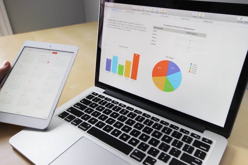
This is the section that will constitute the bulk of the your presentation.
Use the slides in this section to describe the observations, and the resulting outcomes on each of the key parameters that were considered for the research project.
It is usually a good idea to dedicate at least 1 or more slides for each parameter . Make sure that you present data wherever possible. However, ensure that the data presented can be easily comprehended.
Provide key learnings from the data, highlight any outliers, and possible reasoning for it. Try not to go too in-depth with the stats as this can overwhelm the audience. Remember, a presentation is most helpful when it is used to provide key highlights of the research !
Apart from using the data, make sure that you also include a few quotes from the participants.
5. Summary and Learnings from the Research
Once you’ve taken the audience through the core part of your research findings, it is a good practice to summarize the key learnings from each of the section of your project.
Make sure your touch upon some of the key learnings covered in the research outcome of your presentation.
Furthermore, include any additional observations and key points that you may have had which were previously not covered.
The summary slide also often acts as “Key Takeaways” from the research for your audience. Thus, make sure that you maintain brevity and highlight only the points that you want your audience to remember even after the presentation.
6. Inclusions and Exclusions (if any)
While this can be an optional section for some of the researchers.
However, dedicating a section on inclusions and exclusions in your presentation can be a great value add! This section helps your audience understand the key factors that were excluded (or included) on purpose!
Moreover, it creates a sense of thoroughness in the minds of your audience.
7. Conclusion of the Research
The purpose of the conclusion slide of your research findings presentation is to revisit the objective, and present a conclusion.
A conclusion may simply validate or nullify the objective. It may sometimes do neither. Nevertheless, having a conclusion slide makes your presentation come a full circle. It creates this sense of completion in the minds of your audience.
8. Questions
Finally, since your audience did not spend as much time as you did on the research project, people are bound to have a few questions.
Thus, the last part of your presentation structure should be dedicated to allowing your audience to ask questions.
Tips for Effectively Presenting Qualitative Research Findings using PowerPoint
For a presentation to be effective, it is important that the presentation is not only well structured but also that it is well created and nicely delivered!
While we have already covered the structure, let me share with you some tips that you can help you create and deliver the presentation effectively.
Tip 1 – Use Visuals

Using visuals in your presentation is a great way to keep the presentations engaging!
Visual aids not only help make the presentation less boring, but it also helps your audience in retaining the information better!
So, use images and videos of the actual research wherever possible. If these do not suffice or do not give a professional feel, there are a number of resources online from where you can source royalty-free images.
My recommendation for high-quality royalty-free images would be either Unsplash or Pexels . Both are really good. The only downside is that they often do not provide the perfect image that can be used. That said, it can get the job done for at least half the time.
If you are unable to find the perfect free image, I recommend checking out Dreamstime . They have a huge library of images and are much cheaper than most of the other image banks. I personally use Dreamstime for my presentation projects!
Tip 2 – Tell a Story (Don’t Show Just Data!)
I cannot stress enough on how important it is to give your presentation a human touch. Delivering a presentation in the form of a story does just that! Furthermore, storytelling is also a great tool for visualization .
Data can be hard-hitting, whereas a touching story can tickle the emotions of your audience on various levels!
One of the best ways to present a story with your research project is to start with the backstory of the objective. We’ve already talked about this in the earlier part of this article.
Start with why is this research project is so important. Follow a story arc that provides an exciting experience of the beginning, the middle, and a progression towards a climax; much like a plot of a soap opera.
Tip 3 – Include Quotes of the Participants
Including quotes of the participants in your research findings presentation not only provides evidence but also demonstrates authenticity!
Quotes function as a platform to include the voice of the target group and provide a peek into the mindset of the target audience.
When using quotes, keep these things in mind –
1. Use Quotes in their Unedited Form
When using quotes in your presentation, make sure that you use them in their raw unedited form.
The need to edit quotes should be only restricted to aid comprehension and sometimes coherence.
Furthermore, when editing the quotes, make sure that you use brackets to insert clarifying words. The standard format for using the brackets is to use square brackets for clarifying words and normal brackets for adding a missing explanation.
2. How to Decide which Quotes to Consider?
It is important to know which quotes to include in your presentation. I use the following 3 criteria when selecting the quote –
- Relevance – Consider the quotes that are relevant, and trying to convey the point that you want to establish.
- Length – an ideal quote should be not more than 1-2 sentences long.
- Choose quotes that are well-expressed and striking in nature.
3. Preserve Identity of the Participant
It is important to preserve and protect the identity of the participant. This can be done by maintaining confidentiality and anonymity.
Thus, refrain from using the name of the participant. An alternative could be using codes, using pseudonyms (made up names) or simply using other general non-identifiable parameters.
Do note, when using pseudonyms, remember to highlight it in the presentation.
If, however, you do need to use the name of the respondent, make sure that the participant is okay with it and you have adequate permissions to use their name.
Tip 4 – Make your Presentation Visually Appealing and Engaging
It is quite obvious for most of us that we need to create a visually appealing presentation. But, making it pleasing to the eye can be a bit challenging.
Fortunately, we wrote a detailed blog post with tips on how to make your presentation attractive. It provides you with easy and effective tips that you can use even as a beginner! Make sure you check that article.
7 EASY tips that ALWAYS make your PPT presentation attractive (even for beginners)
In addition to the tips mentioned in the article, let me share a few things that you can do which are specific to research outcome presentations.
4.1 Use a Simple Color Scheme
Using the right colors are key to make a presentation look good.
One of the most common mistakes that people make is use too many colors in their presentation!
My recommendation would be to go with a monochromatic color scheme in PowerPoint .
4.2 Make the Data Tables Simple and Visually Appealing
When making a presentation on research outcomes, you are bound to present some data.
But, when data is not presented in a proper manner, it can easily and quickly make your presentation look displeasing! The video below can be a good starting point.
Using neat looking tables can simply transform the way your presentation looks. So don’t just dump the data from excel on your PowerPoint presentation. Spend a few minutes on fixing it!
4.3 Use Graphs and Charts (wherever necessary)
When presenting data, my recommendation would be that graphs and charts should be your first preference.
Using graphs or charts make it easier to read the data, takes less time for the audience to comprehend, and it also helps to identify a trend.
However, make sure that the correct chart type is used when representing the data. The last thing that you want is to poorly represent a key piece of information.
4.4 Use Icons instead of Bullet Points
Consider the following example –
This slide could have been created just as easily using bullet points. However, using icons and representing the information in a different format makes the slide pleasing on the eye.
Thus, always try to use icons wherever possible instead of bullet points.
Tip 5 – Include the Outliers
Many times, as a research project manager, we tend to focus on the trends extracted from a data set.
While it is important to identify patterns in the data and provide an adequate explanation for the pattern, it is equally important sometimes to highlight the outliers prominently.
It is easy to forget that there may be hidden learnings even in the outliers. At times, the data trend may be re-iterating the common wisdom. However, upon analyzing the outlier data points, you may get insight into how a few participants are doing things successfully despite not following the common knowledge.
That said, not every outlier will reveal hidden information. So, do verify what to include and what to exclude.
Tip 6 – Take Inspiration from other Presentations
I admit, making any presentation can be a tough ask let alone making a presentation for showcasing qualitative research findings. This is especially hard when we don’t have the necessary skills for creating a presentation.
One quick way to overcome this challenge could be take inspiration from other similar presentations that we may have liked.
There is no shame in being inspired from others. If you don’t have any handy references, you can surely Google it to find a few examples.
One trick that almost always works for me is using Pinterest .
But, don’t just directly search for a research presentation. You will have little to no success with it. The key is to look for specific examples for inspiration. For eg. search for Title Slide examples, or Image Layout Examples in Presentation.
Tip 7 – Ask Others to Critic your Presentation
The last tip that I would want to provide is to make sure that you share the presentation with supportive colleagues or mentors to attain feedback.
This step can be critical to iron out the chinks in the armor. As research project manager, it is common for you to get a bit too involved with the project. This can lead to possibilities wherein you miss out on things.
A good way to overcome this challenge is to get a fresh perspective on your project and the presentation once it has been prepared.
Taking critical feedback before your final presentation can also prepare you to handle tough questions in an adept manner.
Final Thoughts
It is quite important to ensure that we get it right when working on a presentation that showcases the findings of our research project. After all, we don’t want to be in a situation wherein we put in all the hard-work in the project, but we fail to deliver the outcome appropriately.
I hope you will find the aforementioned tips and structure useful, and if you do, make sure that you bookmark this page and spread the word. Wishing you all the very best for your project!
No products in the cart.
Preparing the presentation of qualitative findings: considering your roles and goals

Dr. Philip Adu is a Methodology Expert at The Chicago School of Professional Psychology (TCSPP). In this post he explains the things to consider when presenting your research findings.
This post follows on from his previous blog post “Perfecting the art of qualitative coding” in which he took us through the stages of qualitative coding and, along the way, outlined the features he found most useful.
In my previous blog post, I presented on making good use of the innovative features of NVivo across the three main stages of qualitative analysis. Expounding on the third stage which is the ‘ Post-Coding stage (Presenting your findings) ’, I want to throw light on things to consider when drafting and refining your presentation. The moment you reach a milestone of successfully using NVivo 12 (Version 12.1.249; QSR International Pty Ltd, 2018) to complete the data analysis process, the reality of preparing all of this data so you can present your findings sets in (Adu, 2016). Your methodical review of the qualitative data and development of codes, categories and themes has yielded massive and interesting NVivo outputs. The outcomes include but are not limited to; codes/nodes, categories/themes, Word Clouds, Word Tree, Framework Matrices, Cluster Tree, code-case matrices, and code-attribute matrices (see Figure 1). These findings need to be carefully examined – selecting the ones that will be useful in drafting a meaningful presentation. You can watch the presentation I developed below:

Source: https://www.youtube.com/watch?v=xEyGGFtVQFw
Note, not all of this information (i.e. the outcomes) needs to be presented to your audience (see Adu, 2019 ). Other questions that may arise as you develop your presentation include; what kind of results should you present? How do you engage with your audience when presenting your findings? How would you help your audience to understand and believe your findings?
In this post, I will discuss the three pertinent components a good presentation of qualitative findings should have. They are; background information, data analysis process and main findings.
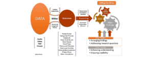
Figure 1. Presentation of findings
Presenting background information
Participants’ past and current situations influence the information they provide to you. Due to this, there is the need to provide readers a summary of who participants are and any background information which may help them to put the findings into the proper context. Also, as a researcher analyzing qualitative data, there is the likelihood of your own background impacting the data analysis process. In the same way, you need to let readers know who you are, what your background is and how you ‘bracketed’ them from not having an effect on the findings ( Adu, 2019 ).
Presenting the data analysis process
Qualitative analysis doesn’t only involve engaging in subjective development of codes and categories, but also promoting transparency in the coding and categorization process (Greckhamer & Cilesiz, 2014). Due to this, you are expected to describe the main and detailed steps you took to analyze your data to arrive at your findings and their respective outcomes. Addressing the following questions would be great:
- What coding strategy did you use?
- What kinds of codes did you assign to relevant excerpts of the data?
- What are the examples of codes you generated?
- What categorization technique did you use?
- How did you develop categories/themes out of the codes?
Your audience’s aim is not only consuming what you found but also learning more about how you came up with the results.
Presenting main findings
When it comes to the presentation of findings, there are two main structures you could choose from. You could present them based on the themes generated or based on the cases (participants or groups of participants) you have. The decision to either structure depends on the kind of research question(s) or the research purpose you have. For a detailed explanation of the types of presentation formats and how to select an appropriate structure, see Chapter 13 of the book, “ A Step-by-Step Guide to Qualitative Data Coding ”.
Considering your roles and goals
As you plan on how to communicate the above components, make sure you accomplish your goals and carry out your role as a communicator of qualitative data analysis outcomes (See Figure 1). Your roles are; to thoughtfully arrange the data analysis outcomes and to adequately address your research questions.
Liken the presentation of your findings to sharing a puzzle which has been solved. Your goal is to prevent a situation where the burden is put on the audience to piece together the puzzle of findings. In other words, you are expected to present the findings in a meaningful way that would enhance the audience’s understanding of the data analysis outcomes (Adu, 2016 & 2019). By so doing, they are more likely to trust what you found.
Let’s summarize the action items:
- Out of a pool of qualitative analysis outcomes, select the ones that would allow you to address your research questions and meaningfully communicate your findings.
- Decide on how you want to structure the presentation of the findings.
- Irrespective of the presentation format you choose, make sure you include background information, the data analysis process and main findings in your presentation.
- Make sure you are ‘narrating’ participants’ stories or what you found – making the numeric outputs include the tables and charts generated play a supporting role when presenting the main findings.
Adu, P. (2016). Presenting Qualitative Findings Using NVivo Output to Tell the Story. [PowerPoint slides]. SlideShare. Retrieved from https://www.slideshare.net/kontorphilip/presenting-qualitative-findings-using-nvivo-output-to-tell-the-story
QSR International Pty Ltd. (2018). NVivo 12. Version 12.1.249 [Computer software]. Retrieved from https://qsrinternational.com/nvivo-qualitative-data-analysis-software
Adu, P. (2019). A Step-by-Step Guide to Qualitative Data Coding . Oxford: Routledge
Greckhamer, T., & Cilesiz, S. (2014). Rigor, Transparency, Evidence, and Representation in Discourse Analysis: Challenges and Recommendations. International Journal of Qualitative Methods, 13(1), 422-443. doi:10.1177/160940691401300123
ABOUT THE AUTHOR

Dr. Philip Adu is a Methodology Expert at The Chicago School of Professional Psychology (TCSPP). His role is to provide support to dissertating students in TCSPP addressing their methodology related concerns. You could access some of his webinars at the ‘Methodology Related Presentations – TCSPP’ YouTube Channel. He completed his Doctoral degree in Education with a concentration in Learning, Instructional Design and Technology from West Virginia University (WVU). Dr. Adu recently authored a book titled, “A Step-by-Step Guide to Qualitative Data Coding” (available on routledge.com or amazon.com ). You could reach Dr. Adu at [email protected] and @drphilipadu on twitter.
Recent Articles
Submit Manuscript
Easy Online Form
Get Newsletter
Sign Up Today
11 Tips to Make an Effective Research Presentation
Home » Presenting Your Research » 11 Tips to Make an Effective Research Presentation

The purpose of a presentation is to tell your audience a story. To achieve this goal, the person giving the presentation must place themselves in the shoes of their listeners and determine what they need to know to understand the story. Telling a great story is more important than any embellishments or technology you use to do it. Below are 11 tips for giving an effective research presentation.
1. Decide what your most important messages are, tailored to your specific audience.
Research can be messy, and so can the results of research. Your audience does not usually need to know every tiny detail about your work or results. Try to narrow down your findings to two or three of the most important takeaways that would resonate with the people in attendance. These takeaways are the messages of your presentation.
2. Start at the beginning and keep it simple.
Now that you have your messages, think about how you got to that point. What question did you ask that led you to do this research, and why did you ask it? Tell your audience this information, just enough of it for them to understand why the story is important and why you’re telling it. Use language that is tailored to the level of understanding of your audience.
3. Tell them how you addressed your question.
This part of any presentation usually involves the greatest risk of being dull. Tell your audience how you address your question, but don’t overwhelm them with detail they don’t need. Tell them what they need to know to get a basic idea of how you got your results.
4. Tell them your most important findings.
Again, do not overwhelm your listeners with noisy data or too much information. Give them a streamlined version of your results, using as your guide what you might include in an abstract of the work.
5. Give them the payoff—your main messages.
Link your results to the main or most important conclusions from your work. Make sure that the results you talk about directly connect with these final messages.
6. Hint at where you’re going next.
If appropriate, you can also tell your audience the new questions that your findings open up, leaving them a little intrigued about where things will go next.
7. Do not go over your time.
No one wants to listen to anyone talk longer than they are supposed to talk. If you’ve been given a 10-minute limit for your presentation, do not take more than 10 minutes. Your best bet is to practice it beforehand, timing yourself, to make sure that you have the right pace to stay within limits. Don’t make it too short, either, although that is almost never a problem.
8. Think about questions people might ask.
If a question-and-answer session is to follow your presentation, go through your talk and put yourself again in your audience’s shoes. What questions would you have if you were listening to this research presentation? Try to anticipate what people might ask and how you’ll answer. If you have friends or family you can use for practice, encourage them to ask questions so you can gain experience answering them.
9. Do not overwhelm with too much text, busy images, tables, or charts.
Having too much text on a slide or busy, illegible images is a major fault of many academic research presentations. Consider the people in your audience and what they’ll be able to see from where they sit. Keep text limited and plain and figures simple and clear. Explain each image that you show, including axis labels and their meaning, and don’t just assume your audience will understand with a quick glance. Also, you do not need to use the tricks that some digital software allows for slides to fade in or out or advance automatically. In fact, you should avoid the latter entirely.
10. Do not read text word for word.
If you are using some form of presentation that involves slides or words on a screen, do not read these words verbatim. Your best approach is to use short phrases in the slides and then add your own expansion as you talk. That way, your audience sees an important, brief phrase and hears you add context around it. Listening to someone read a slide packed with text while reading along with them is mind numbing.
11. Engage with your audience.
If you are comfortable, you can always present your research in a way that invites audience engagement, asking questions as you go that anticipate a slide you are about to show, a result you are about to introduce, or a conclusion you will present.
San Francisco Edit specializes in scientific editing in the United States and we work with scientists from all over the world.
Sign up for our newsletter, latest from the blog.

Why Publish in Peer-Reviewed Journals: Enhancing Your Scientific Credibility

How to Review a Scientific Paper for a Journal: A Step-by-Step Approach

Response Letter to Journal Reviewers: How to Address Feedback Professionally

How to Write a Discussion for a Research Paper: A Step-by-Step Guide
- Knowledge Center
- English Grammar
- Getting Published
- Journal Submission
- Marketing Your Paper and Yourself
- Peer Reviewing a Scientific Paper
- Presenting Your Research
- Thesis vs Dissertation
- What is Scientific Editing
- Why Edit and Types of Editing
- Writing the Manuscript
- Scientific Editing
- Business Editing
- Language Editing
- Newsletters
- Testimonials
- Areas of Expertise
San Francisco Edit 1755 Jackson Street Suite 610 San Francisco, CA 94109 Email: [email protected]
Copyright © 2003-2022 San Francisco Edit. All Rights Reserved.
Join 90,000+ Scientist Who Get Useful Tips For Writing Better Manuscripts
Don't miss out on future newsletters. sign up now..
- Affiliate Program

- UNITED STATES
- 台灣 (TAIWAN)
- TÜRKIYE (TURKEY)
- Academic Editing Services
- - Research Paper
- - Journal Manuscript
- - Dissertation
- - College & University Assignments
- Admissions Editing Services
- - Application Essay
- - Personal Statement
- - Recommendation Letter
- - Cover Letter
- - CV/Resume
- Business Editing Services
- - Business Documents
- - Report & Brochure
- - Website & Blog
- Writer Editing Services
- - Script & Screenplay
- Our Editors
- Client Reviews
- Editing & Proofreading Prices
- Wordvice Points
- Partner Discount
- Plagiarism Checker
- APA Citation Generator
- MLA Citation Generator
- Chicago Citation Generator
- Vancouver Citation Generator
- - APA Style
- - MLA Style
- - Chicago Style
- - Vancouver Style
- Writing & Editing Guide
- Academic Resources
- Admissions Resources
How to Write the Results/Findings Section in Research
What is the research paper Results section and what does it do?
The Results section of a scientific research paper represents the core findings of a study derived from the methods applied to gather and analyze information. It presents these findings in a logical sequence without bias or interpretation from the author, setting up the reader for later interpretation and evaluation in the Discussion section. A major purpose of the Results section is to break down the data into sentences that show its significance to the research question(s).
The Results section appears third in the section sequence in most scientific papers. It follows the presentation of the Methods and Materials and is presented before the Discussion section —although the Results and Discussion are presented together in many journals. This section answers the basic question “What did you find in your research?”
What is included in the Results section?
The Results section should include the findings of your study and ONLY the findings of your study. The findings include:
- Data presented in tables, charts, graphs, and other figures (may be placed into the text or on separate pages at the end of the manuscript)
- A contextual analysis of this data explaining its meaning in sentence form
- All data that corresponds to the central research question(s)
- All secondary findings (secondary outcomes, subgroup analyses, etc.)
If the scope of the study is broad, or if you studied a variety of variables, or if the methodology used yields a wide range of different results, the author should present only those results that are most relevant to the research question stated in the Introduction section .
As a general rule, any information that does not present the direct findings or outcome of the study should be left out of this section. Unless the journal requests that authors combine the Results and Discussion sections, explanations and interpretations should be omitted from the Results.
How are the results organized?
The best way to organize your Results section is “logically.” One logical and clear method of organizing research results is to provide them alongside the research questions—within each research question, present the type of data that addresses that research question.
Let’s look at an example. Your research question is based on a survey among patients who were treated at a hospital and received postoperative care. Let’s say your first research question is:

“What do hospital patients over age 55 think about postoperative care?”
This can actually be represented as a heading within your Results section, though it might be presented as a statement rather than a question:
Attitudes towards postoperative care in patients over the age of 55
Now present the results that address this specific research question first. In this case, perhaps a table illustrating data from a survey. Likert items can be included in this example. Tables can also present standard deviations, probabilities, correlation matrices, etc.
Following this, present a content analysis, in words, of one end of the spectrum of the survey or data table. In our example case, start with the POSITIVE survey responses regarding postoperative care, using descriptive phrases. For example:
“Sixty-five percent of patients over 55 responded positively to the question “ Are you satisfied with your hospital’s postoperative care ?” (Fig. 2)
Include other results such as subcategory analyses. The amount of textual description used will depend on how much interpretation of tables and figures is necessary and how many examples the reader needs in order to understand the significance of your research findings.
Next, present a content analysis of another part of the spectrum of the same research question, perhaps the NEGATIVE or NEUTRAL responses to the survey. For instance:
“As Figure 1 shows, 15 out of 60 patients in Group A responded negatively to Question 2.”
After you have assessed the data in one figure and explained it sufficiently, move on to your next research question. For example:
“How does patient satisfaction correspond to in-hospital improvements made to postoperative care?”

This kind of data may be presented through a figure or set of figures (for instance, a paired T-test table).
Explain the data you present, here in a table, with a concise content analysis:
“The p-value for the comparison between the before and after groups of patients was .03% (Fig. 2), indicating that the greater the dissatisfaction among patients, the more frequent the improvements that were made to postoperative care.”
Let’s examine another example of a Results section from a study on plant tolerance to heavy metal stress . In the Introduction section, the aims of the study are presented as “determining the physiological and morphological responses of Allium cepa L. towards increased cadmium toxicity” and “evaluating its potential to accumulate the metal and its associated environmental consequences.” The Results section presents data showing how these aims are achieved in tables alongside a content analysis, beginning with an overview of the findings:
“Cadmium caused inhibition of root and leave elongation, with increasing effects at higher exposure doses (Fig. 1a-c).”
The figure containing this data is cited in parentheses. Note that this author has combined three graphs into one single figure. Separating the data into separate graphs focusing on specific aspects makes it easier for the reader to assess the findings, and consolidating this information into one figure saves space and makes it easy to locate the most relevant results.

Following this overall summary, the relevant data in the tables is broken down into greater detail in text form in the Results section.
- “Results on the bio-accumulation of cadmium were found to be the highest (17.5 mg kgG1) in the bulb, when the concentration of cadmium in the solution was 1×10G2 M and lowest (0.11 mg kgG1) in the leaves when the concentration was 1×10G3 M.”
Captioning and Referencing Tables and Figures
Tables and figures are central components of your Results section and you need to carefully think about the most effective way to use graphs and tables to present your findings . Therefore, it is crucial to know how to write strong figure captions and to refer to them within the text of the Results section.
The most important advice one can give here as well as throughout the paper is to check the requirements and standards of the journal to which you are submitting your work. Every journal has its own design and layout standards, which you can find in the author instructions on the target journal’s website. Perusing a journal’s published articles will also give you an idea of the proper number, size, and complexity of your figures.
Regardless of which format you use, the figures should be placed in the order they are referenced in the Results section and be as clear and easy to understand as possible. If there are multiple variables being considered (within one or more research questions), it can be a good idea to split these up into separate figures. Subsequently, these can be referenced and analyzed under separate headings and paragraphs in the text.
To create a caption, consider the research question being asked and change it into a phrase. For instance, if one question is “Which color did participants choose?”, the caption might be “Color choice by participant group.” Or in our last research paper example, where the question was “What is the concentration of cadmium in different parts of the onion after 14 days?” the caption reads:
“Fig. 1(a-c): Mean concentration of Cd determined in (a) bulbs, (b) leaves, and (c) roots of onions after a 14-day period.”
Steps for Composing the Results Section
Because each study is unique, there is no one-size-fits-all approach when it comes to designing a strategy for structuring and writing the section of a research paper where findings are presented. The content and layout of this section will be determined by the specific area of research, the design of the study and its particular methodologies, and the guidelines of the target journal and its editors. However, the following steps can be used to compose the results of most scientific research studies and are essential for researchers who are new to preparing a manuscript for publication or who need a reminder of how to construct the Results section.
Step 1 : Consult the guidelines or instructions that the target journal or publisher provides authors and read research papers it has published, especially those with similar topics, methods, or results to your study.
- The guidelines will generally outline specific requirements for the results or findings section, and the published articles will provide sound examples of successful approaches.
- Note length limitations on restrictions on content. For instance, while many journals require the Results and Discussion sections to be separate, others do not—qualitative research papers often include results and interpretations in the same section (“Results and Discussion”).
- Reading the aims and scope in the journal’s “ guide for authors ” section and understanding the interests of its readers will be invaluable in preparing to write the Results section.
Step 2 : Consider your research results in relation to the journal’s requirements and catalogue your results.
- Focus on experimental results and other findings that are especially relevant to your research questions and objectives and include them even if they are unexpected or do not support your ideas and hypotheses.
- Catalogue your findings—use subheadings to streamline and clarify your report. This will help you avoid excessive and peripheral details as you write and also help your reader understand and remember your findings. Create appendices that might interest specialists but prove too long or distracting for other readers.
- Decide how you will structure of your results. You might match the order of the research questions and hypotheses to your results, or you could arrange them according to the order presented in the Methods section. A chronological order or even a hierarchy of importance or meaningful grouping of main themes or categories might prove effective. Consider your audience, evidence, and most importantly, the objectives of your research when choosing a structure for presenting your findings.
Step 3 : Design figures and tables to present and illustrate your data.
- Tables and figures should be numbered according to the order in which they are mentioned in the main text of the paper.
- Information in figures should be relatively self-explanatory (with the aid of captions), and their design should include all definitions and other information necessary for readers to understand the findings without reading all of the text.
- Use tables and figures as a focal point to tell a clear and informative story about your research and avoid repeating information. But remember that while figures clarify and enhance the text, they cannot replace it.
Step 4 : Draft your Results section using the findings and figures you have organized.
- The goal is to communicate this complex information as clearly and precisely as possible; precise and compact phrases and sentences are most effective.
- In the opening paragraph of this section, restate your research questions or aims to focus the reader’s attention to what the results are trying to show. It is also a good idea to summarize key findings at the end of this section to create a logical transition to the interpretation and discussion that follows.
- Try to write in the past tense and the active voice to relay the findings since the research has already been done and the agent is usually clear. This will ensure that your explanations are also clear and logical.
- Make sure that any specialized terminology or abbreviation you have used here has been defined and clarified in the Introduction section .
Step 5 : Review your draft; edit and revise until it reports results exactly as you would like to have them reported to your readers.
- Double-check the accuracy and consistency of all the data, as well as all of the visual elements included.
- Read your draft aloud to catch language errors (grammar, spelling, and mechanics), awkward phrases, and missing transitions.
- Ensure that your results are presented in the best order to focus on objectives and prepare readers for interpretations, valuations, and recommendations in the Discussion section . Look back over the paper’s Introduction and background while anticipating the Discussion and Conclusion sections to ensure that the presentation of your results is consistent and effective.
- Consider seeking additional guidance on your paper. Find additional readers to look over your Results section and see if it can be improved in any way. Peers, professors, or qualified experts can provide valuable insights.
One excellent option is to use a professional English proofreading and editing service such as Wordvice, including our paper editing service . With hundreds of qualified editors from dozens of scientific fields, Wordvice has helped thousands of authors revise their manuscripts and get accepted into their target journals. Read more about the proofreading and editing process before proceeding with getting academic editing services and manuscript editing services for your manuscript.
As the representation of your study’s data output, the Results section presents the core information in your research paper. By writing with clarity and conciseness and by highlighting and explaining the crucial findings of their study, authors increase the impact and effectiveness of their research manuscripts.
For more articles and videos on writing your research manuscript, visit Wordvice’s Resources page.
Wordvice Resources
- How to Write a Research Paper Introduction
- Which Verb Tenses to Use in a Research Paper
- How to Write an Abstract for a Research Paper
- How to Write a Research Paper Title
- Useful Phrases for Academic Writing
- Common Transition Terms in Academic Papers
- Active and Passive Voice in Research Papers
- 100+ Verbs That Will Make Your Research Writing Amazing
- Tips for Paraphrasing in Research Papers
- Library of Congress
- Research Guides
- Science & Technology
Technical Reports & Standards Collection Guide
Introduction.
- Technical Reports Collections
- Standards Collection
- American Documentation Institute (ADI)
- Office of Scientific Research and Development (OSRD) Collection
- Synthetic Rubber Project
- Technical Translations (TT) Series
- Locating Technical Reports and Standards
- Research Assistance and Reproductions
- Online Resources and Databases
- Using the Library of Congress
- Jennifer Harbster, Head, Science Section, Researcher Engagement & General Collections Division
- Sean Bryant, Reference Librarian, Researcher Engagement & General Collections Division
- Ashley Fielder, Librarian for Medicine and Life Science. Science Section, Researcher Engagement & General Collections
- Created: September 22, 2023
Last Updated: May 7, 2024
Science & Technical Reports : Ask a Librarian
Have a question? Need assistance? Use our online form to ask a librarian for help.

Get connected to the Library’s large and diverse collections related to science, technology, and business through our Inside Adams Blog. This blog also features upcoming events and collection displays, classes and orientations, new research guides, and more.
The Library of Congress is completing a project to update and modernize Library reading room websites. As a part of the process, “The Technical Reports and Standards Collection” is in the process of being updated and migrated to this new platform. The process has not yet been completed and the guide remains subject to change.
Researchers with questions about the collection are encouraged to contact a science or business librarian using the Ask-a-Librarian: Science and Technical Reports or Ask a Librarian: Business online form, by phone, at (202) 707-5639, or in person, at the reference desk, in the Science and Business Reading Room, on the fifth floor of the Library's John Adams Building.
Technical Reports

Technical reports are designed to quickly alert researchers to recent findings and developments in scientific and technical research. These reports are issued for a variety of purposes:
- to communicate results or describe progress of a research project
- to convey background information on an emerging or critical research topic
- to provide lists of instructions or procedures for current practices
- to determine the feasibility of a technology and recommend if research should be continued (and how to evaluate any further progress made)
- to detail technical specifications (materials, functions, features, operation, market potential, etc.)
Technical reports first appeared in the early part of the 20th century. The U.S. Geological Survey (USGS) published a series of professional papers beginning in 1902, and the National Advisory Committee for Aeronautics (NACA) issued its first report in 1915. But, the format gained importance during World War II, emerged in the postwar era, and remains, to this day, a major tool for reporting progress in science and technology, as well as in education, business, and social sciences research. The names given to series of these publications vary, but are often such generic terms as "technical reports," "working papers," "research memoranda," "internal notes," "occasional papers," "discussion papers" or "gray (or grey) literature." In the physical and natural sciences, "technical report" seems to be the preferred designation. For reports dealing with business, education, and the social sciences, on the other hand, the terms "working paper," "occasional paper," and "memorandum" are often the designations of choice. Other, more specific types of technical reports include "preprints" and "reprints." Preprints generally are versions of papers issued by researchers before their final papers are published by commercial publishers. Preprints allow researchers to communicate their findings quickly, but usually have not been peer reviewed. Reprints are typically released to heighten awareness of the research being conducted in a particular field or at a single institution. The term, "technical report" encompasses all of these designations.
Since many of these publications are intended to provide just a temporary snapshot of current research in a particular field or topic, they may contain the some of following distinctions:
- Rapid communication of new research results
- Dissemination to a targeted audience.
- Detailed methodologies, in order to facilitate review of research results by others
- No peer review, though there is often another selection process for publication (grant, contract, or institutional affiliation)
- Not published by typical commercial publishers (instead reports are issued or sponsored by government agencies, professional associations, societies, councils, foundations, laboratories, universities, etc.)
- Corporate authorship, where present, is typically emphasized
Unfortunately, uncertain availability, limited print runs, and decentralized distribution patterns with little bibliographic information are also often characteristics of this literature.
The Federal Government issues many different types of technical reports. An overview of some of these can be found in a May 2001 GAO report, " Information Management: Dissemination of Technical Reports ." Government issued or sponsored reports contain an additional characteristic - they may be subject to distribution restrictions linked to their classification status. Although references to classified reports may be found in technical reports literature, the security status or limited distribution of reports may make them unavailable to the general public and to the Library as well, as the Library holds only titles in the public domain. Those interested in locating such materials can consult the U.S. Department of Justice's Freedom of Information Act site for guidance in obtaining these reports.
To enable them to be identified and located, technical reports are assigned report codes by agencies or organizations involved in their production or distribution. These codes may be referred to as "accession numbers," "agency report series numbers," "contract numbers," "grant numbers" or by other names, and include dates and individual report numbers. Typically, reports are assigned multiple codes and these codes help to identify the sponsoring agency, the organization performing the research or the organization disseminating the report. Most technical reports held by the Library of Congress are not cataloged, and, for these reports, one or more report codes is required for Library staff to check the collections for a report or to locate and retrieve it. For more information about the current Standard Technical Report Number format (STRN) see ANSI/NISO Z39.23- 1997 (S2015) Standard Technical Reports Number Format and Creation .
Standards are specifications which define products, methods, processes or practices, and are known to have existed as early as 7000 B.C., when cylindrical stones were used as units of weight in Egypt. According to Office of Management and Budget (OMB) Circular A-119 , as revised in 2016, the term "standard" or "technical standard" refers to:
- common and repeated use of rules, conditions, guidelines or characteristics for products or related processes and production methods, and related management systems practices;
- the definition of terms; classification of components; delineation of procedures; specification of dimensions, materials, performance, designs, or operations; measurement of quality and quantity in describing materials, processes, products, systems, services, or practices; test methods and sampling procedures; or descriptions of fit and measurements of size or strength; and
- terminology, symbols, packaging, marking or labeling requirements as they apply to a product, process, or production method.
Technical standards are not "professional standards of personal conduct; or institutional codes of ethics." (p. 15).
Standards are typically generated by governments or by professional associations and organizations interested in or affected by the subject matter of particular standards. For example, U.S. government standards mandated by the Fair Packaging & Labeling Act (FPLA) have standardized the labeling required for packaging in which consumer commodities is sold. Standards set the basis for determining consistent and acceptable minimum levels of reliability and safety, and are adhered to either voluntarily or as mandated by law. For a more complete overview, see the NIST report " The ABC's of Standards Activities " by Maureen A. Breitenberg (2009).
The Library of Congress standards collection includes military and other federal standards, industry standards, and a few older international standards from Russia, China, and South Africa. Material from the collection is available in various formats, including digital, print, and microform materials. The majority of the Library's standards collection held in the Science Section's Technical Reports and Standards Collection. The collection remains largely uncatalogued, and as a result, most items from this collection are not discoverable in the Library's online catalog. Inquires on Library holdings can be sent to the Science Section using the Science and Technical Reports Ask-a-Librarian form . Some standards, however, are housed in the Library's general collections and discoverable by searching the online catalog -- the ASTM standards are one example. Other standards are in custody of appropriate specialized research centers, such as the Law Library , which maintains OSHA standards and some building codes.
About the Science Section
Part of the Science & Business Reading Room at the Library of Congress, the Science Section is the starting point for conducting research at the Library of Congress in the subject areas of science, medicine and engineering. Here, reference specialists in specific subject areas of science and engineering assist patrons in formulating search strategies and gaining access to the information and materials contained in the Library's rich collections of science, medicine, and engineering materials.
- Next: Technical Reports Collections >>
- Last Updated: Jul 3, 2024 11:51 AM
- URL: https://guides.loc.gov/technical-reports
This paper is in the following e-collection/theme issue:
Published on 12.8.2024 in Vol 26 (2024)
Enhancing Patient Understanding of Laboratory Test Results: Systematic Review of Presentation Formats and Their Impact on Perception, Decision, Action, and Memory
Authors of this article:
- Frederieke A M van der Mee 1 * , MD ;
- Fleur Schaper 2, 3 * , PhD ;
- Jesse Jansen 1 , PhD ;
- Judith A P Bons 3 , PhD ;
- Steven J R Meex 3 , PhD ;
- Jochen W L Cals 1 , MD, Prof Dr
1 Department of Family Medicine, Care and Public Health Research Institute, Maastricht University, Maastricht, Netherlands
2 Department of Clinical Chemistry, Reinier Medical Diagnostic Center, Delft, Netherlands
3 Central Diagnostic Laboratory, Maastricht University Medical Center+, Maastricht, Netherlands
*these authors contributed equally
Corresponding Author:
Frederieke A M van der Mee, MD
Department of Family Medicine
Care and Public Health Research Institute
Maastricht University
P. Debyeplein 1
Maastricht, 6229 HA
Netherlands
Phone: 31 883887059
Email: [email protected]
Background: Direct access of patients to their web-based patient portal, including laboratory test results, has become increasingly common. Numeric laboratory results can be challenging to interpret for patients, which may lead to anxiety, confusion, and unnecessary doctor consultations. Laboratory results can be presented in different formats, but there is limited evidence regarding how these presentation formats impact patients’ processing of the information.
Objective: This study aims to synthesize the evidence on effective formats for presenting numeric laboratory test results with a focus on outcomes related to patients’ information processing, including affective perception, perceived magnitude, cognitive perception, perception of communication, decision, action, and memory.
Methods: The search was conducted in 3 databases (PubMed, Web of Science, and Embase) from inception until May 31, 2023. We included quantitative, qualitative, and mixed methods articles describing or comparing formats for presenting diagnostic laboratory test results to patients. Two reviewers independently extracted and synthesized the characteristics of the articles and presentation formats used. The quality of the included articles was assessed by 2 independent reviewers using the Mixed Methods Appraisal Tool.
Results: A total of 18 studies were included, which were heterogeneous in terms of study design and primary outcomes used. The quality of the articles ranged from poor to excellent. Most studies (n=16, 89%) used mock test results. The most frequently used presentation formats were numerical values with reference ranges (n=12), horizontal line bars with colored blocks (n=12), or a combination of horizontal line bars with numerical values (n=8). All studies examined perception as an outcome, while action and memory were studied in 1 and 3 articles, respectively. In general, participants’ satisfaction and usability were the highest when test results were presented using horizontal line bars with colored blocks. Adding reference ranges or personalized information (eg, goal ranges) further increased participants’ perception. Additionally, horizontal line bars significantly decreased participants’ tendency to search for information or to contact their physician, compared with numerical values with reference ranges.
Conclusions: In this review, we synthesized available evidence on effective presentation formats for laboratory test results. The use of horizontal line bars with reference ranges or personalized goal ranges increased participants’ cognitive perception and perception of communication while decreasing participants’ tendency to contact their physicians. Action and memory were less frequently studied, so no conclusion could be drawn about a single preferred format regarding these outcomes. Therefore, the use of horizontal line bars with reference ranges or personalized goal ranges is recommended to enhance patients’ information processing of laboratory test results. Further research should focus on real-life settings and diverse presentation formats in combination with outcomes related to patients’ information processing.
Introduction
An increasing number of patients have direct access to their own web-based patient portal. This includes diagnostic test results ordered by their health care professional, such as laboratory test results [ 1 , 2 ]. Providing patients with web-based access to patient portals aims to enhance patient involvement in their health management. Improving patients’ knowledge and self-efficacy may enhance disease self-management and interactions with health care providers, and ultimately lead to better health outcomes and increased satisfaction with care [ 3 - 6 ].
However, patient access to web-based patient portals also has potentially negative consequences. For example, misinterpretation or inaccurate knowledge could lead to underestimation of test results and promote a false sense of security [ 7 ]. Similarly, gaining insight into medical test results might trigger feelings of insecurity, anxiety, and confusion [ 8 - 12 ]. Previous studies have shown that poor understanding of test results can lead to an increase in telephone calls or doctor consultations, emergency department visits, and even hospitalizations [ 13 - 15 ]. As a result, the overall utility or benefit of providing lab results directly to patients may depend on how these data are presented to and interpreted by the patient [ 16 , 17 ].
Limited health literacy and numeracy skills are significant barriers to the effective use of web-based patient portals and understanding of laboratory test results [ 18 , 19 ]. Although patient understanding can be improved to some extent by avoiding medical jargon and using plain language, overcoming the problem of incomprehension in its entirety remains an ongoing challenge [ 19 - 21 ]. One of the key issues is the numerical presentation of test results, especially for patients with low numeracy skills (ie, those with limited ability to derive meaning from numbers), who have been shown to have difficulties in interpreting basic laboratory test results and identifying results that fall outside the reference range [ 18 ]. The lack of supporting information and guidance on interpretation of results contributes to the problem of misinterpretation. This challenge becomes even more pronounced when a larger number of test results are presented [ 18 ].
Basic patient portals typically present laboratory test results in a numerical format, often accompanied by a reference range (ie, the range that represents normal values for a particular test) [ 10 , 22 , 23 ]. An alternative approach to communicating test results is the use of visual displays, such as colors or graphics. These formats require less health literacy and numeracy skills for interpretation and may improve patients’ understanding of the results [ 24 - 28 ]. Previous studies have examined a variety of presentation formats for communicating laboratory test results. However, direct comparisons between these studies can be challenging due to the variety of presentation options and clinical contexts. In addition, not all formats may be appropriate for every clinical situation [ 29 ].
There is only limited evidence on the effect of specific presentation formats on patients’ information processing. As highlighted by Witteman and Zikmund-Fisher [ 17 ], laboratory test results often lack meaning for the patients receiving them. Test results represent data, which differs from information and actual knowledge patients commonly encounter in daily life [ 30 , 31 ]. Patients have to complete several steps to go from data perception to usable knowledge. Ancker et al [ 32 ] described these steps as well, based on the Wickens model of human information processing [ 33 ]. In a sequential order, patients need perception and behavioral intention to achieve actual health behavior. Therefore, it is important that these separate steps of information processing are taken into account when presentation formats are evaluated.
Our systematic review aims to synthesize the existing evidence on effective components of presentation formats for laboratory test results focusing on patients’ perception, decision, action, and memory. In this review, we will specifically focus on numeric laboratory test results, and not on results containing only textual or nonnumeric findings.
This review was reported in accordance with the PRISMA (Preferred Reporting Items for Systematic Reviews and Meta-Analyses; Multimedia Appendix 1 ) [ 34 ]. A protocol for this review was not previously registered.
Search Strategy
The search was conducted in 3 databases (PubMed, Web of Science, and Embase) from inception up to May 31, 2023. In each database, a search was performed, which was developed by the first author (FM) together with an experienced librarian and contained both thesaurus and free text terms. For the search in Embase, a filter was applied to remove preprint records and to exclude MEDLINE citations, since the latter were already covered by the PubMed search. Additionally, 2 authors (FM and FS) performed backward snowballing by screening reference sections of all selected articles to identify relevant publications missed with the search strategy. A fully reproducible search can be found in Multimedia Appendix 2 .
Study Selection and Eligibility Criteria
All identified titles and abstracts were downloaded to reference management software (Endnote) and duplicates were removed. Two authors (FM and FS) independently screened for potential eligible articles using Covidence, a Cochrane’s technology platform [ 35 ]. First, titles and abstracts were screened against the eligibility criteria. Second, full texts of potentially suitable articles were rescreened using the same criteria. In case of disagreement, consensus was reached by discussion or screening by a third reviewer (JC).
We considered articles fitting for inclusion if they were original research. Studies describing or comparing different ways of presenting diagnostic laboratory test results to patients were included. Only studies examining numeric laboratory test results were included. Furthermore, studies are needed to evaluate the effect of communicating test results on patients’ comprehensibility, attitudes, or experiences. Studies conducted in primary care and secondary/tertiary care settings were eligible, as well as studies including healthy volunteers. Studies had to be written in English or Dutch.
Studies were excluded if they (1) were protocols, reviews, systematic reviews, meta-analyses, book chapters, editorials, letters, practice pointers, oral presentations, or poster presentations; (2) were about development, implementation, or adoption of web-based patient portals in general, or about the type of notification of laboratory test results, if they did not consider patients’ interpretation of the lab results; (3) focused on web-based access to notes, and not to laboratory test results; (4) did not mention type of presentation format of lab results; (5) focused on the development of web-based lifestyle interventions or web-based applications to collect patient-reported outcomes; (6) focused on the safety or privacy issues of web-based patient portals; (7) were about the effect of communicating test results in web-based patient portals on patients’ medication management; (8) tested the effect of test result communication on health care providers; (9) examined communication of other types of diagnostic test results (eg, pharmacogenomics or genomics, radiology, pathology, or microbiology); and (10) examined communication of test results in the context of screening programs.
Data Extraction
Two authors (FM and FS) independently extracted data from the eligible studies into a prepared spreadsheet. The spreadsheet was developed by the multidisciplinary team and piloted by both authors. For each study, the year of publication, country in which the study was performed, study design, number of participants, description of the study population, and the inclusion and exclusion criteria were assessed. Furthermore, information about the presentation of test results in the portal, the type of laboratory tests studied, and whether real or mock data were used, was extracted.
Outcome Measures
Previous research regarding this subject focused on a variety of outcomes related to patients’ information processing. As stated above, Ancker et al [ 32 ] introduced a taxonomy to categorize different outcome measures when communicating numbers in health care. These categories include sequentially; perception, decision/behavioral intention, action/actual health behavior, and memory. Perception is further divided into 4 subcategories: affective perception, perceived magnitude, cognitive perception, and perception of communication [ 32 , 36 , 37 ]. An explanation of the categorized outcome measures can be found in Textbox 1 [ 32 ]. For this review, the outcome measures of each study were extracted and classified into the categories described.
Affective perception
- Feelings about the laboratory result communicated.
Perceived magnitude
- Perceived size of risk associated with a test result, captured with measures as “how large or small does this value seem to you?”
Cognitive perception
- Understanding whether a laboratory result is elevated, normal, or below normal. Being able to identify direction of a trend over time.
Perception of communication
- Preference for presentation format of test result.
- Intention to seek more information or to change behavior after viewing results.
- Change in actual health behavior (eg, search for more information).
- Recall of a specific test result after viewing (ie, verbatim recall).
Quality Assessment
To assess the quality and risk of bias of all included studies, the Mixed Methods Appraisal Tool (MMAT) was used [ 38 ]. The MMAT is designed to concomitantly appraise studies with different designs, such as qualitative, quantitative, and mixed methods studies [ 39 ]. Question sets are specific to the study design, notably qualitative studies, quantitative randomized controlled trials, quantitative nonrandomized studies, quantitative descriptive studies, and mixed methods studies. For each suitable study, the appropriate category was chosen and the criteria stated for this specific category were rated as “yes,” “no,” or “can’t tell.”
Two authors (FM and FS) discussed both data and quality extraction until a consensus was reached.
Data Synthesis
Due to the heterogeneity of study designs and primary outcomes, meta-analysis was considered inappropriate. Instead, narrative synthesis was used to integrate the findings into descriptive summaries regarding ways of presenting laboratory test results and outcomes of interest.
The initial search identified 10,537 references. A total of 3490 duplicate records were removed. After applying the exclusion criteria in the primary title and abstract screening, another 6900 records were removed. During full-text screening of the remaining articles (n=146), it appeared that 1 full text was not available. Furthermore, 127 articles were excluded because they did not meet the eligibility criteria. Describing the implementation of web-based patient portals, unrelated to laboratory test results, was the most common exclusion criterion (55/127, 43.3%; Figure 1 ). A total of 18 studies were found eligible for this systematic review. Cohen κ for interrater reliability was 0.62 for title and abstract screening and 0.80 for full-text screening, indicating respectively a moderate and strong agreement between the 2 reviewers [ 40 ].

Study Characteristics
A total of 2 qualitative studies, 11 quantitative studies, and 5 mixed methods studies were included (n=18). The included studies were published between 2012 and 2021, and the majority were conducted in the United States (n=13, 72%). The total sample size of the included studies was 12,225 participants, ranging from 8 to 6766 participants. Among the articles reporting the following characteristics, sex was almost equally distributed (6219/13,155, 47.3% female), and participants were predominantly middle-aged (mean 51.1 years) and White (8429/10,865, 77.6% on average). Fourteen (78%) of the 18 studies reported educational level, with 48% (5676/11,813) of the participants reporting a higher education (defined as college-degree or higher). Overall characteristics of the included studies and populations are summarized in Table 1 .
| Author (year) | Country | Study design | Sample (n) | Population characteristics | Aim of study | |||||
| Sample | Sex (% female) | Mean age in years (SD or range) | Race and ethnicity | Education | ||||||
| Bar-Lev et al (2020) [ ] | Israel | Survey | 225 | Convenience sample | 55.9 | 35 (14) | — | 0% low education, 32.6%, middle education, 61.6% high education, and 5.8% other | To examine how different visual displays of personalized medical information affect laypersons’ understanding, perceptions, and actions | |
| Brewer et al (2012) [ ] | United States | Randomized controlled trial; nonrandomized experimental study | 106 | Convenience sample | 79.2 | 46 (30-83) | 82% White | 0% low education, 27% middle education, and 73% high education | To compare the relative usability of tables and horizontal bar graphs for presenting medical test results electronically to consumers | |
| Elder et al (2012) [ ] | United States | Qualitative study | 12 | Convenience sample | 67 | 60 (34-73) | 83% White, 8% Black, and 8% Asian | 0% low education, 58% middle education, and 42% high education | To understand patients’ experiences with, and preferences for, results notification and communication in primary care settings | |
| Fraccaro et al (2018) [ ] | United Kingdom | Nonrandomized experimental study | 20 | Real patients | 20 | 51.8 (10.3) | — | 5% low education, 35% middle education, and 60% high education | To investigate if presentations using color improve patients’ interpretation of laboratory test results presented through patient portals | |
| Hohenstein et al (2018) [ ] | United States | Mixed methods study | 301 | Volunteers | 51 | 46.0 (16.3, 18-90) | 66.8% White, 19.6% Hispanic/ Latino/ Spanish, 12.3% Black/ African American/ Negro, and 4% Asian | 0% low education, 38.2% middle education, 48.2% high education, 13.6% unknown | To explore how people interpret medical test results, examined in various interface designs developed to enable self-care and health management | |
| Kelman et al (2016) [ ] | United States | Survey | 211 | Convenience sample | 90 | 52.7 (10.0) | 89% White, 4% African American, 6% other and 0.5% preferred not to answer | 0.5% low education, 57% middle education, 41% high education, and 1% unknown | To explore ways in which laboratory test results can be communicated in a patient-friendly manner | |
| Morrow et al (2017) [ ] | United States | Mixed methods study | 36 | — | 67 | 77 (65-89) | — | — | A pilot study to finalize development of video-enhanced messages before conducting formal evaluation studies | |
| Morrow et al (2019) [ ] | United States | Randomized controlled trial | 144 | — | 71.5 | 71.9 (60-94) | — | 18.8% low education, 13.2% middle education, and 68% high education | To investigate how to support older adult comprehension of and response to patient portal-based numerical information | |
| Nystrom et al (2018) [ ] | United States | Mixed methods study | 14 | Real patients | — | 43 (25-73) | — | — | To study patient’s ability to generate meaning from each test result and how this meaning would inform their decision-making and subsequent actions | |
| Scherer et al (2018) [ ] | United States | Randomized controlled trial | 6766 | Mixed sample | 50.9 | 49.1 (15.8) | 78.2% White, 14.8% African America, and 9.7% other | 2% low education, 52.2% middle education, and 45.8% high education | To test the impact of including clinically appropriate goal ranges outside the standard range in the visual displays of laboratory test results | |
| Struikman et al (2020) [ ] | The Netherlands | Randomized controlled trial | 487 | Volunteers | 50.3 | 52.8 (15.4) | — | 7.7% low education, 45.8% middle education, 46.4% high education | To discover whether the way of presenting blood test outcomes in an electronic patient portal is associated with patient health engagement and whether this varies across different test outcomes | |
| Talboom-Kamp et al (2020) [ ] | The Netherlands | Survey | 354 | Real patients | — | — | — | — | To investigate attitudes, experiences, and self-efficacy of patients using an online patient portal that communicates laboratory test results | |
| Tao et al (2018) [ ] | China | Nonrandomized experimental study | 72 | Convenience sample | 56 | Young adult group: 22.3 (2.6); older adult group: 65.8 (3.6) | — | 1.4% low education, 33.3% middle education, and 65.3% high education | To examine the effects of 4 graphical formats and age on consumers’ comprehension, perceptions, visual attention, and preference of the graphs of the use of self-monitoring test results | |
| Zarcadoolas et al (2013) [ ] | United States | Qualitative study | 28 | Volunteers | 64.3 | 40.0 (12.4, 21-63) | 25% Hispanic, 3.6% non-Hispanic White, 67.9% non-Hispanic Black, and 3.6% other | 46.4% low education, 53.6% middle education, and 0% high education | To identify vulnerable consumers’ response to patient portals, their perceived utility and value, as well as their reactions to specific portal functions | |
| Zhang et al (2020) [ ] | United States | Mixed methods study | 203 | Volunteers | 48.3 | 63.5 between 26-49 years | 69.5% White, 4.4% Asian or Pacific islander, 16.7% African American, 5.9% Hispanic or Latino, 2% American Indian, and 1.5% other | 0% low education, 19.7% middle education, 79.9% high education, and 0.4% other | To examine the challenges and needs of patients when comprehending laboratory test results | |
| Zhang et al (2021) [ ] | United States | Mixed methods study | 8 | — | 50 | 18-64 | — | — | To examine how to help patients understand the connections between their medical context and test results, and the necessary support and actions after receiving these test results | |
| Zikmund-Fisher et al (2017) [ ] | United States | Survey | 1620 | Volunteers | 52.3 | 48.9 (15.7) | 77.4% White, 13% African American, and 7% other | 1.9% low education, 49.9% middle education, and 48.2% high education | To investigate the extent to which different visual displays help people discriminate between test results that do or do not require urgent action | |
| Zikmund-Fisher et al (2018) [ ] | United States | Randomized controlled trial | 1618 | Volunteers | 52.1 | 48.8 (19-89) | 77.8% White, 13.2% Black, 13.2% Hispanic, 4% Asian, 0.8% native American, and 4.3% other or multirace | 0% low education, 0% middle education, 50.1% high education, and 49.9% unknown | To test the effect of including an additional harm anchor reference point in visual displays of laboratory test results | |
a Low education: primary school. Middle education: secondary, high, or trade school or some college. High education: 4-year, college, associate, university, undergraduate, bachelor’s, master’s, advanced, professional, or doctorate degree.
b Not available.
c The following articles are pilot and main studies: Morrow et al (2017) [ 46 ] and (2019) [ 47 ], as well as Zhang et al (2020) [ 15 ] and (2021) [ 53 ].
d The following articles originate from the same parent study: Zikmund-Fisher et al (2017) [ 22 ] and (2018) [ 54 ].
The most frequently used laboratory tests were lipid profile (n=10) and hemoglobin A 1c (HbA 1c ) or glucose (n=5). In total, 4 studies used real patients as study population, other studies used healthy volunteers, a convenience sample, or a mixed sample (n=12) or did not define their study population (n=3). Studies used mock test results (ie, hypothetical results; n=16), real results (n=1, with real patients), or both (n=1). The majority of studies used numerical values with reference ranges (n=12) or horizontal line bars with colored blocks (n=12; Table 2 ). A more detailed overview of the different ways of presenting test results is provided in Multimedia Appendix 3 [ 7 , 15 , 22 , 23 , 41 - 54 ]. An explanation of the different presentation formats can be found in Figure 2 .

| Author (year) | Laboratory test information and presentation format | ||||||
| Laboratory test | Type of data | Presentation format | |||||
| Numerical | Horizontal line bar | Graph | Video | Text only | |||
| Bar-Lev et al (2020) [ ] | Hemoglobin, cholesterol, progesterone | Mock | ✓ | ✓ | ✓ | ||
| Brewer et al (2012) [ ] | Total cholesterol, HDL , LDL | Mock | ✓ | ✓ | |||
| Elder et al (2012) [ ] | Total cholesterol, HDL, LDL | Mock | ✓ | ✓ | ✓ | ✓ | |
| Fraccaro et al (2018) [ ] | Creatinine, eGFR , potassium | Mock | ✓ | ✓ | |||
| Hohenstein et al (2018) [ ] | Vitamin B12, procalcitonin, cholesterol | Mock | ✓ | ✓ | |||
| Kelman et al (2016) [ ] | Rheumatoid factor | Mock | ✓ | ||||
| Morrow et al (2017) [ ] | Total cholesterol, HDL, LDL, TG , HbA | Mock | ✓ | ||||
| Morrow et al (2019) [ ] | Total cholesterol, HDL, LDL, TG, HbA | Mock | ✓ | ✓ | ✓ | ||
| Nystrom et al (2018) [ ] | Total cholesterol, HDL, LDL, TG | Mock | ✓ | ||||
| Scherer et al (2018) [ ] | HbA | Mock | ✓ | ✓ | |||
| Struikman et al (2020) [ ] | Hemoglobin, TSH , vitamin D | Mock | ✓ | ✓ | |||
| Talboom-Kamp et al (2020) [ ] | Type of test differed per patient | Real | ✓ | ||||
| Tao et al (2018) [ ] | Glucose (fasting and postprandial) | Mock | ✓ | ||||
| Zarcadoolas et al (2013) [ ] | Total cholesterol, HDL, LDL, TG, HbA | Mock | ✓ | ||||
| Zhang et al (2020) [ ] | Total cholesterol, HDL, LDL, TG | Real and mock | ✓ | ||||
| Zhang et al (2021) [ ] | Total cholesterol, HDL, LDL | Mock | ✓ | ||||
| Zikmund-Fisher et al (2017) [ ] | Platelet count, ALT , creatinine | Mock | ✓ | ✓ | |||
| Zikmund-Fisher et al (2018) [ ] | Platelet count, ALT, creatinine | Mock | ✓ | ||||
a HDL: high-density lipoprotein.
b LDL: low-density lipoprotein.
c eGFR: estimated glomerular filtration rate.
d TG: triglycerides.
e HbA 1c : hemoglobin A1c.
f TSH: thyroid stimulating hormone.
g ALT: alanine aminotransferase.
The quality assessment tool (MMAT) includes 5 assessment criteria per study design, each of which is given a score of 20% if present ( Multimedia Appendix 4 [ 7 , 15 , 22 , 23 , 41 - 54 ]). Both qualitative articles (n=2) scored 100%, indicating excellent quality. Quantitative articles (n=11) scored between 0% and 100%, indicating a broad range of quality. These articles lost points mainly for sampling issues (biased sampling strategies and unrepresentative samples), randomization issues (unclear randomization process and incomparable groups at baseline), unclear blinding process, and lack of clarity about the completeness of outcome data and nonresponse bias. Mixed methods articles (n=5) scored between 60% and 100% (low-to-high quality), for the same reasons as described above. In addition, weaknesses in these articles included having an unclear rationale for using a mixed methods design, unclear presentation format, and failure to adequately interpret the results of the integration of qualitative and quantitative findings.
In all 18 studies, perception was an outcome measure, further categorized into affective perception (n=7), perceived magnitude (n=6), cognitive perception (n=10), and perception of communication (n=14; Table 3 and Textbox 1 ). Additionally, 10 studies assessed behavioral intention, while memory was considered as an outcome measure in 3 of the included studies.
| Author (year) | Perception | Decision | Action | Memory | ||||||
| Affective perception | Perceived magnitude | Cognitive perception | Perception of communication | Behavioral intention | Health behavior | Verbatim recall | ||||
| Bar-Lev et al (2020) [ ] | ✓ | ✓ | ||||||||
| Brewer et al (2012) [ ] | ✓ | ✓ | ||||||||
| Elder et al (2012) [ ] | ✓ | ✓ | ||||||||
| Fraccaro et al (2018) [ ] | ✓ | ✓ | ✓ | |||||||
| Hohenstein et al (2018) [ ] | ✓ | ✓ | ✓ | |||||||
| Kelman et al (2016) [ ] | ✓ | ✓ | ✓ | |||||||
| Morrow et al (2017) [ ] | ✓ | ✓ | ✓ | |||||||
| Morrow et al (2019) [ ] | ✓ | ✓ | ✓ | ✓ | ✓ | |||||
| Nystrom et al (2018) [ ] | ✓ | ✓ | ||||||||
| Scherer et al (2018) [ ] | ✓ | ✓ | ✓ | |||||||
| Struikman et al (2020) [ ] | ✓ | ✓ | ✓ | |||||||
| Talboom-Kamp et al (2020) [ ] | ✓ | ✓ | ✓ | |||||||
| Tao et al (2018) [ ] | ✓ | ✓ | ✓ | |||||||
| Zarcadoolas et al (2013) [ ] | ✓ | ✓ | ||||||||
| Zhang et al (2020) [ ] | ✓ | ✓ | ✓ | ✓ | ||||||
| Zhang et al (2021) [ ] | ✓ | ✓ | ||||||||
| Zikmund-Fisher et al (2017) [ ] | ✓ | ✓ | ✓ | |||||||
| Zikmund-Fisher et al (2018) [ ] | ✓ | ✓ | ✓ | |||||||
Affective Perception
Several studies explored participants’ confidence and concerns while viewing and interpreting laboratory results [ 15 , 44 , 47 , 49 , 51 ]. Talboom-Kamp et al [ 51 ] demonstrated that presenting laboratory test results in horizontal line bar format with colored blocks and evaluative labels (ie, textual explanation) enhanced participants confidence in managing their own health, although this effect was not significant. No comparison between different presentation formats and the influence on confidence was described. These comparisons were also lacking in the other studies.
When results were presented in a horizontal line bar format with colored blocks and a personalized goal range, the negative affect was significantly higher than when results were presented without colored blocks [ 49 ].
Scherer et al [ 49 ] studied the use of personalized reference values or goal ranges. A type 2 diabetes mellitus scenario was studied, in which standard reference ranges are often not applicable. Replacing standard ranges with goal ranges significantly reduced perceived discouragement compared with situations without goal display, highlighting a positive effect of goal ranges on affective perception [ 49 ]. Furthermore, 2 other studies recommended the use of personalized reference ranges in their discussion [ 44 , 51 ].
In 3 studies, whether laboratory test results were within reference ranges seemed to be more important than the presentation format. As results moved further from the reference range, positive emotions decreased and negative emotions increased [ 15 , 46 , 47 ]. This change in affective perception was not influenced by message format.
Perceived Magnitude
The perceived magnitude of risk of extremely out-of-range results remained unaffected by the presentation formats in all studies. However, for near-normal or slightly out-of-range results participants encountered difficulties in estimating test result severity. Accurate risk perception was lacking, since the severity of these results was inconsistently overestimated or underestimated [ 7 , 22 , 41 , 47 , 54 ]. Zikmund-Fisher et al [ 54 ] demonstrated that the incorporation of harm anchors (ie, a threshold line outside the reference range labeled “many doctors are not concerned until here”) significantly enhanced adequate estimations of test result severity for slightly out-of-range results.
Three studies investigated the effect of presentation format on the perceived size of risk [ 22 , 23 , 47 ]. Morrow et al [ 47 ] compared horizontal line bars with both numerical and video-enhanced formats. For both low- and borderline-risk scenarios, the perceived magnitude of risk was significantly higher when horizontal line bars were used, indicating that participants tend to overestimate risk for normal results [ 47 ]. Tao et al [ 23 ] did not specify whether result normality affected risk perception using different types of horizontal line bars. However, when personalized information was added to the line bar, the risk was perceived as significantly higher. Interestingly, despite this, participants expressed a preference for personalized line bars [ 23 ]. Zikmund-Fisher et al [ 22 ] compared different types of horizontal line bars with a numerical format. Participants expressed the highest risk perception when near-normal results were presented in a numerical format with a reference range, whereas the perceived risk was lowest when horizontal line bars with gradient colors were used [ 22 ].
Cognitive Perception
In all 10 studies assessing this outcome, participants consistently demonstrated the ability to understand or identify out-of-range results. There was consensus among these studies that presenting numbers with a reference range only was insufficient and that tailored information was needed [ 45 , 52 , 53 ]. A qualitative study revealed that participants preferred the inclusion of evaluative labels [ 43 ]. In 2 studies using horizontal line bars as the presentation format, the understanding was significantly increased when color, text, or personalized information (eg, goal range) was added [ 23 , 49 ].
Perception of Communication
The majority of included studies observed a significant association between presentation format, participant satisfaction, and ease of use. In general, satisfaction and ease of use were rated higher when test results were presented using horizontal line bars with colored blocks, as compared with other presentation formats [ 22 , 23 , 42 , 43 , 47 , 51 , 53 ]. In one qualitative study, numerical presentation with reference ranges was deemed insufficient, while graphs were considered too complex for easy comprehension [ 43 ]. Both quantitative and qualitative studies demonstrated that adding evaluative labels, such as explanations about the meaning and normality of test results, and background information about testing, enhanced understanding and effective use of results. Particularly, the use of lay terms played an important role [ 15 , 23 , 44 , 45 , 48 , 51 - 53 ]. Furthermore, 2 studies found a significant positive effect on participant satisfaction when personalized information or goal ranges were incorporated [ 23 , 51 ]. This addition was also recommended by 2 qualitative studies [ 43 , 53 ]. Zikmund-Fisher et al [ 54 ] specifically studied different types of horizontal line bars and showed no significant differences in participants’ preferences among the studied formats.
The behavioral intention was assessed in 10 studies, with varying focuses among them. Some authors examined whether participants would contact their physician [ 7 , 22 , 48 , 49 , 54 ], while others inquired about participants seeking additional web-based information [ 41 , 45 , 48 ], or making lifestyle changes after reviewing lab results [ 47 , 48 , 51 ].
Two studies demonstrated that the presentation format did not significantly influence participants’ need to contact their health care provider [ 7 , 49 ]. Conversely, Zikmund-Fisher et al [ 22 , 54 ] demonstrated in 2 studies that participants who viewed near-normal results in a numerical format were significantly more likely to contact their doctor compared with those viewing the same results in one of the horizontal line formats. The use of harm anchors in horizontal line bars substantially reduced the number of participants who would want to contact their physician [ 22 , 54 ].
Participants’ tendency to seek web-based information was significantly influenced by the presentation format, with a significantly higher inclination observed for the numerical format compared with the textual format [ 41 ]. Kelman et al [ 45 ] and Nystrom et al [ 48 ] similarly found that approximately half of the participants would look for additional information after receiving test results in numerical format with reference ranges and evaluative labels, or horizontal line bars with colored blocks, respectively. However, no comparison was made between presentation formats in these studies [ 45 , 48 ].
Intention to make lifestyle changes after viewing laboratory results was mentioned as an outcome in 3 studies [ 47 , 48 , 51 ]. Only one of these studies compared several presentation formats but found no significant differences between using a numerical format, horizontal line bars with colored blocks, or video-enhanced format in terms of health-beneficial intentions [ 47 ].
There was limited data concerning the actions patients take to comprehend their test results. One mixed methods study used a numerical format with reference ranges as a presentation format [ 15 ]. Participants with abnormal test results were significantly more likely to take action compared with those with normal test results. As no comparison between presentation formats was investigated, the effect of format on action remains unstudied.
Variation in the presentation format of test results, using either a numerical format with reference ranges and evaluative labels, horizontal line bars with colored blocks, video presentation, or grouped presentation, did not significantly impact participant recall [ 7 , 42 , 47 ]. However, one study found a small but statistically significant effect of test result normality on memory [ 47 ].
Struikman et al [ 50 ] looked at patient health engagement (PHE), a composite measure comprising affective perception, cognitive perception, and behavioral intention. When test results were presented with explanatory text and visualization, PHE was significantly higher compared with when no explanatory information was provided [ 50 ].
Principal Findings
Based on reviewing 18 articles assessing various presentation formats of laboratory test results, we can conclude there is not only one optimal presentation format in terms of patients’ perception, decision, action, and memory. Nevertheless, the results do indicate that presentation format is important for patients’ information processing.
Presentation formats differed between articles, but numerical values with reference ranges or horizontal line bars with colored blocks were most commonly used. All included studies investigated perception as an outcome measure, most frequently perception of communication (n=14). Patients’ cognitive perception and perception of communication improved when results were presented using horizontal line bars accompanied with colored blocks and evaluative labels or textual information. Incorporation of reference ranges or personalized goal ranges further enhanced patients’ perception levels. Using horizontal line bars with harm anchors significantly reduced the number of participants who would want to contact their physician compared with using a numerical format. Furthermore, using the numerical format significantly increased participants’ tendency to search for web-based information, compared with a textual format. Therefore, although no specific format is dissuaded in the included studies, the results suggest that presenting only numbers with reference ranges is suboptimal. Furthermore, adding too many colors and other information to test results could lead to an overload of visual information for some patients, and therefore ultimately decrease the amount of usable knowledge [ 49 ]. Action and memory were less frequently studied, respectively in 1 and 3 studies. Action was studied in a descriptive study not comparing different presentation formats, while memory was not significantly impacted by presentation format.
Several studies highlighted that patients’ affective perception, action, and memory were not only influenced by presentation format, but also by whether test results were within or outside the reference range. Presentation format appeared to be secondary to test result normality if results were extremely out-of-range. Nevertheless, when results were near-normal, presentation format was more important than result normality regarding effects on patients’ information processing.
Overall, the results of this review indicate that presentation format affects patients’ information processing, especially in the case of normal or near-normal test results.
Strengths and Limitations
A multidisciplinary team of general practitioners, behavioral scientists, and clinical chemists was involved in this review, which is one of its strengths. Both presentation formats and outcomes used in the included studies were standardized by the authors using a published taxonomy to enable comparison of different studies. As the results of our review are narrative, there is a potential risk of bias when describing them, introduced by the authors. Furthermore, selection bias arising from the heterogeneity of studies represents a notable limitation of this review.
A limitation of the included studies is the use of volunteers or participants recruited via convenience sampling. Only 3 out of 18 studies used real patients, of which one study used real test results. Sixteen studies used mock test results. Displaying mock data is common practice in system evaluation. This method involves less burden and privacy risks for participants, as no personal medical data are collected. Nonetheless, participants lack personal relevance of test results when hypothetical scenarios are used. Therefore, it is possible that most of the included studies did not reflect how participants would respond in real life to their own personal health information. This may limit the generalizability of the findings. However, using personal test results could have negatively affected the comparability between studies, as each participant would have encountered different data.
Among the articles reporting educational level, 48% (5676/11,813) of the participants reported a higher education level, which is higher than in the general population. This may limit the generalizability of the findings to the overall population. Another limitation is the study heterogeneity. Included articles varied widely in methods, presentation formats, and outcome measures used. Comparison of presentation formats is challenging, especially since laboratory test result communication can have a wide range of possible purposes, from interpreting one single value to identifying important trends on time [ 24 ]. Therefore, useful presentation formats may vary per clinical scenario, which presents new challenges for designing a preferred format.
As stated above, patients have to complete several steps to go from data perception to usable knowledge [ 17 , 32 ]. The majority of the included studies studied the first 2 steps of this taxonomy, perception and decision. Only one study examined action as outcome measure, and 3 studies obtained information about memory. Therefore, little is known about the impact of presentation formats on actual health behavior and usable knowledge.
Comparison With Prior Work
An increasing number of patients can directly access their laboratory test results via web; thus, it is becoming more important to make the available data meaningful to laypeople [ 55 ]. As highlighted in this review, presentation format affects patients’ information processing as described above. In cognitive science, this principle is generally known as information evaluability, in other words using relevant contextual reference information to make it easier to evaluate the meaning of in this case numerical laboratory test results (eg, is this test result good or bad, is it normal or abnormal) [ 56 , 57 ]. The presentation formats for laboratory test results as studied in this review could be considered as different forms of contextual information, or evaluative categories [ 58 ]. Prior research has shown that these evaluative categories add both affective and cognitive meaning to numeric test results. This enhances patients’ information processing by adding meaning and evaluability to numeric information [ 58 - 60 ]. Furthermore, our findings are in line with recommendations made by Witteman and Zikmund-Fisher [ 17 ]. The authors formulated 10 recommendations to communicate laboratory test results via web-based portals in ways that support understanding and actionable knowledge for patients. Our findings align with several of their recommendations, such as the importance of providing a clear takeaway message for each result, establishing thresholds for concern and action whenever feasible, and personalizing the frame of reference by permitting custom reference ranges.
This review explored different strategies to improve patients’ interpretation and comprehension of their laboratory test results. The included studies predominantly focused on the effect of graphical presentation only including a subset of the available visualization options. Other formats such as clocks or pie charts been shown in the broader numeracy literature to improve cognitive outcomes and could be the focus of further research in the context of communicating laboratory test results [ 61 ]. Graphical presentation formats might mitigate the effects of low numeracy. However, it is important to acknowledge that graphical information may not be automatically useful for individuals with limited graph literacy [ 62 ]. Besides numeracy and graph literacy, other factors such as age, educational level, health literacy, and statistical literacy (eg, understanding of concepts of uncertainty and chance) also influence patients’ information processing of such graphical results [ 61 - 63 ]. If one of these factors causes patients to not completely understand a specific presentation format, they may consider this format as not suitable. Therefore, some patients may require extra instructions to be able to adequately process and interpret graphical presentation formats [ 61 ]. For that reason, the interaction between patients’ literacy, numeracy, age, and educational level should be taken into account when performing future work around test result interpretation.
Several initiatives aim to inform and educate patients about laboratory test results while incorporating the insights described above. One example is Lab Tests Online, a website that provides patients with general information about laboratory tests and their meaning [ 64 ]. Recently, the usability of ChatGPT (ie, an upcoming tool based on natural language processing) to interpret laboratory test results were examined [ 65 ]. ChatGPT appeared to provide somewhat superficial interpretations, which were not always correct, and is therefore not yet usable as a primary information source for patients. However, this may change in the future with the further development of these types of tools. While our review focused on different presentation formats of laboratory test results, interpretative comments provided by laboratory specialists were not studied. Laboratory specialists often add comments to test results to assist general practitioners [ 66 , 67 ]. A pilot study by Verboeket-van de Venne et al [ 68 ] demonstrated a positive impact on patient empowerment when patients had access to these patient-specific comments. Therefore, further research should explore the impact of adding interpretative comments to laboratory test results on patients’ information processing.
Patients now have web-based access to not only their laboratory test results but also to medical imaging and microbiology results. Given the variations in these types of diagnostic test results, further research is warranted to explore effective components for communicating these other types of test results to patients in their web-based patient portal.
Conclusions
As patients increasingly receive their diagnostic laboratory test results via web-based patient portals, it is becoming more and more important to make test results meaningful to them. Unnecessary confusion or anxiety should be avoided, especially when test results are outside of the reference range. The data from our systematic review suggest that horizontal line bars with colored blocks and reference ranges or personalized goal range increase patients’ cognitive perception and perception of communication. Furthermore, this format might reduce patients’ concerns and their tendency to contact their physicians. Therefore, to improve patients’ understanding of near-normal laboratory test results and prevent anxiety and concerns after viewing these results, implementing horizontal line bars with colored blocks and reference ranges or personalized goal ranges in web-based patient portals would be a prudent choice. Our review highlights the importance of taking end users (ie, patients) into consideration when designing new presentation formats. These results can guide the development and improvement of (new) web-based patient portals. Nevertheless, there is a need for further research that involves more comprehensive data collection and reporting, as well as more systematic evaluation methods. By using these findings, further research could inform the development of an interpretation support tool for laboratory test results.
Acknowledgments
This study received funding from a partnership between Care Research Netherlands and the Medical Sciences domain of the Dutch Research Council (Dutch abbreviation ZonMW; project 08391052120002). ZonMW had no direct involvement in any facet of the design of the study, analysis or interpretation of the data, or writing of the manuscript.
Authors' Contributions
All authors contributed to the conception of the review. FM and FS conducted the screening and data extraction. FM and FS drafted the manuscript. JJ, JB, SM, and JC gave guidance throughout the whole research process. All authors critically revised and approved the manuscript.
Conflicts of Interest
None declared.
PRISMA (Preferred Reporting Items for Systematic Reviews and Meta-Analyses) 2020 checklist.
Search strategy for PubMed, Web of Science, and Embase up to May 31, 2023.
Detailed overview of laboratory test results presentation formats in all included studies (n=18).
Detailed overview of quality assessment of all included studies (n=18).
- Kaelber DC, Jha AK, Johnston D, Middleton B, Bates DW. A research agenda for personal health records (PHRs). J Am Med Inform Assoc. 2008;15(6):729-736. [ FREE Full text ] [ CrossRef ] [ Medline ]
- Tang PC, Ash JS, Bates DW, Overhage JM, Sands DZ. Personal health records: definitions, benefits, and strategies for overcoming barriers to adoption. J Am Med Inform Assoc. 2006;13(2):121-126. [ FREE Full text ] [ CrossRef ] [ Medline ]
- Ancker JS, Osorio SN, Cheriff A, Cole CL, Silver M, Kaushal R. Patient activation and use of an electronic patient portal. Inform Health Soc Care. 2015;40(3):254-266. [ CrossRef ] [ Medline ]
- Lee CI, Langlotz CP, Elmore JG. Implications of direct patient online access to radiology reports through patient web portals. J Am Coll Radiol. 2016;13(12 Pt B):1608-1614. [ CrossRef ] [ Medline ]
- Fisher B, Bhavnani V, Winfield M. How patients use access to their full health records: a qualitative study of patients in general practice. J R Soc Med. 2009;102(12):539-544. [ FREE Full text ] [ CrossRef ] [ Medline ]
- Bhavnani V, Fisher B, Winfield M, Seed P. How patients use access to their electronic GP record--a quantitative study. Fam Pract. 2011;28(2):188-194. [ CrossRef ] [ Medline ]
- Fraccaro P, Vigo M, Balatsoukas P, van der Veer SN, Hassan L, Williams R, et al. Presentation of laboratory test results in patient portals: influence of interface design on risk interpretation and visual search behaviour. BMC Med Inform Decis Mak. 2018;18(1):11. [ FREE Full text ] [ CrossRef ] [ Medline ]
- Parker RM, Ratzan SC, Lurie N. Health literacy: a policy challenge for advancing high-quality health care. Health Aff (Millwood). 2003;22(4):147-153. [ CrossRef ] [ Medline ]
- Garrido T, Jamieson L, Zhou Y, Wiesenthal A, Liang L. Effect of electronic health records in ambulatory care: retrospective, serial, cross sectional study. BMJ. 2005;330(7491):581. [ FREE Full text ] [ CrossRef ] [ Medline ]
- Krist AH, Woolf SH. A vision for patient-centered health information systems. JAMA. 2011;305(3):300-301. [ FREE Full text ] [ CrossRef ] [ Medline ]
- Pillemer F, Price RA, Paone S, Martich GD, Albert S, Haidari L, et al. Direct release of test results to patients increases patient engagement and utilization of care. PLoS One. 2016;11(6):e0154743. [ FREE Full text ] [ CrossRef ] [ Medline ]
- Sung S, Forman-Hoffman V, Wilson MC, Cram P. Direct reporting of laboratory test results to patients by mail to enhance patient safety. J Gen Intern Med. 2006;21(10):1075-1078. [ FREE Full text ] [ CrossRef ] [ Medline ]
- Giardina TD, Baldwin J, Nystrom DT, Sittig DF, Singh H. Patient perceptions of receiving test results via online portals: a mixed-methods study. J Am Med Inform Assoc. 2018;25(4):440-446. [ FREE Full text ] [ CrossRef ] [ Medline ]
- Palen TE, Ross C, Powers JD, Xu S. Association of online patient access to clinicians and medical records with use of clinical services. JAMA. 2012;308(19):2012-2019. [ CrossRef ] [ Medline ]
- Zhang Z, Citardi D, Xing A, Luo X, Lu Y, He Z. Patient challenges and needs in comprehending laboratory test results: mixed methods study. J Med Internet Res. 2020;22(12):e18725. [ FREE Full text ] [ CrossRef ] [ Medline ]
- Irizarry T, DeVito Dabbs A, Curran CR. Patient portals and patient engagement: a state of the science review. J Med Internet Res. 2015;17(6):e148. [ FREE Full text ] [ CrossRef ] [ Medline ]
- Witteman HO, Zikmund-Fisher BJ. Communicating laboratory results to patients and families. Clin Chem Lab Med. 2019;57(3):359-364. [ FREE Full text ] [ CrossRef ] [ Medline ]
- Zikmund-Fisher BJ, Exe NL, Witteman HO. Numeracy and literacy independently predict patients' ability to identify out-of-range test results. J Med Internet Res. 2014;16(8):e187. [ FREE Full text ] [ CrossRef ] [ Medline ]
- Keselman A, Smith CA. A classification of errors in lay comprehension of medical documents. J Biomed Inform. 2012;45(6):1151-1163. [ FREE Full text ] [ CrossRef ] [ Medline ]
- McDonald KM, Bryce CL, Graber ML. The patient is in: patient involvement strategies for diagnostic error mitigation. BMJ Qual Saf. 2013;22 Suppl 2(Suppl 2):ii33-ii39. [ FREE Full text ] [ CrossRef ] [ Medline ]
- Britto MT, Jimison HB, Munafo JK, Wissman J, Rogers ML, Hersh W. Usability testing finds problems for novice users of pediatric portals. J Am Med Inform Assoc. 2009;16(5):660-669. [ FREE Full text ] [ CrossRef ] [ Medline ]
- Zikmund-Fisher BJ, Scherer AM, Witteman HO, Solomon JB, Exe NL, Tarini BA, et al. Graphics help patients distinguish between urgent and non-urgent deviations in laboratory test results. J Am Med Inform Assoc. 2017;24(3):520-528. [ FREE Full text ] [ CrossRef ] [ Medline ]
- Tao D, Yuan J, Qu X. Presenting self-monitoring test results for consumers: the effects of graphical formats and age. J Am Med Inform Assoc. 2018;25(8):1036-1046. [ FREE Full text ] [ CrossRef ] [ Medline ]
- Turchioe MR, Myers A, Isaac S, Baik D, Grossman LV, Ancker JS, et al. A systematic review of patient-facing visualizations of personal health data. Appl Clin Inform. 2019;10(4):751-770. [ FREE Full text ] [ CrossRef ] [ Medline ]
- O'Kane M, Freedman D, Zikmund-Fisher BJ. Can patients use test results effectively if they have direct access? BMJ. 2015;350:h673. [ CrossRef ] [ Medline ]
- Zikmund-Fisher BJ, Witteman HO, Dickson M, Fuhrel-Forbis A, Kahn VC, Exe NL, et al. Blocks, ovals, or people? icon type affects risk perceptions and recall of pictographs. Med Decis Making. 2014;34(4):443-453. [ FREE Full text ] [ CrossRef ] [ Medline ]
- Watson ID. Making test results more easily understood by patients. BMJ. 2015;350:h1942. [ CrossRef ] [ Medline ]
- Garcia-Retamero R, Cokely ET. Designing visual aids that promote risk literacy: a systematic review of health research and evidence-based design heuristics. Hum Factors. 2017;59(4):582-627. [ CrossRef ] [ Medline ]
- Torsvik T, Lillebo B, Mikkelsen G. Presentation of clinical laboratory results: an experimental comparison of four visualization techniques. J Am Med Inform Assoc. 2013;20(2):325-331. [ FREE Full text ] [ CrossRef ] [ Medline ]
- Boisot M, Canals A. Data, information and knowledge: have we got it right? J. Evol. Econ. 2004;14:43-67. [ CrossRef ]
- Chen M, Ebert D, Hagen H, Laramee RS, van Liere R, Ma KL, et al. Data, information, and knowledge in visualization. IEEE Comput Graph Appl. 2009;29(1):12-19. [ FREE Full text ] [ CrossRef ] [ Medline ]
- Ancker JS, Benda NC, Sharma MM, Johnson SB, Weiner S, Zikmund‐Fisher BJ. Taxonomies for synthesizing the evidence on communicating numbers in health: goals, format, and structure. Risk Analysis. 2022;42(12):2656-2670. [ CrossRef ]
- Wickens CD, Helton W, Hollands JG, Parasuraman R, Banbury S. Engineering Psychology & Human Performance. United Kingdom. Routledge; 2021.
- Page MJ, McKenzie JE, Bossuyt PM, Boutron I, Hoffmann TC, Mulrow CD, et al. The PRISMA 2020 statement: an updated guideline for reporting systematic reviews. BMJ. 2021;372:n71. [ FREE Full text ] [ CrossRef ] [ Medline ]
- Covidence Systematic Review Software, Veritas Health Innovation, Melbourne, Australia. URL: https://www.covidence.org/ [accessed 2023-08-25]
- Becker MH. The health belief model and sick role behavior. Health Education Monographs. 1974;2(4):324-508. [ CrossRef ]
- Witte K. Putting the fear back into fear appeals: the extended parallel process model. Commun Monogr. 1992;59(4):329-349. [ CrossRef ]
- Hong QN, Fàbregues S, Bartlett G, Boardman F, Cargo M, Dagenais P, et al. The Mixed Methods Appraisal Tool (MMAT) version 2018 for information professionals and researchers. EFI. 2018;34(4):285-291. [ CrossRef ]
- Pace R, Pluye P, Bartlett G, Macaulay AC, Salsberg J, Jagosh J, et al. Testing the reliability and efficiency of the pilot mixed methods appraisal tool (MMAT) for systematic mixed studies review. Int J Nurs Stud. 2012;49(1):47-53. [ CrossRef ] [ Medline ]
- McHugh ML. Interrater reliability: the kappa statistic. Biochem Med (Zagreb). 2012;22(3):276-282. [ FREE Full text ] [ Medline ]
- Bar-Lev S, Beimel D. Numbers, graphs and words - do we really understand the lab test results accessible via the patient portals? Isr J Health Policy Res. 2020;9(1):58. [ FREE Full text ] [ CrossRef ] [ Medline ]
- Brewer NT, Gilkey MB, Lillie SE, Hesse BW, Sheridan SL. Tables or bar graphs? presenting test results in electronic medical records. Med Decis Making. 2012;32(4):545-553. [ FREE Full text ] [ CrossRef ] [ Medline ]
- Elder NC, Barney K. "But what does it mean for me?" primary care patients' communication preferences for test results notification. Jt Comm J Qual Patient Saf. 2012;38(4):168-176. [ CrossRef ] [ Medline ]
- Hohenstein JC, Baumer EP, Reynolds L, Murnane EL, O'Dell D, Lee S, et al. Supporting accurate interpretation of self-administered medical test results for mobile health: assessment of design, demographics, and health condition. JMIR Hum Factors. 2018;5(1):e9. [ FREE Full text ] [ CrossRef ] [ Medline ]
- Kelman A, Robinson CO, Cochin E, Ahluwalia NJ, Braverman J, Chiauzzi E, et al. Communicating laboratory test results for rheumatoid factor: what do patients and physicians want? Patient Prefer Adherence. 2016;10:2501-2517. [ FREE Full text ] [ CrossRef ] [ Medline ]
- Morrow D, Hasegawa-Johnson M, Huang T, Schuh W, Azevedo RFL, Gu K, et al. A multidisciplinary approach to designing and evaluating electronic medical record portal messages that support patient self-care. J Biomed Inform. 2017;69:63-74. [ FREE Full text ] [ CrossRef ] [ Medline ]
- Morrow D, Azevedo RFL, Garcia-Retamero R, Hasegawa-Johnson M, Huang T, Schuh W, et al. Contextualizing numeric clinical test results for gist comprehension: implications for EHR patient portals. J Exp Psychol Appl. 2019;25(1):41-61. [ CrossRef ] [ Medline ]
- Nystrom DT, Singh H, Baldwin J, Sittig DF, Giardina TD. Methods for patient-centered interface design of test result display in online portals. EGEMS (Wash DC). 2018;6(1):15. [ FREE Full text ] [ CrossRef ] [ Medline ]
- Scherer AM, Witteman HO, Solomon J, Exe NL, Fagerlin A, Zikmund-Fisher BJ. Improving the understanding of test results by substituting (not adding) goal ranges: web-based between-subjects experiment. J Med Internet Res. 2018;20(10):e11027. [ FREE Full text ] [ CrossRef ] [ Medline ]
- Struikman B, Bol N, Goedhart A, van Weert JCM, Talboom-Kamp E, van Delft S, et al. Features of a patient portal for blood test results and patient health engagement: web-based pre-post experiment. J Med Internet Res. 2020;22(7):e15798. [ FREE Full text ] [ CrossRef ] [ Medline ]
- Talboom-Kamp E, Tossaint-Schoenmakers R, Goedhart A, Versluis A, Kasteleyn M. Patients' attitudes toward an online patient portal for communicating laboratory test results: real-world study using the eHealth impact questionnaire. JMIR Form Res. 2020;4(3):e17060. [ FREE Full text ] [ CrossRef ] [ Medline ]
- Zarcadoolas C, Vaughon WL, Czaja SJ, Levy J, Rockoff ML. Consumers' perceptions of patient-accessible electronic medical records. J Med Internet Res. 2013;15(8):e168. [ FREE Full text ] [ CrossRef ] [ Medline ]
- Zhang Z, Kmoth L, Luo X, He Z. User-centered system design for communicating clinical laboratory test results: design and evaluation study. JMIR Hum Factors. 2021;8(4):e26017. [ FREE Full text ] [ CrossRef ] [ Medline ]
- Zikmund-Fisher BJ, Scherer AM, Witteman HO, Solomon JB, Exe NL, Fagerlin A. Effect of harm anchors in visual displays of test results on patient perceptions of urgency about near-normal values: experimental study. J Med Internet Res. 2018;20(3):e98. [ FREE Full text ] [ CrossRef ] [ Medline ]
- Zikmund-Fisher BJ. Helping people know whether measurements have good or bad implications: increasing the evaluability of health and science data communications. PIBBS. 2019;6(1):29-37. [ CrossRef ]
- Hsee CK. The evaluability hypothesis: an explanation for preference reversals between joint and separate evaluations of alternatives. Organ Behav Hum Decis Process. 1996;67(3):247-257. [ CrossRef ]
- Hsee CK, Zhang J. General evaluability theory. Perspect Psychol Sci. 2010;5(4):343-355. [ CrossRef ] [ Medline ]
- Peters E, Dieckmann NF, Västfjäll D, Mertz CK, Slovic P, Hibbard JH. Bringing meaning to numbers: the impact of evaluative categories on decisions. J Exp Psychol Appl. 2009;15(3):213-227. [ CrossRef ] [ Medline ]
- Zikmund-Fisher BJ, Fagerlin A, Keeton K, Ubel PA. Does labeling prenatal screening test results as negative or positive affect a woman's responses? Am J Obstet Gynecol. 2007;197(5):528. [ FREE Full text ] [ CrossRef ] [ Medline ]
- Peters E. The functions of affect in the construction of preferences. In: The Construction of Preference. New York. Cambridge University Press; 2006:454-463.
- Ancker JS, Senathirajah Y, Kukafka R, Starren JB. Design features of graphs in health risk communication: a systematic review. J Am Med Inform Assoc. 2006;13(6):608-618. [ FREE Full text ] [ CrossRef ] [ Medline ]
- van Weert JCM, Alblas MC, van Dijk L, Jansen J. Preference for and understanding of graphs presenting health risk information. the role of age, health literacy, numeracy and graph literacy. Patient Educ Couns. 2021;104(1):109-117. [ FREE Full text ] [ CrossRef ] [ Medline ]
- Ancker JS, Kaufman D. Rethinking health numeracy: a multidisciplinary literature review. J Am Med Inform Assoc. 2007;14(6):713-721. [ FREE Full text ] [ CrossRef ] [ Medline ]
- Campbell B, Linzer G, Dufour DR. Lab tests online and consumer understanding of laboratory testing. Clin Chim Acta. 2014;432:162-165. [ CrossRef ] [ Medline ]
- Cadamuro J, Cabitza F, Debeljak Z, de Bruyne S, Frans G, Perez SM, et al. Potentials and pitfalls of ChatGPT and natural-language artificial intelligence models for the understanding of laboratory medicine test results. an assessment by the european federation of clinical chemistry and laboratory medicine (EFLM) working group on artificial intelligence (WG-AI). Clin Chem Lab Med. 2023;61(7):1158-1166. [ FREE Full text ] [ CrossRef ] [ Medline ]
- Barlow IM. Are biochemistry interpretative comments helpful? results of a general practitioner and nurse practitioner survey. Ann Clin Biochem. 2008;45(Pt 1):88-90. [ CrossRef ] [ Medline ]
- Verboeket-van de Venne WPHG, Oosterhuis WP, Keuren JFW, Kleinveld HA. Reflective testing in the Netherlands: usefulness to improve the diagnostic and therapeutic process in general practice. Ann Clin Biochem. 2009;46(Pt 4):346-347. [ CrossRef ] [ Medline ]
- Verboeket-van de Venne WPHG, Hendriks-Dybicz AM, Oosterhuis WP. Patiënten informeren over laboratoriumuitslagen in het kader van patient empowerment [Inform patients about laboratory test results in the context of patient empowerment]. Ned Tijdschr Klin Chem Labgeneesk [Dutch Journal of Clinical Chemistry and Laboratory Medicine]. 2015. URL: https://www.nvkc.nl/files/ntkc/N60_049408_BW_NVKC_Juli2015_WQ_012.pdf [accessed 2023-09-07]
Abbreviations
| hemoglobin A1c |
| Mixed Methods Appraisal Tool |
| Preferred Reporting Items for Systematic Reviews and Meta-Analyses |
Edited by A Mavragani; submitted 26.10.23; peer-reviewed by B Zikmund-Fisher, B Steitz; comments to author 26.02.24; revised version received 07.04.24; accepted 27.05.24; published 12.08.24.
©Frederieke A M van der Mee, Fleur Schaper, Jesse Jansen, Judith A P Bons, Steven J R Meex, Jochen W L Cals. Originally published in the Journal of Medical Internet Research (https://www.jmir.org), 12.08.2024.
This is an open-access article distributed under the terms of the Creative Commons Attribution License (https://creativecommons.org/licenses/by/4.0/), which permits unrestricted use, distribution, and reproduction in any medium, provided the original work, first published in the Journal of Medical Internet Research (ISSN 1438-8871), is properly cited. The complete bibliographic information, a link to the original publication on https://www.jmir.org/, as well as this copyright and license information must be included.
- Colleges & Degrees
- Academic Calendar
- International Education
- Graduate Studies
- Accreditation
- Tuition and Fees
- Parking & Maps
- Careers with CSULB
- Alumni Home
- Alumni Volunteering
- Alumni Giving
Campus Life
- Centers & Organizations
- Commencement
- Student Life
- Office of the President
- Office of the Provost
- Administration & Finance
- Student Affairs
- University Relations & Development
- Information Technology
- Beach Shops
- Campus Directory
- Enrollment Services
- Financial Aid
- Schedule of Classes
- Student Records
- 49er Foundation
- Research Foundation

1250 BELLFLOWER BOULEVARD LONG BEACH, CALIFORNIA 90840 562.985.4111
AI Research: Students' Perspectives
This workshop is a presentation on research findings and recommendations from three large-scale student surveys with 8,000 student respondents on their use and perspectives of AI. The presenter will offer concrete actions you can take in your classroom. Topics covered include:
- How different students are reacting to AI.
- How students feel about academic integrity and AI-detectors.
- How students use AI.
Additionally, there will be about 30 minutes of open discussion. Registrants will also get a handout with selected resources on understanding students' perspectives.
| Date | Time | Registration |
|---|---|---|
| Monday, September 23, 2024 | 2-3pm |

Voices of Non-Tenure Track Faculty at UMass Amherst: Findings from Focus Groups and COACHE Survey
Hosted by the Office of Faculty Development
What are the experiences, perspectives, and concerns of non-tenure track faculty at UMass? This presentation will share key findings from the COACHE faculty job satisfaction survey and focus group research with over 50 participants, and provide an interactive space to discuss these findings. Themes include mentoring, teaching, service, promotion, departmental collegiality & engagement, and career development.
Presenter: Christiane Healey, OFD Faculty Fellow and Sr. Lecturer, Biology, CNS
This presentation is part of OFD's "Supporting Non-Tenure Track Faculty" series which offers workshops throughout the year focused on professional development areas of interest to non-tenure track faculty.
Resources from the presentation:
- Presentation slides
- Recording of Zoom presentation
2604 W. E. B. Du Bois Library 154 Hicks Way, Amherst, MA 01003-9275 413-545-1675 [email protected]
IMAGES
COMMENTS
A research presentation is the communication of research findings, typically delivered to an audience of peers, colleagues, students, or professionals. In the academe, it is meant to showcase the importance of the research paper, state the findings and the analysis of those findings, and seek feedback that could further the research.
Written Presentation of Results. Once you've gone through the process of doing communication research - using a quantitative, qualitative, or critical/rhetorical methodological approach - the final step is to communicate it.. The major style manuals (the APA Manual, the MLA Handbook, and Turabian) are very helpful in documenting the structure of writing a study, and are highly recommended ...
Turning a research paper into a visual presentation is difficult; there are pitfalls, and navigating the path to a brief, informative presentation takes time and practice. As a TA for GEO/WRI 201: Methods in Data Analysis & Scientific Writing this past fall, I saw how this process works from an instructor's standpoint. I've presented my own ...
7.1 Sections of the Presentation. When preparing your slides, you need to ensure that you have a clear roadmap. You have a limited time to explain the context of your study, your results, and the main takeaways. Thus, you need to be organized and efficient when deciding what material will be included in the slides.
Qualitative Presentation Strategies. Nov 14, 2023. By Dr. Linda Bloomberg, and hosted by Janet Salmons, Ph.D., Research Community Manager for Sage Methodspace. Dr. Bloomberg is the author of Completing Your Qualitative Dissertation: A Road Map From Beginning to End. Use the code COMMUNITY3 for a 20% discount when you order her book, valid ...
The qualitative research findings presentation, as a distinct genre, conventionally shares particular facets of genre entwined and contextualized in method and scholarly discourse. Despite the commonality and centrality of these presentations, little is known of the quality of current presentations of qualitative research findings.
Oral Presentations Purpose. An Oral Research Presentation is meant to showcase your research findings. A successful oral research presentation should: communicate the importance of your research; clearly state your findings and the analysis of those findings; prompt discussion between researcher and audience. Below you will find information on ...
The purpose of a research presentation is not merely to present data but to serve as a powerful tool for communication and engagement. Sharing knowledge. At its core, a research presentation is a conduit for sharing knowledge, disseminating your research findings, and illuminating the uncharted realms of your work.
The purpose of a research presentation is to share the findings with the world. When done well, it helps achieve significant levels of impact in front of groups of people. Delivering the research paper as a presentation also communicates the subject matter in powerful ways. A beautifully designed research presentation should:
Presenting research findings is a critical component of the research process, allowing you to communicate your results effectively to your audience. ... Whether presenting findings in a written report or an oral presentation, the goal is to make your data accessible, understandable, and compelling. Structuring Your Presentation. 1. Introduction:
This chapter provides an introduction to writing about qualitative research findings. It will outline how writing continues to contribute to the analysis process, what concerns researchers should keep in mind as they draft their presentations of findings, and how best to organize qualitative research writing ... This section is an essential ...
PRESENTATION OF QUALITATIVE RESEARCH FINDINGS. The following extracts are examples of how qualitative data might be presented: Data From an Interview. The following is an example of how to present and discuss a quote from an interview. The researcher should select quotes that are poignant and/or most representative of the research findings ...
Giving a good research presentation as a keynote speaker is an excellent opportunity to showcase your expertise and knowledge in your research domain. As a keynote speaker, you can communicate your research findings, methodologies, and the impact of your research to a wider audience.
Findings from qualitative research are inextricably tied up with the way those findings are presented. These presentations do not always need to be in writing, but they need to happen. Think of ethnographies, for example, and their thick descriptions of a particular culture. Witnessing a culture, taking fieldnotes, talking to people—none of ...
Here's my recommended structure to create your Research Findings presentation -. 1. Objective of the Research. A great way to start your presentation is to highlight the objective of your research project. It is important to remember that merely sharing the objective may sometimes not be enough.
Preparing the presentation of qualitative findings: considering your roles and goals. Dr. Philip Adu is a Methodology Expert at The Chicago School of Professional Psychology (TCSPP). In this post he explains the things to consider when presenting your research findings. This post follows on from his previous blog post "Perfecting the art of ...
Research can be messy, and so can the results of research. Your audience does not usually need to know every tiny detail about your work or results. Try to narrow down your findings to two or three of the most important takeaways that would resonate with the people in attendance. These takeaways are the messages of your presentation. 2.
Image 1: General statement of the findings. Presentation Of Main Results. After presenting an overview of the research findings, the main results should be p resented selectively and. concisely ...
Step 1: Consult the guidelines or instructions that the target journal or publisher provides authors and read research papers it has published, especially those with similar topics, methods, or results to your study. The guidelines will generally outline specific requirements for the results or findings section, and the published articles will ...
3). Research Questions as Headings . You can also present your findings using your research questions as the headings in the findings section. This is a useful strategy that ensures you're answering your research questions and also allows the reader to quickly ascertain where the answers to your research questions are.
Chapter 1. Respondents in this research were therefore expected to be familiar with the principles and the procedures of the exercise to be able to give informed analytic and critical views grounded on the said regulations. 4.2 Findings and their Importance The 'new' and 'elaborated' issues emerging as the study progresses are ...
CHAPTER FOUR. DATA ANALYSIS AND PRESENTATION OF RES EARCH FINDINGS 4.1 Introduction. The chapter contains presentation, analysis and dis cussion of the data collected by the researcher. during the ...
The findings are presented below in figure 4.2 where Accountants represents. 15.4%, IT administrator 7.7%, Internal Auditor 6.2%, Customer 68.5% and Social. W elfare Evaluator represents 2.3% ...
Technical reports are designed to quickly alert researchers to recent findings and developments in scientific and technical research. These reports are issued for a variety of purposes: to communicate results or describe progress of a research project; to convey background information on an emerging or critical research topic
Further research should focus on real-life settings and diverse presentation formats in combination with outcomes related to patients' information processing. Journal of Medical Internet Research - Enhancing Patient Understanding of Laboratory Test Results: Systematic Review of Presentation Formats and Their Impact on Perception, Decision ...
Agency for Healthcare Research and Quality (AHRQ)
Published proceedings record the presentations and discussions that take place at hundreds of conferences, workshops, symposia, forums, roundtables, and other gatherings every year. And, our prestigious journals publish the latest scientific findings on a wide range of topics.
Hundreds of CUNY associate degree students will present the findings of their year-long research experiences in a wide range of STEM and social science disciplines at the 2022 CUNY Research Scholars Program (CRSP) Summer Symposium to be held virtually on July 25 and 27 and August 1. CRSP is the largest mentored research experience for associate degree students in the country.
This workshop is a presentation on research findings and recommendations from three large-scale student surveys with 8,000 student respondents on their use and perspectives of AI. The presenter will offer concrete actions you can take in your classroom. Topics covered include: How different students are reacting to AI.
Hosted by the Office of Faculty Development What are the experiences, perspectives, and concerns of non-tenure track faculty at UMass? This presentation will share key findings from the COACHE faculty job satisfaction survey and focus group research with over 50 participants, and provide an interactive space to discuss these findings. Themes include mentoring, teaching, service, promotion ...