A step-by-step guide to captivating PowerPoint presentation design
november 20, 2023
by Corporate PowerPoint Girl
Do you often find yourself stuck with a lackluster PowerPoint presentation, desperately seeking ways to make it more engaging and visually appealing? If your boss has ever told you to "please fix" a presentation and you didn't know where to start, you're not alone. In this article, we'll walk you through a straightforward method to transform your PowerPoint slides into a visually captivating masterpiece.
Let's dive right in!

Clean up your slides
The first step in this journey to presentation excellence is all about decluttering your slides and elevating their impact. Say goodbye to those uninspiring bullet points that often dominate presentations. Instead, focus on what truly matters – the key call-out numbers. By increasing the font size of these numbers, you ensure they take center stage, immediately drawing your audience's attention.
To make those numbers pop, consider breaking the text after the numbers into the next line and adding a touch of color. The contrast created by pairing a dark color with a lighter shade, like dark teal and light teal or burnt orange with peach, can work wonders. This simple adjustment makes your data more engaging , enhancing the overall impact of your presentation.
Add dimension with boxes
Now, let's introduce an element of depth and organization to your slides. By adding boxes, you'll create a visually pleasing structure that guides your audience through the content. In the "Insert" menu, select "Table" and opt for a one-by-one table. Change the table color to a light gray shade, elongate it, and position it neatly to the left of your text.
To improve readability and aesthetics, increase the spacing between text phrases. A small adjustment in the before spacing setting (setting it to 48) significantly enhances the visual appeal of your slides.
Insert circles
To further enhance the visual appeal and engagement of your slides, let's introduce circles. In the Insert menu, navigate to Shapes and choose the circle. Adjust the circle's height and width to 1.2, ensuring it complements your content seamlessly. Match the circle's shape fill color with the corresponding text color for a harmonious look.
Avoid using colored outlines for the circles, as they may distract from the overall aesthetic. This simple addition of circles adds an element of visual interest to your presentation, making it more captivating.
Choose icons
Now, it's time for a touch of creativity. Selecting icons to complement your text can elevate the clarity and appeal of your slides. In the "Insert" menu, you can search for relevant keywords to find the perfect icon from PowerPoint's extensive library .
For instance, if your text discusses investment portfolio yield, search for "growth" and choose an upward arrow growth icon. These icons add an extra layer of visual appeal and clarity to your content, making it more engaging and informative.
Final touches
To wrap up the transformation process, we come to the final touches that give your presentation a polished, professional finish. Align your icons with their corresponding circles and change the shape fill color to white. This simple adjustment creates a crisp, cohesive look that ties everything together seamlessly.
In conclusion, by following these steps, you've embarked on a journey to enhance your PowerPoint presentation . These initial steps are just the beginning of your exploration into the world of design elements and styles that can cater to your specific presentation needs. The key to a stunning PowerPoint presentation lies in the details. By following these steps, you can turn a lackluster set of slides into a visually engaging and dynamic presentation that will captivate your audience. So, the next time your boss says, "Please fix," you'll know exactly where to start. Happy presenting!
Related topics

Engage your audience with powerful visual presentations.
Visual tools are critical to have in any presentation as they’re one of the key presentation aids that will help enhance your overall presentation .
We’ll give you tips on how to develop a sense of good presentation design whether you’re using PowerPoint, Prezi, Google Slides or any presentation software under the sun. The secret to creating a great presentation does not lie in a superior software, but understanding a few universal design concepts that can applied for all types of visual presentations.
Don’t be afraid to use a few presentation templates – there are ways to make the presentation ideas in those templates your own ideas and advance it in several different ways. Let’s make your next presentation on point and designed beautifully.
Presentations Are The Visual Communication Tool To Your Story

In the age of information, people remember facts faster through stories. Keep your bullet points and information short. You can use a rule of thumb to not put more than a paragraph and 3 points per slide to start.
Make your presentation the visual component of your story, but not something your audience has to read. Something that is short and succinct on screen will capture your audience’s attention and make sure they retain the main points of your message.
This does not mean incomplete slides. A common mistake presenters make is putting too little information on a slide in the name of simplicity when in fact they’re leaving out the main context.
A well designed visual presentation has a great story behind it and a well rehearsed voice telling it as well. Engaging the audience is also a great way to associate meaning or connection to the content of your slide decks. Ask questions and tell stories while showing off a great visual presentation! Think of writing the copy like writing for social media – you only have a certain amount of characters to use and a short audience attention span.
General Tips For Visual Presentations
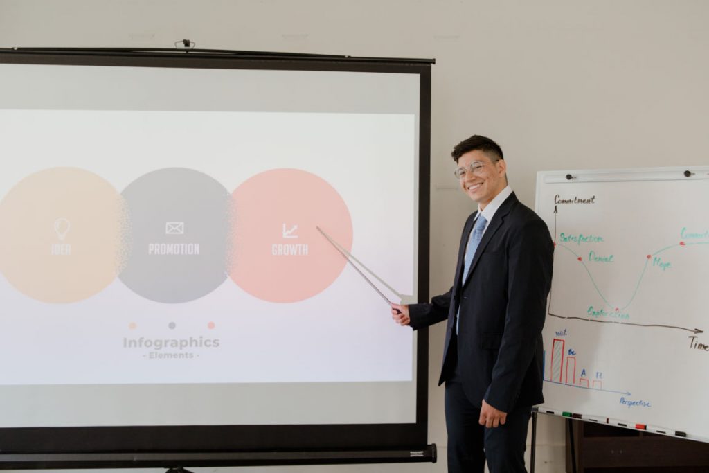
Before you begin creating your presentation, you first need to know what makes effective presentations – storytelling. Such presentations target the audience’s emotions leading to a stronger connection to the audience member and the main point of the presentation.
Below are some storytelling tips for your slides, but remember to keep the presentation itself simple and practice makes perfect. And again, these are more for your spoken component that accompanies the visual component. These tips can be useful because they can be applied to all your presentations in general.
Step 1 is to ask yourself who your audience is and how to convey the key message you have in mind to them. Once you settle on your message, you can start designing your slides with that direction in mind.
You may wonder how to connect with an audience with your slides. Look to your own experiences, your own speaking style and tailor your message to what you know. Not many people want to hear others recite facts with no real meaning driving the story. Ask yourself, “Why does this matter to the audience and why should they care?”.
There is a lot of trust that can be built when the audience has a genuine connection to the presenter. Overall, if you have something that can solve a problem or teach someone complex things, that is enough to form a connection with your audience.
Think of the last app you used, the last email you read or perhaps the last business you purchased from. What was the content or visual elements that pulled you in?
Are you making a PowerPoint, Prezi or other form of visual presentation but it’s taking too much of your time? Enlist the help of Presentation Geeks and consider outsourcing your presentation design . Outsourcing your presentation slides allows you to free more of your time while still getting the results of an interesting presentation. You’ll have the support of expert slide designers who know what presentation visuals work and don’t work thanks to years of presentation feedback and background knowledge.
Color Design Tips For Presentation Slides
When designing your presentation, make sure you take into consideration the colors you’re using. We’ve listed a few background color combinations you might want to consider when developing the overall slide deck and the font to use.
Color Wheel Alignments:
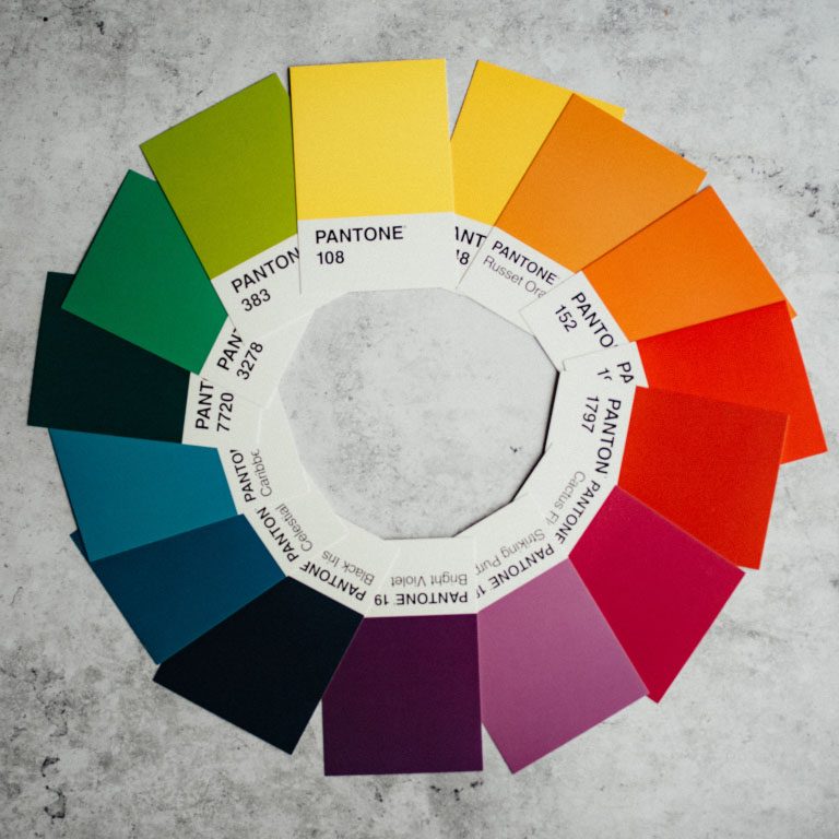
Primary Colors: Red, yellow, blue
Secondary Colors: Green, orange, purple
Tertiary Colors: Yellow-orange, red-orange, red-purple, blue-purple, blue-green & yellow-green
Analogous Colors: These are any three colors which are side by side on a color wheel. (Think green, lime green, yellow)
Complementary Colors: These are colors that are directly opposite of a color wheel. (Think green vs. purple, red vs. blue)
Monochromatic Colors: This is when you use one color and various shades or hues of it. It works well for minimal looks.
Color moods:
Red/Orange/Yellow: Generally these convey a sense of energy, are warm colors and catch your attention. Yellow is a happy warm color on one end and red is very striking and can warn of danger, and symbolizes importance, passion and sometimes violence.
Blue/Purple/Green: These colors are calming, reserved, elegant and often used for corporate slides. Think of how indigo blue is used for many large corporate entities. Green often is branded with earth or medical brands. Purple often conveys a sense of royalty, money and creativity.
Use The Power Of Photography Or Video

Pictures and videos are great visuals to incorporate into any presentation. Remember the saying, “A picture is worth a thousand words”? Well, it’s true! Photos help visualize complex information. You’ll often come across a lot of photos in research presentations as they help the audience understand examples better.
They can also save you from having to put a thousand thoughts into the PowerPoint presentation slide!
The first tip we can give to make a great visual presentation is to choose all your photos before you start. This way you can keep the consistency of the images across your slide deck and make sure they’re somewhat alike in terms of composition, mood and brand.
Use free stock photos
You don’t have to take the photos or videos yourself.
There are plenty of free resources and web pages for stock photos online – Unsplash , Pexels , Pixabay , Free Range , Creative Commons and some photos from Freepik are free to use with some accreditation.
Effective photo use
Make sure you pick an image that will focus on the main theme of the slide. One image is usually enough if the image choice is very relevant to the slide. If you have multiple photos, avoid poor or loose placement of photos all over the slide. Try to use a grid or gallery placement and it will immediately enhance the layout of the slide.
If you pick great images, making presentations can be faster. Instead of having to create an elaborate template with multiple elements, a photo with a couple of bullet points can go a long way in terms of capturing attention and making your presentation slides look professional. This is true on any presentation design platform – whether its PowerPoint, Google Slides, etc.

You can also embed videos whether they’re located on your computer, YouTube, Vimeo or other major video streaming sites. If you’re feeling nervous about your presentation or have a complex message that would be hard to condense in one slide, a video is a dynamic way of conveying your message in any type of presentation.
The Typography You Use Matters
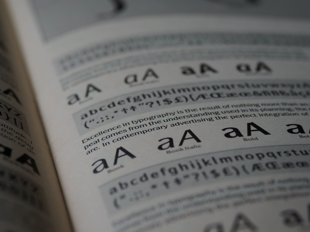
Typography is how you will arrange and present the words in your presentation. An audience can engage when text is readable, functional and works well with the other elements in the presentation. Fonts and sizing are a good place to start establishing the tone of your presentation.
Overview of Font Choices
Elegant fonts often denote a sense of luxury or lifestyle tone. Use script fonts sparingly, but as titles they immediately give this polished and high-end look. This should not be used as body text or something lengthy to read. Think about if you sent an email in that text – it would be tedious to read. However, maybe if it were a title or a way to name email, the choice may be more correct.
Corporate fonts often are traditional, serif fonts or clean sans serif fonts that evoke a sense of trust and a clear message. Think of the fonts Lato, Helvetica or Arial – they’re go-to fonts that are easy to read, and work across many systems. This is especially helpful if you are working across teams when creating content or having to approve the content, idea or visuals.
Of course, you can incorporate more stylistic or playful fonts if you want to give your presentation a personal feel. Much like the scripted font, when used sparingly but in large titles, this choice of font can be very effective at conveying a certain personality.
Adding Symbols & Icons To Your Presentation

You can consolidate information by using symbols or icons to direct your eye to information such as an arrow symbol. What if you used a symbol instead of a bullet point? Think of symbols as anchors for the eye to quickly find information. You can collect symbols off free stock sites or use the built-in ones in PowerPoint that are free to use!
Depending on if your presentation is formal or informal , you may also want to consider adding emojis! Emojis are fun ways to express different emotions and can help connect with a younger demographic.
Overall Branding, Tone of Voice & Consistency
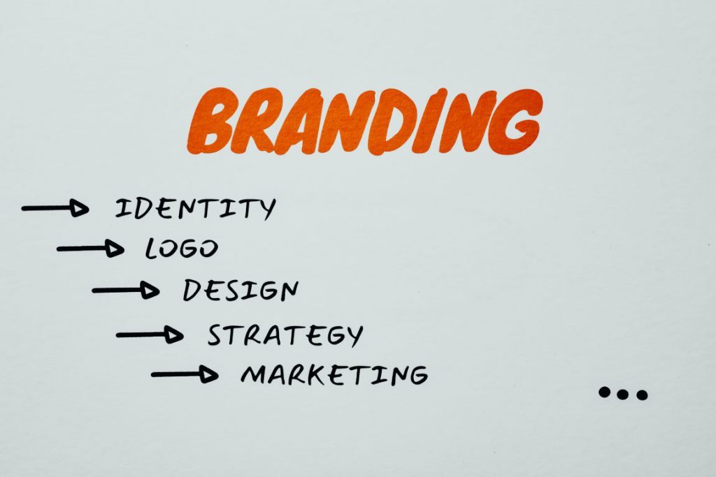
Another tool you may have at your disposal is if your brand, business or company has brand guidelines. It will be the guide and compass to your presentation’s information that goes within it. By keeping consistent you can achieve a polished look even if it looks very simple.
Use your business voice to communicate ideas and set the tone for your presentation. Are you in an investment banking business and want people to rely on the information given to you? That would inform perhaps using blues and purples, which are calmer colors and a cleaner look. Are you an influencer who’s buying power and spending choices matter to your audience? Maybe choosing bright colors with personal touches will make the connection. Are you designing an innovative app? Maybe more interactive slides would do the trick.
Use these questions to make sure your text and tone is consistent as this is a foundation of a well articulated brand or personal identity.
Consistent Hierarchy
Visual hierarchy is how you will arrange objects and text in relation to one another to guide your user and not confuse the objects and how they should read them in your slides. Setting rules helps differentiate and prioritize what’s important in order.
Look at the difference between these two.
Snoop Dogg just launched a wine and it’s coming to Canada
Daily hive branded content | aug 11 2020, 6:30 am.
Australian winery 19 Crimes recently announced that its new Cali Red wine, created in collaboration with Entertainment Icon, entrepreneur, and hip-hop artist Snoop Dogg, will be hitting shelves across Canada later this summer.
The collaboration offers a refreshing take on celebrity partnerships as the apparent shared values and history between the brand and famous rapper make for a perfectly organic pairing.
Comment Name:
By browsing the site, you agree to the use of cookies on this website. see our user agreement for the use of cookies..
You can see a clear distinction in the example below:
Think of hierarchy of a form of narration or story structure. Your eye goes to the title, then to the subtitle, then to the body copy in a logical manner. Where the eye travels is one of those things we don’t think about often. But you can also utilize eye lines in photos. Is your subject in the photo looking left or right? Consider placing text to where your subject is looking and see how effectively your eye travels to that text.
We’ll look at hierarchy strictly as sizing of words for now, but note you can establish hierarchy with type, white space, alignment, etc. As a general rule of thumb, you should have consistent sizing for your Header (or title slide / slide title), your subtitles and your body text. That’s it! If the sizing in your PowerPoint is consistent, your words will look uniform and clean. Everything will be much easier to read and the eye will be trained to move each slide.
Don’t Forget Your Own Style
Also don’t forget to incorporate your own style and what kind of visuals you like. Even if your early visuals may seem simple, build up that design muscle with the basics and design techniques that look clean and consistent.
You’ll find as you design these basics, you’ll probably start noticing other visuals and things you like in other mediums and presentations. Keep a note or screenshot the presentation that inspired you. Create a mood-board that you can refer to in the future for quick idea inspiration. Copying gets a bad rap, but learning how to design something you like even if it’s a clone copy will teach you many things about design. Build a collection of images that informs everything you do: for your color scheme, your designs, the cadence of images, etc.
That being said, you can also use free stock websites like Freepik for some design layouts inspiration. Creative Market is a paid website but the site offers a ton of design inspiration. This site has design templates for what’s currently in and trending. You can subscribe to an email newsletter on either site to get bite sized design influence each day that goes straight to your inbox.
However, don’t be afraid to try something new!
Once you get to a level of comfortable designing, these new ideas will be much easier to execute with the technical knowledge you amassed when you started. You could even try using a new app to design your ideas to keep your knowledge fresh! (Keep in mind that most online apps like SlideShare use cookies to improve functionality and performance.)
Ask your friends or people at your organization to give you feedback and critique, as that’s also crucial to honing your design skills. The people around you also represent different audiences!

The above image looks boring, right?
That’s because there are no visual elements!
Powerful visual presentations can engage audiences psychologically with both the presentation itself and the energy of the presenter. By understanding a few universal design concepts, you can begin your journey creating wonderful visual presentations and becoming a better presenter ! Thanks for reading this blog post, tell us your tips in the comments below.
Author: Content Team
Related posts.

FREE PROFESSIONAL RESOURCES DELIVERED TO YOUR INBOX.
Subscribe for free tips, resources, templates, ideas and more from our professional team of presentation designers.
20 Great Examples of PowerPoint Presentation Design [+ Templates]
Published: August 06, 2024
When it comes to PowerPoint presentation design, there's no shortage of avenues you can take.

While all that choice — colors, formats, visuals, fonts — can feel liberating, it‘s important that you’re careful in your selection as not all design combinations add up to success.
In this blog post, I’m sharing some of my favorite PowerPoint tips and templates to help you nail your next presentation.
Table of Contents
What makes a good PowerPoint presentation?
Powerpoint design ideas, best powerpoint presentation slides, good examples of powerpoint presentation design.
10 Free PowerPoint Templates
Download ten free PowerPoint templates for a better presentation.
- Creative templates.
- Data-driven templates.
- Professional templates.
Download Free
All fields are required.
You're all set!
Click this link to access this resource at any time.
In my opinion, a great PowerPoint presentation gets the point across succinctly while using a design that doesn't detract from it.
Here are some of the elements I like to keep in mind when I’m building my own.
1. Minimal Animations and Transitions
Believe it or not, animations and transitions can take away from your PowerPoint presentation. Why? Well, they distract from the content you worked so hard on.
A good PowerPoint presentation keeps the focus on your argument by keeping animations and transitions to a minimum. I suggest using them tastefully and sparingly to emphasize a point or bring attention to a certain part of an image.
2. Cohesive Color Palette
I like to refresh my memory on color theory when creating a new PowerPoint presentation.
A cohesive color palette uses complementary and analogous colors to draw the audience’s attention and help emphasize certain aspects at the right time.
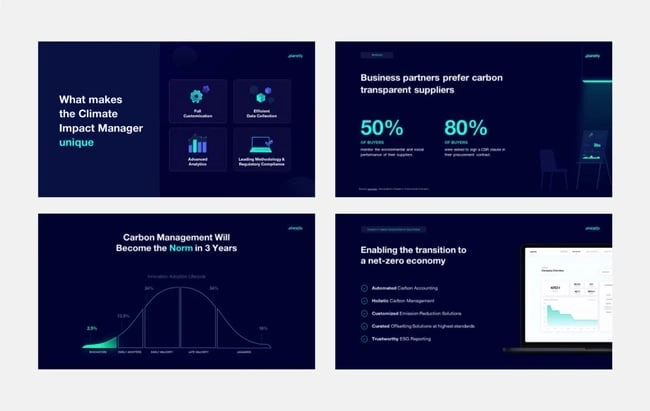
Image source
Mesmerize your audience by adding some neon colors and effects to your PowerPoint slides. Adding pops of color to your presentation will create visual interest and keep your audience engaged.
What I like: Neon will add personality and depth to your presentation and will help the information you're providing stand out and be more memorable.
2. Use an interesting background image.

Do you have some interesting nature photos from a recent road trip? Or maybe a holiday passed, and you have gorgeous photos to share? If so, consider incorporating them into your PowerPoint.
What I like: PowerPoints don't have to be stuffy and boring. They can be fun and a unique or interesting background will enhance the experience of your presentation.
3. Or be minimal.
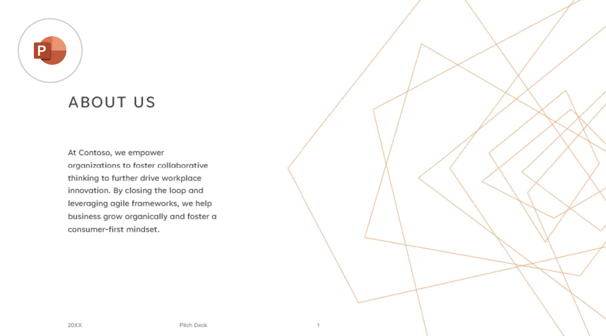
Have you ever heard of K.I.S.S.? Not the band! I mean, Keep It Simple, Sweetheart. If you're worried too many colors or visuals could take attention away from the message of your presentation, consider going minimal.
Pro tip: Stick to no more than three colors if you're going for a minimalist design in your slides.
4. Incorporate illustrations.

Illustrations are a great way to highlight or break down a point in your presentation. They can also add a bit of whimsy and fun to keep viewers engaged.
5. Use all caps.
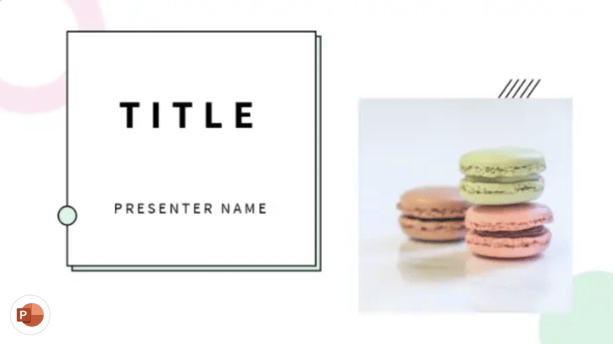
Using all capital letters can draw your audience's eyes to where you need them, helping cement your message in their minds. It can also just be aesthetically pleasing.
Pro tip: If you choose to use all capital letters, use varying fonts so readers can tell which information is important and which are supporting details.
6. Alternate slide layouts
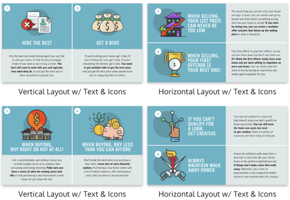
You don't want readers to grow bored with your presentation. So, to retain visual interest, use alternating slide layouts. The example above shows PowerPoint slides alternating between vertical and horizontal layouts.
This keeps things interesting and ensures your presentation isn't monotonous.
7. Inject a little humor.
Humor is a great way to drive a point home and help people remember the information you're presenting. People remember a good joke, so if you have a funny pun to connect to a concept in a presentation, why not use it in a slide?
Pro tip: Remember you're in a professional setting, so keep your jokes appropriate. If you're worried a joke can get you a meeting with HR, then keep it to yourself.
8. Use duotones.

Duotones (or gradience) can take the aesthetic of your PowerPoint to new levels. They can provide a calming energy to your presentation and make viewers feel relaxed and eager to stay focused.
9. Include printed materials.
Let's say you have a PowerPoint you're proud of, but you want to go that extra mile to ensure your audience understands the material. A great way to do this would be to supplement your presentation with printed materials, as such as:
- Pamphlets
- Printed slides
- Short quizzes on the material
10. Keep it to one chart or graph per slide.
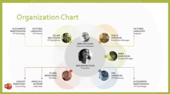
This is both a design example and a warning. Graphs and charts are an excellent way of displaying quantitative data in a digestible format.
However, you should have no more than one graph or chart per slide so your presentation doesn't get too confusing or muddled.
11. Use a large font.
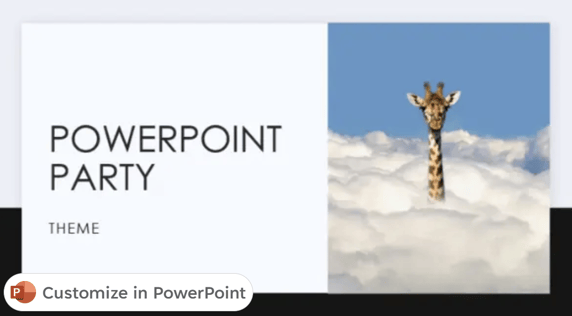
Just like capital letters, a large font will help your shift your audience's focus to key points in your presentation.
Pro tip: You can combine large fonts and capital letters to boost its effectiveness.
12. Include videos.
Embedding a video into your PowerPoint can help you expand on a point or effectively break down a complex topic. You can either embed a video from a platform like YouTube or TikTok or use HubSpot's Clip Creator to make your own.
Pro tip: Try to keep videos short, like, under a minute, and don't use more than one or two.
13. Use GIFs.
GIFs add more visual interest, and they can be a great way to add humor or personal touch to your PowerPoint presentation.
14. Use contrasting colors when comparing two ideas or arguments.

Contrasting colors can convey the difference between two opposing thoughts or arguments in a way that is visually appealing.
15. Add a touch of nature.

If you want your presentation to exude a calming energy to your audience, including images of trees, flowers, and natural landscapes can do the trick.
PowerPoint Theme Ideas
Atlas (theme).
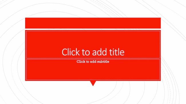
Covering a more creative subject for a younger or more energetic audience? I’d recommend using the cover slide design below. Its vibrant red color blocks and fun lines will appeal to your audience.
This simplistic presentation example employs several different colors and font weights, but instead of coming off as disconnected, the varied colors work with one another to create contrast and call out specific concepts.
What I like: The big, bold numbers help set the reader's expectations, as they clearly signify how far along the viewer is in the list of tips.
10. “Pixar's 22 Rules to Phenomenal Storytelling,” Gavin McMahon
This presentation by Gavin McMahon features color in all the right places. While each of the background images boasts a bright, spotlight-like design, all the characters are intentionally blacked out.
What I like: This helps keep the focus on the tips, while still incorporating visuals. Not to mention, it's still easy for me to identify each character without the details. (I found you on slide eight, Nemo.)
11. “Facebook Engagement and Activity Report,” We Are Social
Here's another great example of data visualization in the wild.
What I like: Rather than displaying numbers and statistics straight up, this presentation calls upon interesting, colorful graphs, and charts to present the information in a way that just makes sense.
12. “The GaryVee Content Model,” Gary Vaynerchuk
This wouldn‘t be a true Gary Vaynerchuk presentation if it wasn’t a little loud, am I right?
What I like: Aside from the fact that I love the eye-catching, bright yellow background, Vaynerchuk does a great job of incorporating screenshots on each slide to create a visual tutorial that coincides with the tips. He also does a great job including a visual table of contents that shows your progress as you go .
13. “20 Tweetable Quotes to Inspire Marketing & Design Creative Genius,” IMPACT Branding & Design
We‘ve all seen our fair share of quote-chronicling presentations but that isn’t to say they were all done well. Often the background images are poor quality, the text is too small, or there isn't enough contrast.
Well, this professional presentation from IMPACT Branding & Design suffers from none of said challenges.
What I like: The colorful filters over each background image create just enough contrast for the quotes to stand out.
14. “The Great State of Design,” Stacy Kvernmo
This presentation offers up a lot of information in a way that doesn't feel overwhelming.
What I like: The contrasting colors create visual interest and “pop,” and the comic images (slides 6 through 12) are used to make the information seem less buttoned-up and overwhelming.
15. “Clickbait: A Guide To Writing Un-Ignorable Headlines,” Ethos3
Not going to lie, it was the title that convinced me to click through to this presentation but the awesome design kept me there once I arrived.
What I like: This simple design adheres to a consistent color pattern and leverages bullet points and varied fonts to break up the text nicely.
16. “Digital Transformation in 50 Soundbites,” Julie Dodd
This design highlights a great alternative to the “text-over-image” display we've grown used to seeing.
What I like: By leveraging a split-screen approach to each presentation slide, Julie Dodd was able to serve up a clean, legible quote without sacrificing the power of a strong visual.
17. “Fix Your Really Bad PowerPoint,” Slide Comet
When you‘re creating a PowerPoint about how everyone’s PowerPoints stink, yours had better be terrific. The one above, based on the ebook by Seth Godin, keeps it simple without boring its audience.
What I like: Its clever combinations of fonts, together with consistent color across each slide, ensure you're neither overwhelmed nor unengaged.
18. “How Google Works,” Eric Schmidt
Simple, clever doodles tell the story of Google in a fun and creative way. This presentation reads almost like a storybook, making it easy to move from one slide to the next.
What I like: This uncluttered approach provides viewers with an easy-to-understand explanation of a complicated topic.
19. “What Really Differentiates the Best Content Marketers From The Rest,” Ross Simmonds
Let‘s be honest: These graphics are hard not to love. I especially appreciate the author’s cartoonified self-portrait that closes out the presentation. Well played, Ross Simmonds.
What I like: Rather than employing the same old stock photos, this unique design serves as a refreshing way to present information that's both valuable and fun.
20. “Be A Great Product Leader,” Adam Nash
This presentation by Adam Nash immediately draws attention by putting the company's logo first — a great move if your company is well known.
What I like: He uses popular images, such as ones of Megatron and Pinocchio, to drive his points home. In the same way, you can take advantage of popular images and media to keep your audience engaged.
And if you want more templates and examples, you can download them here .
PowerPoint Presentation Examples for the Best Slide Presentation
Mastering a PowerPoint presentation begins with the design itself.
Get inspired by my ideas above to create a presentation that engages your audience, builds upon your point, and helps you generate leads for your brand.
Editor's note: This post was originally published in March 2013 and has been updated for comprehensiveness. This article was written by a human, but our team uses AI in our editorial process. Check out our full disclosure to learn more about how we use AI.
Don't forget to share this post!
Related articles.
![visual presentation ppt How to Create the Best PowerPoint Presentations [Examples & Templates]](https://knowledge.hubspot.com/hubfs/powerpoint.webp)
How to Create the Best PowerPoint Presentations [Examples & Templates]
![visual presentation ppt 17 PowerPoint Presentation Tips From Pro Presenters [+ Templates]](https://www.hubspot.com/hubfs/powerpoint-design-tricks_7.webp)
17 PowerPoint Presentation Tips From Pro Presenters [+ Templates]
![visual presentation ppt How to Write an Ecommerce Business Plan [Examples & Template]](https://www.hubspot.com/hubfs/ecommerce%20business%20plan.png)
How to Write an Ecommerce Business Plan [Examples & Template]
![visual presentation ppt How to Create an Infographic in Under an Hour — the 2024 Guide [+ Free Templates]](https://www.hubspot.com/hubfs/Make-infographic-hero%20%28598%20%C3%97%20398%20px%29.jpg)
How to Create an Infographic in Under an Hour — the 2024 Guide [+ Free Templates]

Get Buyers to Do What You Want: The Power of Temptation Bundling in Sales

How to Create an Engaging 5-Minute Presentation
![visual presentation ppt How to Start a Presentation [+ Examples]](https://www.hubspot.com/hubfs/how-to-start-presenting.webp)
How to Start a Presentation [+ Examples]

120 Presentation Topic Ideas Help You Hook Your Audience

The Presenter's Guide to Nailing Your Next PowerPoint
![visual presentation ppt How to Create a Stunning Presentation Cover Page [+ Examples]](https://www.hubspot.com/hubfs/presentation-cover-page_3.webp)
How to Create a Stunning Presentation Cover Page [+ Examples]
Marketing software that helps you drive revenue, save time and resources, and measure and optimize your investments — all on one easy-to-use platform
The Visual Communication Guy
Learn Visually. Communicate Powerfully.

- About The VCG
- Contact Curtis
- Five Paragraph Essay
- IMRaD (Science)
- Indirect Method (Bad News)
- Inverted Pyramid (News)
- Martini Glass
- Narrative Format
- Rogerian Method
- Toulmin Method
- Apostrophes
- Exclamation Marks (Points)
- Parentheses
- Periods (Full Stops)
- Question Marks
- Quotation Marks
- Plain Language
- APPEALS: ETHOS, PATHOS, LOGOS
- CLUSTER ANALYSIS
- FANTASY-THEME
- GENERIC CRITICISM
- IDEOLOGICAL CRITICISM
- NEO-ARISTOTELIAN
- O.P.T.I.C. (VISUAL ANALSYIS)
- S.O.A.P.S.T.O.N.E. (WRITTEN ANALYSIS)
- S.P.A.C.E.C.A.T. (RHETORICAL ANALYSIS)
- BRANCHES OF ORATORY
- FIGURES OF SPEECH
- FIVE CANONS
- LOGICAL FALLACIES
- Information Design Rules
- Arrangement
- Organization
- Negative Space
- Iconography
- Photography
- Which Chart Should I Use?
- “P” is for PREPARE
- "O" is for OPEN
- "W" is for WEAVE
- “E” is for ENGAGE
- PRESENTATION EVALUTION RUBRIC
- POWERPOINT DESIGN
- ADVENTURE APPEAL
- BRAND APPEAL
- ENDORSEMENT APPEAL
- HUMOR APPEAL
- LESS-THAN-PERFECT APPEAL
- MASCULINE & FEMININE APPEAL
- MUSIC APPEAL
- PERSONAL/EMOTIONAL APPEAL
- PLAIN APPEAL
- PLAY-ON-WORDS APPEAL
- RATIONAL APPEAL
- ROMANCE APPEAL
- SCARCITY APPEAL
- SNOB APPEAL
- SOCIAL APPEAL
- STATISTICS APPEAL
- YOUTH APPEAL
- The Six Types of Résumés You Should Know About
- Why Designing Your Résumé Matters
- The Anatomy of a Really Good Résumé: A Good Résumé Example
- What a Bad Résumé Says When It Speaks
- How to Write an Amazing Cover Letter: Five Easy Steps to Get You an Interview
- Make Your Boring Documents Look Professional in 5 Easy Steps
- Business Letters
- CONSUMER PROFILES
- ETHNOGRAPHY RESEARCH
- FOCUS GROUPS
- OBSERVATIONS
- SURVEYS & QUESTIONNAIRES
- S.W.O.T. ANALYSES
- USABILITY TESTS
- CITING SOURCES: MLA FORMAT
- MLA FORMAT: WORKS CITED PAGE
- MLA FORMAT: IN-TEXT CITATIONS
- MLA FORMAT: BOOKS & PAMPHLETS
- MLA FORMAT: WEBSITES AND ONLINE SOURCES
- MLA FORMAT: PERIODICALS
- MLA FORMAT: OTHER MEDIA SOURCES
- Course Syllabi
- Checklists and Peer Reviews (Downloads)
- Communication
- Poster Prints
- Poster Downloads
- Handout & Worksheet Downloads
- QuickGuide Downloads
- Downloads License Agreements

How to Design a PowerPoint: A Visual Guide to Making Slides with Impact
Home > Speaking > How to Design a PowerPoint
A quick Google Images search for “worst PowerPoint slides” proves two very clear realities: 1) anybody can create a PowerPoint; and 2) many don’t know how to do them well.
That’s understandable, though. Unless you’ve recently taken courses or training in design, data visualization, and public speaking, you likely haven’t had any more education on how to create an effective slide deck than a ten-year-old.
And you’re not alone.
Bad PowerPoints are everywhere: professor lectures, science conferences, human resources trainings, team meetings, sales review gatherings, thesis and dissertation defenses, product pitches, job interviews, you name it. Some of the brightest people in the world have created some of the most awful PowerPoints. For most, it’s just not a natural skill.
That’s unfortunate, too, because a well-designed slide deck can make a tremendous difference in the reception of the message you’re trying to convey.
To start designing excellent slide decks right away, follow my quick guide to designing better PowerPoints right after this paragraph. To get a whole workshop’s worth of information about how to design better slides, scroll below. 🙂
Click image to enlarge.

The question is, does designing a nice PowerPoint actually matter?
Well, if you’ve made it this far, you already know my opinion. But the short answer is, YES! Effective slide decks can make a HUGE difference in the outcome of your presentation. Why? Because slides—which should be used to supplement and enhance your well-prepared script (not be the presentation, as we often see in slides that are nothing more than bulleted lists)—significantly improve engagement during the presentation and recall after the presentation.
Basically, if you want people to both pay attention AND remember what you said, good slides can make all the difference. Plus, research has shown that people trust information more when it’s well-designed. In sum, good slides will cause your audience to:
- Pay attention more and stay more engaged;
- Remember the key messages from your presentation better;
- Trust you and your information more; and
- Believe you are super smart and awesome. (I mean, you already are, but good slides will seal the deal.)
Bad slides, on the other hand, are not only distracting, but they can actually damage a person’s ability to understand and follow your message.
At best, poorly designed slides will make you look less professional. At worst, they’ll encourage people to not listen to anything you have to say. Bad slides (which are caused by a whole range of things, including being too text-heavy, too busy, too inconsistent, or too color crazy, etc. [see my article on 40 Ways to Screw Up a PowerPoint Slide ]), overwhelmingly distract from your presentation.
If a slide has too much text, people try to read it and listen to you at the same time—which damages their ability to do either well. If your slides are too busy, your audience won’t be able to understand the information quick enough. If it’s ugly, well…people just tune out and ignore (and judge you, to boot).
Okay, so enough of the why . Let’s get to making better slides!
The 9 Steps to Designing a Better PowerPoint Slide
Step 1: empathize with your audience.

The term “empathy” in this context comes from a relatively new theory called “design thinking,” in which you can apply the mindset of a designer to a variety of contexts. So, whether you’re creating a toothbrush, a video game, an automobile, or…a PowerPoint, you need to be thinking a like a designer—which starts with empathy.
Empathizing with an audience is like applying the Golden Rule: present unto them as you would like to be presented to. Of course, the content of presentation itself comes first and foremost, but the design of your slides should support and enhance your content, so you’ll be thinking of your script and your slides at the same time. To begin, it’s best to start with a few concrete questions about your audience:
- Why are they there? Are they at your presentation because they want to be, or because they have to be? Is your presentation the only one of the day, or is it one of many (like at a conference)? Are they expecting to learn, be entertained, be inspired, be trained? In essence, you want to know their state of mind before coming so you can plan to accommodate that as best you can.
- Why would they care? Dig deep here. Does your audience actually care about the topic as much as you do? And…if you don’t care, why don’t you? If the topic isn’t meaningful and you can’t make it feel that way, then why even present? But…if they do care, know why they do. What will they hope for and expect out of it? What can you do to meet and exceed their expectations?
- What do they need to know? And what DON’T they? How much about your subject do they already know? Are they novices, experts, or a blend of both? Does it make more sense to break your topic into separate presentations on separate days, rather than giving it all at once? Is it focused and narrow enough to make an impact? Can you leave anything that is irrelevant out?
- What will keep them engaged? Consider your content and your big takeaways. Consider the personalities and knowledge base of the audience? What can you do to keep them engaged? Now…remember that “engaged” doesn’t mean “entertained” (though it can). If you’re a scientist presenting on bacterial infections in the liver, entertainment is obviously not appropriate. But…if you don’t engage them, they may not appreciate your research, no matter how valuable it is. What will they want to see, hear, and know and how can you display that to them in a way that will keep them interested?
Once you have clear idea about your audience’s needs and desires, you can begin to develop slides (along with the content of your script) that will give them exactly what they’re looking for rather than wasting their time (and yours).
Step 2: Define the Story

Think of your presentation as a story and you, the presenter, as an author in real time. As you deliver a presentation, you are creating the tone, setting, and plot for what happens. Your execution of the presentation will, if done right, create a climax/conflict and an important resolution. Consider how your slide development functions like the five components of a story, then write down how you plan to control (define) that story:
- The Setting. You create a mood and presence by the way you enter the room, interact with the audience, and display your title. While you may not have full control over who comes and what the room looks like, you do have relative control over the tone and ambiance and how they will react to your message. Consider the title of your presentation. Does it capture your message while also creating a buzz about your topic? Can you add a photo on the title slide that will intrigue your audience? What colors will you use? How do you plan to interact with the slides and how will you keep the audience involved?
- The Characters. You may not know all the people in the room, but you should know as much about them as possible (start with Step 1). Still, you have a way to shape their interest and engagement in this topic. Characters in this story are stakeholders. Your ultimate goal for giving should be one of three things: help them think about something in a new, meaningful way; learn something valuable they didn’t know before; and/or act as a result of what they learned. If you can’t get them to one of those three points, you’ve never really developed the characters.
- The Plot . A plot in storytelling is a series of events that build towards a conclusion. A plot needs to have direction, with clear and meaningful series of events. As you develop your script, you should be thinking about your rhetorical progression of ideas—your building towards a final outcome or conclusion. The development of slides can help you with this and they can help your audience stay on track. The key is, you need to make sure your audience is following the plot. If the plot starts to feel loose, disconnected, fragmented, or…all over the place, you’ll lose them faster than a 0-star rated movie.
- The Conflict. There must be some reason why everyone is there to see you presentation. It’s possible they don’t fully understand it themselves, but you, as the presenter, must make their purpose evidently clear. You must make them care. The more and more you pull them into your subject matter, the more you have effectively built a climax, which is the key to any successful story.
- The Resolution . The resolution is the takeaway—it’s what resolves the conflict. If you’ve built a strong climax, you now need to make sure your audience leaves with something valuable. If they leave thinking in a new, meaningful way; if they have learned something valuable that they can apply today; or if they are ready and knowledgeable about how to act, then the resolution is there and you, the author, have done your job.
Step 3: Brand Your Message

Jeff Bezos is famous for having said, “Brand is what others say about you when you’re not in the room.” You might think similarly about your presentation. How will your audience feel about your presentation afterwards, when you’re not around?
That can be an intimidating question to ask. And, it may seem a little odd to think about your message as a “brand.” But…applying brand theory to messaging makes a lot of sense. You want people to get on board with what you have to say. To do that, you have to establish what they value, what motivates them, and what you’ll have to do meet or exceed their expectations.
Brand experts use a lot of terms to describe and define brands. Let’s address a few, and apply them to slide design:
- Differentiation. How yours is different from the rest. What can you do to make your message stand out from a world of clutter and information? What makes yours unique? Is it your approach, the stories you tell, your language, your humor, your ideas, something else?
- Authenticity . How much you genuinely care. Audiences can tell if you’re passionate or not. They know if you care about both your topic and them learning it. If you fake it, the message gets diluted. Use your slides to help showcase how much you care.
- History . What people already know about you, your topic, or your experience. Do you need to establish credibility, or do you already have it? Do you have experience you can lean into? Does your audience already like/agree with this topic? Is it totally new and unfamiliar to them? How can you bring the history of your topic and yourself into the presentation? Will you audience need a primer on the history or does it matter?
- Simplicity. Making the most important things stick. Good brands almost always have simple logos, simple taglines, and simple brand positioning statements. Many also focus on limited products—they focus on what they do well. Your message can work the same way. Can you simplify your entire message into 2 – 5 key points? Can you reduce the amount of information that has to be taken in all at once? Can you help organize and chunk information to be clearer and simpler to follow? People generally have a hard time remembering complex information all at once—determine what the real purpose of your presentation is and what your audience can reasonably get out of it, then simplify to make sure that happens.
- Visual Identity . Your message, like a brand, can be enhanced if people resonate with the overall look and feel. Just like with buying a brand of shoes, people will be drawn to the design of your information. If it looks static, cliche, poorly design, or just plain ugly, you’ve created an undesirable visual identity and people will have a harder time buying into it. But if you can take your message and harmonize with strong design and imagery, people will be more likely to be attracted by, latch onto, and “buy in” to what you have to say. What should your visual identity look like, considering your topic?
Step 4: Select Your Fonts

The choice of your font may seem a small thing, but it can make the difference between a sleek, professional presentation and one that is static, boring, or, worse, painfully obnoxious.
If you’re not a professional designer, being font savvy may not come natural. Fortunately, there just a few rules you can follow to help you make your choices:
- Avoid the Defaults . In PowerPoint (as in MS Word), the default font is Calibri. Before 2010, the default was Times New Roman. Other programs use Arial or Myriad Pro as the default. What’s wrong with defaults? The fonts themselves are actually fine fonts—that’s why Microsoft went with them. BUT…because they’re the defaults, they are so widely used that they’ve become dull. If you just leave the defaults, your audience will subconsciously feel that you didn’t design your PowerPoint (because you probably didn’t). Just changing the font can bolster your PowerPoint’s professionalism quickly.
- Stick to Simple, Modern Fonts. Okay, so you don’t want to use the defaults, but what DO you use? Something simple. Don’t go crazy. Find something that is similar to the default, with just a little variation. Find something that is super easy to read and looks clean, simple, and sleek. Nothing distracting. Remember: you want people to focus on your story and message, not the lettering. Look at the graphic above for a list of some good, simple, modern fonts. Avoid, at all costs, the notoriously ugly or cliched fonts: Comic Sans; Chiller; Papyrus; Algerian; Curlz MT; and so forth.
- Make Sure Your Fonts Are on the Computer(s) You’re Presenting On. Remember: fonts are installed on individual computers, not attached to a program. A misunderstanding that many people have is that a font comes with PowerPoint (or any other program you’re working on). That’s NOT accurate. Fonts are installed on your computer. So…if you use a cool font that was on your desktop PC, but you are presenting your slides on a MacBook laptop, you’ll want to check that both computers have the font you’re using. Some fonts are pretty standard and you’ll find them on pretty much all computers: Palatino Linotype, Century Gothic, Segoe UI, Garamond. Others, however, are proprietary and may not be on other computers: Acumin Pro, Raleway, Helvetica. If you know you’ll be presenting on multiple different computers, find a standard font. One I’ve always liked to use is Century Gothic.
- Consider Using Two Fonts . The “two-font rule” suggests that designs will be more attractive if they use two fonts—one for headings and titles, the other for body text. You can get away with just one font if you make your headings stand out in some way—by size, weight, or color—but it’s often a nice aesthetic to use two. Just be sure that the two fonts are obviously different from each other (don’t use both Arial AND Century Gothic—they’re too similar, which will look like an accident) and that they harmonize well together. It’s often good to use a serif font (the type with little “feet” like in Palatino Linotype) paired with a sans serif font (the kind without “feet,” like Century Gothic).
Step 5: Narrow Your Colors

A hallmark of any good design is a simple, consistent color scheme. Keep your slide designs to fewer than four colors. Often, it’s good to use black, white, gray, and then one or two accent colors. Years ago, when I was new to design, I had someone tell me that a brochure I created looked like a clown exploded on the page. You DON’T want your slides to look like a clown exploded! To avoid that, find your color scheme in advance and stick to it.
Color can be tricky. If you work for a company that already has a pre-established style guide and color scheme, definitely use it! Not only is that important for your company’s brand, it makes your life a whole lot easier. If you do have to choose colors yourself, though, consider going to this website first: color.adobe.com . You can type things into the “explore” bar and you’ll be led to color schemes that look nice.
What you want to look for are colors that are a bit muted and won’t overwhelm the eyes of your viewers. Remember that you want to keep a high contrast so it doesn’t strain your audience members’ eyes. So…stick to black or really dark gray for text. Keep a white or very light background. Use the accent color for headings or important pieces of content. And…just make sure the colors match your topic or industry.
Step 6: Divide into Sections

Good presentations are well organized. Your slides should visually reflect your organization by using different slide “types” for different parts of your presentation or content.
All presentations should have at least three slide types: a title slide, a body slide, and a closing slide. Most presentations will have a fourth: a section slide. Section slides are used to transition your presentation from one major topic to the next. Many presentations can also benefit from callout slides, which are used to designate unique types of content that show up periodically—like for direct quotes or polling questions to audience members.
If you’ve ever taken a college course on public speaking, you probably remember your professor telling you to use “signposts.” A signpost is a metaphor for visual or oral cues that let your reader know where they’re at in the journey. Signposts keep your audience oriented. Sectioning your slides provides a visual signifier to your audience that you are shifting gears—plus, it just makes your slides feel cohesive, professional, and organized.
Take the time to design your slide types first. Then, fill in the content from your presentation script.
A quick note about body slides, though. These are going to be the most frequently used slides, the ones that you put the majority of your content on. Note that body slides don’t all have to look identical. They need to be consistent in design—repeating the same fonts, colors, photography style, highlights, etc.—but the layouts can change. Providing some visual variation is good for your audience.
Step 7: Visualize Every Slide

One of the biggest errors inexperienced presenters make is believing that audience members need to be able to read a lot of text to understand the message.
The reality is, when you put a lot of text on the screen—even if it’s in a bulleted list—you end up creating more difficulty for your audience. They’ll try to read while also trying to listen to you, creating a conflict of noise that will eventually cause them to only catch about half of what you wanted them to. Plus, a lot of text is boring and not efficient for the human brain.
Research has actually shown (and there is significant evidence to prove this) that making information visual is good for humans for four reasons: engagement, cognition, trust, and recall.
- Visual information is more engaging . Most all people will tell you that they are “visual learners.” The reality is that pretty much all humans are. We pay attention to visual information because our brains are designed to process visual information faster. When you provide visuals—photographs, charts, diagrams, icons, etc.—people will pay far more attention than if you just have text. In fact, if you just have text on a screen, people will likely zone out.
- Visual information is easier to understand. If designed well and related to the topic, people will understand visual information faster than they will from reading. Even as you read this article (assuming you’re still here!), the information that is really going to help you are the visual examples and explanations I’ve added for each section. That’s the stuff where you’ll say, “aha! now I know what Curtis is telling me to do.” All this text—it’s just ancillary stuff to provide more detail. But the photos/graphics are what you’ll really learn from.
- Visualized information builds trust. For better or for worse, humans are wired to trust information more when it has been visualized, especially when it looks professional. If you take a table of data and turn it into a data visualization that is professionally design, people will tend to trust it more. Something about taking the time to visualize information makes people assume you know what you’re talking about. Now, that said, you have to make sure your data visualizations are accurate. The real pitfall here is that people will tend to trust it more, even if it’s misleading. If they discover any flaws, your entire argument (and credibility) will go out the window.
- Visual information is easier to remember . Research studies have shown that visual information will be retained more than six times better if visuals are attached to it. If you actually want people to remember your presentation you must do two things: tell stories and use pictures. If you simply regurgitate information and make it very text-heavy, your audience will forget almost everything you said within three days. If you add pictures, though, they’ll have mental images to trigger memory, helping them retain your message much longer.
Find ways to visualize every chance you can, making sure that your visuals emphasize, clarify, or enhance the content you are talking about. Look at the examples above. Find ways to reduce text and enlarge graphics; turn bullets into images or icons; and use simple, easy to understand graphics that draw attention to the most important point.
Step 8: Play with Photos and Layouts

This is the one that takes the most practice, but it can be the most fun and rewarding. Recognize that your body slides can take multiple forms and that there are endless ways to organize, crop, and adjust visualizations, photos, headings, and designs. As long as you keep your color scheme, fonts, and highlighting techniques consistent, the slides will still feel uniform and professional, while giving variety to your slides.
Some things to think about as you play with the design of your slides:
- CONTRAST: Make sure you use high contrast in colors, especially for areas where you have text (black text on white backgrounds almost always work best). In addition, make sure that things that are different actually look significantly different. If two fonts are different sizes, make them obviously different sizes. If you’re using two colors, make them completely different colors. When two things look similar, there isn’t much contrast, which looks accidental and/or visually dull.
- REPETITION: Repetition is all about consistency in design. Repeat design elements throughout: fonts, colors, highlights, logos, shapes, styles, etc. Repeat the same visual feel for photos. Use the same types of icons and graphics. The more unified the design, the strong the appeal and the more professional you look.
- ALIGNMENT: Make sure everything on your slide is aligned with something else. Nothing should be “floating,” or placed arbitrarily. Align photos to titles, words to other words, rules/lines to other elements. Keep it all tightly aligned and crisp.
- PROXIMITY: Put things that are related close together and things that aren’t apart from each other. The brain will automatically assume that, if two things are next to each other (like a photo and a caption) that they are connected. Avoid confusing your audience by separating things that are different and connecting things that go together.
- Move Photos to the Bleeds . The term “bleed” is a graphic design principle that describes moving photos to the edge of page (where the ink “bleeds” off) in order to reduce visual noise. An old design principles developed by Josef Albers, 1+1=3, suggests that when you insert two objects, you automatically create a third—the space between. When you insert a photo, you end up creating a margin of white space around the edges. If that white space isn’t necessary, just make the image larger and push clear to the edge of the screen. This will remove the margin and the noise. Plus, it just makes slides look simpler and more professional and it really draws the eyes to the photo.
Step 9: Orient Your Audience

In addition to creating section slides (see Step 6 above), you can help your audience—and yourself—stay organized by giving visual cues and textual information in footers, slide counts, and headers or sidebars.
These orienting features of a slide deck can be especially valuable if you’re giving a long presentation, workshop, or training.
Start by creating a footer. These aren’t required and you don’t need them on every slide, but in most costs, presentations will benefit from some information in the footer. Some of the most common things to include in a footer:
- Company logo
- Company name
- Name of presenter
- Name of event or conference
- Title of presentation
- Copyright information
Beyond the footer, you can also include a slide count (in example above, look at the bottom right of the slide). While some argue that this can be distracting, most would say that a slide count will help audience members know how much more to expect, putting their “I’m being held hostage by this presenter!” fears away.
If your presentation is particularly long (like, say, 45 minutes or more) or you’re giving a workshop, you can really help your audience by giving them a sort of contents or guide, so that they know where they’re at in relation to everything else. You might, for example, create a small sidebar on the left that includes the section they’re in with the subsection. Or, as in the example at the top (see top left of example), you might just include which section you’re on and a summary title of that section.
There is no one or perfect way to orient your audience members. Just make sure it’s on the forefront of your mind as you work to build empathy into your slide design. The presentation is for them, after all, not you. Give them as much as you can to help them appreciate the message you’re delivering.
- ← Is a Doctor of Nursing Practice Degree Worth it?
- 6 Things You Should Do to Preserve Your Wealth →
Shop for your perfect poster print or digital download at our online store!

Power of Visual Storytelling in Presentations (+ Free Templates)

Visual storytelling enhances presentations by capturing the audience attention, conveying complex information effectively, and fostering emotional connections.
We’re inherently visual creatures, and we are naturally drawn to images and visuals. That’s why visual storytelling techniques in presentations capture the audience’s attention and sustain their interest throughout the entire session. By utilizing visuals that resonate with the topic or evoke specific emotions, presenters can establish a deeper connection with the audience, leading to increased empathy, motivation, and a stronger impact on their audience.
Table of Contents
Definition and Significance of Visual Storytelling in Presentations
The power of visual storytelling, simplifying complex concepts through visual representations, engaging the audience with visual storytelling techniques, designing effective visual storytelling elements, addressing potential distractions and pitfalls in visual content, ensuring inclusivity and accessibility, tailoring for in-person presentations, optimizing for virtual or online presentations, elevate the power of your visual storytelling with our free templates.
Visual storytelling refers to the use of compelling visuals, such as images, infographics, charts, and videos, to convey information and engage the audience during presentations. It goes beyond simply presenting facts and data by incorporating narrative elements and visual cues to create a more immersive and memorable experience.

The significance of visual storytelling in presentations lies in its ability to enhance communication and leave a lasting impact on the audience.
Visual storytelling in presentations combines the power of visuals with narrative elements to enhance comprehension, engage the audience emotionally, create lasting impressions, and facilitate effective communication. By leveraging storytelling techniques, presenters can deliver impactful presentations that resonate with their audience and leave a lasting impression.
Visual storytelling possesses a remarkable power that can elevate presentations and captivate audiences in various ways. It lies in its ability to captivate attention, enhance comprehension, and evoke emotions.

- Captivating the audience through compelling visuals Storytelling in presentations has the ability to captivate and engage the audience through compelling visuals. Instead of relying solely on text or verbal communication, incorporating visually appealing elements can grab the attention of the audience from the start. Compelling visuals, such as vibrant images, eye-catching graphics, and dynamic animations, help create a visual narrative that draws the audience into the presentation. By using visuals strategically, presenters can create a sense of curiosity and intrigue, sparking the audience’s interest and encouraging them to pay closer attention. Visual storytelling enables presenters to evoke emotions, stimulate imagination, and create a visually immersive experience that keeps the audience actively engaged throughout the presentation.
- Building emotional connections through visual narratives One of the key advantages of visual storytelling is its ability to build emotional connections with the audience. Visuals have a profound impact on our emotions and can evoke powerful responses. By incorporating visual narratives into presentations, presenters can tap into the audience’s emotions, creating a deeper and more meaningful connection. Visual narratives use a sequence of images or visuals to tell a story, evoke empathy, or convey a specific message. They allow presenters to communicate complex ideas, experiences, or concepts in a relatable and emotionally impactful way. Whether through storytelling techniques, relatable characters, or powerful imagery, narrative visualization helps presenters connect with the audience on a personal level, leading to increased engagement, empathy, and understanding.
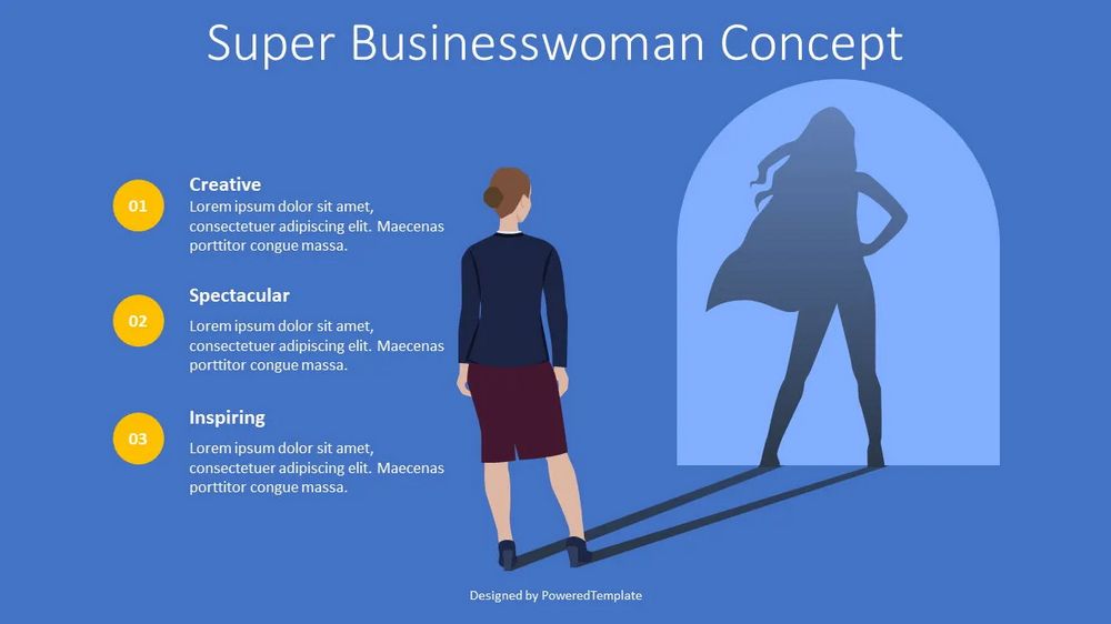
Through captivating visuals and emotional storytelling, presenters can leave a lasting impression on the audience. By leveraging the power of visual storytelling, presenters can make their presentations more memorable, meaningful, and impactful, ultimately influencing the audience’s perception, attitudes, and actions.
Enhancing Information Delivery with Visual Storytelling
Visual storytelling enhances information delivery by simplifying complex concepts and engaging the audience with effective visual techniques. Through the strategic use of visuals, presenters can convey information more efficiently and make it more memorable. Here are two key aspects of enhancing information delivery with visual storytelling.
Complex ideas or data can be challenging to convey in a clear and concise manner. Visual storytelling offers a solution by using visual representations to simplify and distill complex information. By transforming intricate concepts into visual diagrams, charts, or infographics, presenters can break down the information into easily understandable components.
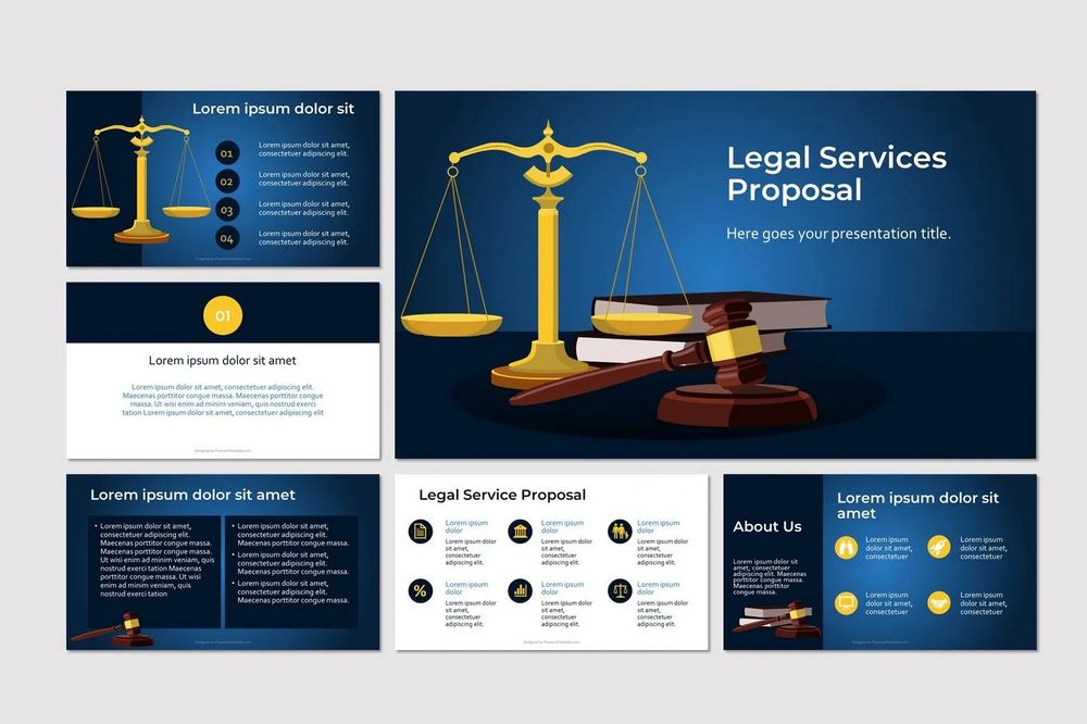
Visual representations enable presenters to emphasize the relationships between different elements, highlight key points, and provide visual cues that aid comprehension. These visuals act as cognitive anchors for the audience, facilitating the organization and processing of information. Through narrative visualization, presenters can effectively communicate complex ideas, making them more accessible and memorable for the audience.
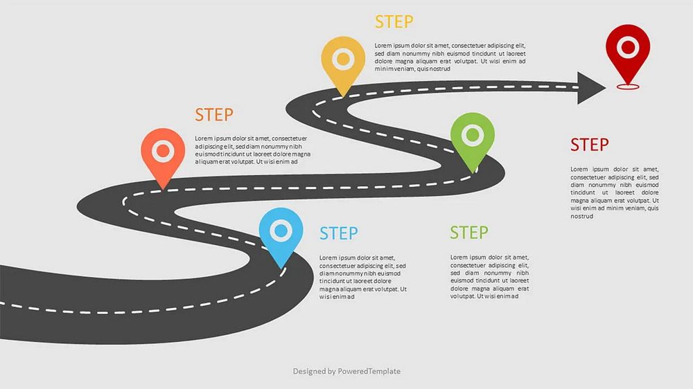
Engagement is crucial for effective information delivery. Visual storytelling techniques can greatly enhance audience engagement by creating a dynamic and interactive presentation experience. Here are some techniques that engage the audience:
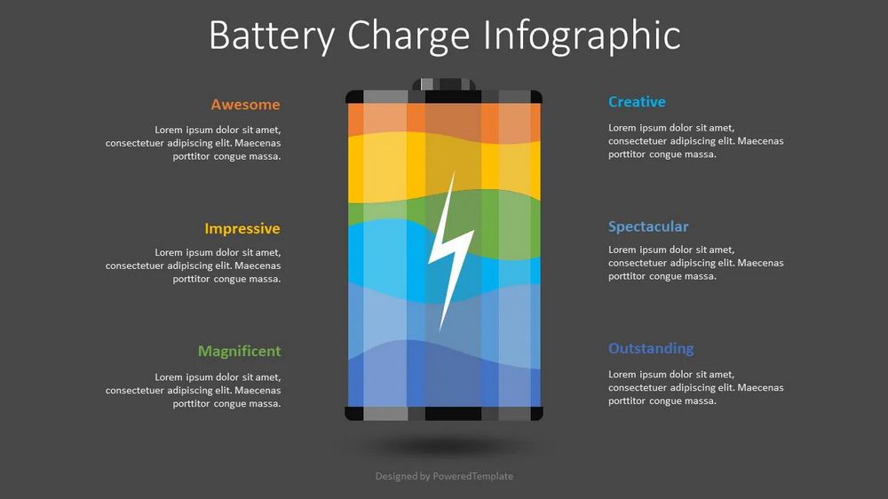
- Visual storytelling frameworks Presenters can structure their presentations around a visual storytelling framework, such as the hero’s journey or a problem-solution narrative. By aligning the content with a compelling narrative structure, presenters can guide the audience through a journey that keeps them engaged and invested in the presentation.
- Interactive visuals Incorporating interactive elements in the visuals, such as clickable elements, animations, or quizzes , encourages active participation and involvement from the audience. This interactivity not only captures attention but also facilitates a deeper understanding and engagement with the content.
- Story-driven examples Using real-life stories, case studies, or examples with vivid visuals helps the audience connect emotionally with the material. Story-driven visuals have a powerful impact on engagement as they make the content relatable, memorable, and relevant to the audience’s own experiences.
- Multimedia integration Integrating multimedia elements, such as videos, audio clips, or animations , into presentations enhances engagement by providing a multi-sensory experience. These elements can convey information in a more engaging and immersive manner, stimulating the audience’s senses and capturing their interest.
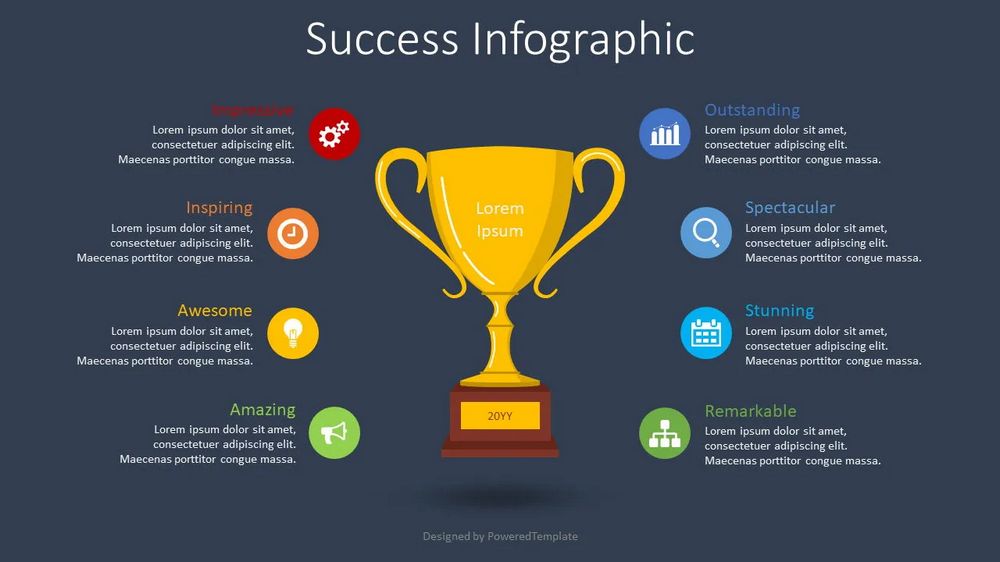
By utilizing narrative visualization techniques, presenters can create an engaging and immersive learning experience for the audience. The combination of simplified visual representations and interactive storytelling techniques enhances information delivery, making presentations more memorable, enjoyable, and effective in conveying key messages.
Design plays a crucial role in visual storytelling within presentations.

By carefully selecting impressive visual effects that align with the message, presenters can create engaging and cohesive narrative elements. This ensures that they effectively support the storytelling, enhance understanding, and contribute to a professional and captivating presentation.
Overcoming Challenges in Visual Storytelling
While visual storytelling in presentations offers numerous benefits, it is essential to address potential challenges and ensure inclusivity and accessibility. This section explores two key aspects of overcoming challenges in narrative visualization:
Visual content, if not carefully executed, can sometimes introduce distractions or pitfalls that hinder the effectiveness of the storytelling. Here are some challenges to consider and strategies to overcome them:
Information overload Overloading presentations with excessive visuals or complex graphics can overwhelm the audience. Presenters should strive for a balance between visuals and textual content, ensuring that visuals enhance rather than overshadow the message. Use visuals strategically and ensure they support the narrative without creating confusion.

Visual clutter When using visuals, it is important to maintain a clean and uncluttered design. Avoid overcrowding slides with too many elements or using busy backgrounds that compete for attention. Prioritize simplicity and visual clarity to guide the audience’s focus and prevent visual distractions.
Inconsistent visual style Inconsistency in visual style can undermine the cohesiveness and impact of the presentation. Establish and adhere to a consistent visual style throughout the slides, including the use of colors, fonts, and graphical elements. Consistency helps create a harmonious and professional visual narrative.
Visual storytelling should be accessible and inclusive to ensure that all audience members can engage with the content. Consider the following strategies:
Alt-text descriptions : Provide alternative text descriptions for visuals, particularly for images, charts, and diagrams. Alt-text helps visually impaired individuals understand the content through screen readers or other assistive technologies.
Color contrast : Ensure sufficient color contrast between text and background to accommodate individuals with visual impairments or color vision deficiencies. This improves readability and accessibility for all audience members.

Text alternatives : Wherever possible, supplement visual content with text-based information to cater to individuals who may prefer or require text-based presentations. Use descriptive captions or bullet points to convey essential information.
Compatibility with assistive technologies : Ensure that visuals are compatible with assistive technologies, such as screen readers or Braille displays. Avoid using visuals that cannot be interpreted by these technologies, and test the presentation with accessibility tools to ensure compatibility.
Consider diverse audiences : Consider the diverse needs and preferences of your audience when selecting visuals. Ensure that visuals are culturally sensitive, inclusive, and representative of a broad range of individuals.
By addressing potential distractions and pitfalls in visual content and ensuring inclusivity and accessibility, presenters can overcome challenges and create visual storytelling experiences that engage and resonate with a diverse audience. Taking these considerations into account enhances the impact and effectiveness of visual storytelling in presentations.
Adapting Visual Storytelling for Different Presentation Formats
Visual storytelling techniques can be adapted to suit different presentation formats, whether in-person or virtual. Here we explore how narrative visualization can be tailored to maximize impact in various presentation formats.
In-person presentations provide the opportunity for direct interaction and engagement with the audience. To make the most of visual storytelling in this format, consider the following:
Large visuals : In a physical setting, utilize large visuals that can be easily seen by all attendees. Use high-quality images, charts, and diagrams that are visually appealing and enhance the overall impact of the presentation.

Visual aids and props : Complement your presentation with physical props or visual aids that can be shared with the audience. These tangible elements can create a multi-sensory experience and strengthen the connection between the story and the audience.
Non-verbal cues : Take advantage of your physical presence to enhance the storytelling through non-verbal cues. Use gestures, facial expressions, and body language to complement and reinforce the narrative, creating a more engaging and memorable experience.
Virtual or online presentations require special considerations to ensure effective visual storytelling in a digital environment. Here are some strategies to optimize visual storytelling for virtual presentations:
Screen sharing : Utilize screen sharing capabilities to present visuals directly to the audience. Ensure that the visuals are clear and well-optimized for online sharing. Zoom in on specific areas of interest or use annotation tools to guide the audience’s attention.
Polls and interactive features : Take advantage of virtual presentation platforms that offer interactive features such as polls, quizzes, or chat functionality. Incorporate these elements strategically to engage the audience, encourage participation, and enhance the overall storytelling experience.
Webcam presence : Leverage your webcam presence to establish a personal connection with the audience. Maintain eye contact, use appropriate facial expressions, and convey enthusiasm and passion for the story being shared. A genuine and engaging webcam presence can significantly enhance the impact of narrative visualization in virtual presentations.
Multimedia integration : Incorporate multimedia elements, such as videos, audio clips, or animations, to enhance the visual storytelling experience in virtual presentations. Ensure that these multimedia elements are well-integrated and compatible with the virtual platform being used.
Adapting narrative visualization techniques to different presentation formats allows presenters to maximize the impact of their narratives and engage the audience effectively, whether in-person or in virtual settings. By tailoring visuals and incorporating interactive elements specific to each format, presenters can create memorable and engaging storytelling experiences that resonate with the audience.
To assist presenters in creating impactful visual storytelling presentations, the PoweredTemplate library offers a collection of free presentation templates . These templates are designed to provide a solid foundation for incorporating narrative visualization techniques into your presentations.
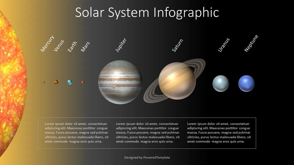
Our templates include a range of pre-designed visual elements, such as images , icons , charts , and diagrams , that can be easily customized to suit your specific content and storytelling needs. These elements help simplify the process of selecting impactful visuals that support your message.
Our templates feature layouts that are specifically designed to support the narrative flow of your presentation. They include sections for introducing the story, building suspense, conveying information visually, and concluding with a strong call to action. These storytelling-oriented layouts guide you in structuring your presentation effectively.
Find the images you need to make standout work. If it’s in your head, it’s on our site.
- Images home
- Curated collections
- AI image generator
- Offset images
- Backgrounds/Textures
- Business/Finance
- Sports/Recreation
- Animals/Wildlife
- Beauty/Fashion
- Celebrities
- Food and Drink
- Illustrations/Clip-Art
- Miscellaneous
- Parks/Outdoor
- Buildings/Landmarks
- Healthcare/Medical
- Signs/Symbols
- Transportation
- All categories
- Editorial video
- Shutterstock Select
- Shutterstock Elements
- Health Care
- PremiumBeat
- Templates Home
- Instagram all
- Highlight covers
- Facebook all
- Carousel ads
- Cover photos
- Event covers
- Youtube all
- Channel Art
- Etsy big banner
- Etsy mini banner
- Etsy shop icon
- Pinterest all
- Pinterest pins
- Twitter all
- Twitter Banner
- Infographics
- Zoom backgrounds
- Announcements
- Certificates
- Gift Certificates
- Real Estate Flyer
- Travel Brochures
- Anniversary
- Baby Shower
- Mother’s Day
- Thanksgiving
- All Invitations
- Party invitations
- Wedding invitations
- Book Covers
- Editorial home
- Entertainment
- About Creative Flow
- Create editor
- Content calendar
- Photo editor
- Background remover
- Collage maker
- Resize image
- Color palettes
- Color palette generator
- Image converter
- Contributors
- PremiumBeat blog
- Invitations
- Design Inspiration
- Design Resources
- Design Elements & Principles
- Contributor Support
- Marketing Assets
- Cards and Invitations
- Social Media Designs
- Print Projects
- Organizational Tools
- Case Studies
- Platform Solutions
- Generative AI
- Computer Vision
- Free Downloads
- Create Fund

How to Make a Beautiful PowerPoint Presentation: A Simple Guide
Ready to craft a beautiful and attention-grabbing powerpoint presentation we’ll walk you through slideshow design tips, show you some tricks to maximize your powerpoint skills, and give you everything you need to look really good next time you’re up in front of a crowd..
In this post, we’ll cover:
Key Elements of Winning PowerPoints
Illustrative, not generic, supportive, not distracting, inspiring and engaging, other considerations when creating a slideshow.
How many times have you sat through a poorly designed business presentation that was dull, cluttered, and distracting? Probably way too many. Even though we all loathe a boring presentation, when it comes time to make our own, do we really do any better?
The good news is you don’t have to be a professional designer to make professional presentations. We’ve put together a few simple guidelines you can follow to create a beautifully assembled deck.
We’ll walk you through some slide design tips, show you tricks to maximize your PowerPoint skills, and give you everything you need to look really good next time you’re up in front of a crowd.
And, while PowerPoint remains one of the biggest names in presentation software, many of these design elements and principles work in Google Slides, as well.
Let’s dive right in.
1. Use Layout to Your Advantage
Layout is one of the most powerful visual elements in design, and it’s a simple, effective way to control the flow and visual hierarchy of information. It’s also one of the most important elements to consider when thinking about how to make your PowerPoint look better.
For example, most Western languages read left to right, top to bottom. Knowing this natural reading order, you can direct people’s eyes in a deliberate way to certain key parts of a slide that you want to emphasize.
You can also guide your audience with simple tweaks to the layout. Use text size and alternating fonts or colors to distinguish headlines from body text.
Placement also matters. There are many unorthodox ways to structure a slide, but most audience members will have to take a few beats to organize the information in their head—that’s precious time better spent listening to your delivery and retaining information.
Try to structure your slides more like this:

And not like this:

Layout is one of the trickier PowerPoint design concepts to master, which is why we have these free PowerPoint templates already laid out for you. Use them as a jumping off point for your own presentation, or use them wholesale!
Presentation templates can give you a huge leg up as you start working on your design.
2. No Sentences
This is one of the most critical slide design tips. Slides are simplified, visual notecards that capture and reinforce main ideas, not complete thoughts.
As the speaker, you should be delivering most of the content and information, not putting it all on the slides for everyone to read (and probably ignore). If your audience is reading your presentation instead of listening to you deliver it, your message has lost its effectiveness.
Pare down your core message and use keywords to convey it. Try to avoid complete sentences unless you’re quoting someone or something.
Stick with this:

And avoid this:

3. Follow the 6×6 Rule
One of the cardinal sins of a bad PowerPoint is cramming too many details and ideas on one slide, which makes it difficult for people to retain information. Leaving lots of “white space” on a slide helps people focus on your key points.
Try using the 6×6 rule to keep your content concise and clean looking. The 6×6 rule means a maximum of six bullet points per slide and six words per bullet. In fact, some people even say you should never have more than six words per slide!
Just watch out for “orphans” (when the last word of a sentence/phrase spills over to the next line). This looks cluttered. Either fit it onto one line or add another word to the second line.

Slides should never have this much information:

4. Keep the Colors Simple
Stick to simple light and dark colors and a defined color palette for visual consistency. Exceptionally bright text can cause eye fatigue, so use those colors sparingly. Dark text on a light background or light text on a dark background will work well. Also avoid intense gradients, which can make text hard to read.
If you’re presenting on behalf of your brand, check what your company’s brand guidelines are. Companies often have a primary brand color and a secondary brand color , and it’s a good idea to use them in your presentation to align with your company’s brand identity and style.
If you’re looking for color inspiration for your next presentation, check out our 101 Color Combinations , where you can browse tons of eye-catching color palettes curated by a pro. When you find the one you like, just type the corresponding color code into your presentation formatting tools.
Here are more of our favorite free color palettes for presentations:
- 10 Color Palettes to Nail Your Next Presentation
- 10 Energizing Sports Color Palettes for Branding and Marketing
- 10 Vintage Color Palettes Inspired by the Decades
No matter what color palette or combination you choose, you want to keep the colors of your PowerPoint presentation simple and easy to read, like this:

Stay away from color combinations like this:

5. Use Sans-Serif Fonts
Traditionally, serif fonts (Times New Roman, Garamond, Bookman) are best for printed pages, and sans-serif fonts (Helvetica, Tahoma, Verdana) are easier to read on screens.
These are always safe choices, but if you’d like to add some more typographic personality , try exploring our roundup of the internet’s best free fonts . You’ll find everything from classic serifs and sans serifs to sophisticated modern fonts and splashy display fonts. Just keep legibility top of mind when you’re making your pick.
Try to stick with one font, or choose two at the most. Fonts have very different personalities and emotional impacts, so make sure your font matches the tone, purpose, and content of your presentation.

6. Stick to 30pt Font or Larger
Many experts agree that your font size for a PowerPoint presentation should be at least 30pt. Sticking to this guideline ensures your text is readable. It also forces you, due to space limitations, to explain your message efficiently and include only the most important points. .

7. Avoid Overstyling the Text
Three of the easiest and most effective ways to draw attention to text are:
- A change in color
Our eyes are naturally drawn to things that stand out, but use these changes sparingly. Overstyling can make the slide look busy and distracting.

8. Choose the Right Images
The images you choose for your presentation are perhaps as important as the message. You want images that not only support the message, but also elevate it—a rare accomplishment in the often dry world of PowerPoint.
But, what is the right image? We’ll be honest. There’s no direct answer to this conceptual, almost mystical subject, but we can break down some strategies for approaching image selection that will help you curate your next presentation.
The ideal presentation images are:
- Inspirational

These may seem like vague qualities, but the general idea is to go beyond the literal. Think about the symbols in an image and the story they tell. Think about the colors and composition in an image and the distinct mood they set for your presentation.
With this approach, you can get creative in your hunt for relatable, authentic, and inspirational images. Here are some more handy guidelines for choosing great images.
Tips on Making Beautiful PowerPoint Presentations
So, the slide in question is about collaborating as a team. Naturally, you look for images of people meeting in a boardroom, right?
While it’s perfectly fine to go super literal, sometimes these images fall flat—what’s literal doesn’t necessarily connect to your audience emotionally. Will they really respond to generic images of people who aren’t them meeting in a boardroom?
In the absence of a photo of your actual team—or any other image that directly illustrates the subject at hand—look for images of convincing realism and humanity that capture the idea of your message.
Doing so connects with viewers, allowing them to connect with your message. This is one way to learn how to make your PowerPoint stand out and ensure a dynamic presentation PowerPoint.

The image above can be interpreted in many ways. But, when we apply it to slide layout ideas about collaboration, the meaning is clear.
It doesn’t hurt that there’s a nice setting and good photography, to boot.
Now that we’ve told you to get creative with your image selection, the next lesson is to rein that in. While there are infinite choices of imagery out there, there’s a limit to what makes sense in your presentation.
Let’s say you’re giving an IT presentation to new employees. You might think that image of two dogs snuggling by a fire is relatable, authentic, and inspirational, but does it really say “data management” to your audience?
To find the best supporting images, try searching terms on the periphery of your actual message. You’ll find images that complement your message rather than distract from it.
In the IT presentation example, instead of “data connections” or another literal term, try the closely related “traffic” or “connectivity.” This will bring up images outside of tech, but relative to the idea of how things move.

There’s a widespread misconception that business presentations are just about delivering information. Well, they’re not. In fact, a great presentation is inspirational. We don’t mean that your audience should be itching to paint a masterpiece when they’re done. In this case, inspiration is about engagement.
Is your audience asking themselves questions? Are they coming up with new ideas? Are they remembering key information to tap into later? You’ll drive a lot of this engagement with your actual delivery, but unexpected images can play a role, as well.
When you use more abstract or aspirational images, your audience will have room to make their own connections. This not only means they’re paying attention, but they’re also engaging with and retaining your message.
To find the right abstract or unconventional imagery, search terms related to the tone of the presentation. This may include images with different perspectives like overhead shots and aerials, long exposures taken over a period of time, nature photos , colorful markets , and so on.

The big idea here is akin to including an image of your adorable dog making a goofy face at the end of an earnings meeting. It leaves an audience with a good, human feeling after you just packed their brains with data.
Use that concept of pleasant surprise when you’re selecting images for your presentation.

Setting Appropriate Image Resolution in PowerPoint
Want to learn how to make a PowerPoint look good? Though you can drag-and-drop images into PowerPoint, you can control the resolution displayed within the file.
All of your PowerPoint slide layout ideas should get the same treatment to be equal in size.
Simply click File > Compress Pictures in the main application menu.

If your presentation file is big and will only be viewed online, you can take it down to On-screen , then check the Apply to: All pictures in this file , and rest assured the quality will be uniform.

This resolution is probably fine for proofing over email, but too low for your presentation layout ideas. For higher res in printed form, try the Print setting, which at 220 PPI is extremely good quality.
For large-screens such as projection, use the HD setting, since enlarging to that scale will show any deficiencies in resolution. Low resolution can not only distract from the message, but it looks low-quality and that reflects on the presenter.
If size is no issue for you, use High Fidelity (maximum PPI), and only reduce if the file size gives your computer problems.

The image quality really begins when you add the images to the presentation file. Use the highest quality images you can, then let PowerPoint scale the resolution down for you, reducing the excess when set to HD or lower.
Resizing, Editing, and Adding Effects to Images in PowerPoint
PowerPoint comes with an arsenal of tools to work with your images. When a picture is selected, the confusingly named Picture Format menu is activated in the top menu bar, and Format Picture is opened on the right side of the app window.

In the Format Picture menu (on the right) are four sections, and each of these sections expand to show their options by clicking the arrows by the name:
- Fill & Line (paint bucket icon): Contains options for the box’s colors, patterns, gradients, and background fills, along with options for its outline.
- Effects (pentagon icon): Contains Shadow, Reflection, Glow, Soft Edges, 3-D Format and Rotation, and Artistic Effects.
- Size & Properties (dimensional icon): Size, Position, and Text Box allow you to control the physical size and placement of the picture or text boxes.
- Picture (mountain icon): Picture Corrections, Colors, and Transparency give you control over how the image looks. Under Crop, you can change the size of the box containing the picture, instead of the entire picture itself as in Size & Properties above.
The menu at the top is more expansive, containing menu presets for Corrections, Color, Effects, Animation, and a lot more. This section is where you can crop more precisely than just choosing the dimensions from the Picture pane on the right.
Cropping Images in PowerPoint
The simple way to crop an image is to use the Picture pane under the Format Picture menu on the right side of the window. Use the Picture Position controls to move the picture inside its box, or use the Crop position controls to manipulate the box’s dimensions.

To exert more advanced control, or use special shapes, select the picture you want to crop, then click the Picture Format in the top menu to activate it.

Hit the Crop button, then use the controls on the picture’s box to size by eye. Or, click the arrow to show more options, including changing the shape of the box (for more creative looks) and using preset aspect ratios for a more uniform presentation of images.

The next time you design a PowerPoint presentation, remember that simplicity is key and less is more. By adopting these simple slide design tips, you’ll deliver a clear, powerful visual message to your audience.
If you want to go with a PowerPoint alternative instead, you can use Shutterstock Create to easily craft convincing, engaging, and informative presentations.
With many presentation template designs, you’ll be sure to find something that is a perfect fit for your next corporate presentation. You can download your designs as a .pdf file and import them into both PowerPoint and Google Slides presentation decks.
PowerPoint Presentations FAQs
What is the 5 5 5 rule in powerpoint.
The 5 5 5 rule in PowerPoint is fairly simple: 5 lines per slide, each line with no more than 5 words, and make sure your presentation is no longer than 5 minutes.
How long should your PowerPoint be?
A PowerPoint can be as long as it needs to be, but some people—and the 5 5 5 rule—advise you to keep five minutes or shorter.
What is the easiest way to make a PowerPoint prettier?
Beyond using eye-catching imagery and colors, a pretty PowerPoint should also follow good design principles. You want the information to be organized, balanced, and easy to digest. It doesn’t matter how many appealing images you include are if the information is hard to internalize. Use appropriate fonts and shorts sentences to make sure the words are legible and don’t crowd the slides with too many elements.
License this cover image via F8 studio and Ryan DeBerardinis .
Recently viewed
Related Posts

Light Painting Photography Ideas: Easy Tips to Get Started
Light painting photography is a type of long exposure photography…

What Is the Bokeh Effect and How to Achieve It in Photos
Ethereal and dreamlike, the bokeh effect is a specific photographic…

How to Use Color Saturation to Enhance Your Photos
Color saturation refers to the intensity of color in an…

11 Profile Picture Ideas to Stand Out on Any Platform
While social media is designed to be fun and casual,…
© 2023 Shutterstock Inc. All rights reserved.
- Terms of use
- License agreement
- Privacy policy
- Social media guidelines
We use essential cookies to make Venngage work. By clicking “Accept All Cookies”, you agree to the storing of cookies on your device to enhance site navigation, analyze site usage, and assist in our marketing efforts.
Manage Cookies
Cookies and similar technologies collect certain information about how you’re using our website. Some of them are essential, and without them you wouldn’t be able to use Venngage. But others are optional, and you get to choose whether we use them or not.
Strictly Necessary Cookies
These cookies are always on, as they’re essential for making Venngage work, and making it safe. Without these cookies, services you’ve asked for can’t be provided.
Show cookie providers
- Google Login
Functionality Cookies
These cookies help us provide enhanced functionality and personalisation, and remember your settings. They may be set by us or by third party providers.
Performance Cookies
These cookies help us analyze how many people are using Venngage, where they come from and how they're using it. If you opt out of these cookies, we can’t get feedback to make Venngage better for you and all our users.
- Google Analytics
Targeting Cookies
These cookies are set by our advertising partners to track your activity and show you relevant Venngage ads on other sites as you browse the internet.
- Google Tag Manager
- Infographics
- Daily Infographics
- Popular Templates
- Accessibility
- Graphic Design
- Graphs and Charts
- Data Visualization
- Human Resources
- Beginner Guides
Blog Beginner Guides How To Make a Good Presentation [A Complete Guide]
How To Make a Good Presentation [A Complete Guide]
Written by: Krystle Wong Jul 20, 2023

A top-notch presentation possesses the power to drive action. From winning stakeholders over and conveying a powerful message to securing funding — your secret weapon lies within the realm of creating an effective presentation .
Being an excellent presenter isn’t confined to the boardroom. Whether you’re delivering a presentation at work, pursuing an academic career, involved in a non-profit organization or even a student, nailing the presentation game is a game-changer.
In this article, I’ll cover the top qualities of compelling presentations and walk you through a step-by-step guide on how to give a good presentation. Here’s a little tip to kick things off: for a headstart, check out Venngage’s collection of free presentation templates . They are fully customizable, and the best part is you don’t need professional design skills to make them shine!
These valuable presentation tips cater to individuals from diverse professional backgrounds, encompassing business professionals, sales and marketing teams, educators, trainers, students, researchers, non-profit organizations, public speakers and presenters.
No matter your field or role, these tips for presenting will equip you with the skills to deliver effective presentations that leave a lasting impression on any audience.
Click to jump ahead:
What are the 10 qualities of a good presentation?
Step-by-step guide on how to prepare an effective presentation, 9 effective techniques to deliver a memorable presentation, faqs on making a good presentation, how to create a presentation with venngage in 5 steps.
When it comes to giving an engaging presentation that leaves a lasting impression, it’s not just about the content — it’s also about how you deliver it. Wondering what makes a good presentation? Well, the best presentations I’ve seen consistently exhibit these 10 qualities:
1. Clear structure
No one likes to get lost in a maze of information. Organize your thoughts into a logical flow, complete with an introduction, main points and a solid conclusion. A structured presentation helps your audience follow along effortlessly, leaving them with a sense of satisfaction at the end.
Regardless of your presentation style , a quality presentation starts with a clear roadmap. Browse through Venngage’s template library and select a presentation template that aligns with your content and presentation goals. Here’s a good presentation example template with a logical layout that includes sections for the introduction, main points, supporting information and a conclusion:

2. Engaging opening
Hook your audience right from the start with an attention-grabbing statement, a fascinating question or maybe even a captivating anecdote. Set the stage for a killer presentation!
The opening moments of your presentation hold immense power – check out these 15 ways to start a presentation to set the stage and captivate your audience.
3. Relevant content
Make sure your content aligns with their interests and needs. Your audience is there for a reason, and that’s to get valuable insights. Avoid fluff and get straight to the point, your audience will be genuinely excited.
4. Effective visual aids
Picture this: a slide with walls of text and tiny charts, yawn! Visual aids should be just that—aiding your presentation. Opt for clear and visually appealing slides, engaging images and informative charts that add value and help reinforce your message.
With Venngage, visualizing data takes no effort at all. You can import data from CSV or Google Sheets seamlessly and create stunning charts, graphs and icon stories effortlessly to showcase your data in a captivating and impactful way.
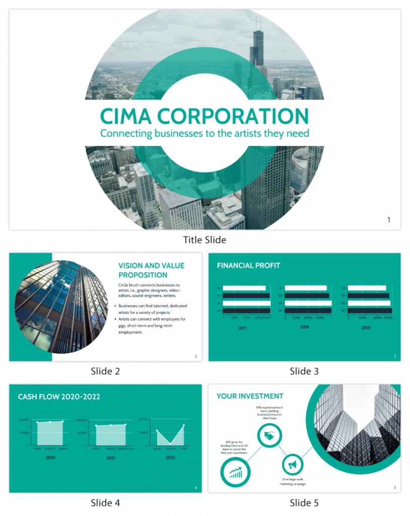
5. Clear and concise communication
Keep your language simple, and avoid jargon or complicated terms. Communicate your ideas clearly, so your audience can easily grasp and retain the information being conveyed. This can prevent confusion and enhance the overall effectiveness of the message.
6. Engaging delivery
Spice up your presentation with a sprinkle of enthusiasm! Maintain eye contact, use expressive gestures and vary your tone of voice to keep your audience glued to the edge of their seats. A touch of charisma goes a long way!
7. Interaction and audience engagement
Turn your presentation into an interactive experience — encourage questions, foster discussions and maybe even throw in a fun activity. Engaged audiences are more likely to remember and embrace your message.
Transform your slides into an interactive presentation with Venngage’s dynamic features like pop-ups, clickable icons and animated elements. Engage your audience with interactive content that lets them explore and interact with your presentation for a truly immersive experience.
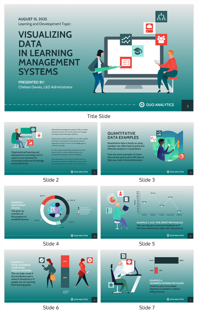
8. Effective storytelling
Who doesn’t love a good story? Weaving relevant anecdotes, case studies or even a personal story into your presentation can captivate your audience and create a lasting impact. Stories build connections and make your message memorable.
A great presentation background is also essential as it sets the tone, creates visual interest and reinforces your message. Enhance the overall aesthetics of your presentation with these 15 presentation background examples and captivate your audience’s attention.
9. Well-timed pacing
Pace your presentation thoughtfully with well-designed presentation slides, neither rushing through nor dragging it out. Respect your audience’s time and ensure you cover all the essential points without losing their interest.
10. Strong conclusion
Last impressions linger! Summarize your main points and leave your audience with a clear takeaway. End your presentation with a bang , a call to action or an inspiring thought that resonates long after the conclusion.
In-person presentations aside, acing a virtual presentation is of paramount importance in today’s digital world. Check out this guide to learn how you can adapt your in-person presentations into virtual presentations .
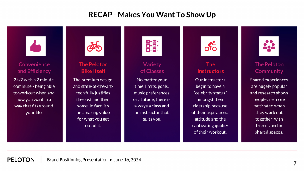
Preparing an effective presentation starts with laying a strong foundation that goes beyond just creating slides and notes. One of the quickest and best ways to make a presentation would be with the help of a good presentation software .
Otherwise, let me walk you to how to prepare for a presentation step by step and unlock the secrets of crafting a professional presentation that sets you apart.
1. Understand the audience and their needs
Before you dive into preparing your masterpiece, take a moment to get to know your target audience. Tailor your presentation to meet their needs and expectations , and you’ll have them hooked from the start!
2. Conduct thorough research on the topic
Time to hit the books (or the internet)! Don’t skimp on the research with your presentation materials — dive deep into the subject matter and gather valuable insights . The more you know, the more confident you’ll feel in delivering your presentation.
3. Organize the content with a clear structure
No one wants to stumble through a chaotic mess of information. Outline your presentation with a clear and logical flow. Start with a captivating introduction, follow up with main points that build on each other and wrap it up with a powerful conclusion that leaves a lasting impression.
Delivering an effective business presentation hinges on captivating your audience, and Venngage’s professionally designed business presentation templates are tailor-made for this purpose. With thoughtfully structured layouts, these templates enhance your message’s clarity and coherence, ensuring a memorable and engaging experience for your audience members.
Don’t want to build your presentation layout from scratch? pick from these 5 foolproof presentation layout ideas that won’t go wrong.
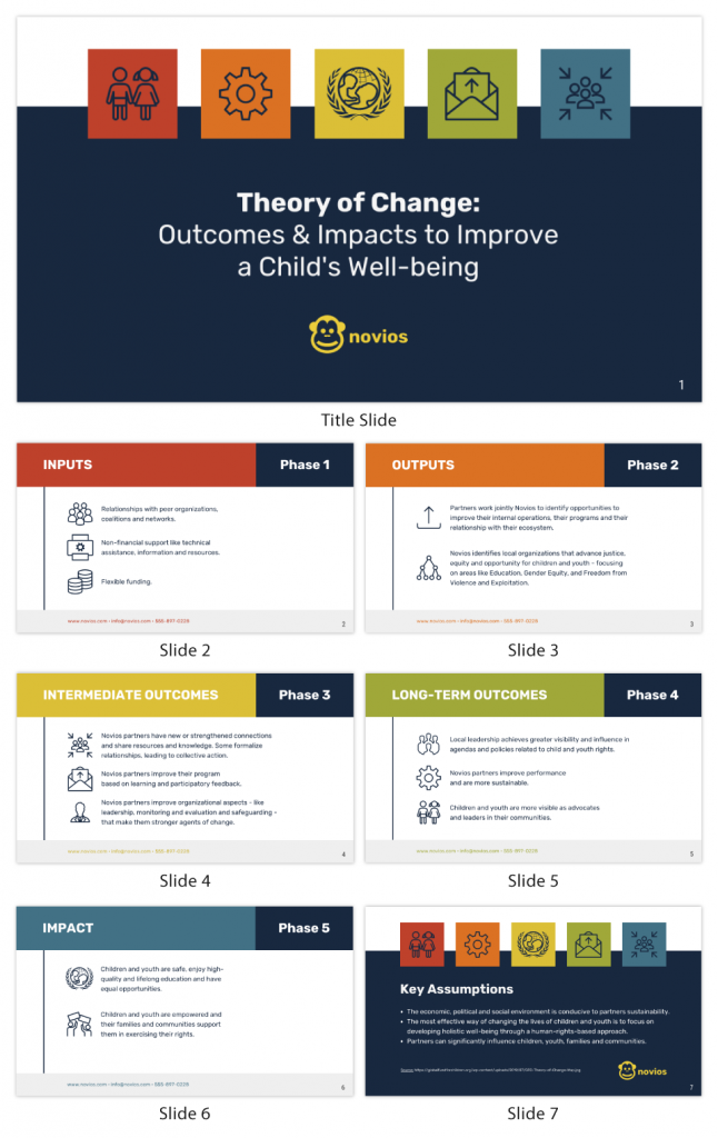
4. Develop visually appealing and supportive visual aids
Spice up your presentation with eye-catching visuals! Create slides that complement your message, not overshadow it. Remember, a picture is worth a thousand words, but that doesn’t mean you need to overload your slides with text.
Well-chosen designs create a cohesive and professional look, capturing your audience’s attention and enhancing the overall effectiveness of your message. Here’s a list of carefully curated PowerPoint presentation templates and great background graphics that will significantly influence the visual appeal and engagement of your presentation.
5. Practice, practice and practice
Practice makes perfect — rehearse your presentation and arrive early to your presentation to help overcome stage fright. Familiarity with your material will boost your presentation skills and help you handle curveballs with ease.
6. Seek feedback and make necessary adjustments
Don’t be afraid to ask for help and seek feedback from friends and colleagues. Constructive criticism can help you identify blind spots and fine-tune your presentation to perfection.
With Venngage’s real-time collaboration feature , receiving feedback and editing your presentation is a seamless process. Group members can access and work on the presentation simultaneously and edit content side by side in real-time. Changes will be reflected immediately to the entire team, promoting seamless teamwork.
7. Prepare for potential technical or logistical issues
Prepare for the unexpected by checking your equipment, internet connection and any other potential hiccups. If you’re worried that you’ll miss out on any important points, you could always have note cards prepared. Remember to remain focused and rehearse potential answers to anticipated questions.
8. Fine-tune and polish your presentation
As the big day approaches, give your presentation one last shine. Review your talking points, practice how to present a presentation and make any final tweaks. Deep breaths — you’re on the brink of delivering a successful presentation!
In competitive environments, persuasive presentations set individuals and organizations apart. To brush up on your presentation skills, read these guides on how to make a persuasive presentation and tips to presenting effectively .
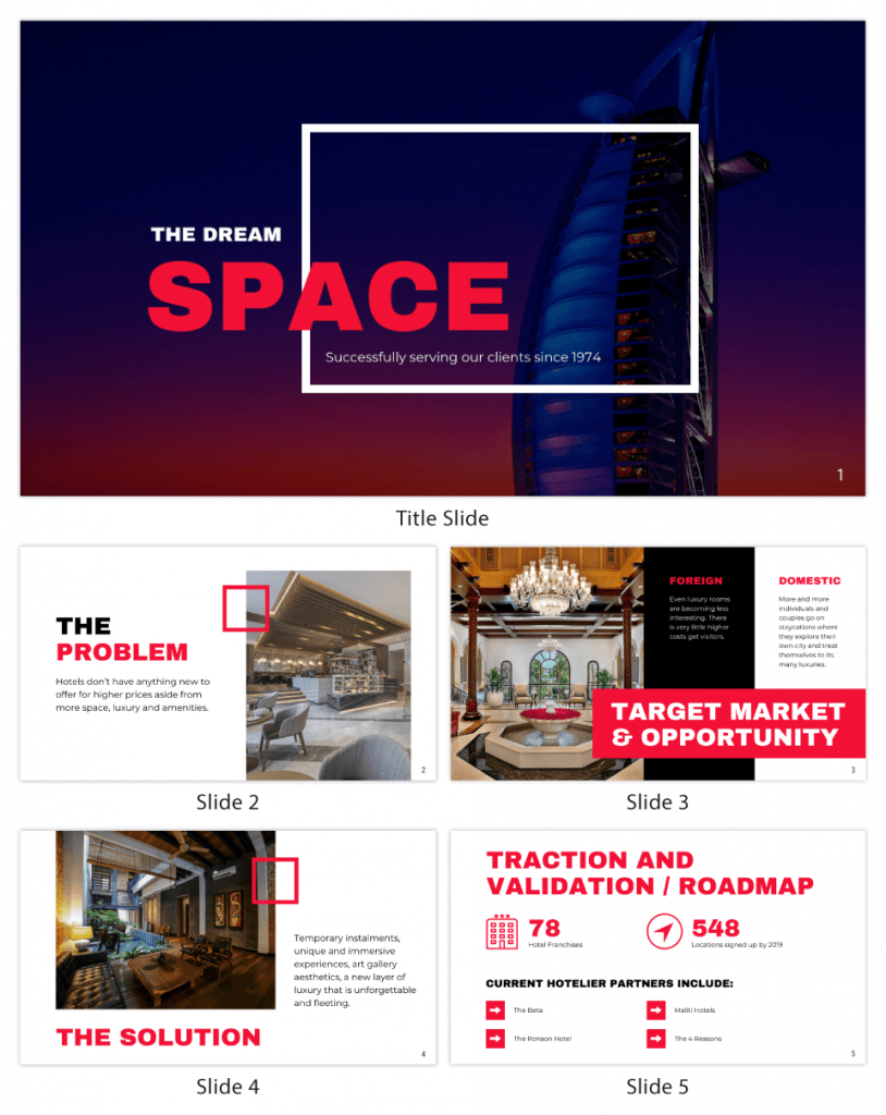
Whether you’re an experienced presenter or a novice, the right techniques will let your presentation skills soar to new heights!
From public speaking hacks to interactive elements and storytelling prowess, these 9 effective presentation techniques will empower you to leave a lasting impression on your audience and make your presentations unforgettable.
1. Confidence and positive body language
Positive body language instantly captivates your audience, making them believe in your message as much as you do. Strengthen your stage presence and own that stage like it’s your second home! Stand tall, shoulders back and exude confidence.
2. Eye contact with the audience
Break down that invisible barrier and connect with your audience through their eyes. Maintaining eye contact when giving a presentation builds trust and shows that you’re present and engaged with them.
3. Effective use of hand gestures and movement
A little movement goes a long way! Emphasize key points with purposeful gestures and don’t be afraid to walk around the stage. Your energy will be contagious!
4. Utilize storytelling techniques
Weave the magic of storytelling into your presentation. Share relatable anecdotes, inspiring success stories or even personal experiences that tug at the heartstrings of your audience. Adjust your pitch, pace and volume to match the emotions and intensity of the story. Varying your speaking voice adds depth and enhances your stage presence.
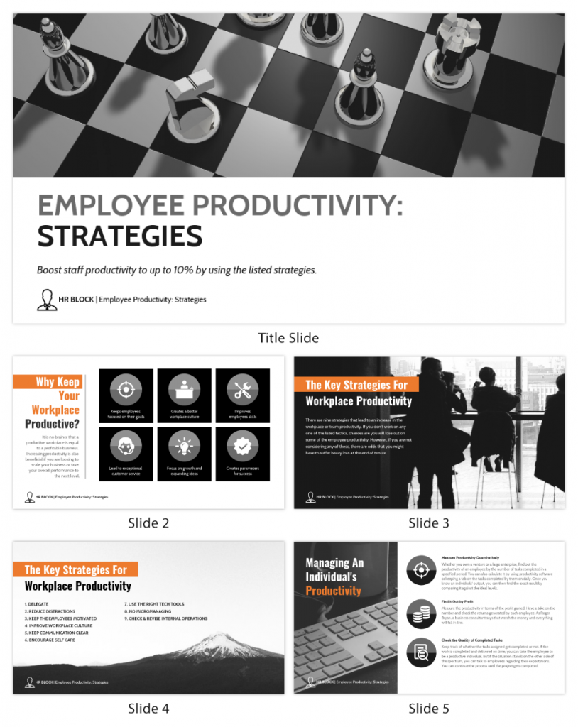
5. Incorporate multimedia elements
Spice up your presentation with a dash of visual pizzazz! Use slides, images and video clips to add depth and clarity to your message. Just remember, less is more—don’t overwhelm them with information overload.
Turn your presentations into an interactive party! Involve your audience with questions, polls or group activities. When they actively participate, they become invested in your presentation’s success. Bring your design to life with animated elements. Venngage allows you to apply animations to icons, images and text to create dynamic and engaging visual content.
6. Utilize humor strategically
Laughter is the best medicine—and a fantastic presentation enhancer! A well-placed joke or lighthearted moment can break the ice and create a warm atmosphere , making your audience more receptive to your message.
7. Practice active listening and respond to feedback
Be attentive to your audience’s reactions and feedback. If they have questions or concerns, address them with genuine interest and respect. Your responsiveness builds rapport and shows that you genuinely care about their experience.
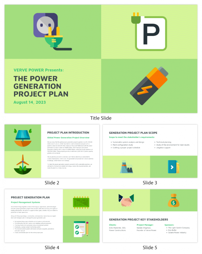
8. Apply the 10-20-30 rule
Apply the 10-20-30 presentation rule and keep it short, sweet and impactful! Stick to ten slides, deliver your presentation within 20 minutes and use a 30-point font to ensure clarity and focus. Less is more, and your audience will thank you for it!
9. Implement the 5-5-5 rule
Simplicity is key. Limit each slide to five bullet points, with only five words per bullet point and allow each slide to remain visible for about five seconds. This rule keeps your presentation concise and prevents information overload.
Simple presentations are more engaging because they are easier to follow. Summarize your presentations and keep them simple with Venngage’s gallery of simple presentation templates and ensure that your message is delivered effectively across your audience.
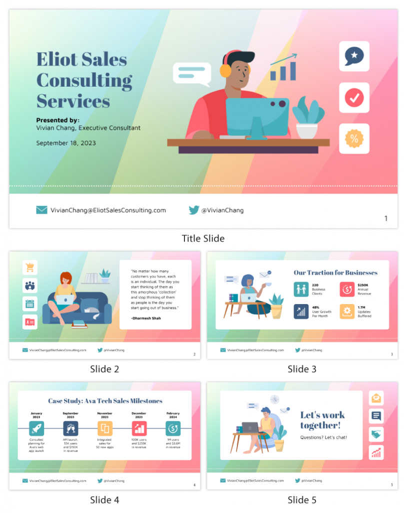
1. How to start a presentation?
To kick off your presentation effectively, begin with an attention-grabbing statement or a powerful quote. Introduce yourself, establish credibility and clearly state the purpose and relevance of your presentation.
2. How to end a presentation?
For a strong conclusion, summarize your talking points and key takeaways. End with a compelling call to action or a thought-provoking question and remember to thank your audience and invite any final questions or interactions.
3. How to make a presentation interactive?
To make your presentation interactive, encourage questions and discussion throughout your talk. Utilize multimedia elements like videos or images and consider including polls, quizzes or group activities to actively involve your audience.
In need of inspiration for your next presentation? I’ve got your back! Pick from these 120+ presentation ideas, topics and examples to get started.
Creating a stunning presentation with Venngage is a breeze with our user-friendly drag-and-drop editor and professionally designed templates for all your communication needs.
Here’s how to make a presentation in just 5 simple steps with the help of Venngage:
Step 1: Sign up for Venngage for free using your email, Gmail or Facebook account or simply log in to access your account.
Step 2: Pick a design from our selection of free presentation templates (they’re all created by our expert in-house designers).
Step 3: Make the template your own by customizing it to fit your content and branding. With Venngage’s intuitive drag-and-drop editor, you can easily modify text, change colors and adjust the layout to create a unique and eye-catching design.
Step 4: Elevate your presentation by incorporating captivating visuals. You can upload your images or choose from Venngage’s vast library of high-quality photos, icons and illustrations.
Step 5: Upgrade to a premium or business account to export your presentation in PDF and print it for in-person presentations or share it digitally for free!
By following these five simple steps, you’ll have a professionally designed and visually engaging presentation ready in no time. With Venngage’s user-friendly platform, your presentation is sure to make a lasting impression. So, let your creativity flow and get ready to shine in your next presentation!
Discover popular designs

Infographic maker

Brochure maker

White paper online

Newsletter creator

Flyer maker

Timeline maker

Letterhead maker

Mind map maker

Ebook maker
Home Blog Presentation Ideas 23 PowerPoint Presentation Tips for Creating Engaging and Interactive Presentations
23 PowerPoint Presentation Tips for Creating Engaging and Interactive Presentations
PowerPoint presentations are not usually known for being engaging or interactive. That’s often because most people treat their slides as if they are notes to read off and not a tool to help empower their message.
Your presentation slides are there to help bring to life the story you are telling. They are there to provide visuals and empower your speech.
So how do you go about avoiding a presentation “snoozefest” and instead ensure you have an engaging and interactive presentation? By making sure that you use your slides to help YOU tell your story, instead of using them as note cards to read off of.
The key thing to remember is that your presentation is there to compliment your speech, not be its focus.
In this article, we will review several presentation tips and tricks on how to become a storytelling powerhouse by building a powerful and engaging PowerPoint presentation.

Start with writing your speech outline, not with putting together slides
Use more images and less text, use high-quality images, keep the focus on you and your presentation, not the powerpoint, your presentation should be legible from anywhere in the room, use a consistent presentation design, one topic per slide, avoid information overwhelm by using the “rule of three”.
- Display one bullet at a time
Avoid unnecessary animations
- Only add content that supports your main points
- Do not use PowerPoint as a teleprompter
- Never Give Out Copies of the Presentation
Re-focus the attention on you by fading into blackness
Change the tone of your voice when presenting, host an expert discussion panel, ask questions, embed videos, use live polling to get instant feedback and engage the audience.
- He kept his slides uncluttered and always strived for simplicity
- He was known to use large font size, the bigger, the better.
- He found made the complex sound simple.
He was known to practice, practice, and keep on practicing.
Summary – how to make your presentation engaging & interactive, fundamental rules to build powerful & engaging presentation slides.
Before we go into tips and tricks on how to add flair to your presentations and create effective presentations, it’s essential to get the fundamentals of your presentation right.
Your PowerPoint presentation is there to compliment your message, and the story you are telling. Before you can even put together slides, you need to identify the goal of your speech, and the key takeaways you want your audience to remember.
YOU and your speech are the focus of this presentation, not the slides – use your PowerPoint to complement your story.
Keep in mind that your slides are there to add to your speech, not distract from it. Using too much text in your slides can be distracting and confusing to your audience. Instead, use a relevant picture with minimal text, “A picture is worth a thousand words.”
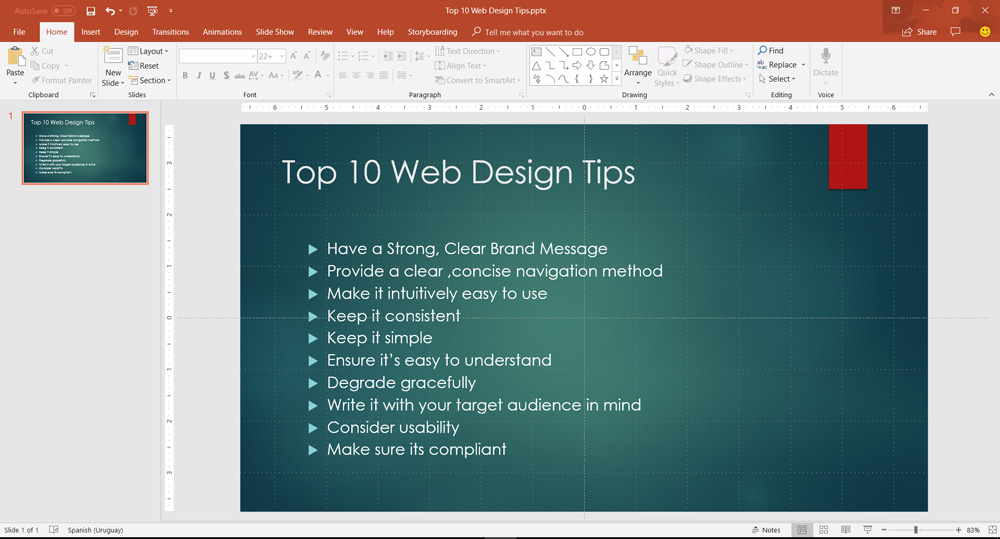
This slide is not unusual, but is not a visual aid, it is more like an “eye chart”.
Aim for something simpler, easy to remember and concise, like the slides below.
Keep in mind your audience when designing your presentation, their background and aesthetics sense. You will want to avoid the default clip art and cheesy graphics on your slides.
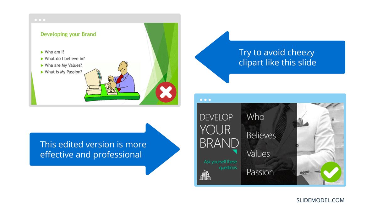
While presenting make sure to control the presentation and the room by walking around, drawing attention to you and what you are saying. You should occasionally stand still when referencing a slide, but never turn your back to your audience to read your slide.
You and your speech are the presentations; the slides are just there to aid you.
Most season presenters don’t use anything less than twenty-eight point font size, and even Steve Jobs was known to use nothing smaller than forty-point text fonts.
If you can’t comfortably fit all the text on your slide using 28 font size than you’re trying to say and cram too much into the slide, remember tip #1.4 – Use relevant images instead and accompany it with bullets.
Best Practice PowerPoint Presentation Tips
The job of your presentation is to help convey information as efficiently and clearly as possible. By keeping the theme and design consistent, you’re allowing the information and pictures to stand out.
However, by varying the design from slide to slide, you will be causing confusion and distraction from the focus, which is you and the information to be conveyed on the slide.
Technology can also help us in creating a consistent presentation design just by picking a topic and selecting a sample template style. This is possible thanks to the SlideModel’s AI slideshow maker .
Each slide should try to represent one topic or talking point. The goal is to keep the attention focused on your speech, and by using one slide per talking point, you make it easy for you to prepare, as well as easy for your audience to follow along with your speech.
Sometimes when creating our presentation, we can often get in our heads and try to over-explain. A simple way to avoid this is to follow the “Rule of Three,” a concept coined by the ancient Greek philosopher Aristotle.
The idea is to stick to only 3 main ideas that will help deliver your point. Each of the ideas can be further broken into 3 parts to explain further. The best modern example of this “Rule of Three” can be derived from the great Apple presentations given by Steve Jobs – they were always structured around the “Rule of Three.”
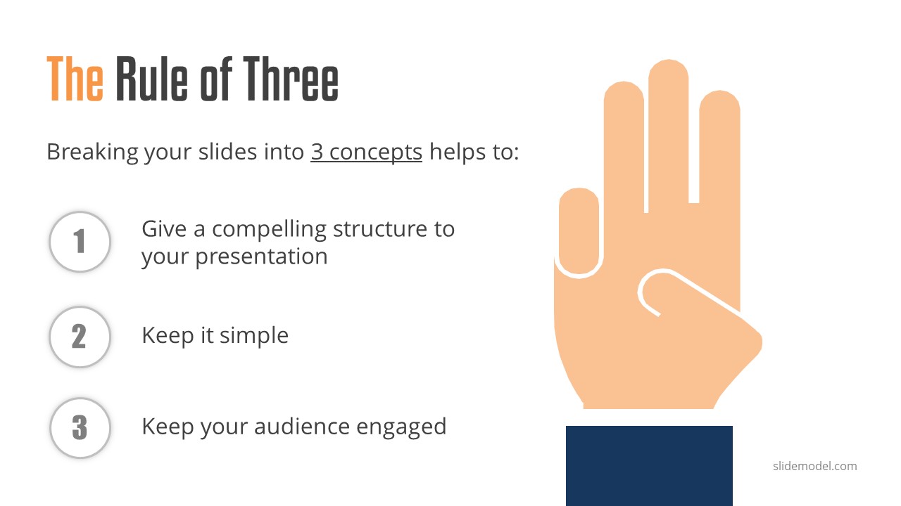
Display one sentence at a time
If you are planning to include text in your slides, try to avoid bullet lists, and use one slide per sentence. Be short and concise. This best practice focuses on the idea that simple messages are easy to retain in memory. Also, each slide can follow your storytelling path, introducing the audience to each concept while you speak, instead of listing everything beforehand.
Presentation Blunders To Avoid
In reality, there is no need for animations or transitions in your slides.
It’s great to know how to turn your text into fires or how to create a transition with sparkle effects, but the reality is the focus should be on the message. Using basic or no transitions lets the content of your presentation stand out, rather than the graphics.
If you plan to use animations, make sure to use modern and professional animations that helps the audience follow the story you are telling, for example when explaining time series or changing events over time.
Only add engaging content that supports your main points
You might have a great chart, picture or even phrase you want to add, but when creating every slide, it’s crucial to ask yourself the following question.
“Does this slide help support my main point?”
If the answer is no, then remove it. Remember, less is more.
Do not use PowerPoint as a Teleprompter
A common crutch for rookie presenters is to use slides as their teleprompter.
First of all, you shouldn’t have that much text on your slides. If you have to read off something, prepare some index cards that fit in your hand but at all costs do not turn your back on your audience and read off of your PowerPoint. The moment you do that, you make the presentation the focus, and lose the audience as the presenter.
Avoid Giving Out Copies of the Presentation
At least not before you deliver a killer presentation; providing copies of your presentation gives your audience a possible distraction where they can flip through the copy and ignore what you are saying.
It’s also easy for them to take your slides out of context without understanding the meaning behind each slide. It’s OK to give a copy of the presentation, but generally it is better to give the copies AFTER you have delivered your speech. If you decide to share a copy of your presentation, the best way to do it is by generating a QR code for it and placing it at the end of your presentation. Those who want a copy can simply scan and download it onto their phones.
Tips To Making Your Presentation More Engaging
The point of your presentation is to help deliver a message.
When expanding on a particularly important topic that requires a lengthy explanation it’s best to fade the slide into black. This removes any distraction from the screen and re-focuses it on you, the present speaker. Some presentation devices have a built-in black screen button, but if they don’t, you can always prepare for this by adding a black side to your presentation at the right moment.
“It’s not what you say, it’s how you say it.”
Part of making your presentation engaging is to use all the tools at your disposal to get your point across. Changing the inflection and tone of your voice as you present helps make the content and the points more memorable and engaging.
One easy and powerful way to make your presentation interactive is experts to discuss a particular topic during your presentation. This helps create a more engaging presentation and gives you the ability to facilitate and lead a discussion around your topic.
It’s best to prepare some questions for your panel but to also field questions from the audience in a question and answer format.
How To Make Your Presentation More Interactive
What happens if I ask you to think about a pink elephant? You probably briefly think about a pink elephant, right?
Asking questions when presenting helps engage the audience, and arouse interest and curiosity. It also has the added benefit of making people pay closer attention, in case they get called on.
So don’t be afraid to ask questions, even if rhetorical; asking a question engages a different part of our brain. It causes us to reflect rather than merely take in the information one way. So ask many of them.
Asking questions can also be an excellent way to build suspense for the next slide.
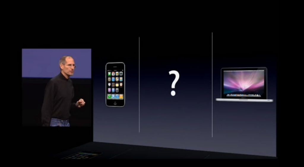
(Steve Jobs was known to ask questions during his presentations, in this slide he built suspense by asking the audience “Is there space for a device between a cell phone and a laptop?” before revealing the iPad) Source: MacWorld SF 2018
Remember the point of your presentation is to get a message across and although you are the presenter, it is completely fine to use video in your PowerPoint to enhance your presentation. A relevant video can give you some breathing time to prepare the next slides while equally informing the audience on a particular point.
CAUTION: Be sure to test the video beforehand, and that your audience can hear it in the room.
A trending engagement tool among presenters is to use a live polling tool to allow the audience to participate and collect immediate feedback.
Using a live polling tool is a fun and interactive way to engage your audience in real-time and allow them to participate in part of your presentation.
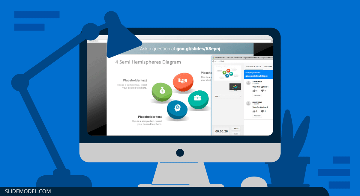
Google Slides has a built-in Q&A feature that allows presenters to make the slide deck more interactive by providing answers to the audience’s questions. By using the Q&A feature in Google Slides, presenters can start a live Q&A session and people can ask questions directly from their devices including mobile and smartphones.
Key Takeaways from one of the best presenters, Steve Jobs
He kept his slides uncluttered and always strove for simplicity.
In this slide, you can easily see he is talking about the battery life, and it uses a simple image and a few words. Learning from Jobs, you can also make a great presentation too. Focus on the core benefit of your product and incorporate great visuals.

Source: Macworld 2008
SlideModel.com can help to reproduce high-impact slides like these, keeping your audience engagement.

He was known to use large font sizes, the bigger, the better
A big font makes it hard to miss the message on the slide, and allows the audience to focus on the presenter while clearing the understanding what the point of the slide is.
He found made the complex sound simple
When explaining a list of features, he used a simple image and lines or simple tables to provide visual cues to his talking points.

What made Steve Jobs the master of presentation, was the ritual of practicing with his team, and this is simple yet often overlooked by many presenters. It’s easy to get caught in the trap of thinking you don’t need to practice because you know the material so well.
While all these tips will help you create a truly powerful presentation , it can only achieve if applied correctly.
It’s important to remember when trying to deliver an amazing experience, you should be thoroughly prepared. This way, you can elevate your content presentation, convey your message effectively and captivate your audience.
This includes having your research cited, your presentation rehearsed. Don’t just rehearse your slides, also take time to practice your delivery, and your tone. The more you rehearse, the more relaxed you will be when delivering. The more confident you will feel.
While we can’t help you with the practice of your next presentation, we can help you by making sure you look good, and that you have a great design and cohesiveness.
You focus on the message and content; we’ll focus on making you look good.
Have a tip you would like to include? Be sure to mention it in the comments!
Like this article? Please share
Audience, Engaging, Feedback, Interactive, Poll, Rule of Three, Steve Jobs Filed under Presentation Ideas
Related Articles

Filed under Presentation Ideas • November 29th, 2023
The Power of Audience Engagement: Strategies and Examples
As presenters, captivating the interest of our viewers is the most important thing. Join us to learn all that’s required to boost audience engagement.
Filed under Business • April 30th, 2020
A Manager’s Guide to Interpersonal Communication
People are promoted to management positions for a variety of reasons. For many, they rise to the top because of their knowledge, technical skills, and decision-making capabilities. As a manager, your effectiveness also strongly depends on your ability to communicate well with your team members and other stakeholders. Here is a quick guide on Interpersonal Communication for Managers.

Filed under Business • June 27th, 2019
Using 360 Degree Feedback in Your Organization
Many organizations use 360 degree feedback to provide assessment for employees via multiple sources to analyze the knowledge, skill and behavior of employees. It is also known as multi-rater feedback, multi-source feedback, 360 Degree Review and multi-source assessment, since it is used frequently for assessing the performance of an employee and to determine his/her future […]
2 Responses to “23 PowerPoint Presentation Tips for Creating Engaging and Interactive Presentations”
Very great advices!
Greetings ! A compact composed communication for the host to have an impact -VOICE
Thank You ?
Leave a Reply
Top searches
Trending searches
135 templates

suicide prevention
9 templates

35 templates

13 templates
hispanic heritage month
21 templates

mid autumn festival
18 templates
Create engaging presentations, faster
Free templates for google slides, powerpoint and canva, or kick off your next project with ai presentation maker.
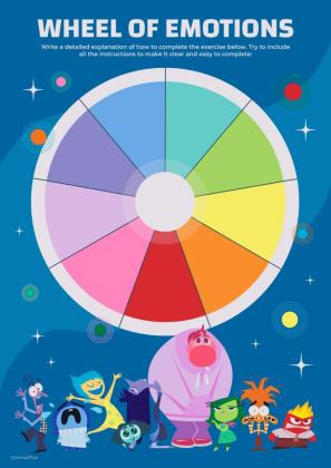
Inside Out Disney
11 templates

256 templates

Slidesclass
400 templates

Editor’s Choice
3684 templates

9522 templates
3189 templates
Presentation Maker
1738 templates
91 templates

1240 templates

Mental Health
413 templates
Social Media
702 templates
Latest themes

It seems that you like this template!

Register for free and start downloading now
Casual & vintage watercolor collage minitheme.
Are you good with handicrafts? Those who are skilled with scissors and glue know how to create true masterful compositions that mix photographs, textures, layouts and other elements to create collages that convey all kinds of ideas. Of course, there's no need to get your fingers dirty with glue to...
Modern Doodle Minitheme
Download the Modern Doodle Minitheme presentation for PowerPoint or Google Slides and start impressing your audience with a creative and original design. Slidesgo templates like this one here offer the possibility to convey a concept, idea or topic in a clear, concise and visual way, by using different graphic resources....
Funny Looking Cartoon Characters Minitheme
If you are looking for an eye-catching presentation that will instantly grab your audience's attention, this may be a great option for you. With its grid background and cartoon style characters, it gives a fun and playful touch to any topic you want to talk about. But that's not all....

Premium template
Unlock this template and gain unlimited access
Elementary Geography Lesson Infographics
Download the Elementary Geography Lesson Infographics presentation for PowerPoint or Google Slides and easily edit it to fit your own lesson plan! Designed specifically for elementary school education, this eye-catching design features engaging graphics, and age-appropriate fonts; elements that capture the students' attention and make the learning experience more enjoyable...

Creative Leafy Backgrounds Minitheme
Who said elegance and creativity are at odds? Take a look at this floral style template to prove it. On the striking red background we have added illustrations of leaves in different colors, such as blue, green and pink, bringing dynamism and joy. All this, added to the wide variety...
Third Grade Infographics
Download the Third Grade Infographics template for PowerPoint or Google Slides and discover this set of editable infographics for education presentations. These resources, from graphs to tables, can be combined with other presentations or used independently. The most important thing is what you will achieve: transmit information in an orderly...
Popular themes

Minimalist Business Slides
Minimalism is an art style that frees the canvas and that lets the content stand out for itself. It’s a way of conveying modernism, simplicity and elegance and can be your best ally in your next presentation. With this new design from Slidesgo, your business presentations will be as professional...

Chalkboard Background Theme for Elementary
Download the Chalkboard Background Theme for Elementary presentation for PowerPoint or Google Slides and easily edit it to fit your own lesson plan! Designed specifically for elementary school education, this eye-catching design features engaging graphics and age-appropriate fonts; elements that capture the students' attention and make the learning experience more...
Papyrus History Lesson
History lessons tend to be boring for students, since they need to remember dates and a bunch of information. Make it entertaining by editing our free presentation template, whose backgrounds based on ancient papyrus rolls take it to the next level.

Steps for Studying a Text
Reading a book is good practice. Books are a source of knowledge! However, the complexity of the text you're reading affects the time you'll spend understanding it and memorizing it. That can be a problem when studying, so here's a template with some tips on how to face difficult texts...

Fall Cottagecore Theme
Ah yes, the temperature drops two degrees at the end of summer and your mind automatically switches on fall mode: warm brown and green tones, you start wearing your jacket, drink the coffee hotter, watch (again) that show inspired by fall... We understand that desire for the best time of...

Colorful Theme
Download the Colorful Theme presentation for PowerPoint or Google Slides and start impressing your audience with a creative and original design. Slidesgo templates like this one here offer the possibility to convey a concept, idea or topic in a clear, concise and visual way, by using different graphic resources. You...
Infographics
Fresh Lemon Pattern Newsletter Infographics
Download the Fresh Lemon Pattern Newsletter Infographics template for PowerPoint or Google Slides and discover the power of infographics. An infographic resource gives you the ability to showcase your content in a more visual way, which will make it easier for your audience to understand your topic. Slidesgo infographics like...
College Lessons with Cycle Diagrams
Download the College Lessons with Cycle Diagrams presentation for PowerPoint or Google Slides. As university curricula increasingly incorporate digital tools and platforms, this template has been designed to integrate with presentation software, online learning management systems, or referencing software, enhancing the overall efficiency and effectiveness of student work. Edit this...
Elegant Blue Benchmarking Strategies Infographics
Download the Elegant Blue Benchmarking Strategies Infographics template for PowerPoint or Google Slides to get the most out of infographics. Whether you want to organize your business budget in a table or schematically analyze your sales over the past year, this set of infographic resources will be of great help....
Education presentation templates

926 templates
590 templates
123 templates

815 templates
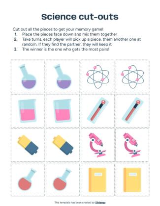
1055 templates

3617 templates

Thesis Defense
1013 templates
Teacher Toolkit
121 templates
426 templates
848 templates

59 templates
Editable in Canva

Judaism: Culture and Traditions Workshop
Download the Judaism: Culture and Traditions Workshop presentation for PowerPoint or Google Slides. If you are planning your next workshop and looking for ways to make it memorable for your audience, don’t go anywhere. Because this creative template is just what you need! With its visually stunning design, you can...
What's new on Slidesgo
See the latest website updates, new features and tools and make the most of your Slidesgo experience.
Make presentations with AI
Make school fun from day one with Disney and Pixar templates

Free printable coloring pages in PDF for back to school
Browse by tags.
- Kids 2151 templates
- Food 959 templates
- Technology 1076 templates
- Travel 436 templates
- Animal 1137 templates
- Art 848 templates
- Health 3816 templates
- History 1443 templates
- Environment 533 templates
- Galaxy 193 templates
- Fashion 247 templates
- Biology 517 templates
- Summer 234 templates
- Architecture 156 templates
- Music 426 templates
- Research 1662 templates
- Culture 2100 templates
- Background 10111 templates
- Back to School 202 templates
- Coloring Page 352 templates
What do our users say about us?

I just wanted to thank you! I learned more about slides in one day of quarantine than in my whole life
Gabriela Miranda

Your slides are so unique and gorgeous! They really help me with PowerPoint presentations for school and now even my mom uses them for work
Marie Dupuis

I would like to thank to you for these amazing templates. I have never seen such service, especially free! They are very useful for my presentation.
Ali Serdar Çelikezen

Thank you Slidesgo for creating amazing templates for us. It's made my presentation become much better.
Thiên Trang Nguyễn
Create your presentation Create personalized presentation content
Writing tone, number of slides, register for free and start editing online.
Unsupported browser
This site was designed for modern browsers and tested with Internet Explorer version 10 and later.
It may not look or work correctly on your browser.
- Presentations
30 PowerPoint Presentation Tips to Make Good PPT Slides in 2024 (+ 6 Expert Tips)
- Bahasa Indonesia
Here are 30 quick PowerPoint presentation tips to help you improve your presentations.

Plus, get PowerPoint tips on changing your slide design to make your content shine. We've even called on six presentation experts for their best tips.
How to Make a Good PowerPoint Presentation (Watch & Learn)
This screencast is a speed round of my very favorite PowerPoint tricks. It's a great resource to learn how to make a presentable PowerPoint. I'll walk you through ten of my favorite PowerPoint tips and tricks to create a better presentation.
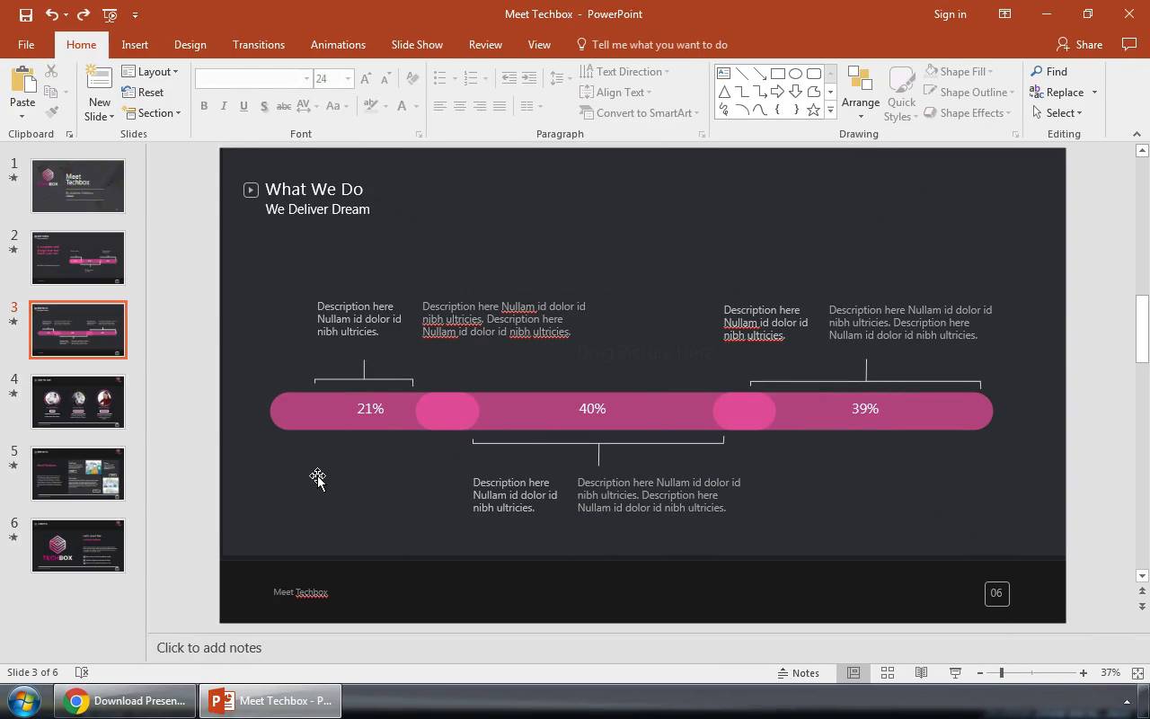
Keep reading for an illustrated version of these good PPT tips (and more) that you can use to improve your PowerPoint presentations. You'll see 30 of our favorite PowerPoint presentation tips and tricks, including techniques to update slide master PowerPoint 2024 designs.
Jump to content in this section:
- How Do You Give a Memorable PPT Presentation?
- Practice Makes Perfect
- Adapt Your Presentation to the Audience
- Use a Custom Font
- Use Contrast
- Avoid Too Many Animations
- Use the Rule of Three
- Use a Custom PPT Theme Design
- Make Use of Charts and Graphs
- Use the Built-in Slide Layouts
- Align Text Consistently
- Make Your Exports User-Friendly
- Try a Different Color Scheme
- Edit Slide Masters for Consistency
- Use the Alignment Feature
- Use Stock Assets
- Reduce Your Content
- Rethink Your Slide Order
- Use PowerPoint Animations
- Invite Collaborators
- Add Supporting Video Clips
- Use Infographic Templates
- Use Impactful Closing Techniques
- Include Data in the Appendix
- Alternate Between Solid Color and White Slides
- Present Information With Maps
- Keep the Design Best Practices in Mind
- Set a Time Limit
- Test Your Content Everywhere
30 Tips: How to Make Good PowerPoint Presentation Designs Fast in 2024
A few tried and true tips can help you speed up your PowerPoint presentation design. Check out 30 of my favorite PowerPoint tips to do just that. Each of these give you PowerPoint slideshow help to create good PowerPoint slides:
1. How Do You Give a Memorable PPT Presentation?
If you're learning the top PowerPoint presentation tips and tricks, you're probably asking yourself: how do I give a presentation that won't be forgotten?
We all want to be remembered. The best PowerPoint slideshow help to make a mark on the audience. There are tried-and-true ways to do just that, and expert Neil Tomlinson shares expertise on being remembered:
Get your main point into the presentation as early as possible (this avoids any risk of audience fatigue or attention span waning), then substantiate your point with facts, figures etc and then reiterate your point at the end in a ‘Summary’.
2. Practice Makes Perfect
Also, don’t forget to practice your presentation. Go through your slide deck a few times to make sure you know it like the back of your hand when the big day arrives. Doing so helps you feel more confident. It'll reduce any anxiety and nervousness you might feel as the presentation day approaches.
What's the best way to rehears for a good PowerPoint? Here's one of the top PowerPoint presentation tips from expert presenter Sandra Zimmer :
Once slides are ready, practice one slide at a time aloud until you feel like you know it and like the flow of speech. Be willing to change anything that does not feel in flow. At the end of learning all your slides, practice the whole talk.
If you want even more great PowerPoint presentation tips and tricks, check out the following post:

3. Adapt Your Presentation to the Audience
Let's say that you're a seasoned presenter with a pretty standard set of presentation topics. Maybe you're an expert in your field, and you're asked to give a PPT presentation frequently on similar topics.
That's the value of being an expert. You might have a standard spiel that you give your audiences, and your content won't totally change from one presentation to another. That's why it helps to make only slight tweaks to adapt your presentation to each audience.
Leading presentation expert Suzannah Baum offered up this advice:
Different audiences will have different needs and different challenges, which requires me to re-sequence the slides, or create new ones. I tend to do a lot of research on my audiences – via surveys, interviews, and conversations with the hiring manager – to help me better understand what information would be most relevant to them.
How do you adapt to your audience? Here are a few more tips:
- Learn about them. If you're asked to speak, talk to the curator of the presentation to learn more about the audience and their background.
- Ask about them! With contact details, send out a survey or a response link to ask for feedback and preparation info. Ask leading questions like "what do you want to learn?"
- Consider the environment. If you're presenting via Zoom, your style will differ from presenting in person. The key is to acknowledge the difference and adapt to your environment.

Learn everything you can about your audience. Learning how to make a presentable PowerPoint is all about thinking of the recipient, not the presenter!
4. Use a Custom Font
A PowerPoint presentation tip that'll make your slideshow more interesting and more engaging is to use a custom font.
Fonts set the tone for your presentation. So, when you use a premium font, you’re opting for a high-quality font while also adding a personal or creative touch.
When choosing a font, remember that you want everyone to read your text easily.
5. Use Contrast

One PowerPoint trick is to use contrast to make some of your text stand out or make it easier to read.
If you’re putting text over an image on our PowerPoint slide, you may need to use a white box with black text in it to make your text easier to read. You can also use contrasting colors to highlight important text.
6. Avoid Too Many Animations
Another PowerPoint tip is to avoid having too many animations or transitions.
When you've got too many animations, it can be distracting to the audience. It’s not only distracting, but it's unprofessional.
It’s best to stick to one or two animations throughout your presentation. Also, if you've got any animations in your presentation, make sure to test them to see if they work before presenting.

7. Add Audio
Include audio on a slide on PowerPoint to increase audience engagement. Audio can be anything from fun sound effects to interview clips. You can even add an audio clip of your voice.
Audio gives you a break from speaking while also engaging the audience. Envato Elements has hundreds of premium audio clips if you want to add some.

8. Use the Rule of Three
One PowerPoint tip and trick is to follow the rules of PowerPoint.
One of those rules is the rule of three. It's where you start by dividing your presentation into thirds. Everything should come in thirds, so if you use bullet points, you should only have three. If you use icons, you should only have three.
When things come in threes, it's easier to remember them. For more information, read this informative article:

9. Use a Custom PPT Theme Design
Above all, consistently use custom PowerPoint themes. Microsoft has built-in themes that you can use for free, sure. But the premium themes that are on Envato Elements are a major step-up from PowerPoint's built-in themes.

When you subscribe to Envato Elements, you'll have access to unlimited downloads of all the PowerPoint themes. Right now, Envato Elements has almost 4,000 PowerPoint themes and that number is always growing. You'll learn tips for a good PowerPoint presentation by using the best templates.

10. Make Use of Charts and Graphs
Illustrate your data with the use of charts and graphs. Not only will you be able to make your presentation more visually appealing, but you'll also help your audience remember the information better.

Many PowerPoint templates already include chart and graph elements. Easily customize them to make your data and stats more interesting and easier to understand.
Want to learn more about how to use data? Turn to expert Adrienne J ohnston , a presentation professional:
When it comes to visualizing data in presentations, we have to remember that our audience does not need all the fine details of the data - they need the main takeaway and we need to make sure that's evident to them when looking at the slide.
11. Use the Built-in Slide Layouts
Inside of PowerPoint themes, you'll find layouts , which are custom slide designs.
Most themes include a selection of content layouts that you can use as a starting point for your own slide designs. You can leverage slide master PowerPoint 2024 designs with the help of layouts.

Layouts are like a starting point for your PowerPoint presentation slides. They contain combinations of placeholders for text boxes, images, and more.
Instead of clicking and drawing individual objects onto the slide, use one of these layouts to start your slide off. It's one of the top PowerPoint presentation tips and tricks to save time.
12. Align Text Consistently
When you're working with text on your slide, it helps to ensure that it aligns consistently. Keeping your text aligned in the same orientation really makes a slide look clean.
In the example below, I've basically got three text boxes:
- list of bulleted points
Notice that all this text is aligned left.

Aligning text was the " aha " moment that I learned when I started studying slide design. It's one of those steps that makes a slide look much neater and professional, so keep it in mind when designing.
13. Make Your Exports User-Friendly
No matter how great your PowerPoint presentation slides look, you need to think about how your user will use the presentation file.
Any of these are likely scenarios if you're regularly sending presentations to other users:
- The viewer may not have PowerPoint installed on their computer.
- The recipient may be using a version of PowerPoint that renders the presentation differently.
- Maybe you don't want the user to be able to make any edits or see your notes in the presentation file.

In this case, my favorite tip is to export the presentation as a PDF. To do that, go to File > Export > Create PDF , and then save your presentation as a PDF.
This is sure to help most of your users see the presentation just the way you intended.
14. Try a Different Color Scheme
Many PowerPoint themes have more than one color scheme that you can apply to your presentation. On the Design tab, click on the drop-down next to Themes to try out a different color scheme.

Typically, these will restyle your entire presentation. Premium themes that you might get from Envato Elements, for example, may have many versions inside the original presentation zip file.
15. Edit Slide Masters for Consistency
The slide master controls the design for your PowerPoint slide. Instead of making the same change to each slide, apply a change to a slide master. It'll affect all the PowerPoint presentation slides that use the same master.

It's ideal to apply a logo to the slide master itself, for example. This keeps the logo the same size and in the same position on each slide.
To do that, go to View > Slide Master. On the right side, you're likely to see a variety of slide masters that control designs for many slides. Drop the elements that you want to remain consistent onto one of the slide masters.
16. Use the Alignment Feature
PowerPoint presentation slides look better when the objects on them are in line with one another. There's a certain visual rhythm that occurs when objects line up in the center or along certain boundary lines.

When you start dragging objects on your slide, you'll see guiding lines that pop up. These are very intuitive, and you'll likely notice that they help you line up your objects. You might seem them pop up when you've got a box that's equidistant between two other objects on the slide, for example.
This is one of the best tricks for improving the look of your PowerPoint slide. Spend some time making sure that your key elements line up cohesively.
17. Use Stock Assets
Earlier, I mentioned using Envato Elements to grab PowerPoint themes. But there's more that comes with an Envato Elements subscription for presentations.
That includes a wide variety of stock photos, graphics, and custom designed fonts that you can use in your presentation. Instead of reusing the same stock photo or clip art, Envato Elements has everything you need to supplement a presentation.
Again, Envato Elements is the perfect subscription if you build presentations. It's a one-stop-shop that you can use to fill content.
18. Reduce Your Content
There's nothing that makes an audience tune out faster than being overloaded with slide content. Sometimes we try to make so many points that the audience misses all of them due to information overload.
Less is truly more. When you cut the weaker points of your presentation, the audience's attention will follow your key points accordingly.
It seems like cheating, but one of the best steps that you can take for your slide is to simply reduce the number of items that are on it. Convert some of your typed points to things you'll speak verbally.
19. Rethink Your Slide Order
Sometimes, I find that my presentations are out of order. I might spend too much time explaining my decision before I get to the conclusion.
In these cases, I like to use Slide Sorter View to re-sequence the slides in my presentation. To access this view, go to View > Slide Sorter on PowerPoint's ribbon.

From Slide Sorter view, you've got a top-down view of all the slides in your presentation deck. It sometimes becomes obvious that the slides can be reordered into a better sequence from this view.
20. Use PowerPoint Animations
One of my favorite PowerPoint presentation tips is to complement your major points with a bit of animation. Using animation can bring a key point onto your slide with style!
Check out ten of the best PowerPoint tips for how to use animation from expert Sven Lenaerts below:
21. Invite Collaborators
Building a presentation often benefits from a second set of eyes. That's why it helps so much to invite a collaborator to work with you side-by-side in Microsoft PowerPoint.
Pushing your presentation up to OneDrive and inviting collaborators is easy. Thanks to the cloud-based approach, more than one user can edit a slide deck in real time. Learn how to do that in the tutorial below:

22. Add Supporting Video Clips
Building impactful presentations is all about adding other perspectives and angles to the content. One of my favorite ways to do that is to add a video clip. Maybe that's a production that you built on your own or found on sites like YouTube.
Either way, learn how to add and auto play a video clip in the quick tip below:
23. Use Infographic Templates
More presentations than ever will feature visuals that tell stories with data. But it's easy for an audience become overwhelmed with data.
That's where infographics come into play. Learn to use them in PowerPoint in the tutorial below:
24. Use Impactful Closing Techniques
I've sat through many presentations in my life. I can only remember a few that really stick out, thanks to techniques that highlighted key points. You need PowerPoint tips and tricks that help leave your audience with an impact.
To do just that, make sure you use some of the techniques highlighted in the article below:

To do that, just drag and drop the thumbnails into the order you want. When you return to Normal view, the PowerPoint presentation slides will be in the resequenced order you set here.
25. Include Data in the Appendix
Many PowerPoint presentations include data in the form of charts and graphs. That means that you'll condense specifics into a few easy-to-follow charts.
But what if your audience wants more of the backing details? Maybe they want to validate and review the detail for themselves. In that case, a set of appendix slides with extra data is sure to help.

Appendix slides are included at the end of a presentation deck for backup purposes. You might not present them, but your audience is certain to appreciate that you included them. That helps your presentation continue to be useful even after you leave the room.
Here's a great tip from: pro presenter Graeme Thomas of Johnny F Designs:
If (my clients) are sending the deck straight to clients however, I would then put all the information on the slides but will often use more slides so that they aren't too cluttered. In cases where there is a lot of content, like financial statements, I would use appendix slides.
Including an appendix helps your audience understand data without overwhelming them with that data. Follow these tips so that you get the best of both worlds.
26. Alternate Between Solid Color and White Slides
Alternating between solid color and slides with a white background can produce an interesting visual effect and engage your audience. You can use the solid-colored slides to signify a new section in your presentation.

Not to mention, solid-colored slides are the perfect way to re-enforce your brand colors and build your brand recognition.
27. Present Information With Maps
If you’re trying to make a case for a global expansion or need to report on how other branches are performing, consider using a map to help your audience visualize the data.
There's no shortage of quality PowerPoint templates with maps built in so be sure to take advantage of them.
28. Keep the Design Best Practices in Mind
The design of your presentation matters just as much as the content of your presentation. That’s why you need to devote an equal amount of time to making sure the design of your presentation is on point as you do to the actual content.
Familiarize yourself with best design practices and keep them in mind as you go about customizing your template.
29. Set a Time Limit
How many slides is the right number for you? Well, it all depends on the time limit you set for your presentation.
Believe it or not, setting a time limit is helpful to create good PowerPoint slides. If you want to learn how to make a presentable PowerPoint, it's a must to lock in the time limit and ensure that your slides support that timeframe.
Expert presenter Stephanie Ottavan offers one of our top tips for a good PowerPoint presentation based on time limits:
A presenter is usually limited to a specific time frame and you want to adhere to that as closely as you can. If you have animations and transitions in your deck, these take added time so make sure to rehearse in “show mode” of PowerPoint or Keynote and time yourself.
Believe it or not, setting a time frame is one of the most important part of creating a PPT presentation. It helps you influence how many good PowerPoint slides you should design.
30. Test Your Content Everywhere
PowerPoint in 2024 could take place anywhere. Maybe you present, online, in-person, or beam it to mobile devices. It's important to remember that the content will appear differently on each device.
PowerPoint Online is a different medium than many other apps. Make sure that your presentation design appears the same by testing it with the help of this tutorial. It shows you how your PPT presentation appears even in a browser:

Discover Great Premium PowerPoint Templates With Google Slides (For 2024)
Creating a great presentation starts with a great template. And a great PowerPoint slide design use the best presentation practices, for example:
- Use high-quality photos and graphics to help tell the story.
- Keep text to a minimum.
- Stick to one idea per slide.
Designing a great template doesn’t mean you've got to start from scratch, though. Take a look at some of the best PowerPoint templates we've got on Envato Elements.
1. Neo PowerPoint Template

The Neo PowerPoint template features a modern and bold design and includes five color variations to get you started. Along with this, you'll also get 10 master slides and 30 individual slides for all your presentation needs.
2. Vexana PowerPoint Template

The Vexana template is a great choice for brands that need a touch of elegance. This template works with PowerPoint and Google Slides and comes with a grand total of 150 slides. It also has five color variations and includes infographic elements and photo placeholders.
3. Sprint PowerPoint Template

The Sprint PowerPoint template features a professional and modern design. The template is easy to customize. You'll find 20 masters in the standard 4:3 size, allowing you to choose the best layout for your information.
4. Travelicious PowerPoint Template

For any presentation that deals with the topic of travel, check out the Travelicious template. This template is compatible with both PowerPoint and Google Slides. It includes three premade color variations as well as 30 unique slides.
As you can see from the examples above, there's no shortage of beautiful and professional PowerPoint slide designs on Envato Elements . What’s more, Envato Elements allows you to download as many PowerPoint templates as you want. Plus, get thousands of other design assets such as fonts, photos, and icons—all for one low monthly price.
Want to see even more great PowerPoint template examples? Be sure to check out our related roundup:
Need Help? Grab Our Making Great Presentations eBook (Free)
We've got the perfect complement to this tutorial. You can find more information in our eBook on making great presentations . Download this PDF eBook now for FREE with your subscription to the Tuts+ Business Newsletter.
It'll help you master the presentation process from initial creative ideas through to writing, design, and delivering with impact.

PowerPoint Frequently Asked Questions (FAQ)
Now that you’ve read about PowerPoint tips and tricks, if you want to learn more about PowerPoint, here are some FAQs:
1. What Is a Placeholder?
Placeholders in your slide on PowerPoint help you easily add text or images to your slide without changing your design.
In a template, sometimes the placeholders have prompts such as “Click to insert a picture” or “Click to add text.” These prompts let you know what kind of placeholder it is. To learn more about placeholders, read this article:

2. How Can I Automatically Play a Video?
A PowerPoint tip is to insert an automatically played video in your presentation. When you've got a video that'll play automatically, it saves you the trouble of starting your video manually.
Videos can illustrate topics or specific points. They're also a great way to keep your audience engaged. If you want to learn how to play a video automatically, read this tutorial:
3. How Can I Add a Map to my Slide?
Another PowerPoint trick is to add a map to your slide. If you're discussing a specific location, then a map can help your audience visualize the location you're presenting. To learn how to add a map to your PowerPoint slide, read this tutorial:
4. How Do I Add a GIF to My Presentation?
Adding a GIF to your slide on PowerPoint is one way you can grab your audience's attention. To add a GIF to your slide, you’ll need to download a GIF.
Once you download it, upload it into PowerPoint and use it on your slide. For more information about how to add a GIF to your slide on PowerPoint, read this article:

5. Can I Recover My Unsaved Presentation?
Another PowerPoint trick is to learn how to recover unsaved PowerPoint files so that you can be prepared in case of an emergency. If you want to learn more, read this tutorial:
Learn More About How to Make Presentable PowerPoints
These quick PowerPoint Presentation tips are some of my favorite ways to rapidly improve a presentation. Keeping them in mind while you build a presentation can help you build a deck that you'll be confident about presenting.
Check out these tutorials to keep learning more about PowerPoint. These tutorials will give you more ideas for fixing up your PowerPoint presentation slides efficiently:

Find More Templates
Didn't see a template you like? Here are some more:

Use These PPT Presentation Tips on Your Next Presentation
Now that you've studied some of our best PowerPoint tips, it's time to put them to use. Download one of our top-notch PowerPoint themes from Envato Elements to get started. These PowerPoint presentation tips and tricks give you confidence to make you a skilled presenter.
Editorial Note : This post was first published in February of 2019. Our staff updates this post regularly — adding new, exciting PowerPoint tips and templates (with special help from Brenda Barron , Andrew Childress and Sarah Joy ).


Disclosure: MyeLearningWorld is reader-supported. We may receive a commission if you purchase through our links.
How to Create Stunning PowerPoint Visuals without Being a Designer
Published on: 02/05/2024
By Scott Winstead
- Share on Facebook
- Share on LinkedIn
- Share on Reddit
- Share on Pinterest
PowerPoint has always been one of my favorite instructional design tools . Like other instructional designers , I use it all the time when creating my courses , and I can tell you, there’s a lot that goes into creating a great PowerPoint presentation, whether it’s for an eLearning course, a school project, or even a work presentation. You need to have a strong and memorable message, compelling information, and, of course, great visuals.
The last part is where most people fall short. Unfortunately, it’s also the most important part. Your PowerPoint visuals are what people will remember most about your presentation, so you want to make sure they’re as effective as possible. If your graphics and images are low quality, generic, or just plain boring, your whole presentation will suffer and your message will get lost.
But don’t worry, I have good news — you don’t have to be a graphic designer to create great PowerPoint visuals. There are a few simple principles you can follow and free tools you can use to make sure your visuals support your message and help you deliver a more impactful presentation.
11 Tips for Taking Your PowerPoint Visuals to the Next Level
1. use powerpoint add-ins to create better graphics.
There are some excellent free and cheap PowerPoint add-ins and tools that can help you create better visuals without any design experience.
PowerPoint add-ins are plugins that add new features and functionality to PowerPoint.
There are all sorts of add-ins available, but for visuals, I recommend looking for ones that help you create charts and graphs, infographics, and other types of graphics.
My personal favorite PowerPoint add-in is Office Timeline , which helps you easily create professional timelines and Gantt charts right inside PowerPoint.
It has tons of professional templates and graphics that you can customize to fit your presentation perfectly.
But that’s just one example — there are loads of other great add-ins out there that can help you take your PowerPoint visuals to the next level.
2. Find high-quality stock images
A picture is worth a thousand words, as they say. And that’s especially true when it comes to PowerPoint visuals.
Images can help you add emotion and personality to your presentation and make complex concepts easier to understand.
But not all images are created equal. When it comes to PowerPoint visuals, you want to make sure you’re using high-quality, professional images.
Low-quality images will drag down the overall quality of your presentation, so it’s important to be selective about which ones you use.
There are a few different ways to find great PowerPoint visuals.
You can buy professional stock photos, search for free stock photos, or create your own images.
If you’re going to use stock photos, I recommend spending a few bucks to get high-quality ones. They’ll make a big difference in the overall look and feel of your presentation.
3. Incorporate video and audio
Video and audio are powerful presentation tools that can help you engage your audience and deliver your message more effectively.
Adding video content or audio to your PowerPoint slides can help you add emotion, drama, and impact to your presentation.
And with today’s technology, it’s easier than ever to incorporate video and audio into your PowerPoint slides.
You can insert videos directly into PowerPoint slides or embed them from online video sites. You can even add YouTube videos to PowerPoint .
If you’re going to use video or audio in your presentation, make sure it’s high quality and relevant to your message.
Adding random videos or audio clips will only distract from your presentation and could make it harder for people to understand your message.
4. Use PowerPoint templates
PowerPoint templates are pre-designed slide decks that you can use as a starting point for your own presentations.
Templates can help you save time and create a more professional-looking presentation with minimal effort.
There are all sorts of PowerPoint templates available online, from simple designs to more complex, creative ones.
When choosing a template, make sure it’s compatible with the version of PowerPoint you’re using and that it matches the overall tone and style of your presentation.
5. Have a consistent color scheme
Color is a powerful design tool that you can use to make your PowerPoint visuals more effective.
The colors you use in your presentation should be consistent with your brand and the overall tone of your presentation.
And while you don’t need to use a lot of color, I’ve found that a few well-placed accent colors can really make your slides pop.
When choosing colors for your presentation, I recommend sticking to a limited color palette and use light and dark shades to create contrast.
If you’re not sure where to start, there are plenty of great resources that can help you create an effective color scheme for your presentation.
6. Don’t overcrowd your slides
One of the most common mistakes I see people make when creating PowerPoint visuals is cramming too much onto each slide.
This not only makes your slides look cluttered and unprofessional, but it can also make them difficult for your audience to understand.
When in doubt, less is more.
Don’t be afraid to leave some negative space on your slide so that it’s easy on the eyes.
And only include information that’s absolutely essential to your presentation.
If you have a lot of information that you want to include, consider breaking it up into multiple slides.
7. Use easy-to-read fonts
The font you use in your PowerPoint visuals can make a big difference in how easy they are to read.
When choosing a font, stick to simple, easy-to-read fonts like Arial, Helvetica, or Calibri.
And avoid using more than two different fonts in your presentation.
If you want to add some visual interest to your slides, you can experiment with different font sizes and colors.
But most importantly, make sure that the font you use is still easy to read.
8. Use the right kind of charts for your content
Simple, clear charts work better on PowerPoint presentations than detailed infographics.
When choosing charts for your presentation, make sure they’re easy to understand and that they effectively communicate the data you’re trying to present.
There are all sorts of different charts you can use in PowerPoint, from bar charts to line graphs to timelines (like those offered by Office Timeline ).
And if you’re not sure which type of chart to use to communicate your information, there are plenty of resources available online that can help you choose the right chart for your data.
9. Animate your slides sparingly
Animations and transition effects can be a great way to add visual interest to your PowerPoint visuals.
But if they’re used too often or in the wrong way, they can be distracting and make your slides look unprofessional.
When using animations and transitions, less is more.
And make sure that the animations you use are relevant to the content of your presentation.
For example, if you’re presenting data, using a transition effect to highlight important points could be effective.
But animating every element on your slide will likely just be confusing and distracting for your audience.
10. Change bulleted lists into visual elements
Bulleted lists are a great tool for quickly communicating key points, but you can jazz them up by turning them into visual elements.
Rather than just presenting your bullet points as plain text, you can use shapes, icons, and even photos to make them more visually appealing.
This is a great way to add some visual interest to your slides while still communicating the key points of your presentation.
11. Use the rule of thirds
When creating visuals for your PowerPoint presentation, I like to follow the rule of thirds.
This is a design principle that suggests that you should divide your slide into a grid with nine equal sections and align your content along these lines.
Doing this can help create balance and visual interest in your slides.
Final Thoughts
Creating PowerPoint visuals doesn’t have to be difficult—just follow these simple tips and you’ll be well on your way to creating visuals that are both informative and visually appealing.
Remember to keep your slides uncluttered, use high-quality images, and choose a color scheme that you’ll stick to throughout your presentation.
And don’t forget to take advantage of tools to create visuals that are both professional and eye-catching.
With just a little bit of effort, you can easily take your PowerPoint visuals from drab to fab, even if you’re not a designer!
Have any questions about improving the quality of your PowerPoint visuals? Let me know by leaving a comment below.
Coursera Pricing: Plans, Free Trial Info, More (2024 Guide)
How to use electronic forms in online education , leave a comment cancel reply.
Save my name, email, and website in this browser for the next time I comment.
- Alternatives 🔥
2024's Must-See Visual Presentation Examples to Power Up Your Deck
Anh Vu • 05 April, 2024 • 8 min read
Keep on reading because these visual presentation examples will blow your boring decks away! For many people, delivering a presentation is a daunting project, even before it turns to hybrid and virtual displays due to the pandemic. To avoid the Death By PowerPoint phenomenon, it is time to adopt new techniques to make your presentations more visual and impressive.
This article tries to encourage you to think outside of the slide by providing essential elements of a successful visual presentation, especially for the new presenter and those who want to save time, money, and effort for the upcoming presentation deadline.
Table of Contents
What is a visual presentation.
- Types of Visual Presentation Examples
How to Create a Visual Presentation
- What Makes a Good Presentation Visual?
Frequently Asked Questions
How ahaslides supports a good visual presentation.
As mentioned before, you need a presentation tool to make your presentation more visual and engaging. The art of leveraging visual elements is all intended visual aids make sense and kick off audiences' imagination, curiosity, and interest from the entire presentation.
The easiest way to create interaction between the presenter and the audience is by asking for rhetorical and thought-provoking quizzes and quick surveys during the presentation. AhaSlides , with a range of live polls , live Q&A , word clouds >, interactive questions, image questions, creative fonts, and integration with streaming platforms can help you to make a good visual presentation in just a second.
- Types of Presentation
- College Presentation
- Creative Presentation Ideas
- AhaSlides Free Public Templates

Start in seconds.
Get free templates for your next interactive presentation. Sign up for free and take what you want from the template library!
| What are visual presentation examples? | Infographics, photographs, videos, diagrams, graphs, and charts. |
| Why do presenters use presentation aids? | Presentation aids allow the audience to understand clearly and easily the information. |
So, what are the visual presentation examples? When providing as much information as possible, many presenters think that text-heavy slides may help, but by contrast, they may lead to distraction. As we explore the characteristics of good presentations, illustrations and graphics play an important role in delivering compelling content and turning complex concepts more clearly, precisely, and instantly to understand. A visual presentation is the adoption of a range of visual aids on presentation to ensure information is easier to understand and memorize.
In addition, visual aids can also help to keep presenters on track, which can be used as a cue for reviving a train of thought. They build better interaction and communication between presenters and the audience, making them notice more deeply what you are saying.
Types of Visual Presentation Examples
Some possible visual presentations include infographics , charts, diagrams, posters, flipcharts, idea board , whiteboards, and video presentation examples.
An infographic is a collection of different graphic visual presentations to represent information, data, or knowledge intended more visually quickly and clearly to grab the audience's attention.
To illustrate quantitative data effectively, it is important to make use of graphs and charts. For both business use and research use, graphs and charts can show multiple and complex data in a way that is easy to understand and memory.
When it comes to presenting information systematically and logically, you can use diagrams. A diagram is a powerful tool for effective communication and brainstorming processes. It also is time-saving for people to read and collect information.
A poster, especially a research project poster, provides brief and concrete information about a research paper straightforwardly. The audiences can grab all important data knowledge and findings through posters.
A flipchart and whiteboard are the most basic presentation aids and work best to supplement lecture slides. Excellent whiteboard and flipchart composite of well-chosen words, and clear diagram will help to explain complex concepts.
A video presentation is not a new concept, it is a great way to spread ideas lively and quickly attract the audience's attention. The advantages of a video presentation lie in its animation and illustration concepts, fascinating sound effects, and user-friendliness.
In addition, we can add many types of visual aids in the presentations as long as they can give shapes and form words or thoughts into visual content. Most popular visual aids include graphs, statistics, charts, and diagrams that should be noted in your mind. These elements combined with verbal are a great way to engage the listeners’ imagination and also emphasize vital points more memorable.

It is simply to create more visual presentations than you think. With the development of technology and the internet, you can find visual presentation examples and templates for a second. PowerPoint is a good start, but there are a variety of quality alternatives, such as AhaSlides , Keynote, and Prezi.
When it comes to designing an effective visual presentation, you may identify some key steps beforehand:
Visual Presentation Examples - Focus on Your Topic
Firstly, you need to determine your purpose and understand your audience's needs. If you are going to present in a seminar with your audience of scientists, engineers, business owners… They are likely to care about data under simple charts and graphs, which explain the results or trends. Or if you are going to give a lecture for secondary students, your slides should be something fun and interesting, with more colourful pictures and interactive questions.
Visual Presentation Examples - Animation and Transition
When you want to add a bit of excitement to a slideshow and help to keep the listener more engaged, you use animation and transition. These functions help to shift the focus of audiences between elements on slides. When the transition style and setting are set right, it can help to give fluidity and professionalism to a slideshow.
Visual Presentation Examples - Devices for Interactivity
One of the approaches that improve communication between audiences and the use of visual aids is using technology assistance. You don’t want to take too much time to create well-designed visual aids while ensuring your presentation is impressive, so why not leverage a presentation app like AhaSlides ? It properly encourages participant engagement with interactive visual features and templates and is time-saving. With its help, you can design your presentation either formally or informally depending on your interest.
Visual Presentation Examples - Give an Eye-catching Title
Believe it or not, the title is essential to attracting audiences at first sight. Though don’t “read the book by its cover”, you still can put your thoughts into a unique title that conveys the topic while piquing the viewer’s interest.
Visual Presentation Examples - Play a Short Video
Creative video presentation ideas are always important. “Videos evoke emotional responses”, it will be a mistake if you don’t leverage short videos with sound to reel in and captivate the audience's attention. You can put the video at the beginning of the presentation as a brief introduction to your topic, or you can play it as a supplement to explain difficult concepts.
Visual Presentation Examples - Use a Prop or Creative Visual Aid to Inject Humour
It is challenging to keep your audience interested and engaged with your audience from the whole presentation. It is why to add a prop or creative visual aid to pull your audience's focus on what you say. Here are some ideas to cover it:
- Use neon colour and duotones
- Tell a personal story
- Show a shocking heading
- Use isometric illustrations
- Go vertical
Visual Presentation Examples - Rehearsal and Get Feedback
It is an important step to make your visual presentation really work out. You won’t know any unexpected mirrors may come out on D-day if you don’t make the rehearsal and get feedback from a reliable source. If they say that your visual image is in bad-quality, the data is overwhelming, or the pictures are misunderstood, you can have an alternative plan in advance.

What Makes a Good Visual Presentation?
Incorporate visual or audio media appropriately. Ensure you arrange and integrate suitable data presentation in your slides or videos. You can read the guidelines for visual aids applications in the following:
- Choose a readable text size about the slide room and text spacing in about 5-7 doubted-spaced.
- Use consistent colour for overall presentation, visual aids work better in white yellow and blue backgrounds.
- Take care of data presentation, and avoid oversimplification or too much detail.
- Keep the data shown minimum and highlight really important data points only.
- Choose font carefully, keep in mind that lowercase is easier to read than uppercase
- Don’t mix fonts.
- Printed text is easier to read than handwritten text.
- Use the visual to emphasize punctuation in your verbal presentation.
- Say no to poor-quality images or videos.
- Visual elements need to be strategic and relevant.
What well-designed visual aids should have?
To make an effective visual aid, you must follow principles of design, including contrast, alignment, repetition, and proximity.
Why is it important to keep visual aids simple?
Simple ads help to keep things clear and understandable, so the message can be communicated effectively.
What is the purpose of visual aids in the classroom?
To encourage the learning process and make it easier and more interesting so students would want to engage in lessons more.

Tips to Engage with Polls & Trivia
More from AhaSlides

.css-1qrtm5m{display:block;margin-bottom:8px;text-transform:uppercase;font-size:14px;line-height:1.5714285714285714;-webkit-letter-spacing:-0.35px;-moz-letter-spacing:-0.35px;-ms-letter-spacing:-0.35px;letter-spacing:-0.35px;font-weight:300;color:#606F7B;}@media (min-width:600px){.css-1qrtm5m{font-size:16px;line-height:1.625;-webkit-letter-spacing:-0.5px;-moz-letter-spacing:-0.5px;-ms-letter-spacing:-0.5px;letter-spacing:-0.5px;}} Best Practices The #1 rule for improving your presentation slides
by Tom Rielly • May 12, 2020

When giving presentations, either on a video conference call or in person, your slides, videos and graphics (or lack of them) can be an important element in helping you tell your story or express your idea. This is the first of a series of blog posts that will give you tips and tricks on how to perfect your visual presentations.
Your job as a presenter is to build your idea -- step-by-step -- in the minds of your audience members. One tool to do that is presentation graphics, such as slides and videos.
Why graphics for your presentation?
A common mistake is using slides or videos as a crutch, even if they don’t actually add anything to your presentation. Not all presentations need graphics. Lots of presentations work wonderfully with just one person standing on a stage telling a story, as demonstrated by many TED Talks.
You should only use slides if they serve a purpose: conveying scientific information, art, and things that are hard to explain without pictures. Once you have decided on using slides, you will have a number of decisions to make. We’ll help you with the basics of making a presentation that is, above all, clear and easy to understand. The most important thing to remember here is: less is more.
Less is so much more
You want to aim for the fewest number of slides, the fewest number of photos, the fewest words per slide, the least cluttered slides and the most white space on your slides. This is the most violated slide rule, but it is the secret to success. Take a look at these examples.

As you can see in the above example, you don’t need fancy backgrounds or extra words to convey a simple concept. If you take “Everything you need to know about Turtles”, and delete “everything you need to know about” leaving just “turtles”, the slide has become much easier for your audience to read, and tells the story with economy.

The above example demonstrates that a single image that fills the entire screen is far more powerful than a slide cluttered with images. A slide with too many images may be detrimental to your presentation. The audience will spend more mental energy trying to sort through the clutter than listening to your presentation. If you need multiple images, then put each one on its own slide. Make each image high-resolution and have it fill the entire screen. If the photos are not the same dimensions as the screen, put them on a black background. Don’t use other colors, especially white.
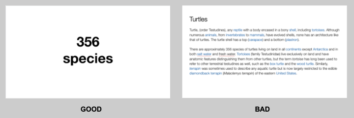
Your slides will be much more effective if you use the fewest words, characters, and pictures needed to tell your story. Long paragraphs make the audience strain to read them, which means they are not paying attention to you. Your audience may even get stressed if you move on to your next slide before they’ve finished reading your paragraph. The best way to make sure the attention stays on you is to limit word count to no more than 10 words per slide. As presentation expert Nancy Duarte says “any slide with more than 10 words is a document.” If you really do need a longer explanation of something, handouts or follow-up emails are the way to go.
Following a “less is more” approach is one of the simplest things you can do to improve your presentation visuals and the impact of your presentation overall. Make sure your visuals add to your presentation rather than distract from it and get your message across.
Ready to learn more about how to make your presentation even better? Get TED Masterclass and develop your ideas into TED-style talks.
© 2024 TED Conferences, LLC. All rights reserved. Please note that the TED Talks Usage policy does not apply to this content and is not subject to our creative commons license.
Newly Launched - AI Presentation Maker

- Flat Designs
- Visuals and Illustrations
AI PPT Maker
Powerpoint Templates
Icon Bundle
Kpi Dashboard
Professional
Business Plans
Swot Analysis
Gantt Chart
Business Proposal
Marketing Plan
Project Management
Business Case
Business Model
Cyber Security
Business PPT
Digital Marketing
Digital Transformation
Human Resources
Product Management
Artificial Intelligence
Company Profile
Acknowledgement PPT
PPT Presentation
Reports Brochures
One Page Pitch
Interview PPT
All Categories

Visuals, Illustrations PowerPoint Designs, Presentation Visuals & PPT Examples
- Sub Categories
- Arrows and Targets
- Bullet and Text Slides
- Charts and Graphs
- Circular Cycle Diagrams
- Concepts and Shapes
- Custom Flat Designs
- Dashboards and Measuring
- Flow Process
- Harvey Balls
- Idea Innovation and Light Bulbs
- Linear Process Diagrams
- Magnifying Glass
- Misc Other Graphics
- Opportunity and Handshake
- Organization Charts
- Roadmaps and Timelines
- Silhouettes
- Strategic Planning Analysis
- SWOT Analysis
- Tables and Matrix
- Technology and Communication
- Venn Diagrams
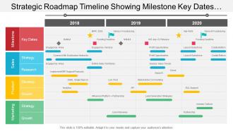
Awesome use of colors and innovatively designed. Absolutely modifiable presentation image as some elements are editable. Ease of personalization with your company name and logo. PPT diagram can be downloaded easy with no trouble. Transmute into JPG and PDF format. Access similar designs with different nodes and stages as required. Creative shaped PowerPoint template with editing options. PowerPoint slide can be projected in standard and widescreen view
Presenting, our 6 piece puzzle circular diagram arranged side by side PowerPoint template. High-resolution PPT slides presenting to all the needs related to achieving smart goals. Related content with flexible data. Can be readily converted to PDF and JPF format. Propitious for students, researchers, business professional, and corporative successes. Catchy graphics for illustration and interesting figures to illustrate the concepts. Adjustable background with color, layout, font and can be projected to widescreens for business meets.

Presenting this set of slides with name - Project Management Powerpoint Presentation Slides. This PPT deck displays sixtynine slides with in depth research. Our topic oriented Project Management Powerpoint Presentation Slides presentation deck is a helpful tool to plan, prepare, document and analyse the topic with a clear approach. We provide a ready to use deck with all sorts of relevant topics subtopics templates, charts and graphs, overviews, analysis templates. Outline all the important aspects without any hassle. It showcases of all kind of editable templates infographs for an inclusive and comprehensive Project Management Powerpoint Presentation Slides presentation. Professionals, managers, individual and team involved in any company organization from any field can use them as per requirement.

Presenting corporate strategy PowerPoint deck. This complete presentation comprises of total of 50 PowerPoint slides. This deck is extensively research and has been created by the PowerPoint experts. Our PowerPoint professionals have incorporated relevant diagrams, layouts, templates and icons related to the topic. The best part is that these templates are completely customizable. Edit the colour, text and icon as per your need. Click the download button below to get this PPT to strategize your business.
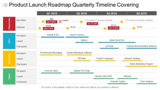
Presenting this set of slides with name - Product Launch Roadmap Quarterly Timeline Covering Milestone Marketing And Sales. This is a four stage process. The stages in this process are Product Launch Roadmap, Product Launch Timeline, Product Launch Linear Process.

Presenting, digital revolution PowerPoint presentation slides. Providing a complete set on digital revolution, high quality and completely editable. Accessible both in standard and widescreen view. Light to transform into JPEG or PDF document. Downloadable PPT design to include data and share. Possible in high-quality resolution display. Fully cooperative with google slides. Useful for business people, researchers, analysts, marketers, etc. Add or remove text as per the business demand. Editing benefits available to customize as per your preference.
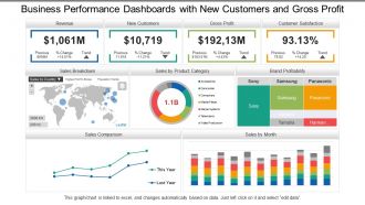
Presenting, business performance dashboards Snapshot with new customers and gross profit PowerPoint ideas for your ease. Information based slides, creating an impact on the viewer, can be used by specialists from any background, entrepreneurs, and scholars. Engaging and editable font style, type, text design and the content of the icons or the PPT slides. Full-screen view choice available and can be transformed into the desired format. Compatible with Google Slides. Open in widescreen size 16:9 after downloading.

Presenting transformation strategy presentation slides. This deck has a total of 19 professionally designed slides. Our PowerPoint experts have conducted their thorough research before making it into a complete presentation. Each slide consists of professional visuals with an appropriate content. Not just this, every PPT slide comprises of diagrams, graphics, icons, charts and graphs. This deck is completely customizable. You can edit the color, text, icon, and font size as per your need. Easy to download. Compatible with all screen types and monitors. Supports Google Slides. Premium Customer Support available. Grab this professionally designed transformation strategy PPT and develop a transitional plan for your organization.

Our topic specific Digital Transformation Powerpoint Presentation Slides deck contains twenty four slides to formulate the topic with a sound understanding. This PPT deck is what you can bank upon. With diverse and professional slides at your side, worry the least for a powerpack presentation. A range of editable and ready to use slides with all sorts of relevant charts and graphs, overviews, topics subtopics templates, and analysis templates makes it all the more worth. This deck displays creative and professional looking slides of all sorts. Whether you are a member of an assigned team or a designated official on the look out for impacting slides, it caters to every professional field.

Presenting business strategy innovation presentation slides. This deck comprises of total of 25 professionally PPT templates. Each slide consists of professional visuals with an appropriate content. This complete deck presentation covers all the design elements such as layout, diagrams, icons, and more. This PPT presentation has been crafted with a thorough research. You can easily edit each template. Edit the colour, text, icon, and font size asper your requirement. Easy to download.

Beautifully crafted 41 slides annual operating strategy PPT deck is quite versatile in nature. PowerPoint slides contain the information that can add value to any business presentation. Great use of colors, text and font has been used in the designing. Perfect for the business management team as helps to communicate the information related to budget. High resolution pixels ensure better experience for the audience. Each Presentation graphic can be edited and merged with Google slides.

Presenting business strategy presentation slides. This deck comprises of total of 50 slides. It covers all the major aspects of the topic. This complete presentation comprises of amazing visuals, icons, graphs, and templates. Our designers have crafted this presentation with a thorough research. These slides are easily editable. You can add or delete the content as per your need. Compatible with all screen types and monitors. Supports Google Slides. Download it now.

Ready to use PowerPoint sample assist you in saving both your time and effort. Luxury to add or remove content in the design. Transmute the PPT layout with industry information i.e. banner and icon. Flexible as can be adapted in JPEG or PDF documents. Text and font can be easily reformed as the presentation need. Presentation template design shown in both standard and widescreen slide
Presenting, meet our team representing in a circular format PPT design. This PPT slide contains visually engaging PPT presentation diagrams, which are loaded with incomparable benefits and can be utilized for displaying your team. Change the colors schemes used here, include your employee images and personalize. This design can be personalized by appending company trademark, logo, brand, symbols. Well-arranged patterns to avoid any confusion or uncertainty. These PPT slides can be instantly downloaded with just a click
Presenting design roadmap timeline showing project scope idea generation PowerPoint designs. We have shown a fully customizable design to show your planning through a PowerPoint presentation. This PPT slide is fully compatible with Google Slides. Use it in full version or in 4:3 standard and full-screen version 16:9 subsequent downloading. Projected on wide screens and include your company's logo/trademark for your best experience. Personalize the text, color schemes and font used here.
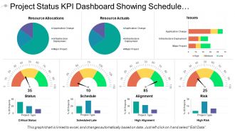
Presenting this set of slides with name - Project Status Kpi Dashboard Showing Schedule And Alignment. This is a seven stage process. The stages in this process are Project Health Card, Project Performance, Project Status.

Presenting this set of slides with name - People Process Technology Powerpoint Presentation Slides. It covers all the important concepts and has relevant templates which cater to your business needs. This complete deck has PPT slides on People Process Technology Powerpoint Presentation Slides with well suited graphics and subject driven content. This deck consists of total of twenty two slides. All templates are completely editable for your convenience. You can change the colour, text and font size of these slides. You can add or delete the content as per your requirement. Get access to this professionally designed complete deck presentation by clicking the download button below.
Presenting this set of slides with name - 3 Piece Puzzle Circular Diagram Arranged Side By Side. This is a three stage process. The stages in this process are 7 Piece Puzzle, 7 Part Puzzle, 7 Segment Puzzle.

Presenting budget proposal presentation slides. This deck has a total of 69 professionally designed slides. Our PowerPoint experts have conducted their thorough research before making it into a complete presentation. Each slide comprises of professional visuals with an appropriate content. Not just this, this complete presentation is a full package and consists of diagrams, graphics, icons, charts and graphs. All PPT templates are completely editable. You can edit the color, text, icon, and font size as per your need. Easy to download. Compatible with all screen types and monitors. Supports Google Slides. Premium Customer Support available.
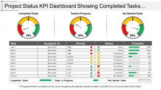
Presenting, project status kpi dashboard snapshot showing completed tasks and task in progress. This PowerPoint slide can be used by businesses experts for their business performance related presentations. The topics and the similar data shown in the flat design can be easily edited in terms of color, text, and fonts by just by heeding few steps. The color and orientation of the elements can also be changed easily. These PPT slides are cooperative with google slides.

Sharing Hr Roadmap PowerPoint Presentation Slides. This presentation contains 19 visually appealing PowerPoint templates. These PPT slides can be easily edited. Users can change the fonts, colors, and slide backdrop as per their need. Presentation templates can be downloaded in both widescreen and standard screen. The presentation is compatible with Google Slides. It can be easily converted into JPG or PDF format

This PPT deck displays thirt two slides with in depth research. Our topic oriented Six Building Blocks Of Digital Transformation Powerpoint Presentation Slides deck is a helpful tool to plan, prepare, document and analyse the topic with a clear approach. We provide a ready to use deck with all sorts of relevant topics subtopics templates, charts and graphs, overviews, analysis templates. Outline all the important aspects without any hassle. It showcases of all kind of editable templates infographs for an inclusive and comprehensive Six Building Blocks Of Digital Transformation Powerpoint Presentation Slides. Professionals, managers, individual and team involved in any company organization from any field can use them as per requirement.

Presenting business transformation PowerPoint presentation slides. This deck covers all the major areas of business transformation. It highlights all the important aspects of the topic. This complete presentation comprises of amazing visuals, icons, graphs, and templates. Our designers have crafted this presentation with a thorough research. These slides are easily customizable. You can add or delete the content as per your requirement. Compatible with all screen types and monitors. Supports Google Slides. Premium Customer Support available. Suitable for use by managers, employees and organizations. You can get access to this readymade professionally designed business transformation presentation with just one click. Download it now.
Presenting this set of slides with name - Before Vs After Implementation Comparison. This is a two stage process. The stages in this process are Current State Future State, Today Tomorrow, Before Vs After.

Presenting training roadmap PowerPoint presentation slides. This deck consists of 21 high resolution PPT slides covering all the necessary templates related to training roadmap. Templates have adequate space for user to write titles or text. These slides are completely customizable. You can edit the colour, text or icon as per your need. Add or delete the content as per your convenience. East to switch in PDF or JPG formats. Compatible with Google slides. Click the download button below to access this training roadmap presentation and engage the audience with creative PowerPoint slide designs.

Presenting this set of slides with name - Business Plan for New Company PowerPoint Presentation Slides. Our topic specific Business Plan for New Company PowerPoint Presentation Slides deck contains seventy four slides to formulate the topic with a sound understanding. This PPT deck is what you can bank upon. A range of editable and ready to use slides with all sorts of relevant charts and graphs, overviews, topics subtopics templates, and analysis templates makes it all the more worth. Export these slides anywhere easily as they are compatible with Google slides. Convert these slides in PDF or JPG formats. Download this deck below.
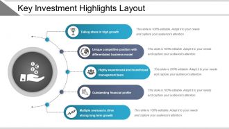
Presenting key investment highlights layout example of a PPT slide. High-resolution PPT example. Easy to edit and customize PPT graphics.Compatible with all software and can be saved in any format (JPEG/JPG/PDF). A useful tool for students, business analysts, and professionals of any and every industry. Precise and easy to comprehend information on PPT sample. Freedom to personalize the content with company name and logo. Hassle free addition and deletion of content as per need.

Presenting detailed business plan for company presentation slides. This deck comprises of total of 77 professionally PowerPoint templates. Each slide consists of professional visuals with an appropriate content. These slides have been designed keeping the requirements of the customers in mind. This complete deck presentation covers all the design elements such as layout, diagrams, icons,and more. This PPT presentation has been crafted after a thorough research. You can easily edit each template. Edit the colour, text, icon, and font size asper your requirement. Easy to download. Compatible with all screentypes and monitors. Supports Google Slides. Premium Customer Support available.

Introducing Strategy Evolution Framework PowerPoint Presentation Slides. This complete deck contains 18 content ready templates. Each component given in slides can be easily modified to meet specific needs. Users can quickly download Presentation templates in both widescreen and standard screen. The presentation is fully supported with Google Slides. It can be easily converted into JPG or PDF format.
Presenting 3 Months Business Planning Timeline PPT slide. The monthly business timeline presentation template designed by the professional team of SlideTeam to maintain a business plan. The business planning timeline slide is editable in PowerPoint and the slide is compatible with Google Slides so that you can share it with others. The font size and type, colors and shapes of the figure are editable and you can modify it in the template according to different business planning. You can insert the text related to business activity planning because SlideTeam has inserted dummy text in this slide.
Presenting 8 step process roadmap timeline PowerPoint slides. This is enclosed PPT image favorable for the business professional or experts. The scheme, intensity, context, symbols etc. can be easily reconstruct able. This Presentation graphic can also be erratic into various file configurations like PDF or JPG. Offers an option to add company logo or trademark. It is an immense quality PPT design which remains their intensity of high quality when projected on wider screens.
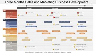
The design template is fully compatible with Google Slides and Microsoft Office software. Both standard and wide screen views are available. This unique PPT design can easily be easily converted into JPEG and PDF format. Design is highly useful for sales and marketing professionals, business managers. High resolution graphics and icons have been used in designing the slideshow, quality of design won’t change on wide screen design view.
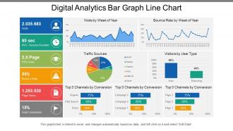
Presenting this set of slides with name - Digital Analytics Bar Graph Line Chart. This is a five stage process. The stages in this process are Digital Analytics, Digital Dashboard, Digital Kpis.
Presenting this set of slides with name - Monthly Business Plan Animation Timeline. This is a six stage process. The stages in this process are Animation Timeline, Animation Roadmap, Animation Linear Process.

Presenting, product quarterly roadmap graphic with the product line and milestones PowerPoint design. We have shown high-resolution PPT slides to achieve smart goals. Project on wider screens for business meetings and edit the design without any change in the quality. Flexible background with the color, layout, font allows you to personalize the PPT design. Can be easily converted to pdf and jpg format and is useful for students, researchers, business professional, and corporative successes.
Presenting 7 Piece puzzle showing circular layout with seven categories of icon option7 PowerPoint presentation slide. The user can change to any scheme in colors, fonts and texts. This PPT slide is supported by Google slides. Quick and easy downloadable icon and supports other formats like JPEG and PDF. Well suited for corporate, business, teachers, sales and marketing teams. You can adjust shapes and colors to make the chart fitting your brand colors and style. Data entry of company name, logo and trademark is simple.

Presenting sales playbook PowerPoint presentation slide. This deck has a set of 19 slides. Completely apt for sales manager to train his team. This presentation has been crafted with an extensive research done by the research experts. Our PowerPoint designers have designed this PPT by incorporating appropriate diagrams, layouts, templates and icons related to the topic. These slides are completely customizable. Edit the colour, text and icon as per your need. Click the download button below to grab this content-ready PPT deck.

This is a three stage process. The stages in this process are Lego Bricks, Building Pieces, Building Blocks.
Introducing, the performance meter gauges PowerPoint Presentation Slide. This Presentation has been designed professionally and is fully editable. You can reshape the font size, font type, colors, and even the background. This Template is amiable with Google Slide and can be saved in JPG or PDF format without any fuss created. Fast download at the click of the button.
Presenting this set of slides with name - 3 Piece Puzzle Arranged In A Horizontally Straight Row. This is a three stage process. The stages in this process are 7 Piece Puzzle, 7 Part Puzzle, 7 Segment Puzzle.
Presenting this set of slides with name - Innovation Roadmap Timeline Showing Achievements Releases. This is a four stage process. The stages in this process are Innovation Roadmap Timeline, Idea Roadmap Timeline.

Presenting this set of slides with name - Team Capabilities Powerpoint Presentation Slides. This complete deck is oriented to make sure you do not lag in your presentations. Our creatively crafted slides come with apt research and planning. This exclusive deck with twenty slides is here to help you to strategize, plan, analyse, or segment the topic with clear understanding and apprehension. Utilize ready to use presentation slides on Team Capabilities Powerpoint Presentation Slides with all sorts of editable templates, charts and graphs, overviews, analysis templates. It is usable for marking important decisions and covering critical issues. Display and present all possible kinds of underlying nuances, progress factors for an all inclusive presentation for the teams. This presentation deck can be used by all professionals, managers, individuals, internal external teams involved in any company organization.

Presenting this set of slides with name - Operating Model Powerpoint Presentation Slides. PowerPoint template is completely flexible with Google slides. PPT design can be displayed in wide screen view without the problem of pixilation. Presentation slide is completely amendable color, text and font as per the trade. Effortless to download and can be turned into JPG and PDF format. Ease of adding corporate designation and insignia. Comparable designs accessible with different nodes and stages. Fast download and easy to save in the system or in the working presentation.

Presenting cost reduction plans presentation slides. This deck comprises of total of 34 PowerPoint slides. Each slide consists of professional visuals with relevant content. These PowerPoint templates have been designed keeping the customers requirement in mind. This complete presentation covers all the design elements such as layout, diagrams, icons, and more. This deck has been crafted with a thorough research. You can easily customize each template. Edit the colour, text, icon, and font size asper your requirement. Easy to download. Compatible with all screen types and monitors.

Introducing content strategy maturity model PowerPoint template slide. You can download the slide with numerous hubs. Instructional slides are accommodated for your direction. You can change the shading, content, text dimension and textual style sort of the slide at whatever point required. Layout slide empowers you to erase the watermark. Individualize the slide by joining your organization logo, trademark, copyright or mark. Incomparable quality designs have been sent to plot this slide are editable in PowerPoint. You can exhibit the illustrations on vast screen as the image quality does not get hurt. Accessible in both standard and widescreen see.
Presenting this set of slides with name - Summary Recommendations In Table Of Contents. This is a five stage process. The stages in this process are Table Of Contents, TOC, Lists.

Presenting this set of slides with name - Futuristic Modern Interactive Technology Elements. This is a four stage process. The stages in this process are Futuristic, Technology, Modern.
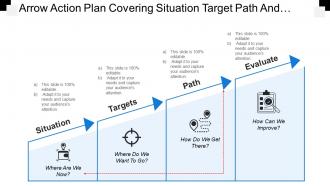
Presenting this set of slides with name - Arrow Action Plan Covering Situation Target Path And Evaluate. This is a four stage process. The stages in this process are Road Sig Arrow Action Plan, Arrow Action Strategy, Arrow Action Approachns Powerpoint, Traffic Signs, Traffic Symbol.
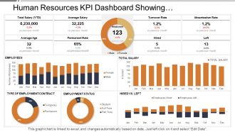
SlideTeam presents the Human Resources Kpi Dashboard Showing Employment Status Turnover Rate PPT which will help you keep a track of the human capital working under you. All the slides in the slideshow are 100 percent editable and you can make all the desired changes in the presentation. You can also add or delete the slides All the slides are fully compatible with Google slides as well. Your audience will be amazed by Google slides. You can even view the document in 16:9 widescreen size.
Zero issue of pixilation when projected on wide screen. Hassle free inclusion and exclusion of company name, logo and trademark. PPT is compatible with numerous software options and formats. It is time saving PowerPoint template on part of designing and formatting. This professionally proficient PPT presentation layout is easily editable colors, text, fonts, shapes, icons and orientation. Impressive picture quality provides high resolution output. Marketers, strategists, business planners, students and teachers make vivid use of this slide design in their presentations.
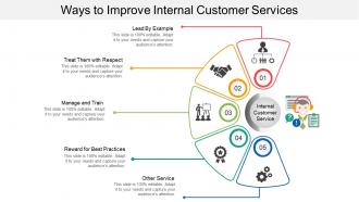
Presenting internal customer service presentation template. This slide is fully customizable in PowerPoint and is designed professionally. You can make changes to the objects in the slide like font size and font color. This presentation template is fully compatible with Google Slide and can be saved in JPG or PDF file format easily. Download this fast at the click of a button.

Presenting event planning PowerPoint Presentation slides. This presentation includes 32 professional PPT slides. All templates are fully editable in PowerPoint. Customize the font size, font style, graphic colors, and slide background without any hassle. The slides have text placeholders to enter your presentation content. Data driven charts and graphs help you present your research in easy to understand, visual style. Presentation is downloaded in both widescreen (16:9) and standard screen (4:3) aspect ratio. Presentation templates are compatible with Google slides. They make sure to display relevant information in front on the viewers.
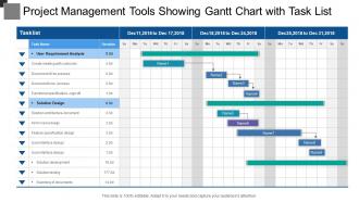
Presenting this set of slides with name - Project Management Tools Showing Gantt Chart With Task List. This is a three stage process. The stages in this process are Project Management Tools, Project Management Software, Project Management Techniques.
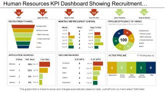
Presenting this set of slides with name - Human Resources Kpi Dashboard Showing Recruitment Funnel Application Sources. This is a six stage process. The stages in this process are Human Resource, Hrm, Human Capital.

Striking ROI calculation PowerPoint template. This presentation covers 22 professionally designed PowerPoint slides, all of them being 100% editable in PowerPoint. Offers wide variety of options and colors to alter the appearance. Allows adding of enterprise personal details such as brand name, logo and much more. Enough space available to enter text and its related points in the PPT table. High-resolution PowerPoint presentation backgrounds for better clarity of the information displayed. These PPT slides are available in both Standard and Widescreen slide size.

Keep your audience glued to their seats with professionally designed PPT slides. This deck comprises of total of sixtyseven slides. It has PPT templates with creative visuals and well researched content. Not just this, our PowerPoint professionals have crafted this deck with appropriate diagrams, layouts, icons, graphs, charts and more. This content ready presentation deck is fully editable. Just click the DOWNLOAD button below. Change the colour, text and font size. You can also modify the content as per your need. Get access to this well crafted complete deck presentation and leave your audience stunned.
Presenting this set of slides with name - People Process Technology Business Process Icons. This is a three stage process. The stages in this process are 3 Successful Organizational Transformation Elements Icons, People Process Technology Icons.
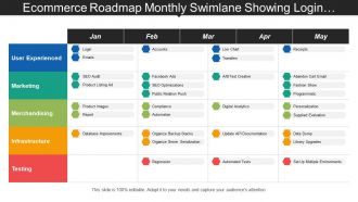
Presenting, project our e-commerce roadmap monthly swimlane showing login emails accounts regression PowerPoint deck. This PowerPoint slide can be practiced by businesses experts for their e-commerce presentations. Can be accessed in both standard 4:3 and widescreen format 16:9 after downloading .The topics and the related data shown in the flat design can be simply edited in terms of color, text, and fonts by just by heeding few steps. The color and orientation of the elements can also be replaced easily. These PPT slides are supportive with Google Slides.

Presenting learning roadmap presentation slides. This deck comprises of total of 20 professionally PPT slides. Each template consists of professional visuals with an appropriate content. These slides have been designed keeping the requirements of the customers in mind. This complete deck presentation covers all the design elements such as layout, diagrams, icons, and more. This PPT presentation has been crafted after a thorough research. You can easily edit each template. Edit the color, text, icon, and font size as per your requirement. Easy to download. Compatible with all screen types and monitors. Supports Google Slides. Premium Customer Support available. Download now and outline your short- and long-term goals with learning roadmap PPT templates.
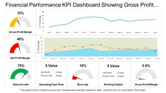
Presenting this set of slides with name - Financial Performance Kpi Dashboard Showing Gross Profit Margin Sales Growth Operating Cash Flow. This is a three stage process. The stages in this process are Financial Performance, Financial Report, Financial Review.
Item 1 to 60 of 7300 total items
- You're currently reading page 1

Ratings and Reviews
by David Wright
June 24, 2021
by Jake Smith
by fatima aljamal
May 9, 2023
by Douglas Lane
July 18, 2021
by Connie Simmons
by Edwin Valdez
July 20, 2021
by Darin Chen
July 19, 2021
by Charlie Reed
by Brown Baker
by Clair Gray
Items 1 to 10 of 115 total

- Presentations
- Most Recent
- Infographics
- Data Visualizations
- Forms and Surveys
- Video & Animation
- Case Studies
- Design for Business
- Digital Marketing
- Design Inspiration
- Visual Thinking
- Product Updates
- Visme Webinars
- Artificial Intelligence
18 Best Presentation Tools for Beautiful Presentations [In 2023]
![visual presentation ppt 18 Best Presentation Tools for Beautiful Presentations [In 2023]](https://visme.co/blog/wp-content/uploads/2019/09/best-presentation-tools-header-wide.jpg)
Written by: Chloe West

Looking for the best presentation tools to help you get your presentations to the next level? Powerpoint alternatives like Visme have tons of features and tools to amp up your presentation. In this guide, we will discuss how you can make the most of some of the tools like:
- Templates and themes
- Slide layouts
- Color themes
We’ve got a lot to cover, so let’s get into it.
18 Best Presentation Tools for Beautiful Presentations
Tool #1: templates and themes, tool #2: slide layouts, tool #3: fonts, tool #4: color themes, tool #5: icons, tool #6: shapes, tool #7: stock photos, tool #8: charts and graphs, tool #9: maps, tool #10: tables, tool #11: flowcharts, tool #12: icon charts, tool #13: radials, tool #14: progress bars, tool #15: animation, tool #16: transitions, tool #17: interactivity, tool #18: audio and video.
At Visme, we have two different options for users to get started with a new presentation.
The first option is presentation templates . There are over 100 editable presentation templates in Visme that range from 2 to 15 pre-designed slides for you to easily plug your content in.
Presentation Templates

Ecommerce Webinar Presentation

Buyer Presentation
PixelGo Marketing Plan Presentation

Technology Presentation
Product Training Interactive Presentation

Work+Biz Pitch Deck - Presentation
Create your presentation View more templates
However, we also have three separate presentation themes – Modern , Simple and Creative .
Each theme has hundreds of slide layouts that you can mix and match, or pull into your presentation and customize with your own colors, fonts and content.
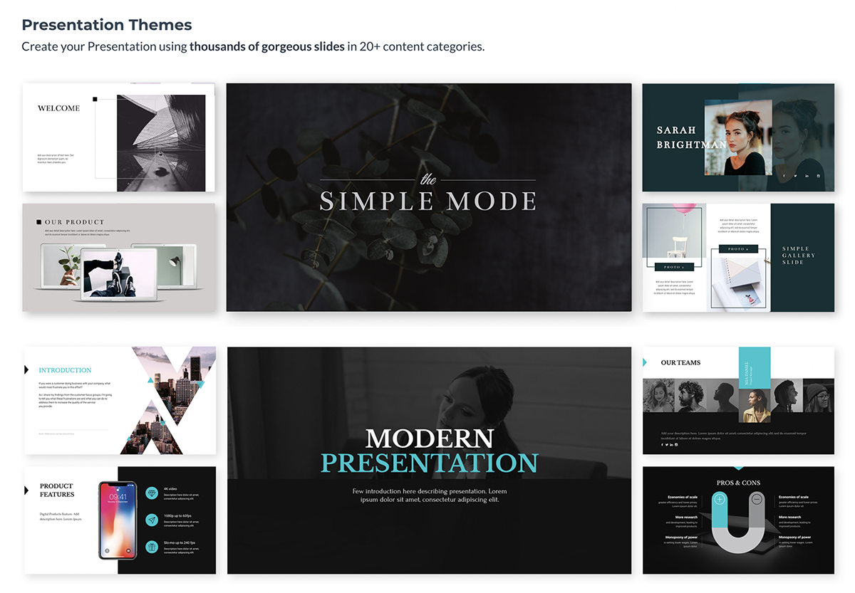
Regardless of if you choose a template or theme, you have full range customization options to make the presentation your own. We just give you a visually appealing starter kit to make your life easier.
If you choose between one of our presentation themes, you have hundreds of slide layouts to choose from to build out your presentation in the way that you see fit.
Whether you need a title slide, a timeline , a slide for your services or an ending contact us slide, our slide library has plenty of options for you.
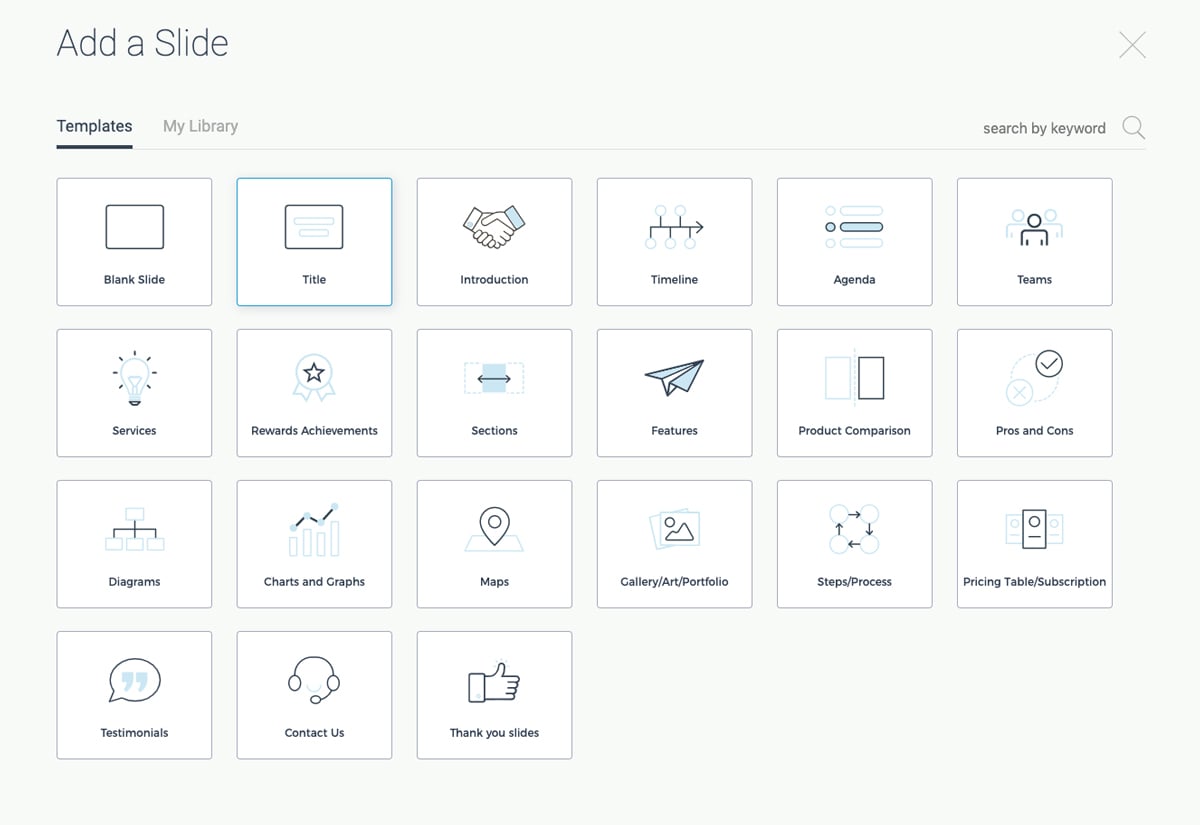
When you’re in the presentation maker , click Add Slide to access the slide library. Choose one of the categories to view each of the slide layout options available.
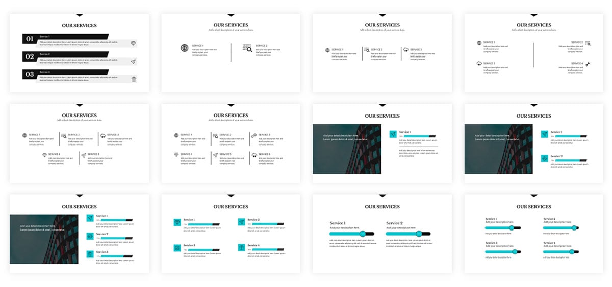
This allows you to reuse the same theme over and over again for multiple presentations while maintaining a fresh look each time. Just choose the slide you want to edit, add it into your presentation and customize it with your own information.
Hey marketers! Need to create scroll-stopping visual content fast?
- Transform your visual content with Visme’s easy-to-use content creation platform
- Produce beautiful, effective marketing content quickly even without an extensive design skillset
- Inspire your sales team to create their own content with branded templates for easy customization
Sign up. It’s free.
Another important tool for your presentations that you have access to in Visme is free fonts. There are over 100 fonts for users to choose from in the presentation design dashboard.
Stick to three fonts or less. Too many different font faces can make your slides appear cluttered. It’s best to incorporate one font for headers, one for body copy and a possible third for an accent font.
If you don’t find the font you want, you can also utilize Visme’s Brand Kit to upload and access your own preferred fonts. This can include your company’s brand fonts or simply a personal favorite or two.
While many of the presentation themes and templates come with an already established color scheme , absolutely nothing is set in stone. You can switch out the color of every item in your presentation to match your company or your topic.
One great presentation tool that Visme has is color themes. This allows you to change the color scheme of your entire presentation with a single click.
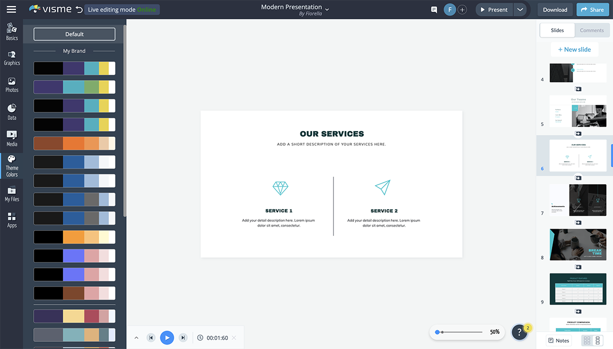
You can add your own brand color scheme into the Brand Kit section of your Visme dashboard so you can easily access them later. There is also a section to create your own color themes from scratch.
The color themes you create will appear at the top of the list and will switch the colors of your presentation for you without you having to pick and choose which individual elements are which color.
Using icons in your business presentation is a great way to visualize the text in your slides. You don’t want to include only text for your audience to follow along, so incorporating graphics as a visual aid is a great way to make your content more engaging.
In Visme, users have access to over 10,000 icons with four different styles to choose from.
Since you want to stick to a single icon style throughout your presentation, this gives you a way to differentiate each presentation you create while still having tons of icon options.
Access thousands of high-quality icons and graphics!
- Vector icons to spice up any Visme design or document
- Free to use , and great for print or web.
- Customize colors to fit your design needs.
Use these high-quality icons and graphics to help visualize the main points in your next presentation.
Another great way to add a few design touches to your presentation is by incorporating shapes. These can be used to emphasize photos and text by surrounding them or to create a design by themselves.
Check out the presentation slide template below. It's a great example of how using circular frames around photos can help draw attention to them.
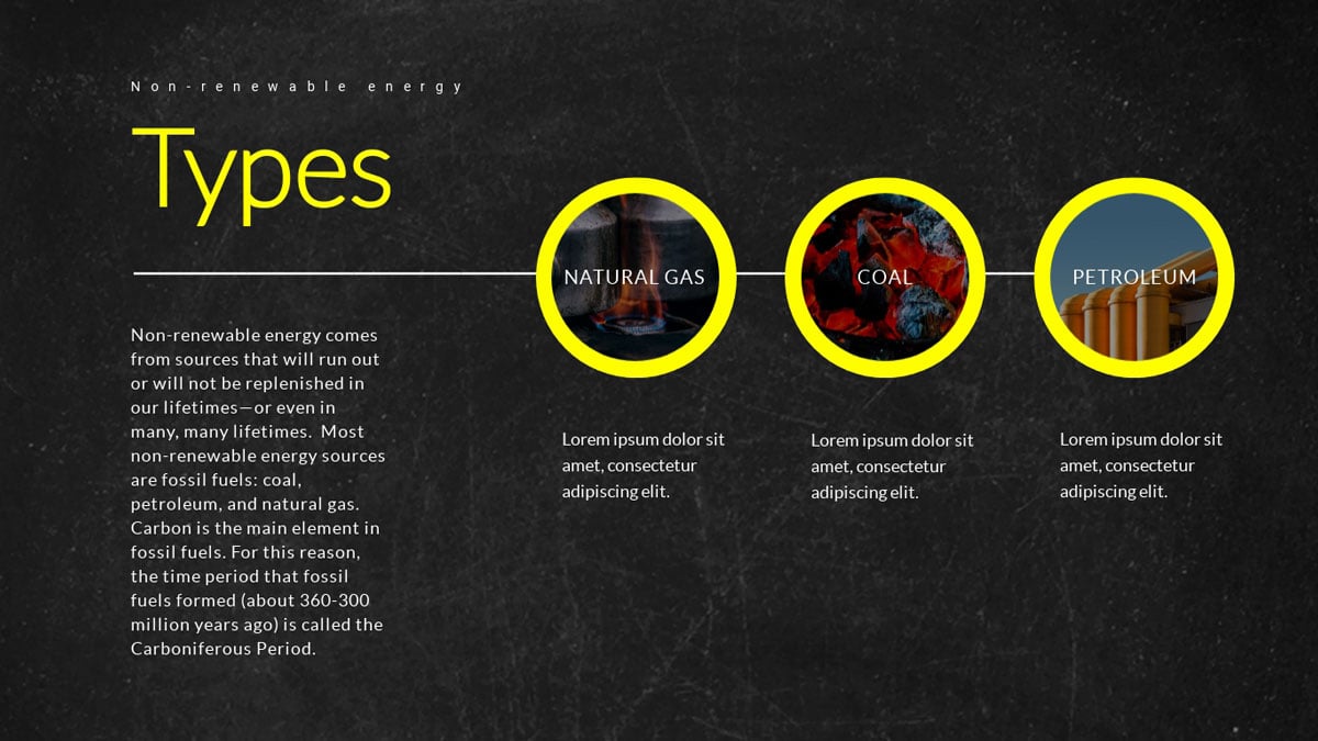
Here's another presentation slide template that incorporates shapes into the design.

Incorporating different shapes can help to add depth to your presentation. It’s not all text, photos and icons. Instead, there’s an entire design aspect to your slides as well.
Here’s a video of how to format shapes and lines in Visme.
Visme partners with Unsplash to bring its users a massive library of free stock photos to incorporate into presentations, infographics , social media graphics and more.
While you may have your own photos of your team, business, products and services, there are still many other options for including stock photos in your presentation.
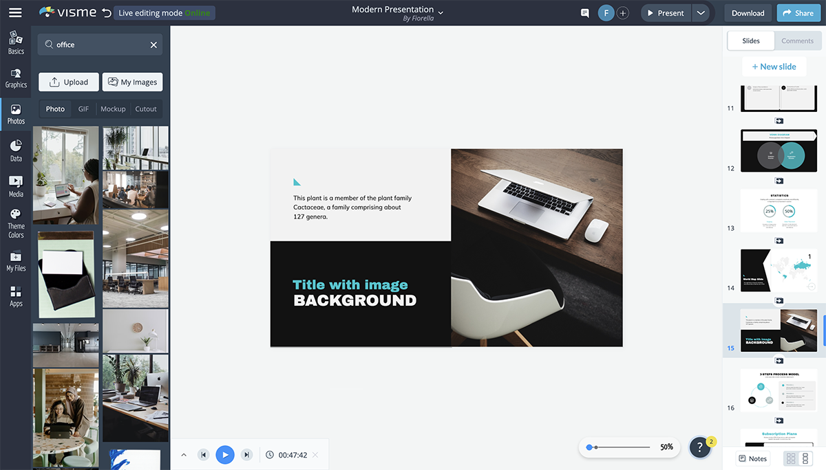
You can use the search bar to find exactly what you’re looking for in the photo library and easily drag and drop it onto your presentation slide.
If you have a preset slide with images you want to change out, click on the photo to have the option to replace it appear in the top bar.
There are many ways to use presentation images , so be sure you browse through the photo library to see what options are available for you to use in your own slides.
If you’re presenting financial data, charts and graphs are key presentation mediums . There are many different chart and graph options available, from bar charts to line graphs and pie charts to funnel charts and more.
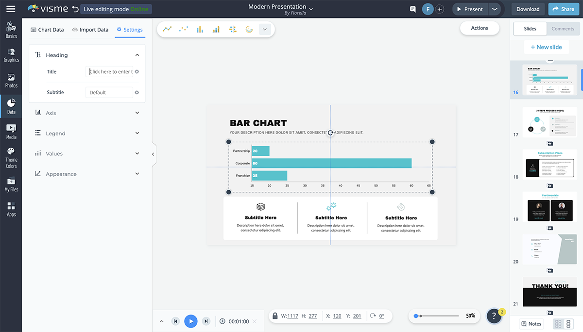
Want to create your own charts and graphs?
- Upload an Excel file or sync with live data from Google sheets
- Choose from 16+ types of charts, from bar and line graphs to pyramid and Mekko charts
- Customize anything, from backgrounds and placement of labels to font style and color
The Graph Engine is the first option available to users when you open up the Data tab in the design dashboard, giving you 15 chart and graph options right off the bat.
You’re able to input your data manually or import an Excel or Google spreadsheet and your dynamic chart will automatically update to reflect it.
Change colors, name axes and customize the legend. All charts and graphs in Visme can also be animated to make your presentation look even more engaging and creative.
If you’re talking about demographics or sharing information that pertains to a location within your presentation, consider adding in a map to visualize the area.
Visme’s map maker allows you to insert a world map or pinpoint any location in the world, color coding areas and creating an engaging visualization for your audience.
Set a global color for your map and color code different areas based on your information. You can hide areas on the map or showcase just one specific country or continent in the world.
There are many reasons you may need to add a table to your presentation.
You can create a schedule for the event or presentation, create a pricing table or even include a table of data next to the chart that visually represents it.
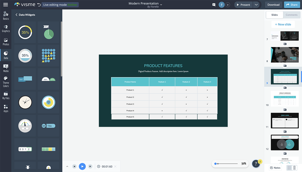
It's very easy to add a table to your presentation in Visme. You can set the number of rows and columns your table has, change cell colors, customize fonts and more.
A flowchart can help you visualize business processes, chains of command and more. And Visme makes it extremely easy to customize a premade flowchart or create one entirely from scratch.
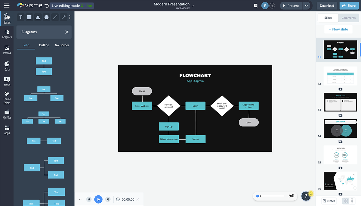
There are several slide layouts that include flowcharts you can edit to fit your content, but it’s actually quite fun to play with the shapes and lines to create your own flow.
The flowchart elements are fully customizable so that you can choose outlines or filled in shapes, corners or rounded edges in your lines, line width and more.
An icon chart or an array is a way to represent data with icons. You can use this to differentiate between the number of men and women, cats and dogs, etc., that fall under different categories.
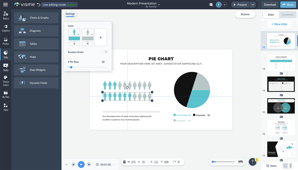
While the array visualization automatically comes with two icons, you can add more, change colors, switch the icons with any options from our library and more.
A radial, or circular counter, is a more engaging way to represent numbers or percentages than having them stand alone on the slide.
The thing is, not many PowerPoint alternatives have this tool. However, there are many different styles to choose from in Visme's data widget sidebar.
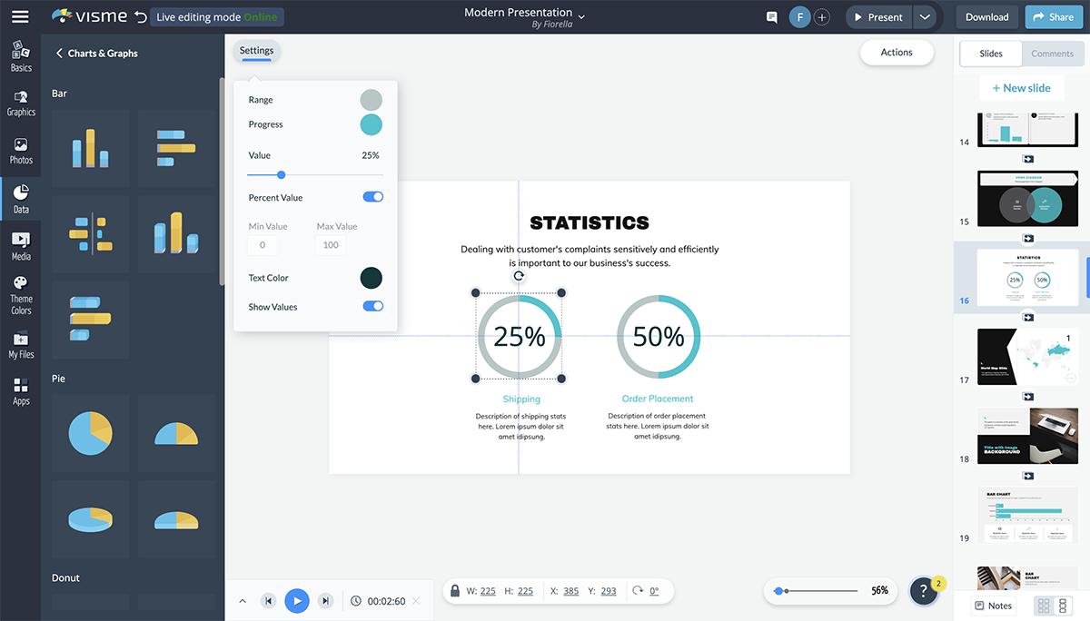
You’re able to customize the colors, the number, the maximum and minimum values and even whether you’re visualizing a percentage or just a number.
You can even add icons to the center of your radial to better visualize what each percentage is referencing.
Want to let your audience know how much time there is left in the presentation? Add a progress bar to the bottom of each slide.
You can also use this to show how far along the company is with creating products or gathering funding.
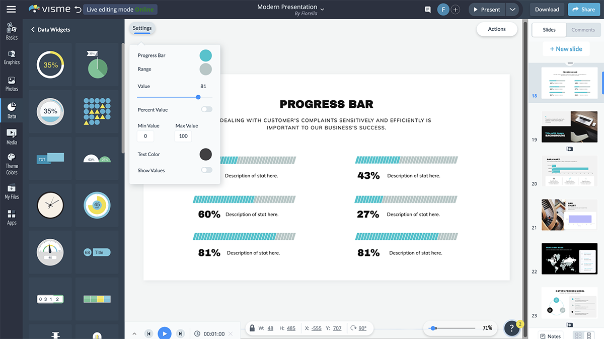
In Visme, you can choose from many different styles of progress bars, creating a new look and feel in each presentation you add this feature to.
To make your presentation more engaging , consider adding animation to the elements in your slides. This makes them move on the screen and helps grab the attention of your audience.
In Visme, you have six animation options:
- Fly from left
- Fly from right
- Fly from top
- Fٖٖٖly from bottom
Just remember that you only want to stick to one animation type per presentation. Having elements fly in from all different directions is not a good look and can easily overwhelm your audience.
Create beautiful and animated presentations!
- Add your own text, images, colors and more
- Add interactive buttons, transitions and animations
- Customize anything to fit your design and content needs
Watch this video to learn how you can animate text, video, shapes and images in Visme.
Your transition is the way your slides appear and disappear, and it’s a great idea to give this a bit more flair than your typical slide interchange.
With Visme, you can create transitions that not only move your slide, but each of the elements simultaneously. Simply click on the gear at the right corner of the slides to access the transitions.
The Staggered Fade, Enter from Side, Enter from Bottom, Enter from Top and Zoom In transitions all include both slide and element transitions. However, if you want to animate your elements separately, you can choose the transition Simple Fade or Slide In.
Visme also offers several great ways to make your presentation interactive.
Have Q&As, bring props, have your audience raise their hands and more. You create hyperlinks between slides and even design elements to create a unique experience for your audience.
This is a great way to make your presentation stand out and get your audience involved, so be sure to keep some of these interactivity ideas in mind.
Adding an audio narrative, recording a voice-over for your slides, incorporating background music or even embedding a video can be a great way to increase engagement in your presentation.
You can record audio directly in Visme, embed video links or embed any other type of online content directly in your presentation slides.
This can also give you a break from presenting during longer sessions, breaking up the monotony of your audience listening to the same thing for the duration of the time.
Watch the video below to learn how to embed video into your presentation and capture your audience's attention.
Looking for the Best Presentation Software to Use These Tools?
There you have it. We’ve shared 18 valuable tools for beautifying your next presentation.
But here’s a caveat! When preparing your presentation, don’t throw in all of these tools. Match the presentation topic with the tool that will have the most impact on your audience.
While there is a lot of presentation software out there—like PowerPoint, Keynote, Beautiful.ai, Prezi, Canva, Visme and more—what tools do you use for your presentation? Visme comes preloaded with all of the best presentation tools we’ve mentioned and more. Use them to create a presentation that your potential customers and investors will fall in love with.
Sign up for a free Visme account today to get started, and check out all of our presentation templates to find something you love.
Create beautiful presentations faster with Visme.

Trusted by leading brands
Recommended content for you:

Create Stunning Content!
Design visual brand experiences for your business whether you are a seasoned designer or a total novice.
About the Author
Chloe West is the content marketing manager at Visme. Her experience in digital marketing includes everything from social media, blogging, email marketing to graphic design, strategy creation and implementation, and more. During her spare time, she enjoys exploring her home city of Charleston with her son.

IMAGES
VIDEO
COMMENTS
15 Effective Visual Presentation Tips To Wow Your Audience
150+ Free PowerPoint Slides to Make Great Visually Appealing Presentations. As our content catalog has grown, we have started to publish free PowerPoint slides every new week. Our free slides have had a very good adoption and we could also notice the number of free downloads is increasing over time. Reusing our 100% editable PowerPoint diagrams ...
A step-by-step guide to captivating PowerPoint ...
How To Create A Great Visual Presentation
Minimalism PowerPoint Template - Effective storytelling PPT and visual PowerPoint presentation template. Try this template if you're looking for a way to make an impact with your story. Clear of clutter and distractions, the minimalist slides help draw attention to the text and make the visuals stand out. The template includes:
20 Great Examples of PowerPoint Presentation Design ...
Visual information is easier to remember. Research studies have shown that visual information will be retained more than six times better if visuals are attached to it. If you actually want people to remember your presentation you must do two things: tell stories and use pictures. If you simply regurgitate information and make it very text ...
Research, plan, and prepare your presentation professionally. It helps you deliver an effective message to your target audience. Designed Correctly. Your visual points should stand out without overwhelming your audience. A good PowerPoint visual shouldn't complicate your message. Practiced to Perfection.
Apple® founder Steve Jobs was known widely for his great presentations. His unveiling of the iPhone® in 2007 is considered to have been one of his best presentations ever, and, if you were one of the millions who watched it online, you'll know why. The presentation was engaging, and passionate. Jobs was particularly well known for building his presentations around powerful visual aids.
Visual storytelling refers to the use of compelling visuals, such as images, infographics, charts, and videos, to convey information and engage the audience during presentations. It goes beyond simply presenting facts and data by incorporating narrative elements and visual cues to create a more immersive and memorable experience.
Overstyling can make the slide look busy and distracting. 8. Choose the Right Images. The images you choose for your presentation are perhaps as important as the message. You want images that not only support the message, but also elevate it—a rare accomplishment in the often dry world of PowerPoint.
How To Make a Good Presentation [A Complete Guide]
23 PowerPoint Presentation Tips for Creating Engaging ...
Slidesgo: Free Google Slides themes and Powerpoint templates
How to use visual communication to raise your presentation game. Use images and icons. Use visual metaphors. Master the use of color. Use geometric shapes. Use charts and graphs. Convert complex explanations into diagrams and infographics. Create the right mood with typography. Try using GIF and video.
Get your main point into the presentation as early as possible (this avoids any risk of audience fatigue or attention span waning), then substantiate your point with facts, figures etc and then reiterate your point at the end in a 'Summary'. 2. Practice Makes Perfect. Also, don't forget to practice your presentation.
1. Use PowerPoint add-ins to create better graphics. There are some excellent free and cheap PowerPoint add-ins and tools that can help you create better visuals without any design experience. PowerPoint add-ins are plugins that add new features and functionality to PowerPoint. There are all sorts of add-ins available, but for visuals, I ...
2024's Must-See Visual Presentation Examples to Power ...
The most important rule for visual presentations is to keep ...
Now that you have an idea of good vs. bad visuals, let's talk about 7 types of visuals you can use in your presentation. 1. Use stock photos for your presentation slides. When I'm giving a presentation training workshop, I ask people what types of visuals they should avoid, and a lot of them say "stock photos!".
Visuals and Illustrations PowerPoint Designs | Presentation ...
Tool #4: Color Themes. While many of the presentation themes and templates come with an already established color scheme, absolutely nothing is set in stone. You can switch out the color of every item in your presentation to match your company or your topic. One great presentation tool that Visme has is color themes.